Expandable List
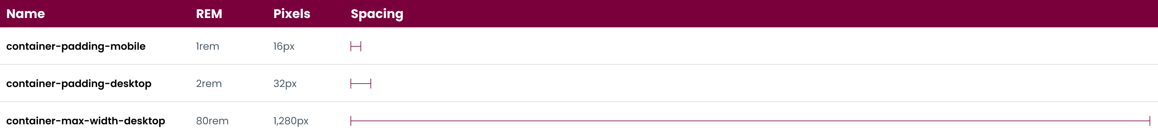
Spacing
Working from a defined spacing system means faster and more consistent designs.
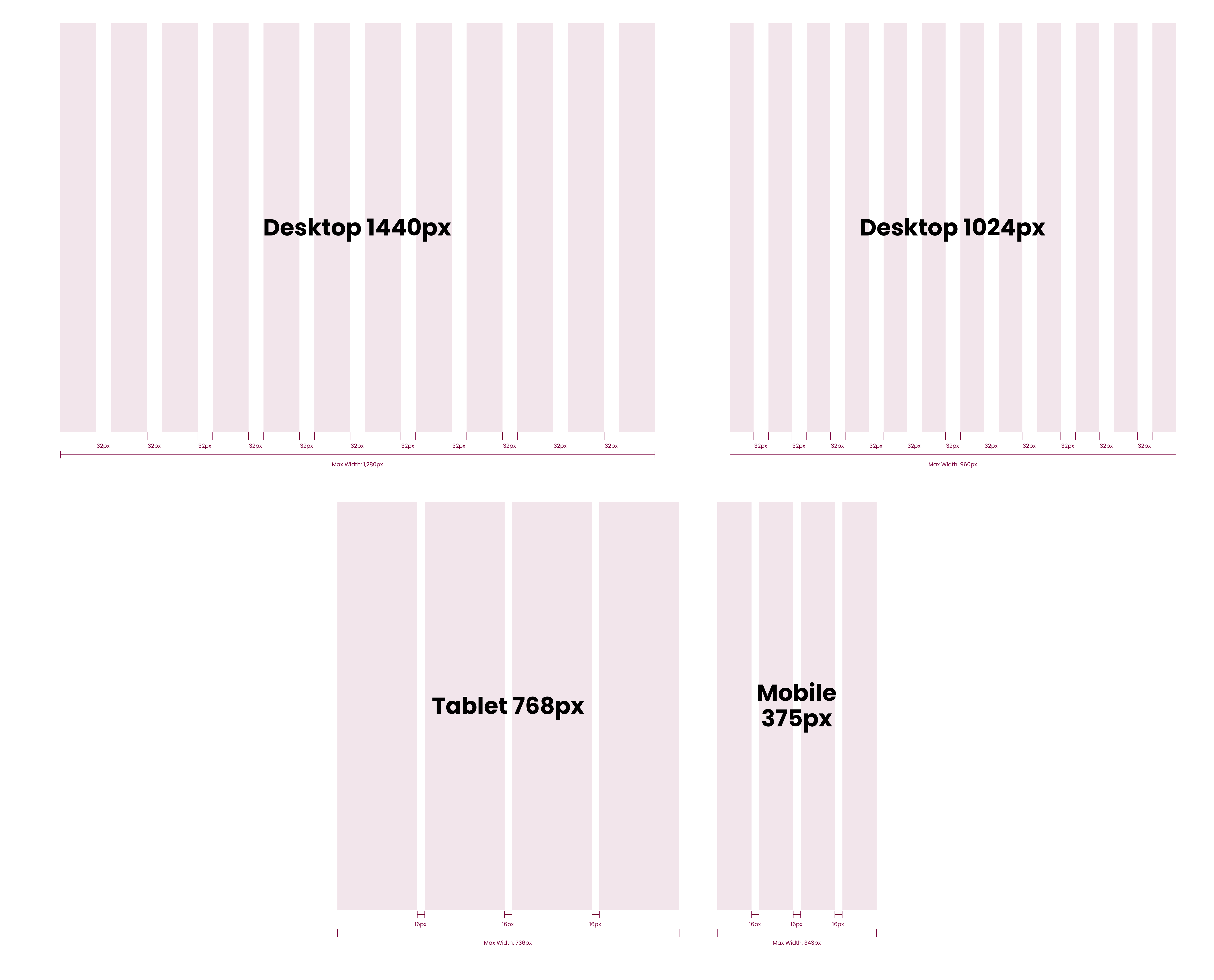
Scale
McMaster websites must be responsive across all devices, from standard desktops to smartphones. The default grid system has four columns for small to medium screens. It expands to 12 columns for larger screens with a maximum container width of 1,280px.
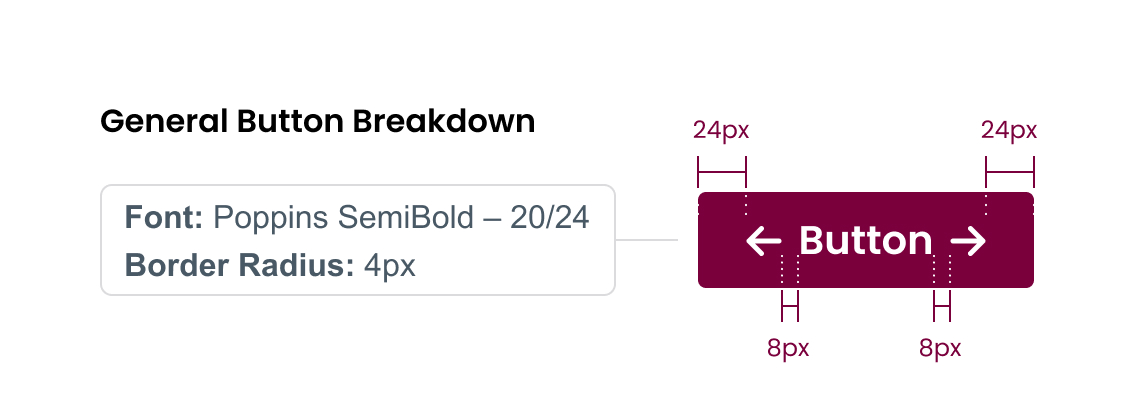
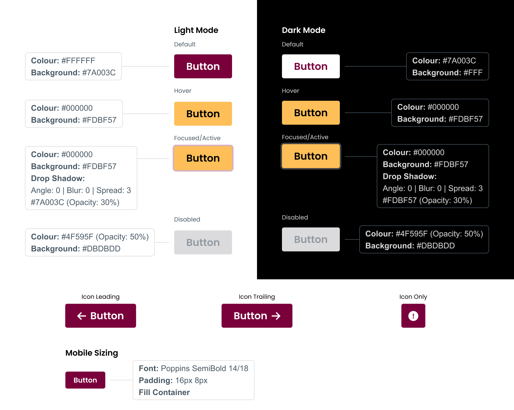
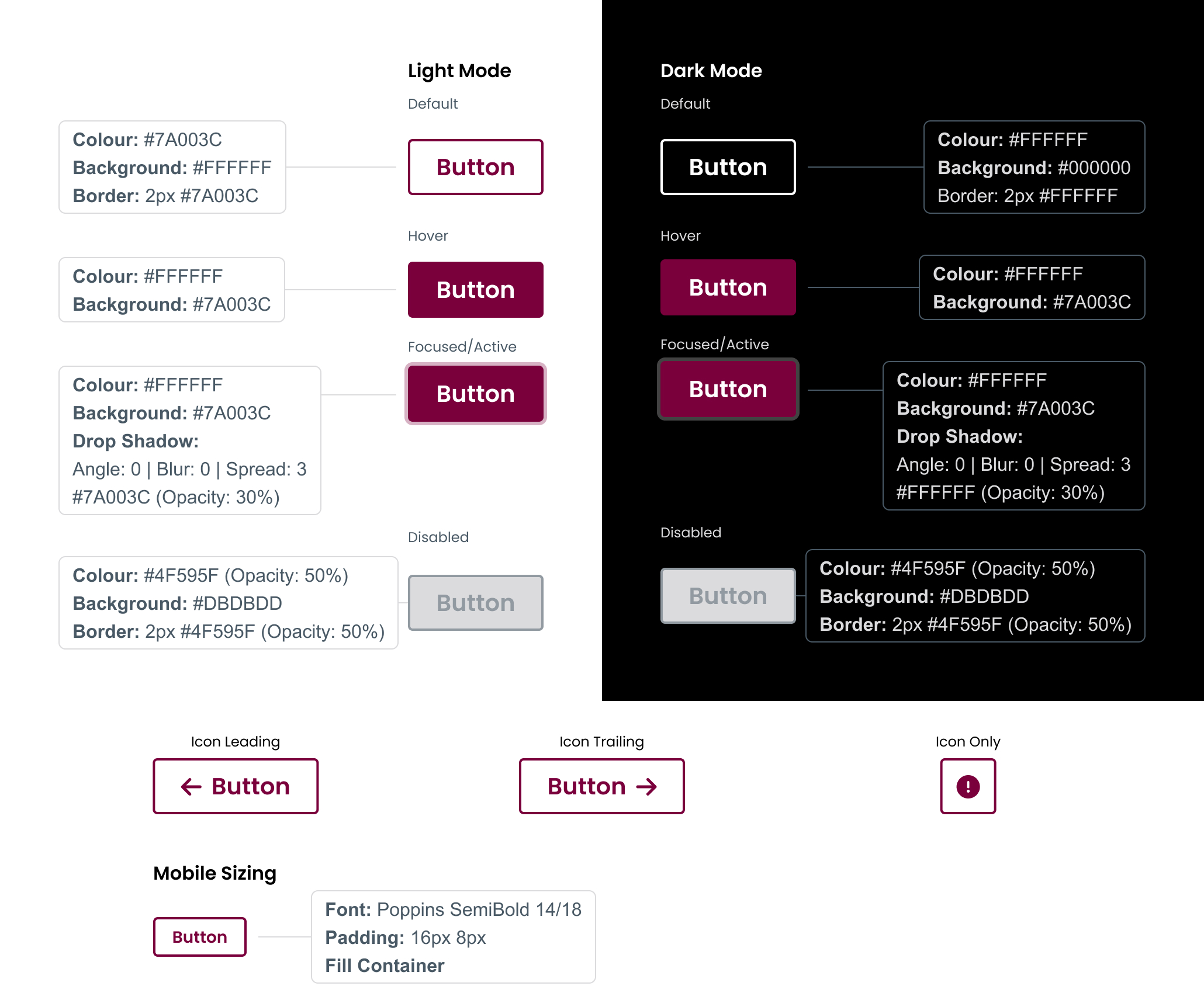
Primary buttons
Primary buttons highlight the most important actions for users to take. Consistent treatment of the buttons is important for the user experience.
Poppins SemiBold – 20/24 Padding: 24px 12px
Gap: 8px
Border radius: 4px
Secondary buttons
Secondary buttons are used for actions available to the user, but with less prominence than the primary buttons.
Poppins SemiBold – 20/24 Padding: 24px 12px
Gap: 8px
Border radius: 4px
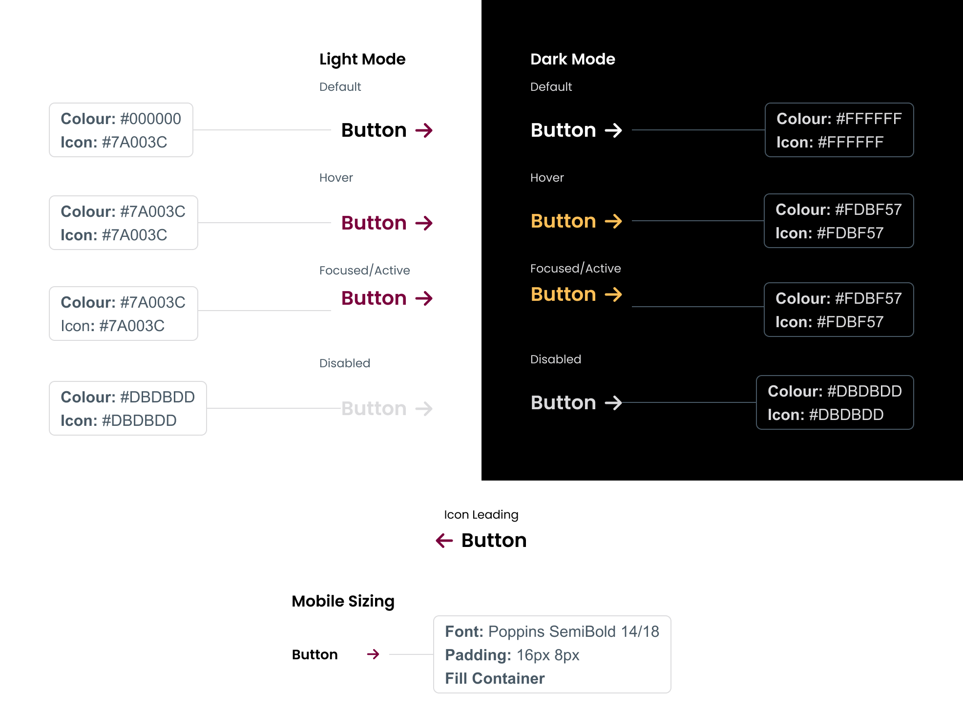
Tertiary buttons
Used in cards and stories, tertiary buttons are used when a call to action is provided, but is not the main calling point of the asset. These buttons are not inside a box, and will always be accompanied by an icon.
Poppins SemiBold – 20/24
Gap: 8px
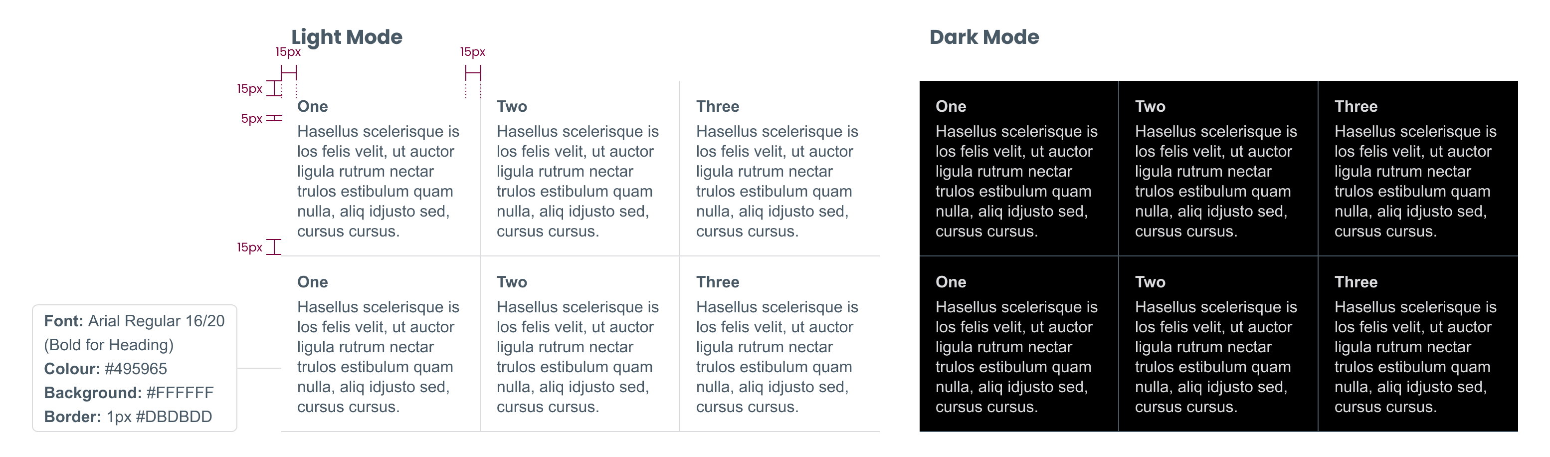
Tables are a great way to display a large amount of structured information in a clean and organized way. Choose the right style of table to best suit your content.
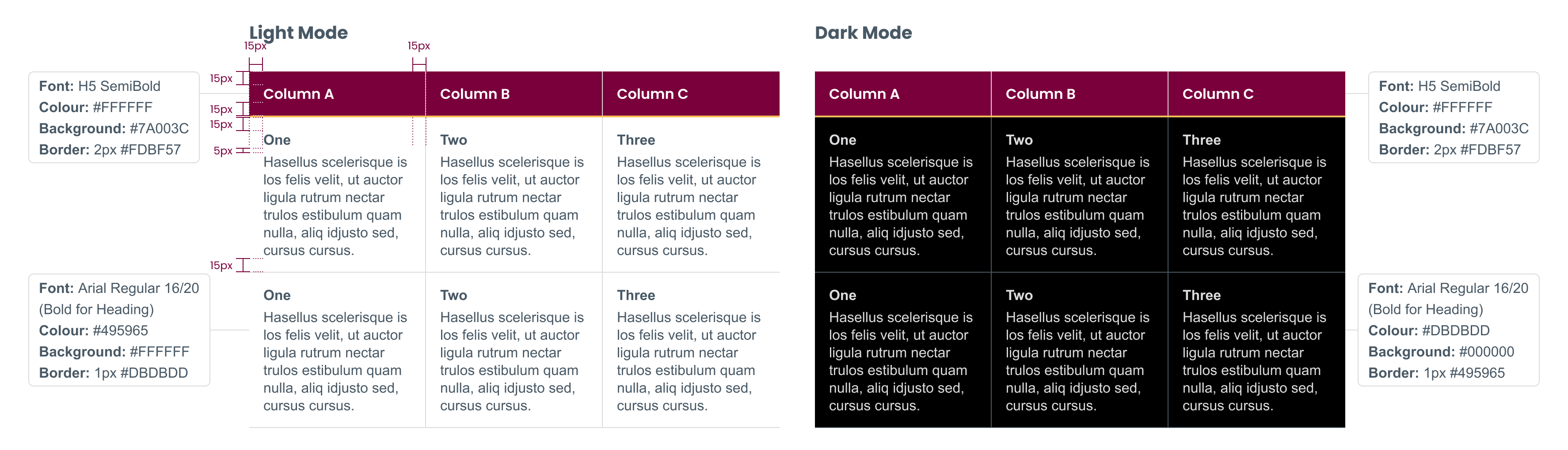
Tables with column headers
Column head
Column Title: H5 SemiBold
Padding: 15px
Colour: #FFFFFF
Background: #7A003C
Bottom border: 2px solid #FDBF57
Column body
Title: H5 Regular
Body copy: Arial 16/20
Padding: 15px
Colour: #495965
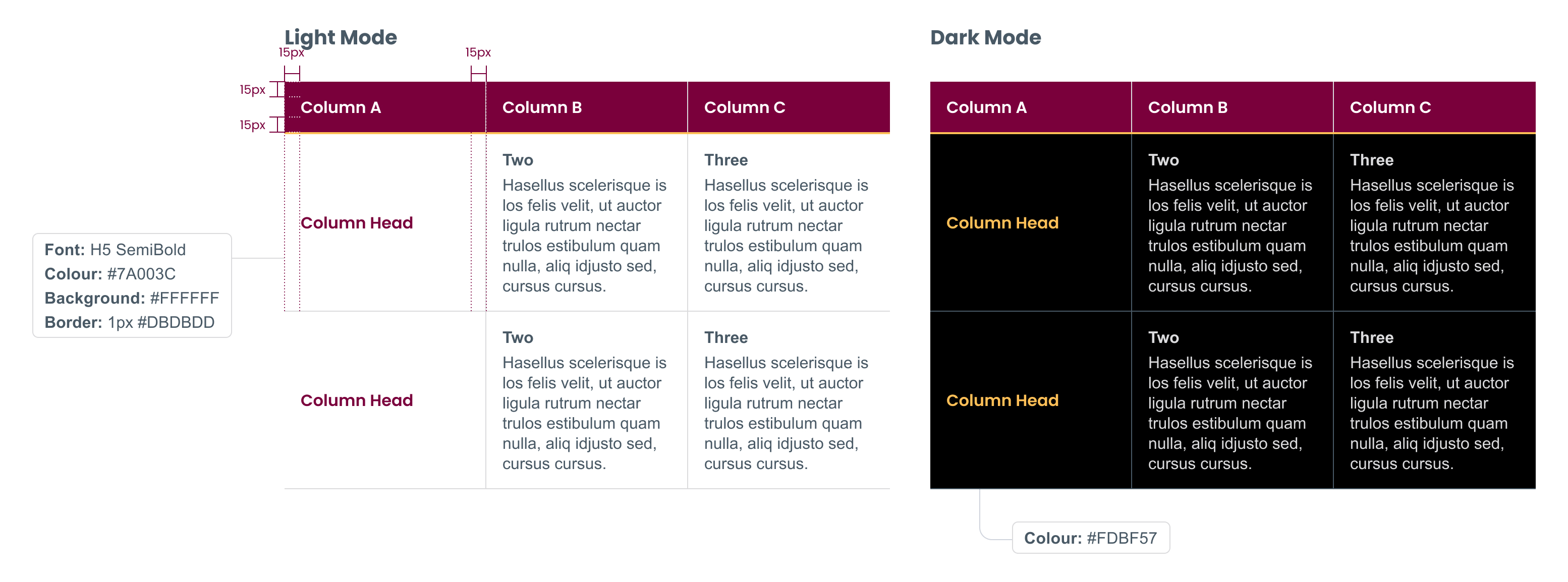
Tables with column and row headers
Column head
Column title: H5 SemiBold
Padding: 15px
Colour: #FFFFFF
Background: #7A003C
Bottom border: 1px solid #FDBF57
Column body
Title: Body Regular
Body copy: Arial 16/20
Padding: 15px
Colour: #495965
Tables with no headers
Padding: 15px
Colour: #495965
Title: H5 Regular
Body copy: Arial 16/20
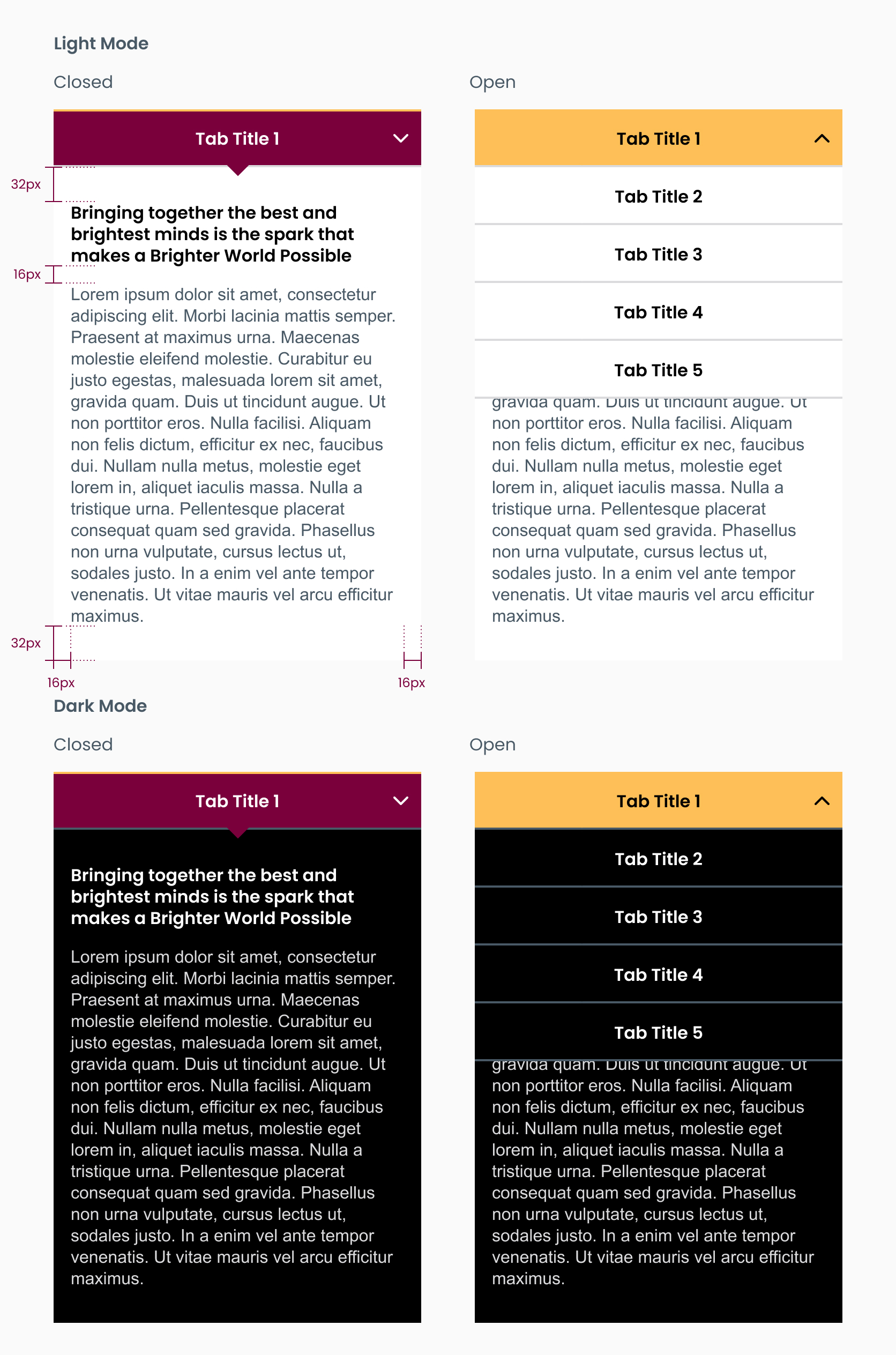
Tabs can be used to organize large amounts of related content. This helps to reduce page scroll, and breaks information into smaller pieces that are easier to consume.
Selected state
Font: H6 SemiBold
BG: #7A003C | Text: #FFF
Border top: 2px # FDBF57
Border bottom: 2px #DBDBDD
Hover state
Font: H6 Poppins SemiBold
BG: #FDBF57 | Text: #000000
Default state
Font: H6 Poppins SemiBold
BG: #FFF | Text: # 000000
Tab body
Title: H5 SemiBold #000000 (#FFF on dark mode)
Body: Arial 16/24 #495965 (#FFF on dark mode)
Padding: 32px
Gap: 16px
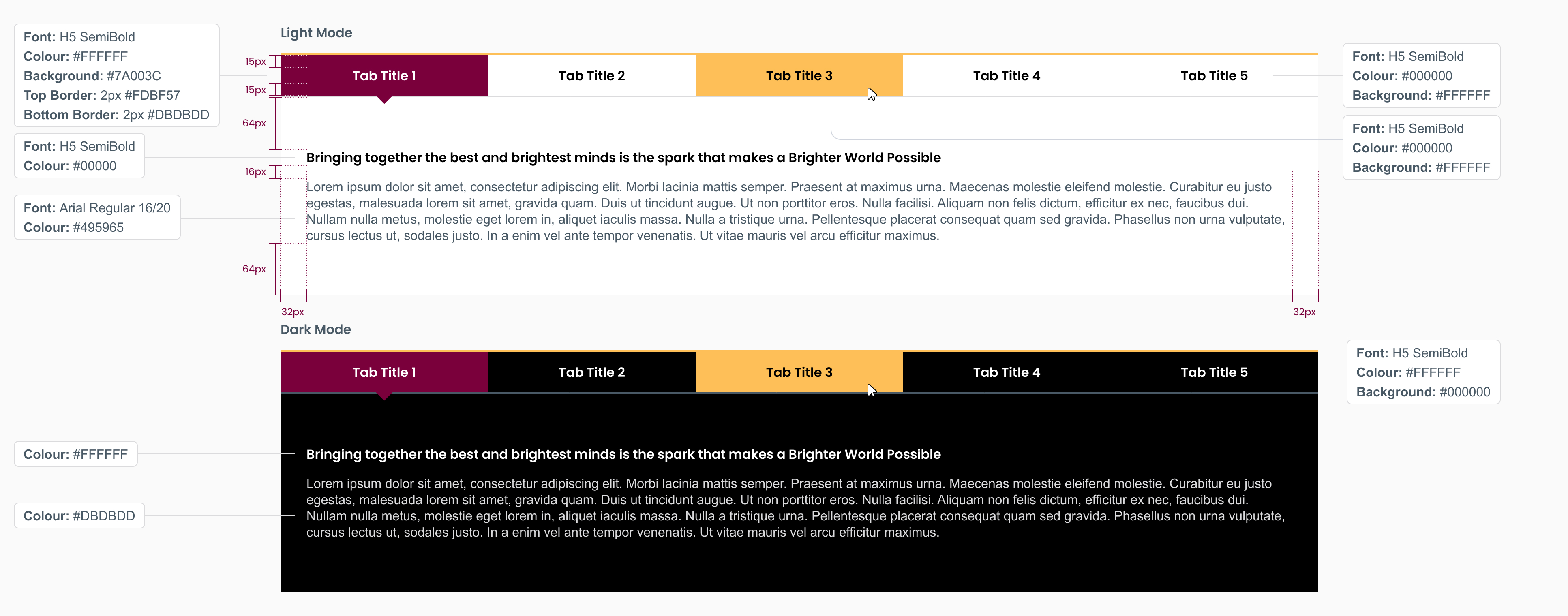
Tabs turn into an adaptive accordion on mobile.
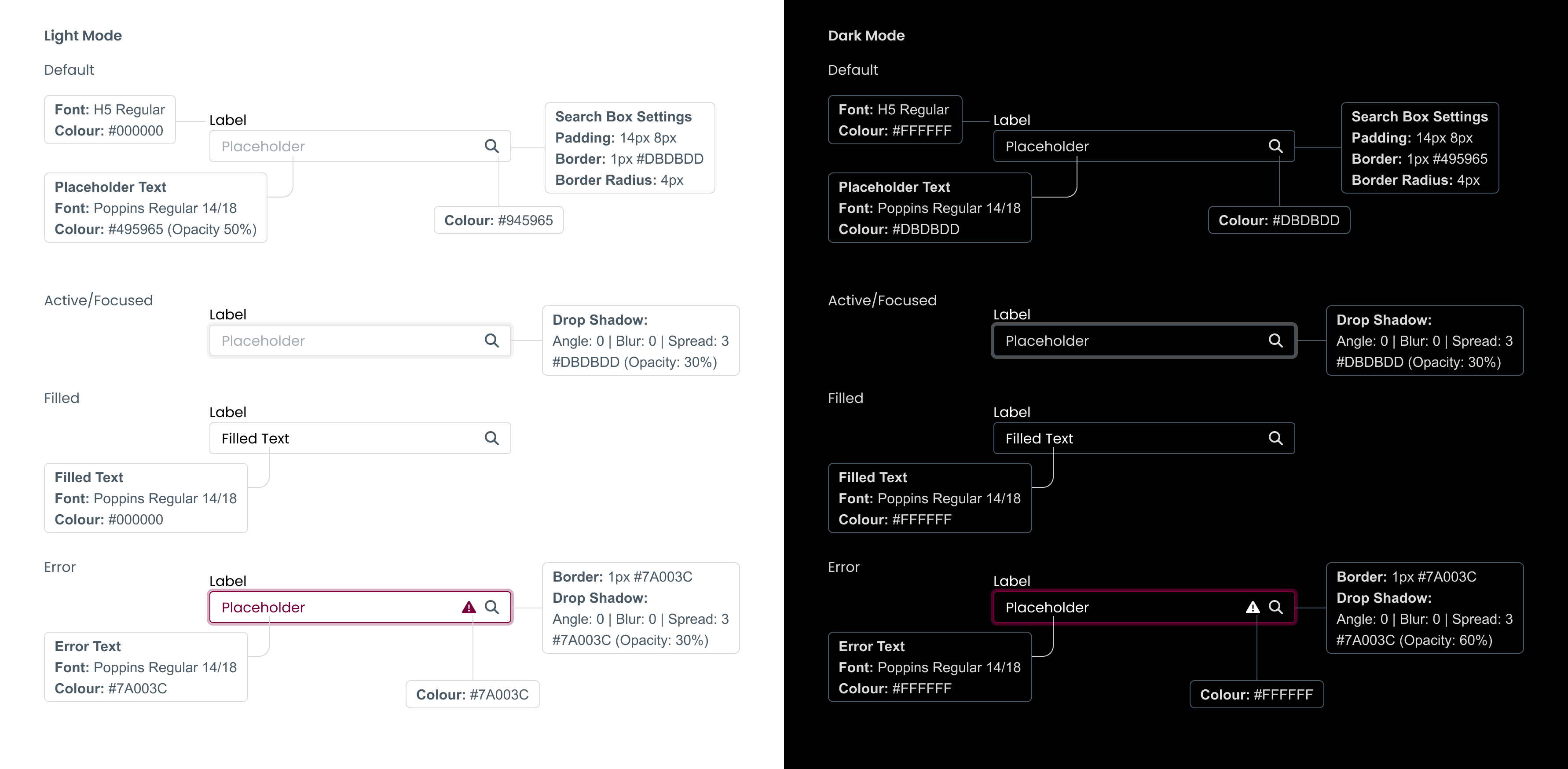
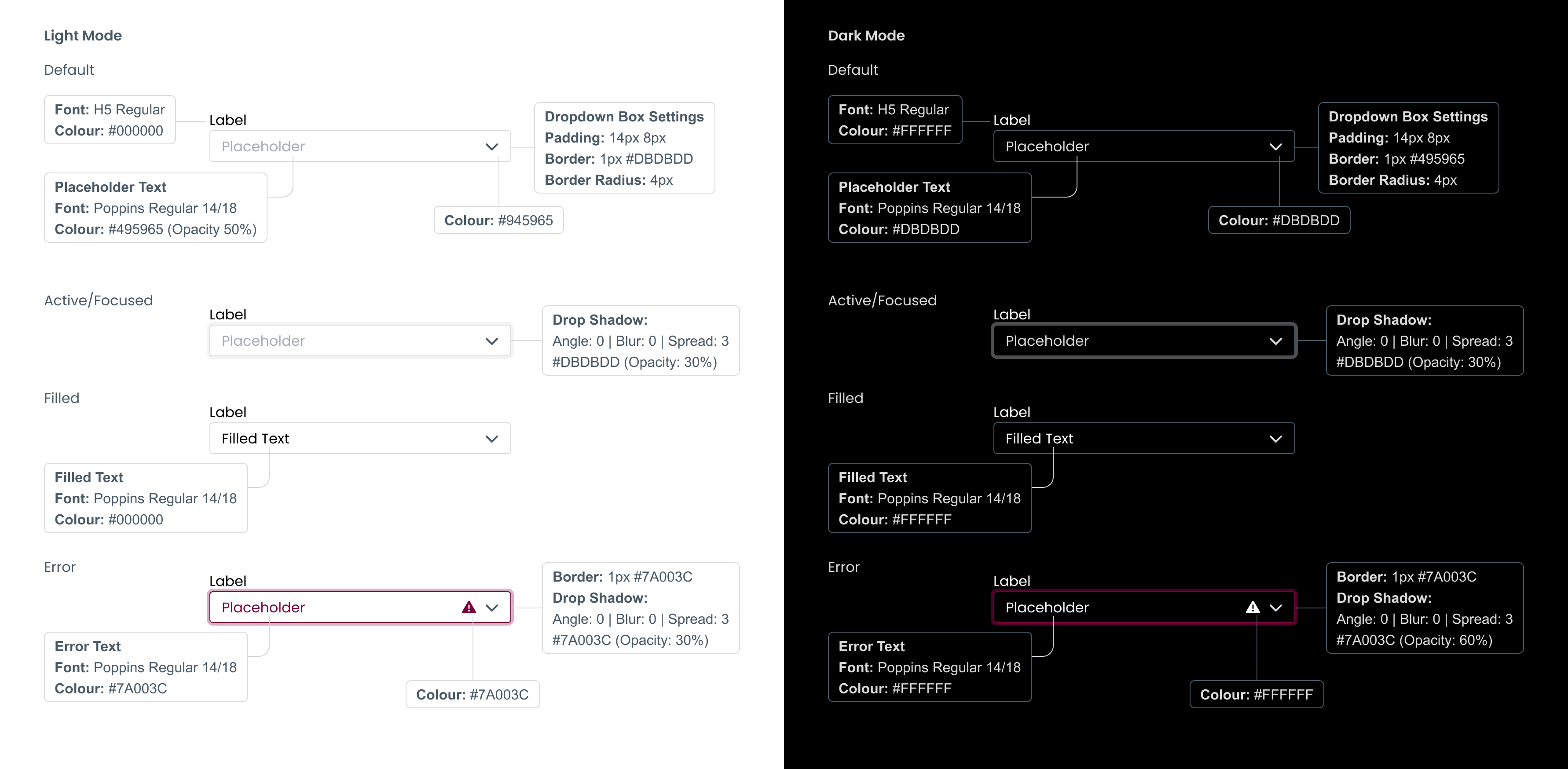
Clearly labelled form fields make it faster and easier for users to complete forms. Follow the guidelines when creating form fields, and keep the text labels within each field.
Label
Font: Poppins Regular 16px
Colour: #495965
(Opacity 50%)
Default
Padding: 14px 8px
Outline: 1px #DBDBDD
Border radius: 4px
Text
Font: Poppins Regular 16px
Colour: #000000
Active
Drop shadow: #DBDBDD
Angle: 0 | Opacity: 30% |
Distance: 0 | Size: 0
Spread: 30px
Text
Font: Poppins Regular 16px
Colour: #7A003C
Error message
Outline: 1px #7A003C
Drop shadow: #7A003C
Angle: 0 | Opacity: 25% |
Distance: 0 | Size: 0
Spread: 30px
Icon
Height: 16px
Colour: #7A003C

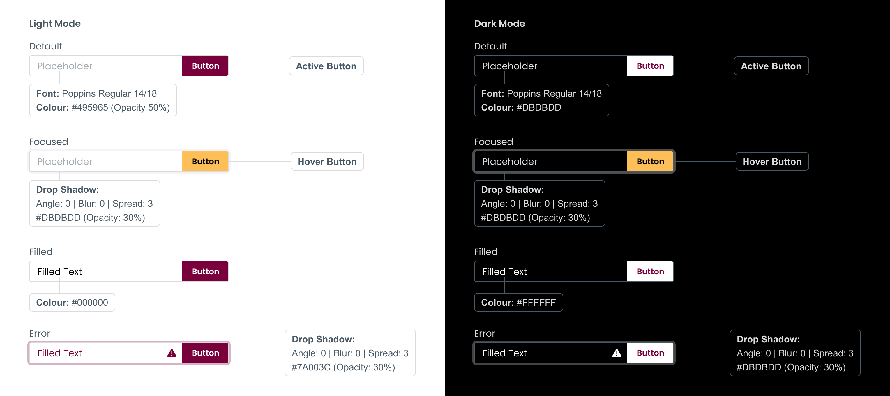
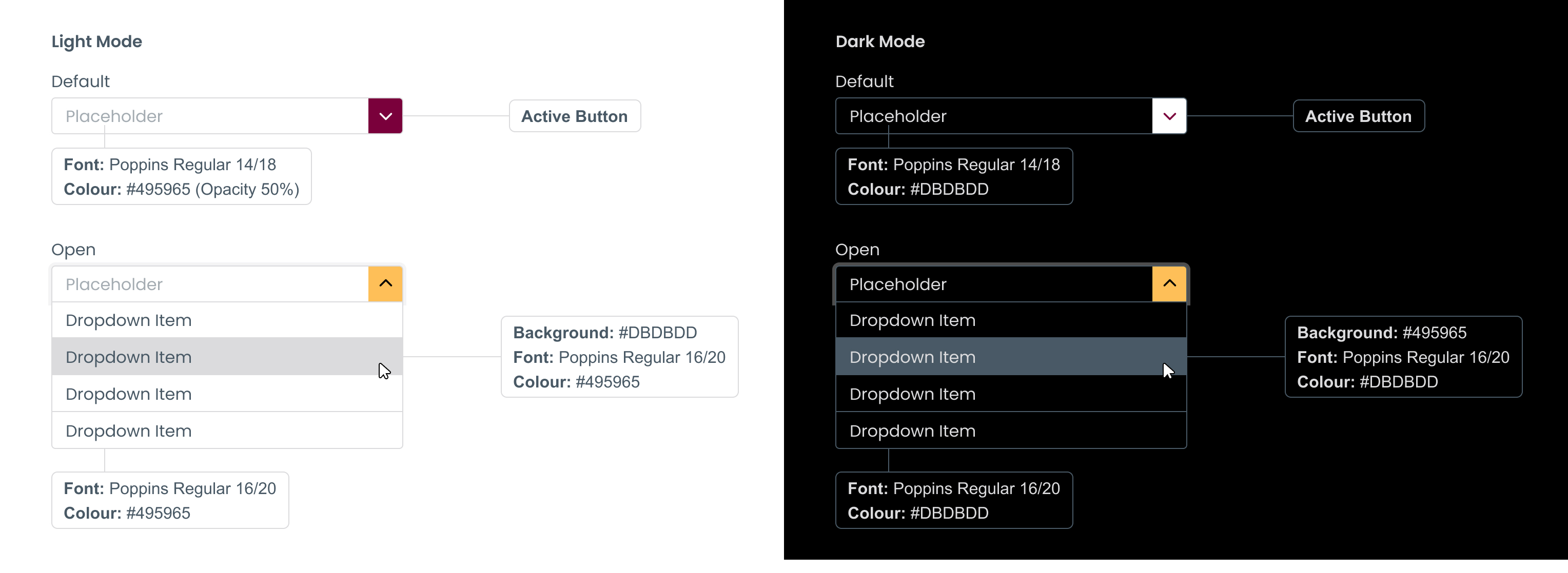
Clearly labelled form fields make it faster and easier for users to complete forms. Follow the guidelines when creating form fields, and keep the text labels.
Dropdown item
Colour: 495965
Padding: 14px 8px
Hover: #DBDBDD
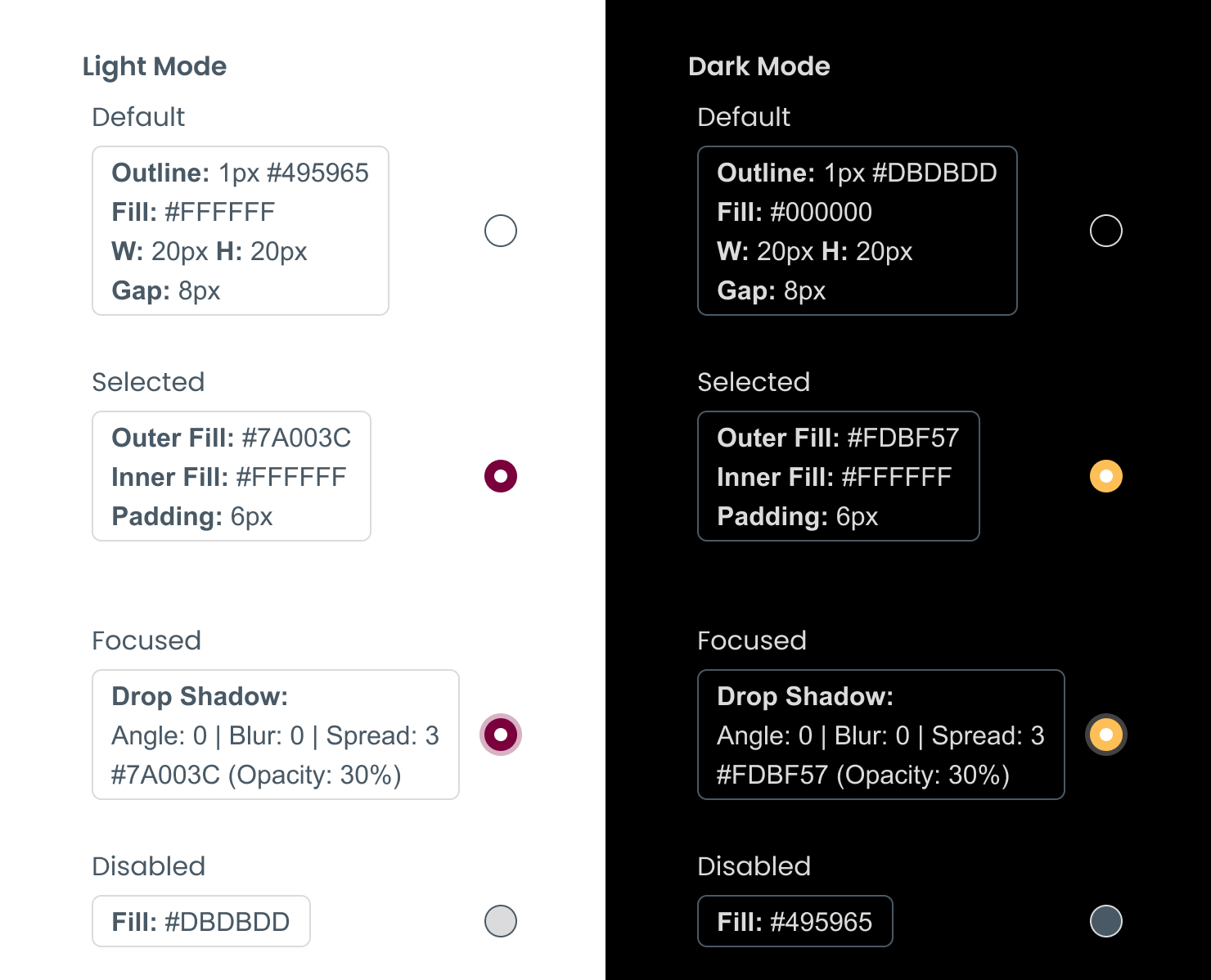
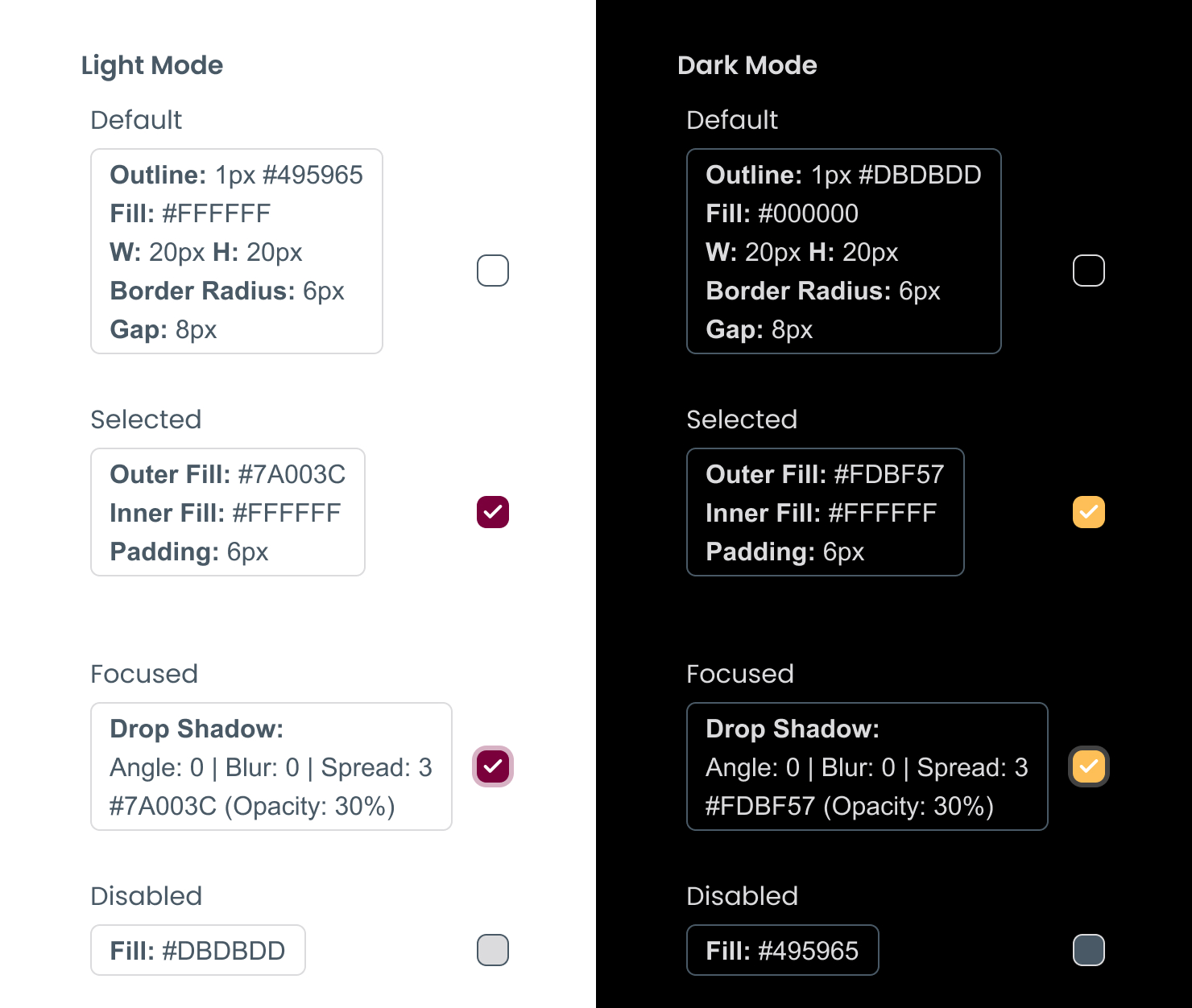
Below are examples of radio buttons and checkboxes to be used, in their default, selected and focused states. These can be used in forms or selection boxes.
Follow these guidelines to create search bars in both light and dark modes.
The ask button takes the same styling and hover states as standard primary buttons.
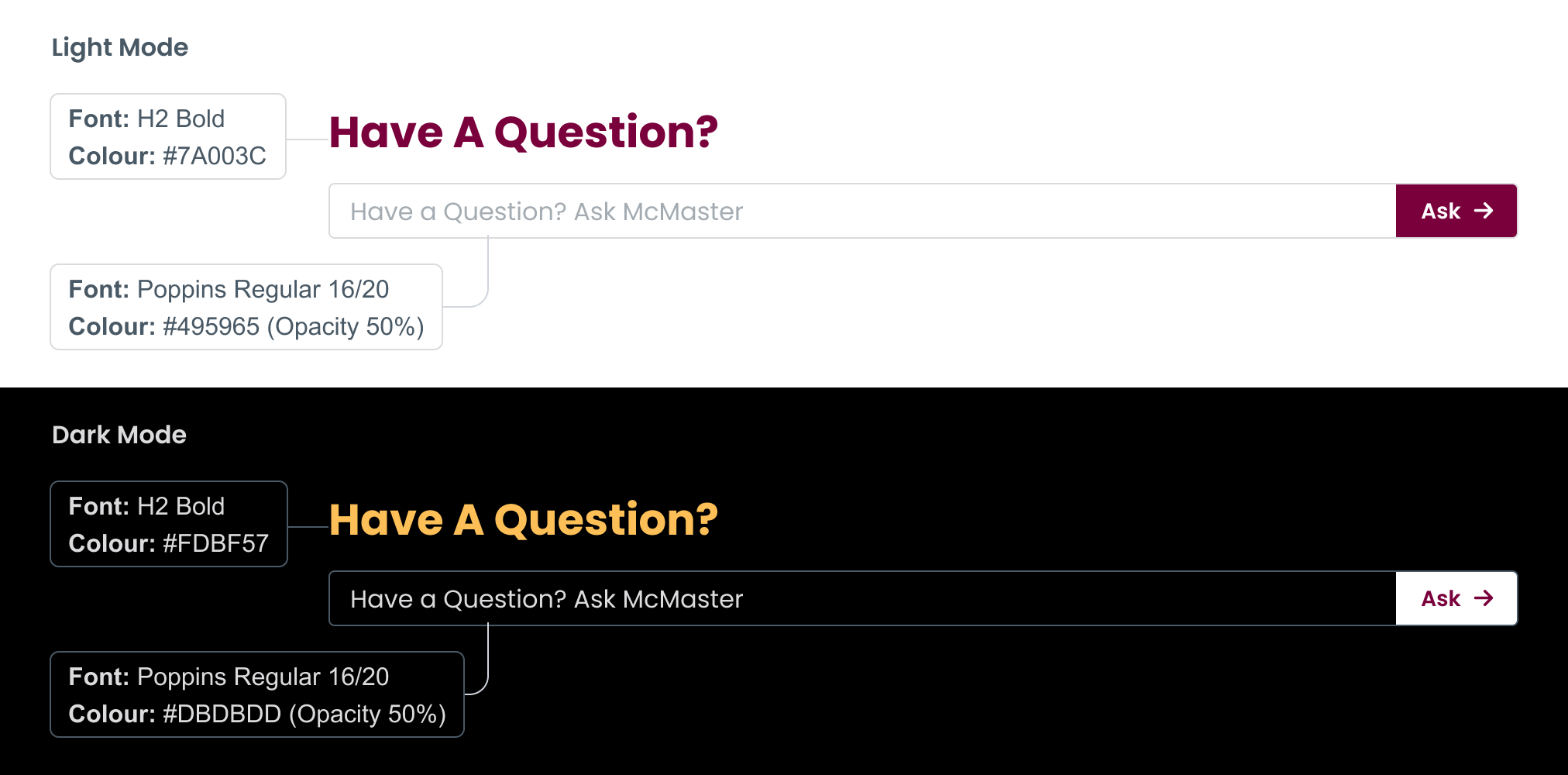
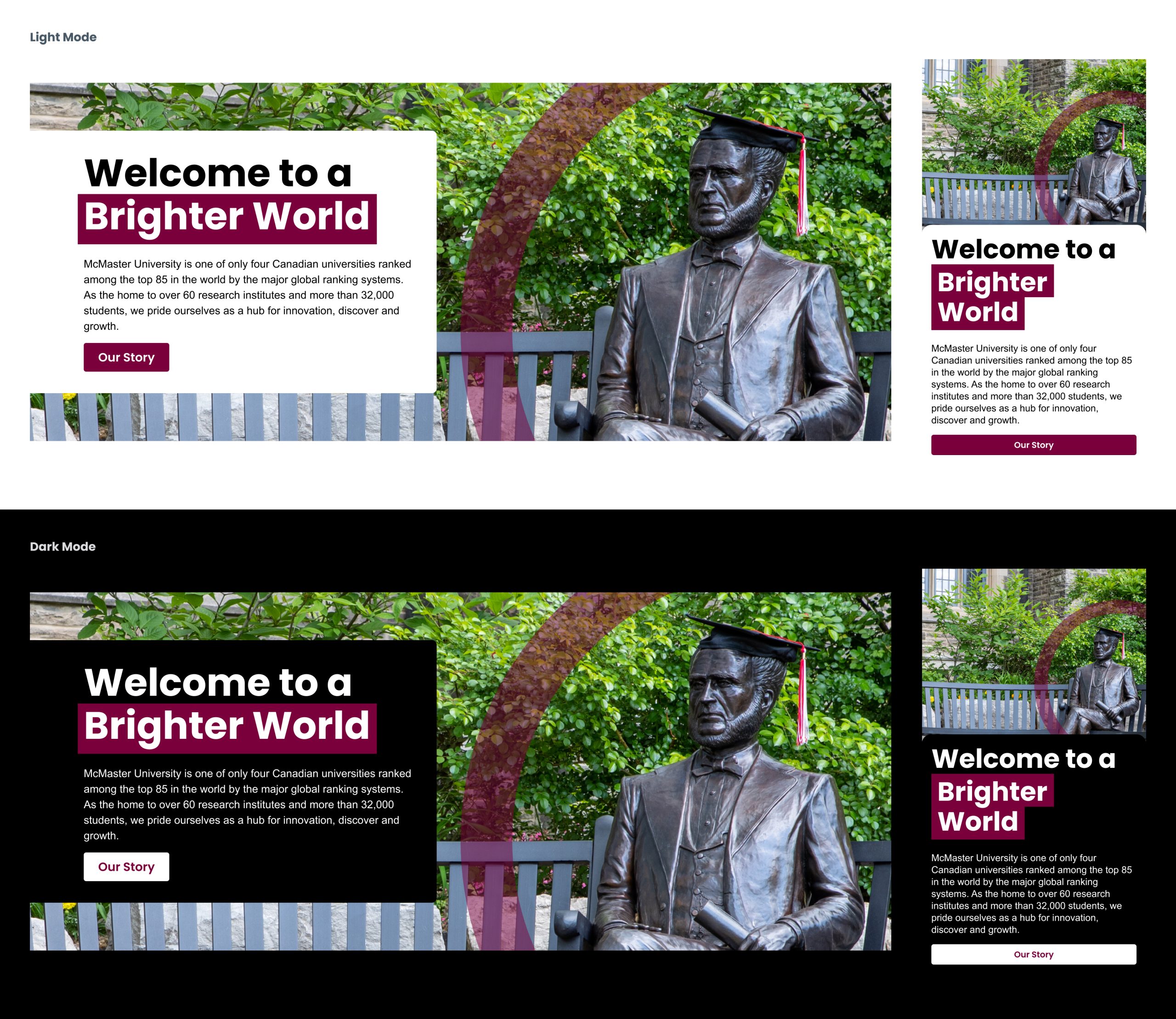
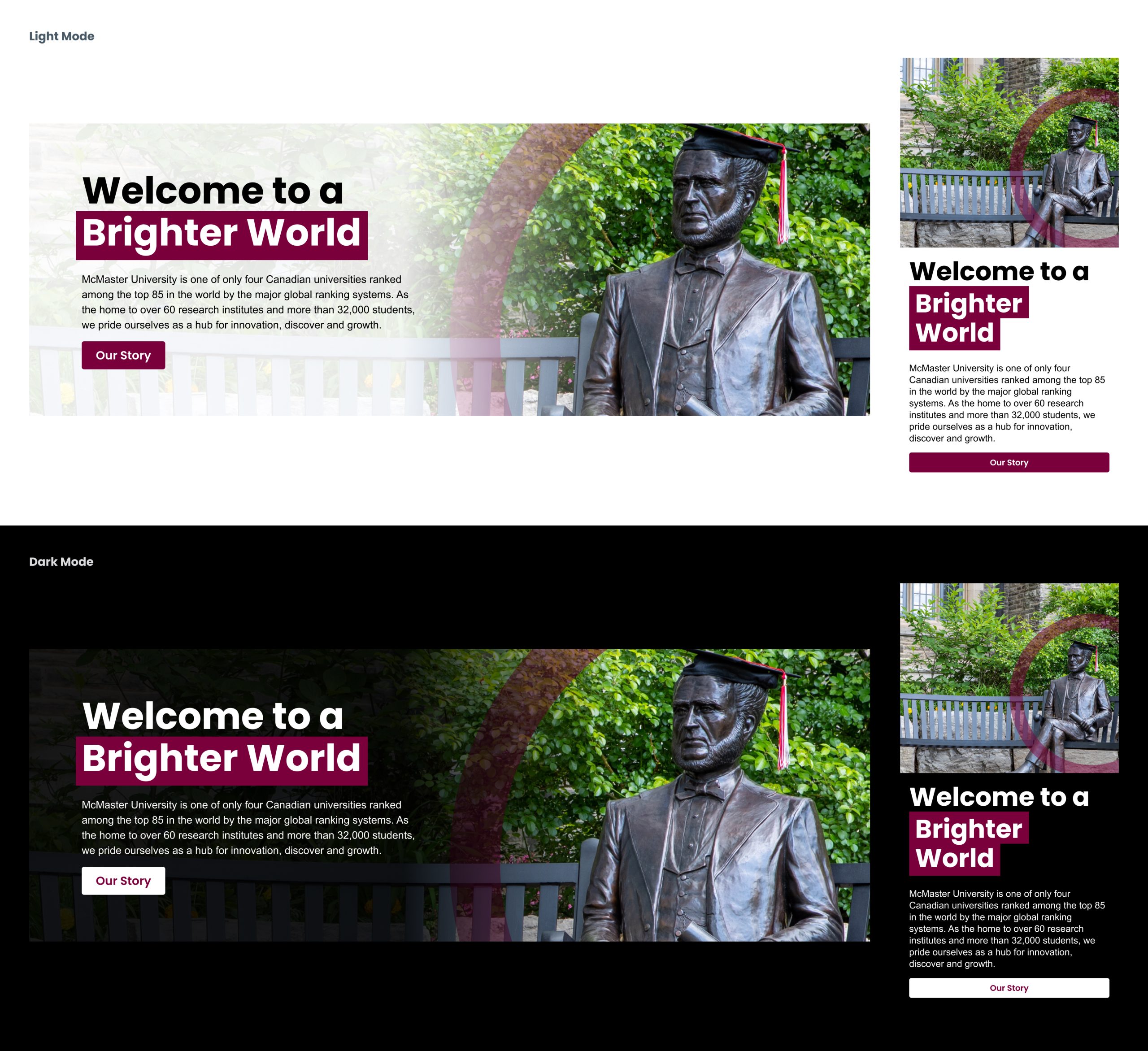
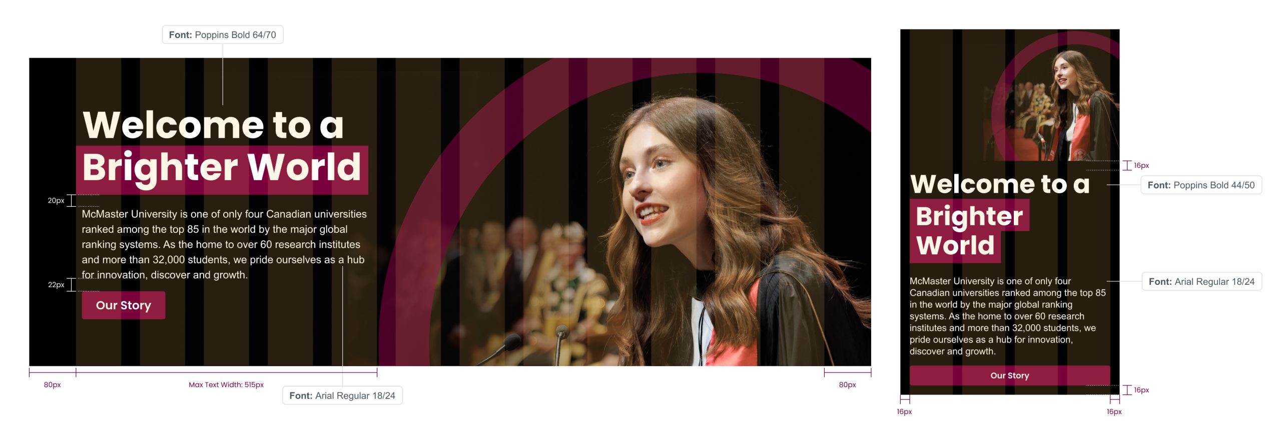
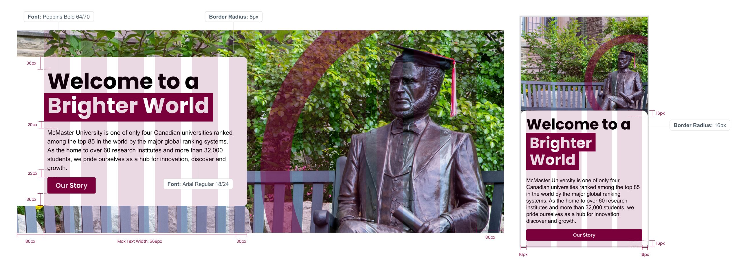
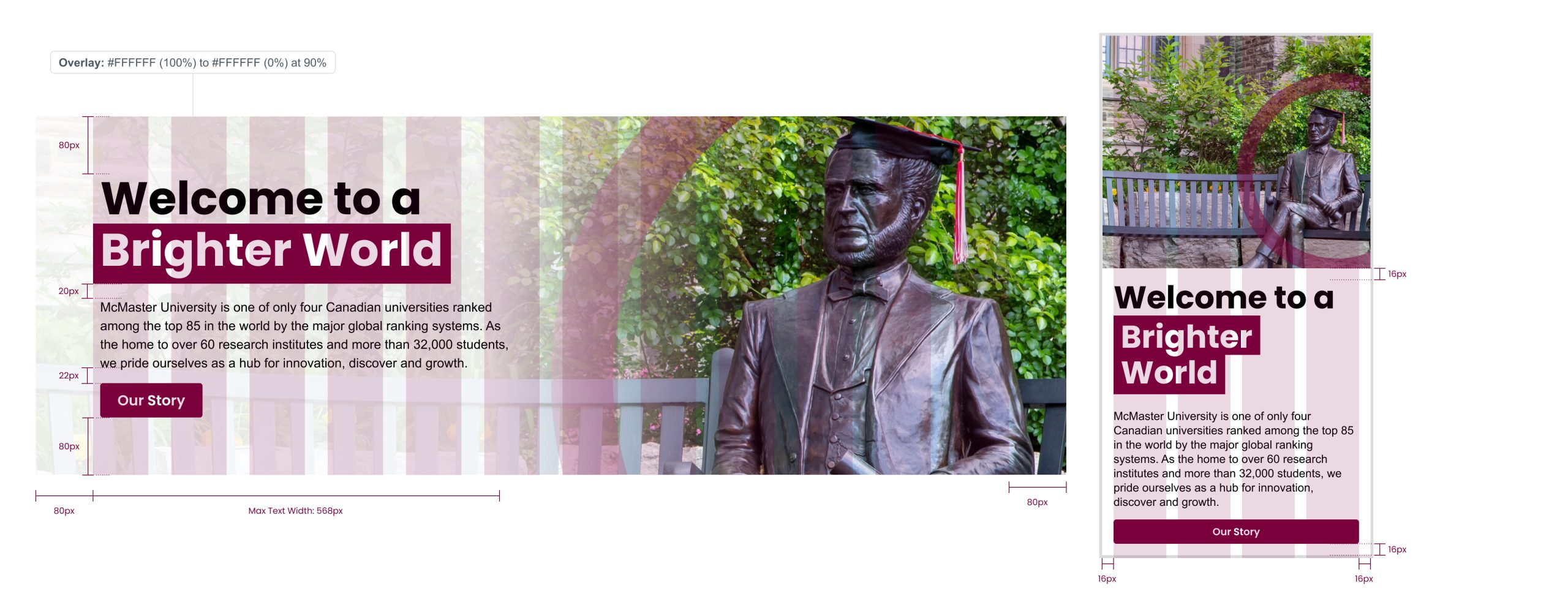
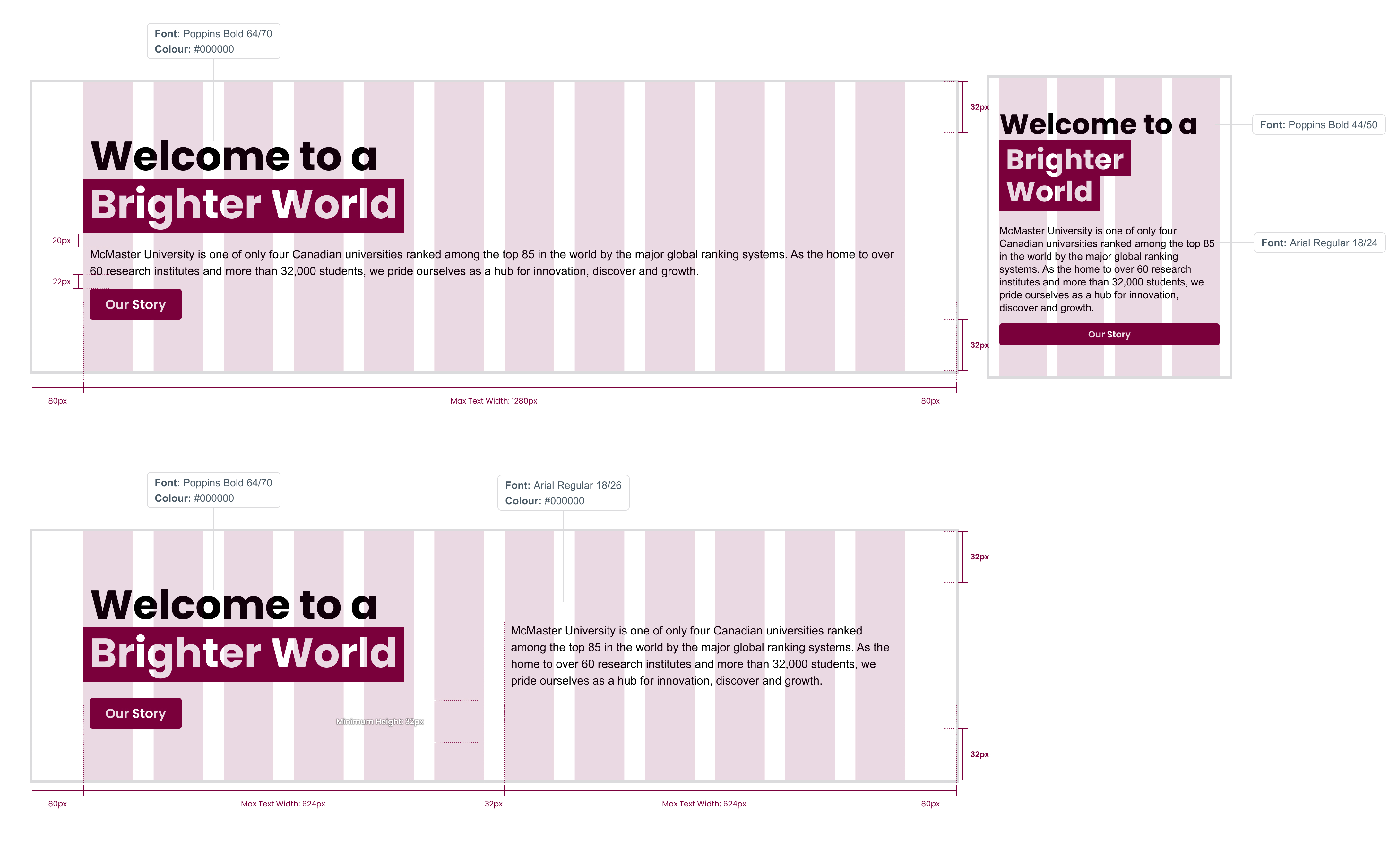
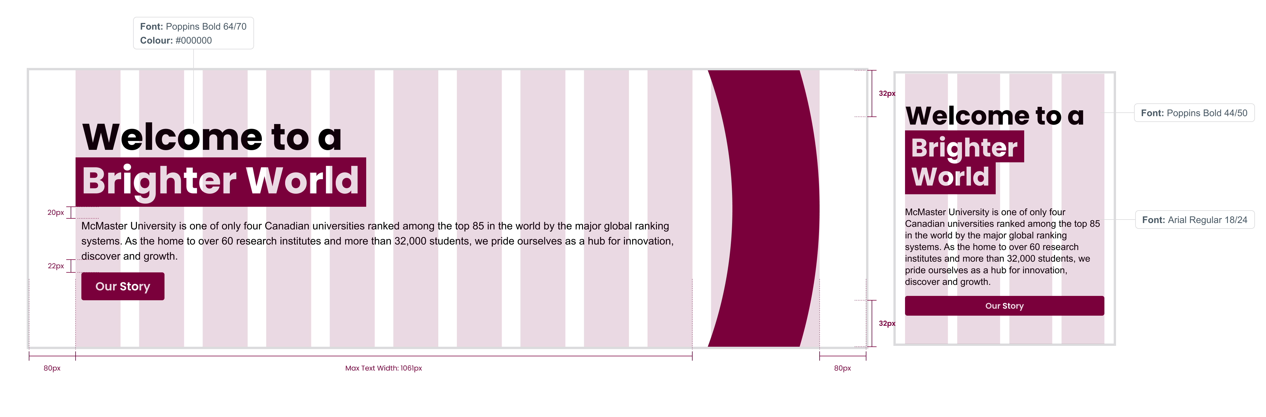
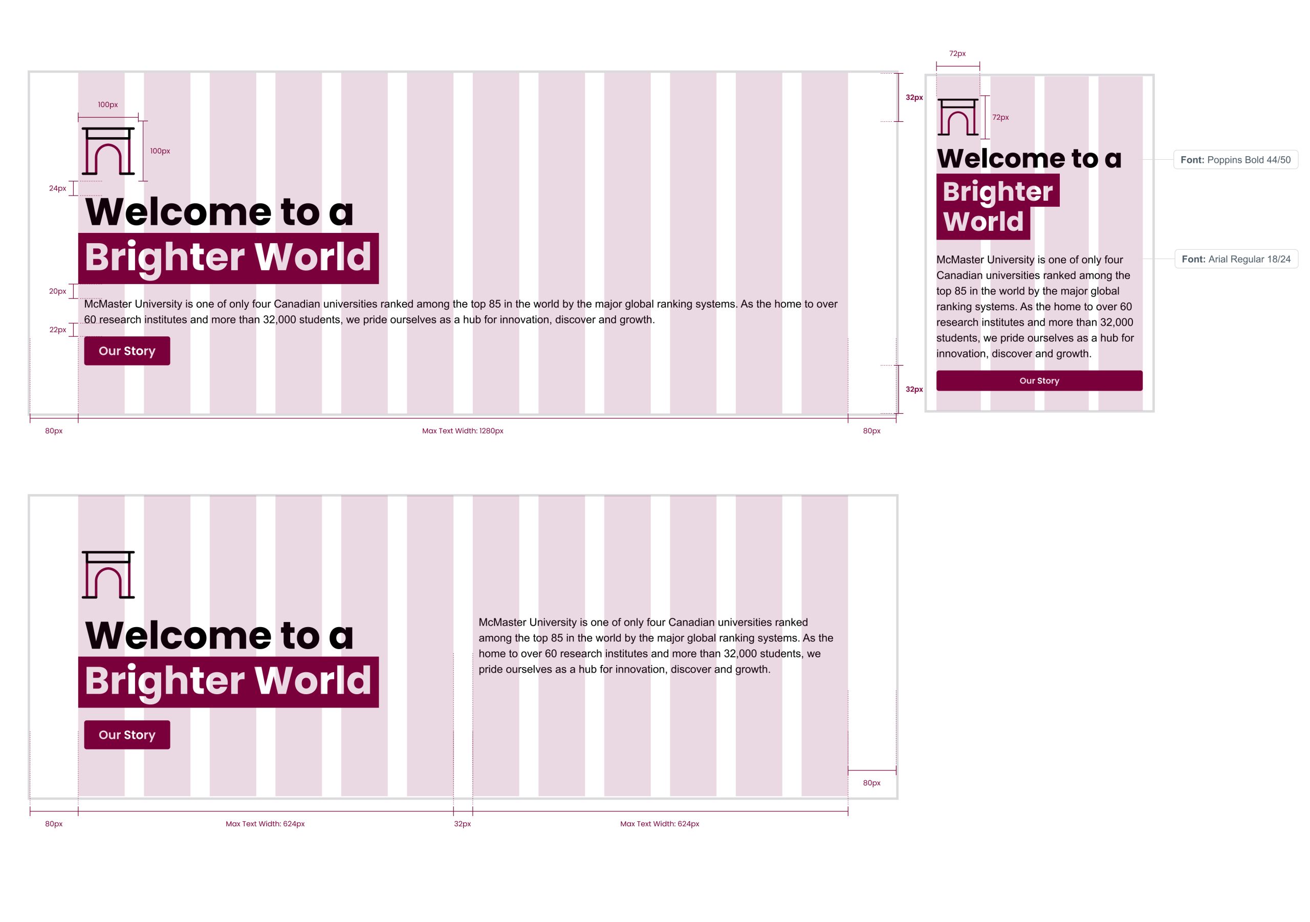
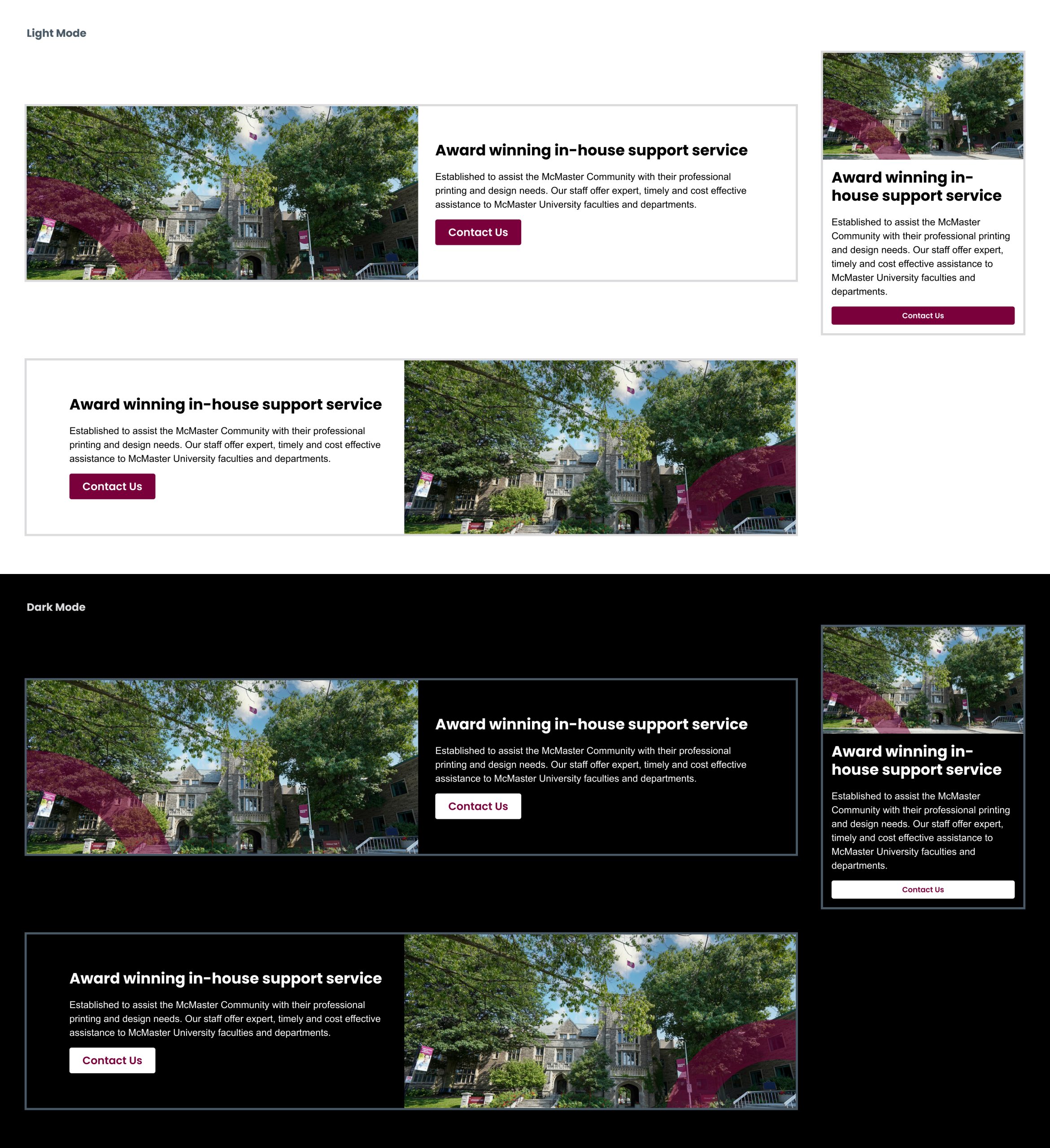
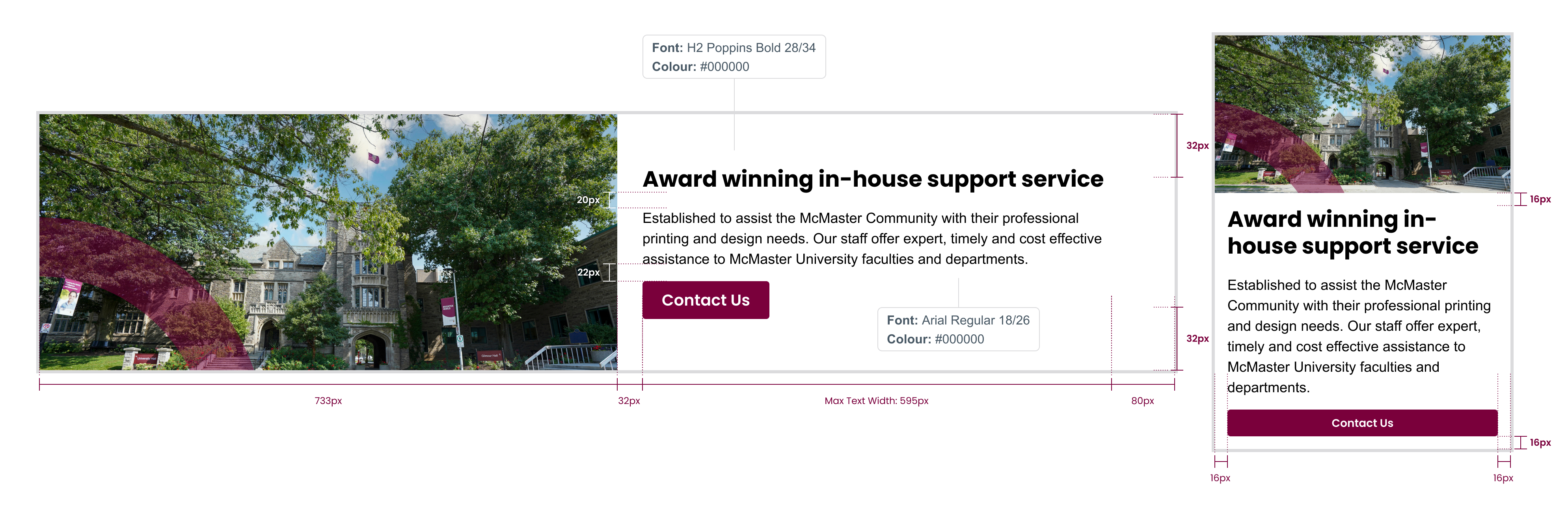
Image hero banners
Hero banners are a great way to add visual interest to a page and give a sense of the content the viewer is about to see.
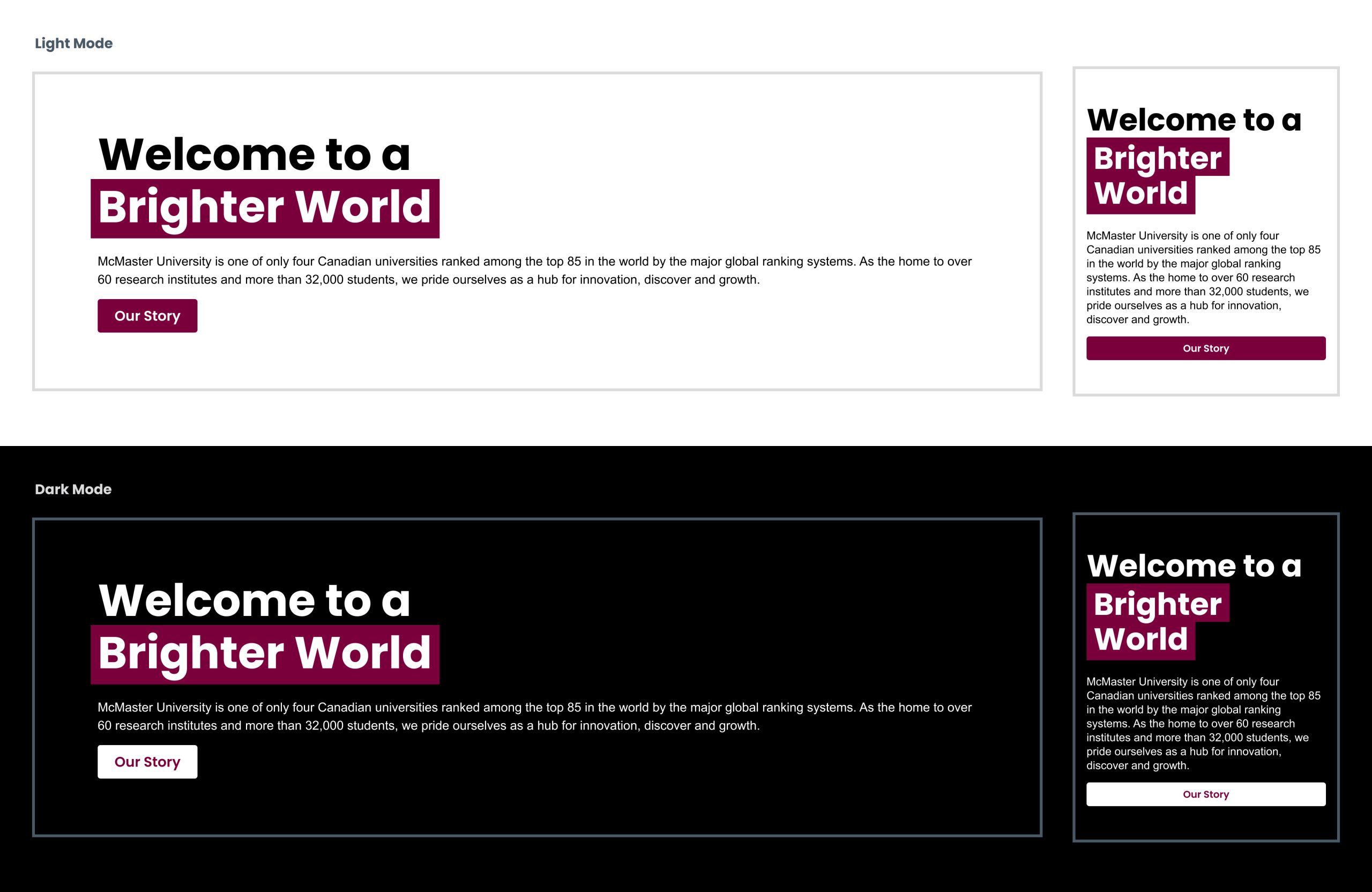
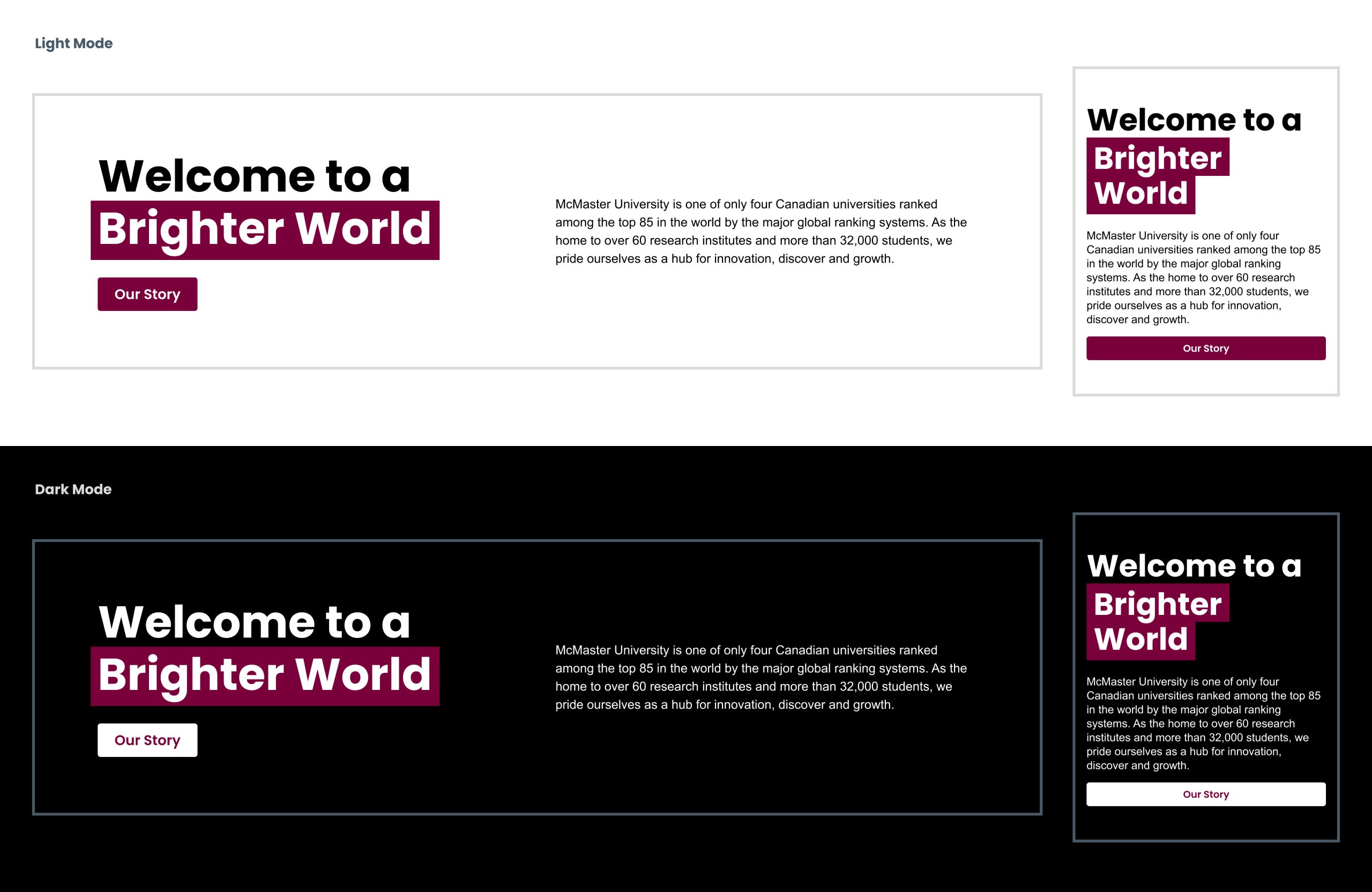
Hero banners follow the responsive grid system. To ensure users can view as much of the hero banner photo as possible, hero copy should only take up 50% (6 columns) of the entire banner on larger screen sizes. Sub-copy and button(s) on hero banners are optional.
It is important to consider the image used carefully, as there needs to be sufficient contrast between the copy and the image to ensure the copy remains legible and is accessible. General visual guidelines should be followed when selecting images for web banners.
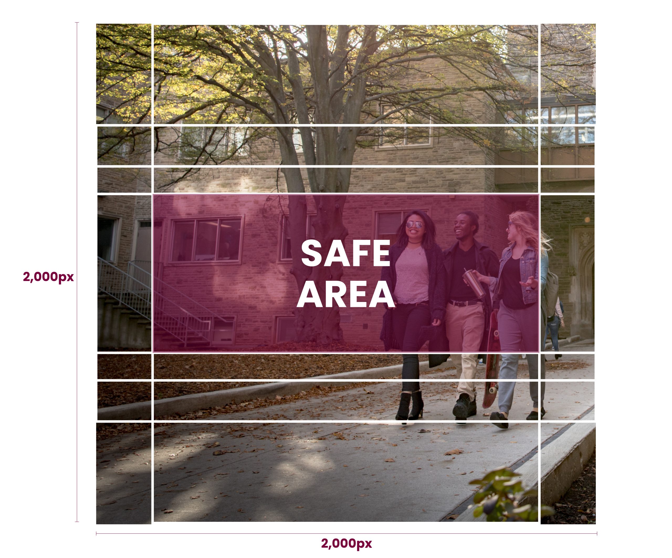
There are a few ways hero banners can be created. The preferred strategy is to have a designer create the image for the banner, and include the circle element, if applicable, and crop or alter the image to create a solid area for the contrasting copy to sit. When creating the image, consider the grid below to ensure it will work for all screen sizes.
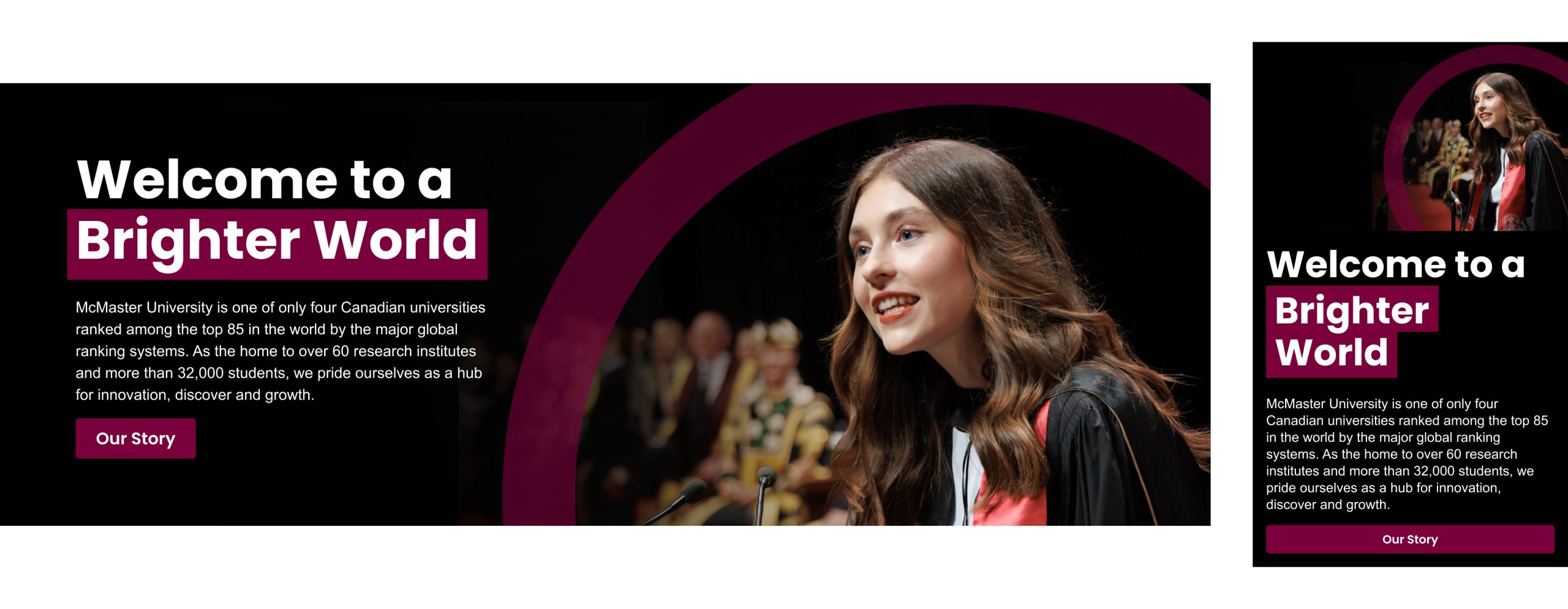
Examples of banners using an image created by a designer, with the appropriate circle element and solid area for copy:
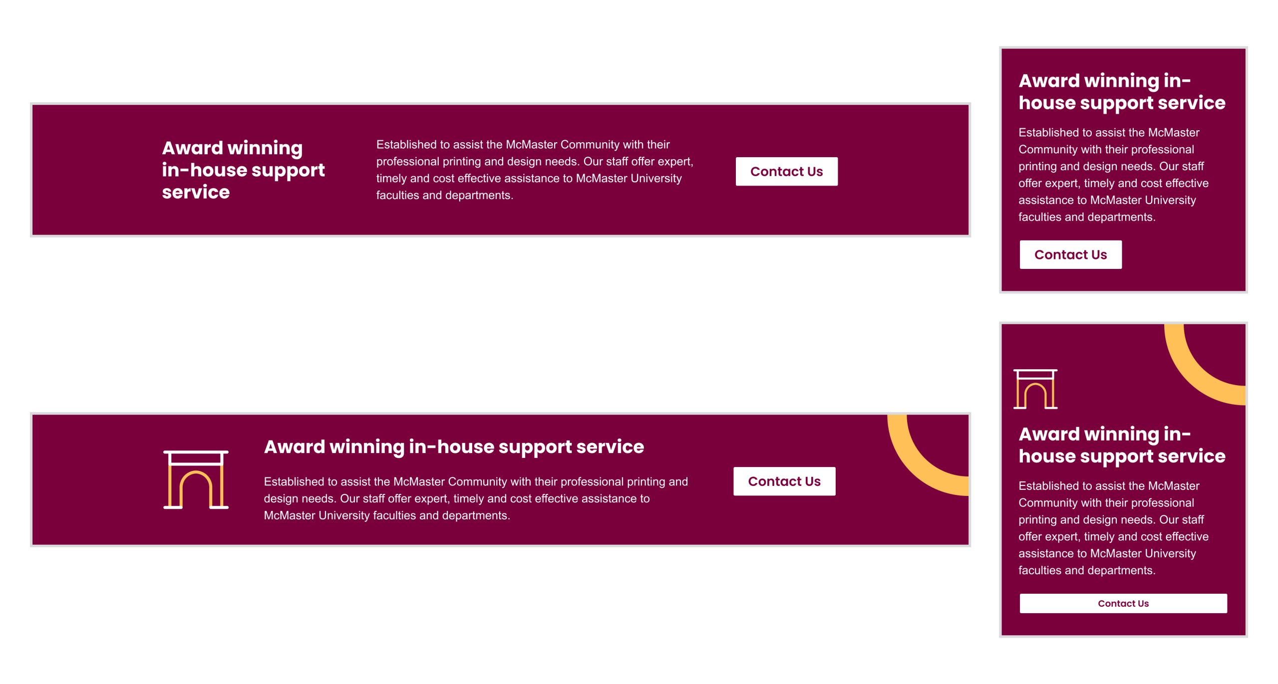
A secondary option for the banner is to have a solid colour box applied over the image to create the necessary contrasting space for the copy to sit. This box should be fully opaque (to avoid the look of an overlay that alters the appearance of people’s skin tone).
The last option is to use an overlay to darken or lighten an area of the photo where the copy will sit to ensure sufficient contrast. This is the least desirable option as it strays the farthest from the visual guidelines, however it is critical that accessibility is considered and copy is legible.
Hero banner copy
Follow these guidelines for copy that sits on hero banners.
Text only hero banners
In the absence of a suitable photo to include on the hero banner, follow these guidelines for text only options.
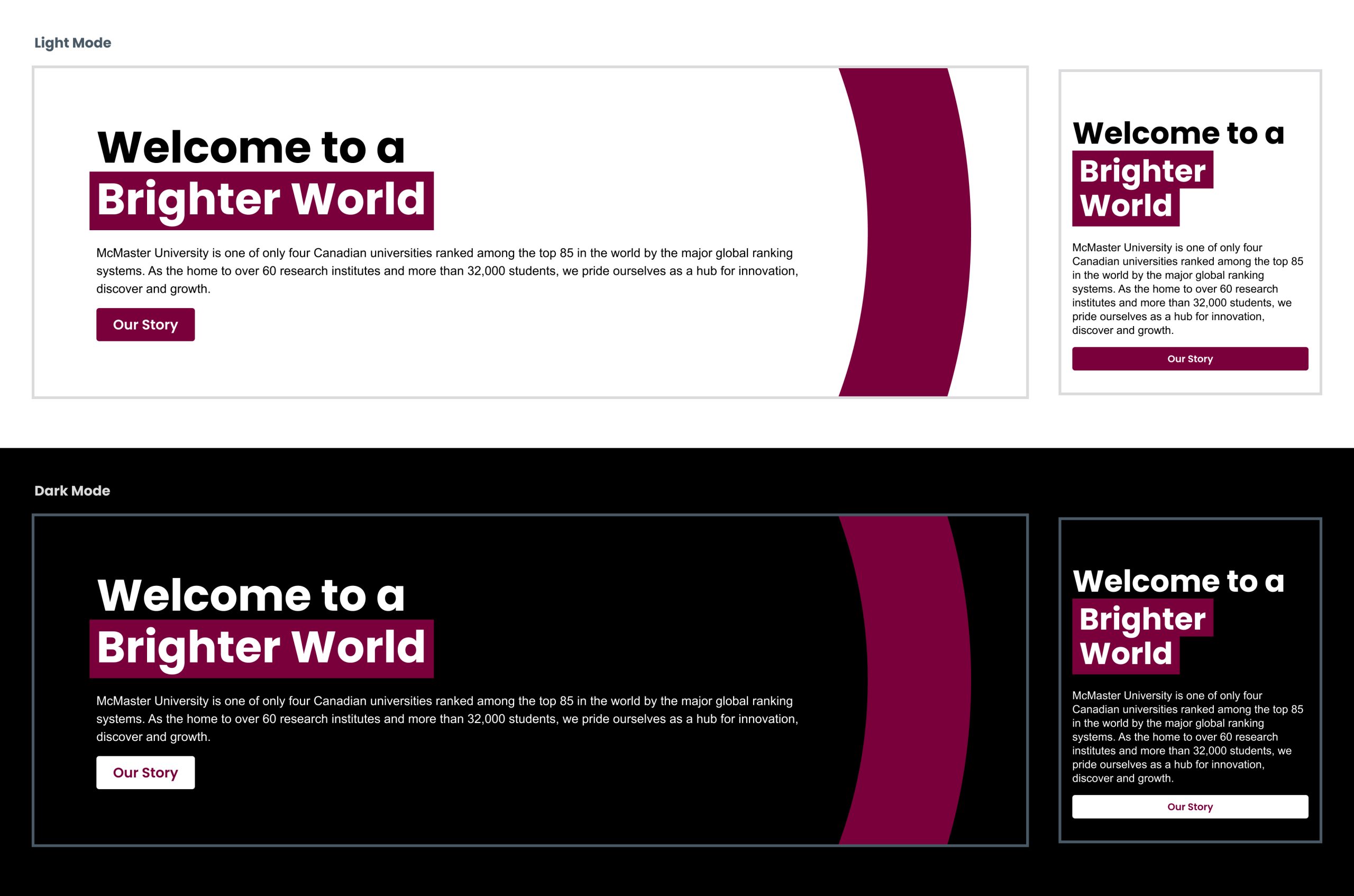
Follow these guidelines for copy that sits on text only hero banners.
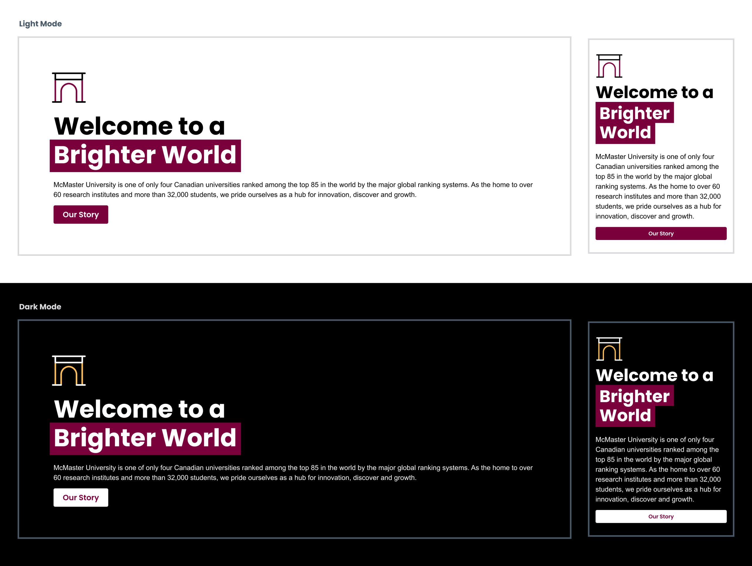
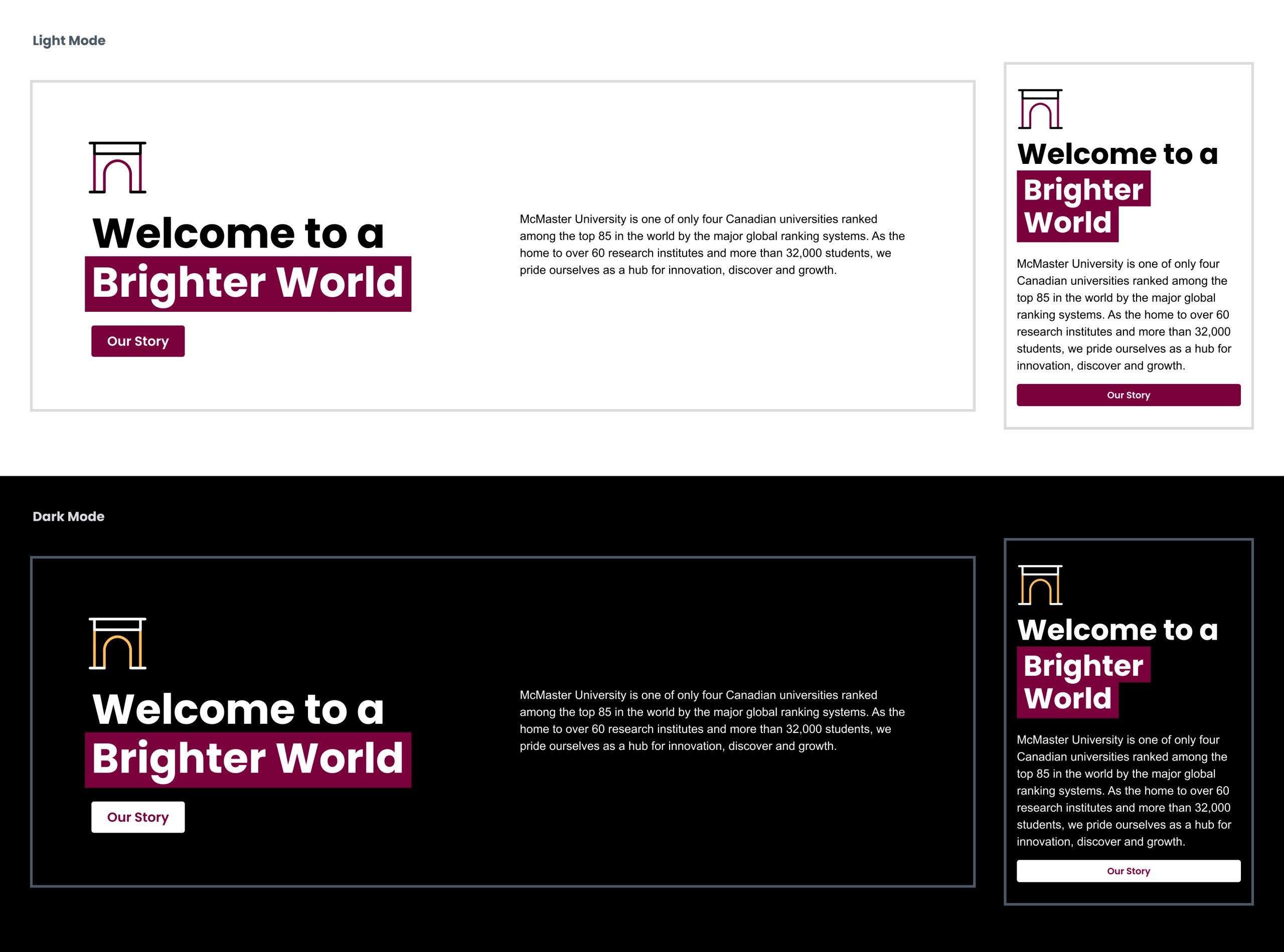
Icon hero banners
If no suitable image is available, but there is still a desire to include a visual element in the banner, an icon can be used/added to a text only banner.
Call to action (CTA) banners follow similar principles to hero banners.
CTA banners are an important element of a web page as they provide the reader with their next step. The copy and buttons on CTA banners should be as clear and legible as possible. This is the preferred layout for CTA banners.
Text only, or icon and text CTA banners
In the absence of a suitable photo to include on the CTA banner, either text only, or icon and text options can be used.

Charts and infographics
To break up large amounts of copy and convey information in an easily consumable way, consider including charts and infographics throughout your web pages. Follow the brand guidelines for icons and accent colours where applicable.
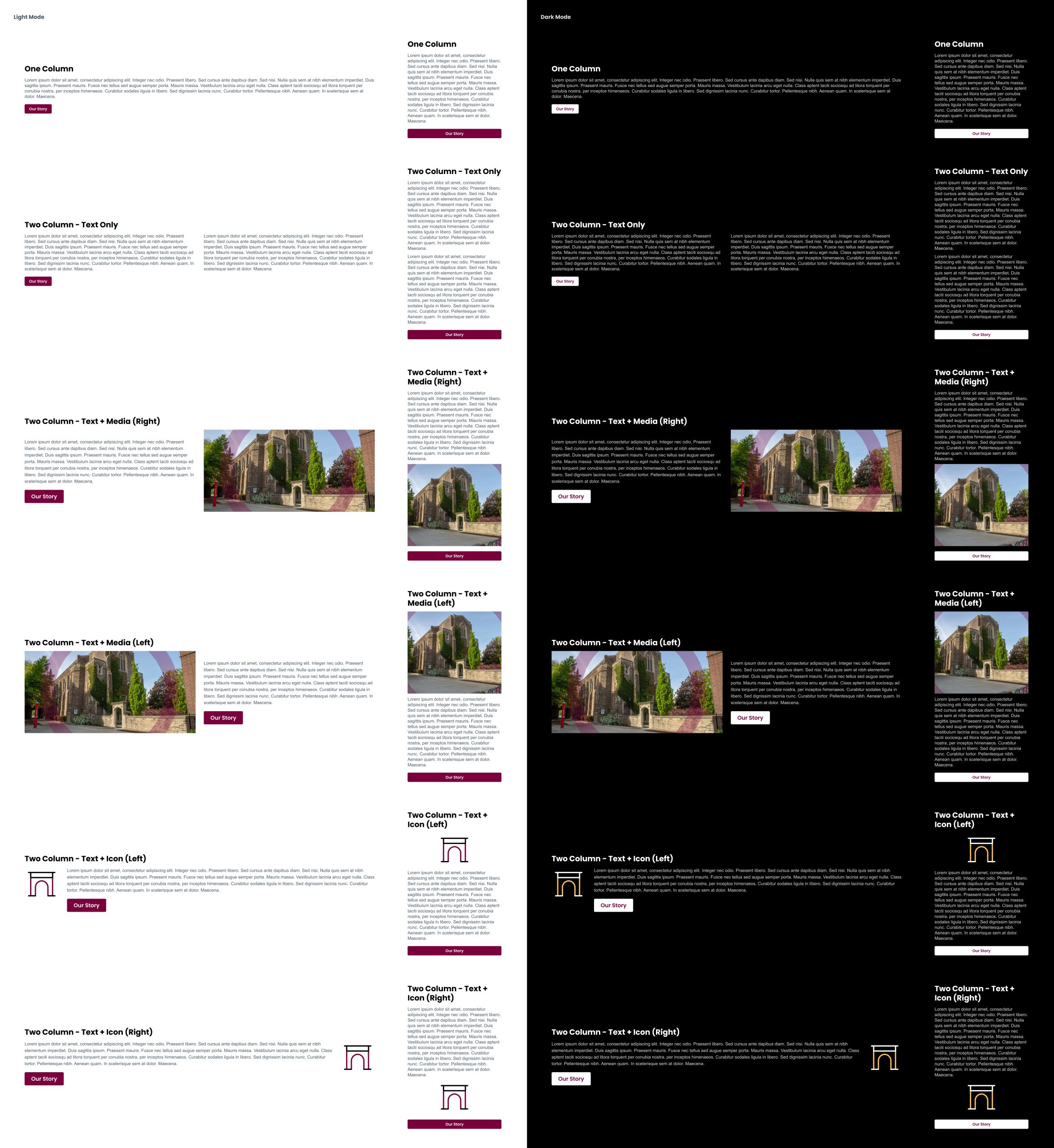
Content areas
Content areas are an easy and flexible way to support up to two columns of text, responsive video, or responsive image content. Content areas follow the grid system, ensuring enough padding between columns for easy legibility.
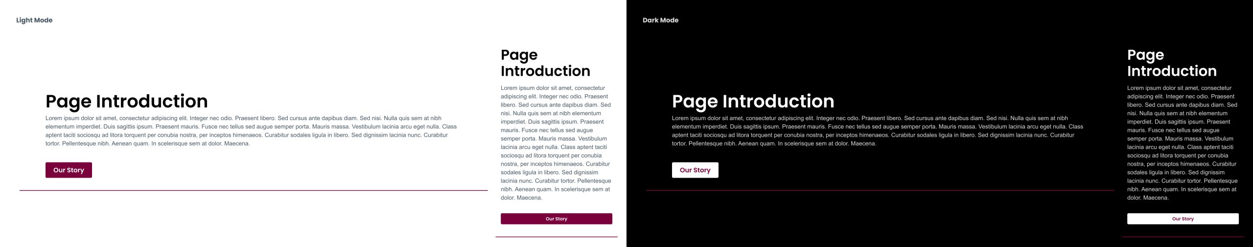
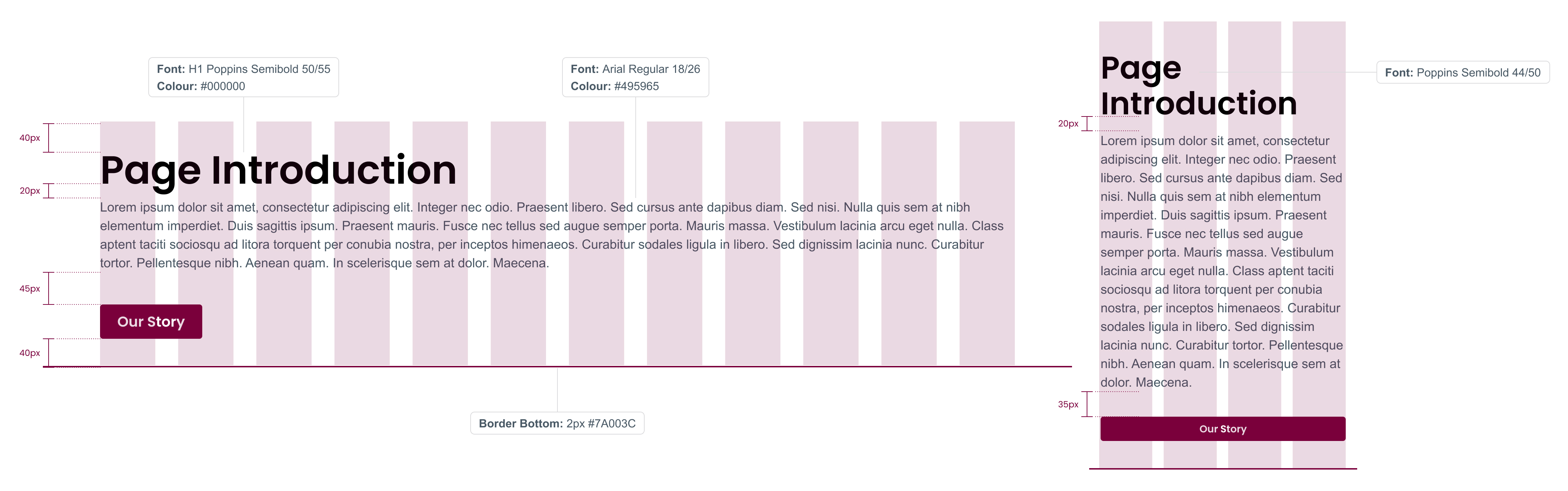
Page introductions
A page introduction is a sentence or two of text to introduce the page and its contents.
Title: H1 SemiBold #000000 (#FFF on dark mode)
Body: Arial Regular 16/24 #495965
(#FFF on dark mode)
Border bottom: 2px #7A003C
(#FDBF57 on Dark mode)
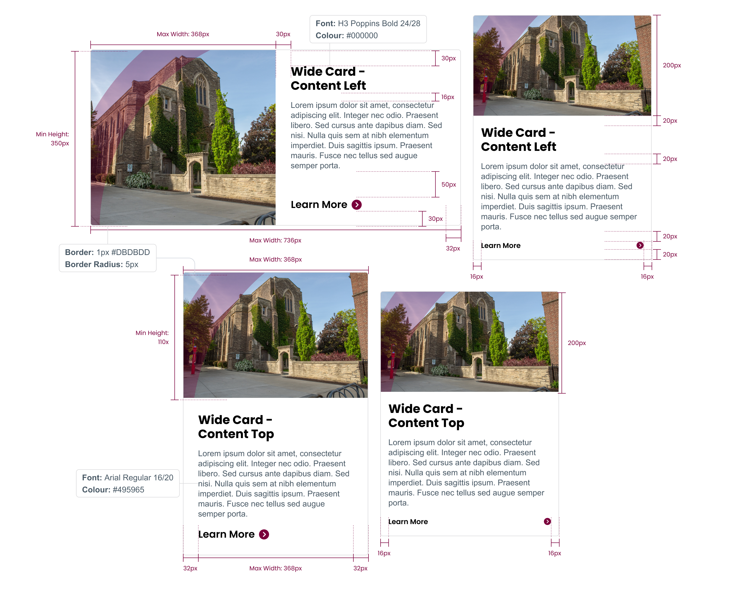
Cards are components used throughout a web page that combine copy and images into a single block. Cards can either stand alone or be grouped with other cards.
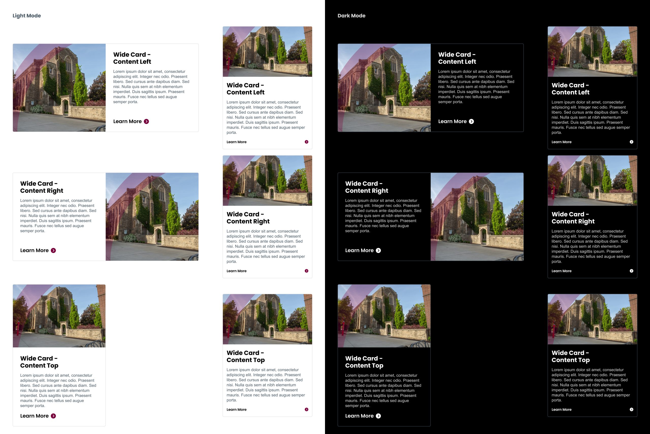
If suitable photos or images are not available, cards can use icons or be text only.
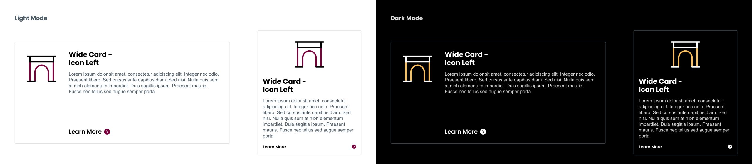