
Overview
Driven by our dedication to collaboration, our visual identity guidelines inspire our community to create cohesive, inclusive and compelling visual stories and marketing materials.
In this section, guidelines are provided on typography use, the McMaster and Brighter World colour palettes and our brand’s visual expression, including graphical elements such as the Brighter World circle element.
Information Box Group

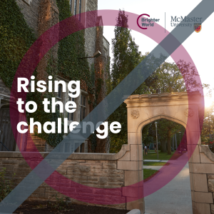
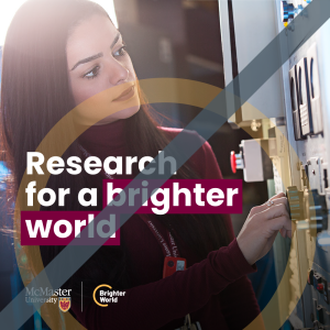
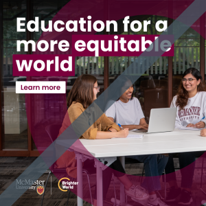
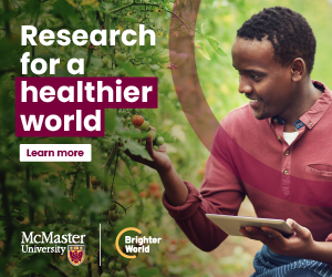
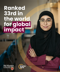
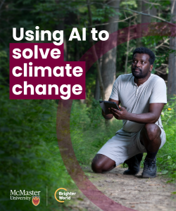
Bring campus to life in full colour
Use large, full-colour photographs in graphic design and feature maroon as McMaster’s most prominent colour.

A new accessible font
Use Poppins, our new primary, versatile sans serif font in communications and marketing material. Ensure all visual materials are accessible, including alternative text for images and appropriate colour contrast alongside the use of our new, accessible font.

Highlight the positive impact
Call out key messaging with the use of a maroon box over key words in the headline.

Focus on what matters
Graphic designers can use the Brighter World circle element in layouts to draw attention to the subject matter or copy as the focal point in the creative.
Typography
A modern, accessible font helps bring Brighter World to life.
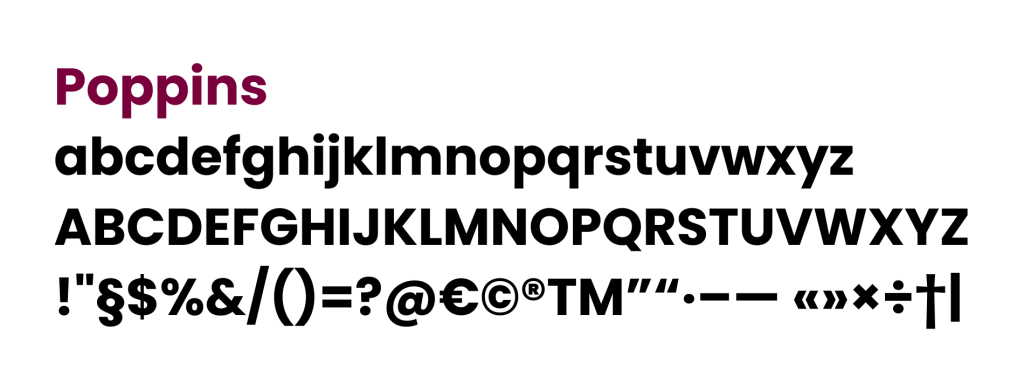
The primary font, Poppins, is a versatile, sans serif typeface that is a leading accessible font style. This modern typeface embodies McMaster’s commitment to innovation and clarity. Whether used in digital or print formats, Poppins ensures clear and legible communication, contributing to a more inclusive brand experience for everyone engaging with McMaster University. Poppins is a Google font that can be downloaded here.
Expandable List
Poppins should be used for the following purposes:
- Headlines: Poppins is the preferred font for headlines on McMaster’s print and digital assets. It provides a strong and distinctive visual appeal, helping to capture the readers’ attention.
- Print materials: Poppins should be used consistently in all printed materials, including brochures, posters, banners, and other promotional items; this ensures visual consistency and reinforces brand recognition.
- Digital assets: Poppins should also be used in all digital assets, such as social media graphics and online advertisements. Consistency in typography helps to establish a cohesive visual identity across various digital channels.
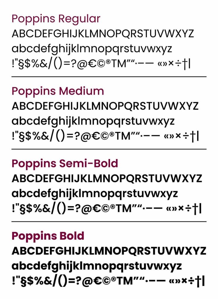
Poppins offers a variety of font weights and styles to accommodate different design needs. We recommend the following font weights when using Poppins:
- Regular: Ideal for body copy, paragraphs, and introductory copy.
- Medium: Suitable for subheadings, captions, and callouts.
- Semi-Bold: Perfect for headings, highlighting key information and emphasizing important sections.
- Bold: Reserved for particularly impactful headlines or statements.
Example layout with different Poppins font treatments:
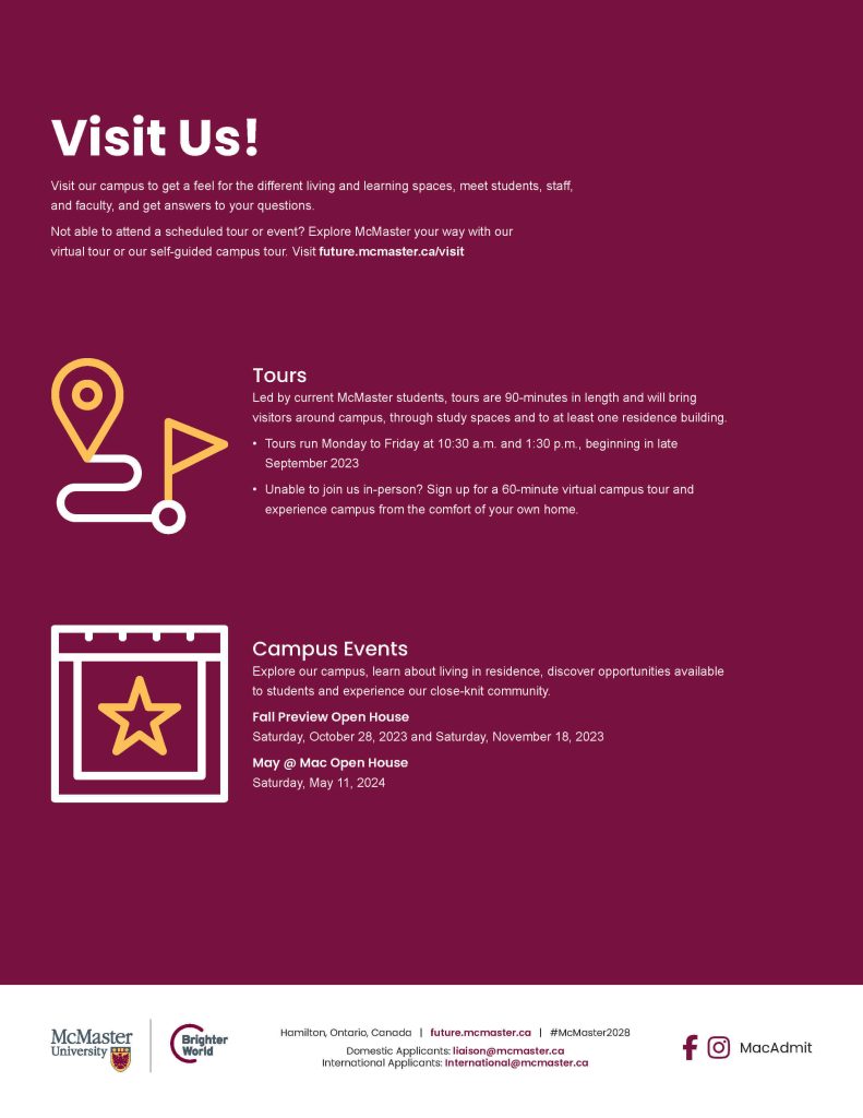
Arial serves as the secondary font for the brand and should be primarily used for web body copy, email and documents created in software such as Microsoft Word, PowerPoint, and similar applications. Arial is a system font that should be available on anyone’s computer.
Arial should be used in the following contexts:
- Web body copy: When presenting longer blocks of text on McMaster University websites, Arial is the recommended font. It provides excellent readability and ensures a comfortable reading experience.
- Emails: Arial is the recommended font when creating emails. As a system font, its use ensures the original design will match the end-user’s experience.
- Word processing presentation software: When creating documents using software such as Microsoft Word, PowerPoint, or any other similar tools, Arial is the preferred font. Similar to emails, the Arial font ensures the original design is the same as the end-user experience; this ensures consistency and makes it easier for staff and faculty members to adopt the brand guidelines in their daily work.
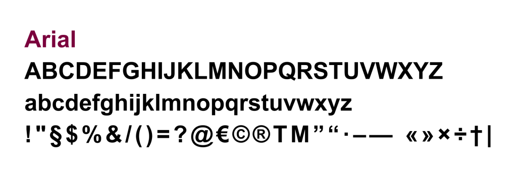
Arial offers different font weights and styles to suit various design requirements. When using Arial, the following font weights are recommended:
- Regular: Best suited for body text, paragraphs, and general content.
- Bold: Suitable for headings or emphasized text within documents or presentations.
- Italic: Reserved for instances where emphasis or differentiation within the text is necessary.
By adhering to these typography guidelines, we can maintain a cohesive visual identity that reflects the university’s professionalism, innovation, and commitment to excellence.
Example layout with different Arial font treatments:
Colour palette
The Brighter World colour palette reflects our dedication to tradition and our long history of innovation.
For decades, McMaster’s visual identity has been linked to our signature maroon. Brighter World embraces this tradition by featuring maroon as our primary colour, while introducing some new secondary colours to the mix.
Expandable List
Strengthen the McMaster brand by consistently using the McMaster colour palette. The rich hues convey tradition and stability. These colours are all reflected in the McMaster logo, an essential element of our brand identity. McMaster Heritage Maroon is the primary colour, and best represents the McMaster brand. It should always be the first choice of colour used in designs or layouts.
McMaster Heritage Maroon
If McMaster Heritage Maroon has been prominently used, secondary colours may be used for further visual interest and differentiation in the layout. If even more colour range is necessary, there is a collection of approved accent colours that can be explored. Continue reading for guidance on the use of these additional colours.
 |
|
McMaster Heritage Gold
McMaster Heritage Gold should be the first additional colour choice after McMaster Heritage Maroon, ensuring McMaster Heritage Maroon is always the more prominent colour.
 |
|
McMaster Heritage Grey
McMaster Heritage Grey is part of the McMaster and Brighter World logos; however, it should not be used as a dominant design colour. It can be used for body copy in web and email applications as a softer alternative to black.
 |
|
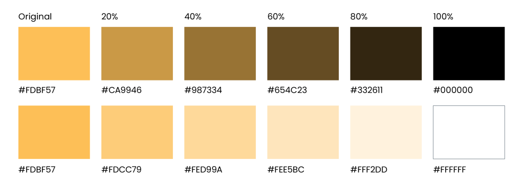
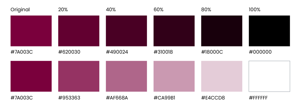
Tints and shades
A tint is a lightened version of a colour, while a shade is a darkened version. Tints and shades of the McMaster Heritage colour palette (only) are allowed in select scenarios, such as tables and charts, when information should be separated to increase legibility or provide a hierarchy of information. Tints and shades of accent colours should not be used.
Tints and shades can be created by adding white or black to the original colour. Aim for 20% increments to ensure sufficient differentiation between each iteration.
Gold tints:
Maroon tints:
The primary and secondary colour palettes should be the dominant colours used for all external-facing assets, including documentation, web pages, graphics, ads, and more; this ensures the McMaster brand is clearly and consistently represented and reinforced in the community and beyond. When assets are developed for an internal audience, additional flexibility is available when it comes to the use of colours. While the primary and secondary colour palettes should still be the most prominent, a collection of accent colours has been carefully selected to complement the Heritage colour palette and each other. Developed to be vibrant and diverse and pay homage to the city of Hamilton, these colours help to reflect the Brighter World brand story and spirit of collaboration at the university.
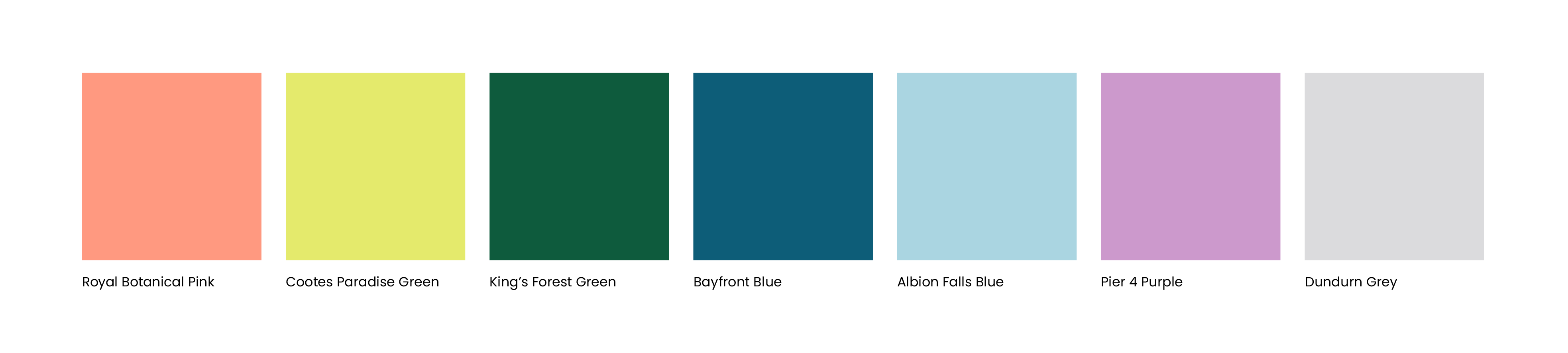
Royal Botanical Pink
 |
|
Cootes Paradise Green
 |
|
King’s Forest Green
 |
|
Bayfront Blue
 |
|
Albion Falls Blue
 |
|
Pier 4 Purple
 |
|
Dundurn Grey
 |
|
Brighter World accent colours should be reserved for scenarios where the primary and secondary colours have already been used, however, additional variations are still required for function or design. Examples include large or multi-page documents with the primary colours already heavily used, data-driven documents with charts and graphs, or infographics. Accent colours can be used independently in charts or graphs or mixed in with primary and secondary colours. Creative assets being developed exclusively for an internal audience can have more flexibility with the use of the accent colour palette. However, the creative should still include primary and secondary colours to ensure brand consistency.
Brighter World accent colours can be used sparingly after primary and secondary colours are predominant. They are ideal for small details such as icons, callout boxes and stats, especially within multiple-page documents.
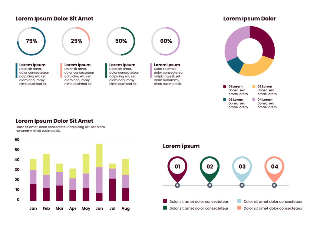
When building a multipage document, accent colours should be limited to one or two colours per page. When two pages are facing each other (a “spread”), this should be treated the same, only using one or two accent colours across the two pages.
Do Not:
- Use accent colours more dominantly than primary and secondary colours.
- Use accent colours to create the circle element.
Sufficient colour contrast is crucial for accessibility. It ensures that individuals with various visual abilities easily perceive visual content. Inadequate contrast makes it difficult for people with impairments to read or understand information accurately. By providing sufficient contrast, designers can make their content more inclusive, allowing all users to easily access and navigate digital experiences. Adhering to colour contrast guidelines enhances legibility and usability for a broader audience, resulting in a better user experience.
More flexibility is available when using the accent colour palette for items that are simply adding visual interest to an asset. However, when these colours are used for elements that are critical to the message or context of the asset, follow these guidelines:
On a white background, the following colours have sufficient contrast:

On a black background, the following colours have sufficient contrast:

Black icons can be used on the following coloured backgrounds:
White icons can be used on the following coloured backgrounds:
While they are not built into the colour palette, black and white are available as neutral colours. They will be the primary colours for copy on most assets, selected accordingly based on how dark or light the image is; this will ensure proper contrast and legibility. Black and white can also be used as background colours.
Brighter World Visual Expression
The new brand identity for Brighter World embodies optimism, innovation and positive change.
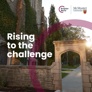
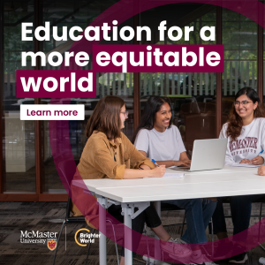
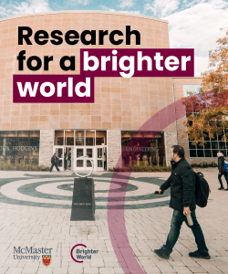
The brand pieces come together to form a vibrant identity by leveraging full-colour photography, the circle element, a dynamic typography treatment, and compelling messaging. This combination of modern design elements reflects the brand’s forward-thinking approach and commitment to positively impacting the world. All together, the brand’s visual expression will capture attention and evoke a sense of energy and innovation, effectively conveying McMaster’s mission and inspiring others to join in creating a Brighter World.
Expandable List
Full-colour photography brings McMaster’s brand to life, showcasing campus life and innovation, researcher and student accomplishments, and positive impacts on the community and beyond. Additionally, it allows for the expression of diversity, capturing the multicultural campus community and highlighting inclusivity. By incorporating full-colour photography into branded assets, McMaster can create a strong emotional connection, evoke a sense of pride and belonging, and showcase its efforts towards creating a Brighter World.
See the photography section for more information on the style and format of photos.
Stemming from the consultation that supported the brand evolution process, the circle element symbolizes:
- Collaboration: Like our brand story says: Excellence is not a solitary act. At McMaster, it’s a collective art.
- Welcoming Community: Our diverse and inclusive community is one where everyone is valued and respected.
- Positive Impact: We are determined to advance human and societal health and well-being for all.
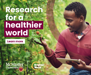
The circle element is meant to draw attention to the photo’s focal point while simultaneously reinforcing the brand colour(s) and creating a recognizable aesthetic across all assets. To ensure cohesive usage of the circle element, be sure to adhere to the following guidelines:
- The primary colour choice for the circle is McMaster Heritage Maroon. McMaster Heritage Gold may add variety where McMaster Heritage Maroon is already prominent in the creative. No other colours may be used for the circle element.
- The opacity of the circle can range between 30-50%, depending on the saturation of the photo it is placed on.
- The circle should never overlap a person’s skin. However, if there are people in the background of a photo, there is some depth of field, and they are not the focal point of the image, the circle may overlap them, if necessary.
- The circle element will often overlap a person’s body, which is acceptable as long as it is not over skin. However, it is important to be considerate and mindful of where on the body the circle is sitting.
- Only one circle element may be used on any graphic or asset.
- The circle should be positioned to encircle or draw the eye towards the image’s focal point. In some cases, the circle may be placed in the negative space, as long as it’s in a way that still directs the eye to the focal point and does not distract from it or compete with it.
- Alternatively, if it does not detract from the image, the circle may sit behind the copy to help create sufficient contrast for legibility and accessibility or to encircle the copy to emphasize the message.
- The circle should always be partially cropped off the page on one or two sides.
- Avoid having a ‘half’ circle, but instead have approximately one quarter or three quarters of the circle visible.
- Generally, it is preferred for the circle to create an arch shape (curve at the top, open at the bottom) rather than a cup shape (curve at the bottom, open at the top). However, in certain scenarios, depending on the format of the asset, the photo, and copy placement, if applicable, a cup shape can be used if it suits the layout better.
- The thickness of the circle can vary based on the size of the asset, the image, and the positioning. It should not be so thin that it appears as a stroke; it should have some substance. As a general guide, the circle thickness should be similar to the height of a capital letter in the largest copy on the asset.
- In select scenarios, the circle element can be placed behind the subject but in front of the background. However, it is important not to “weave” the circle between plains. If it is placed behind the subject, it should be fully behind the subject, and no parts should be in front of them, or in front of any objects that are in front of them. **Engage a designer to support this application.
- The circle element should be fully opaque when used on a solid colour background.
- The circle element should NOT be used as a container, or a divider.
DO:


DON’T:


The circle element should be used wherever possible, even on small assets. In scenarios where the asset is too small to fit an image and the circle element, the image can be removed, but the circle element should be kept.


In applications where multiple assets may be stacked together, such as an email or webpage, avoid having two adjacent assets with the circle element, as it will become busy. Alternate between a range of assets, such as images with the circle element, solid colour blocks, full image blocks, and copy blocks.
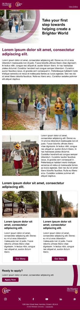
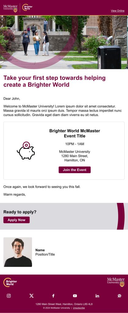
The copy should be placed directly over the full-colour photography. The copy should be left-aligned whenever possible. It should be positioned to fit in with the image versus being pushed to the top or bottom of the layout (although this will depend on the image). It is essential to choose the placement carefully, ensuring sufficient contrast for legibility and accessibility. In some cases, adding a semi-transparent black or white layer behind the copy may be necessary to increase the contrast; this must be done carefully to avoid the appearance of an overlay on the photo.
Image + semi-transparent overlay = sufficient contrast.
Overlay layer must be behind the logo, copy and typography treatment, and circle element (only in front of the photo).

Alternatively, if there is no area of the image that provides sufficient contrast for the copy to be legible, and an alternate image cannot be used instead, an area of solid colour (either McMaster Heritage Maroon or white) may be applied over the images, either full width, or full height, and extending to the edge of the image. Logos and copy can then be placed in the solid colour area to ensure acceptable contrast.

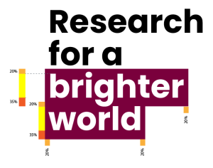
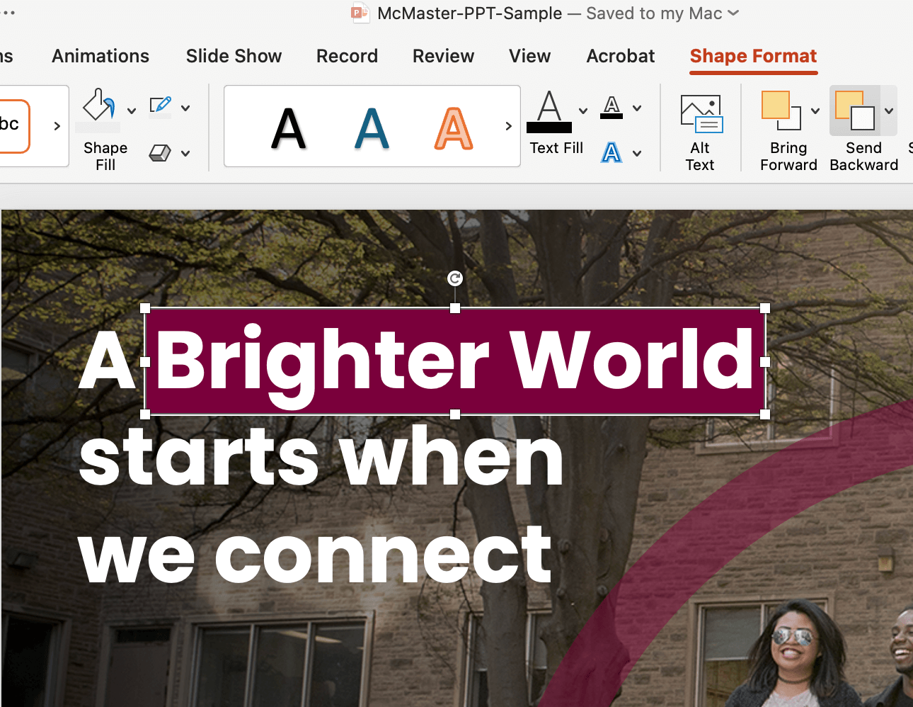
For prominent headline copy, a McMaster Heritage Maroon box should be selectively placed behind keywords that indicate a positive benefit or outcome. The maroon box serves multiple purposes:
- Emphasizes key messaging
- Provides an opportunity to further enforce the brand through the primary maroon colour
- Helps to create sufficient contrast for copy against full-colour photography
The maroon box typography treatment is to be used strategically (it should NOT be added to all headline copy). It may only work well on some assets. When messaging includes a positive benefit or outcome, the two to four words* describing the benefit or outcome can be highlighted with the maroon box. The highlight should only extend across part of the headline, never across an entire headline..
The copy in front of the maroon boxes should always be white to ensure sufficient contrast and emphasis. (Even if the copy in the rest of the message is a different colour, the copy in front of the maroon box must be changed to white).
In the case of a maroon background, the box should be changed to white, with maroon copy in front. This is the only scenario that will differ from the standard usage.
To size the maroon box appropriately, follow this guideline:
- Identify the height of a capital letter
- Multiply that number by .2 (20%)
- This will be how far the maroon box should extend above the capital letter, and to the left and right of the word(s)
- Multiply that number by .35 (35%)
- This will be how far the maroon box should extend below the baseline of the letters
As a general reference, the box should extend beyond the highlighted words on the top and sides by the approximate thickness of an upright piece of a capital letter, and should extend beyond the bottom of the words by about double the thickness (this will ensure it highlights most of descending letters without infringing too much on additional lines of copy below)
* Exceptions may apply depending on specific wording.

Iconography
Icons are a great way to add visual interest alongside copy. They can also be used to convey high-level information quickly and simply.
The icon’s simplistic stroke-only (no fill) style provides a modern aesthetic and aligns nicely with the circle element. These icons can enhance assets without overshadowing the messaging.
Expandable List
Various colour options can be applied to this icon style within the McMaster brand. When selecting a colour, there are a few things to remember.
Icons as information:
When icons are used to convey information, accessibility compliance needs to be considered. For example, a magnifying glass in a web page navigation bar that functions as a search tool needs to be large enough and have sufficient colour contrast against the background to be easily viewed and clear for all users. The icon should be a single colour in these scenarios. On dark backgrounds, either white or McMaster Heritage Gold; on a light background, either black or McMaster Heritage Maroon.
Icons as design:
More approved colour options are available when icons provide visual interest to an asset alongside copy. They can be a single colour selected from any McMaster colour palette, as long as all colour palette standards are being followed (i.e. McMaster Heritage Maroon is the most prominent colour in the asset). The following two-colour options can also be used – but no other two-colour combinations are permitted.
There is a library of icons available on the Brand Resource Library. PowerPoint templates also include icons. (Asset currently in development.)
If additional icons are required, please contact: brandmrk@mcmaster.ca.
How to build the best assets
Don’t have access to a graphic designer? This page will help you build branded assets for free.
Expandable List
When possible, working with a designer who uses professional design software is the first choice for creating assets. Within Adobe (Illustrator, InDesign, Photoshop, AfterEffects, etc.), a designer will be able to edit photos and elements in a more precise way to create the best visuals.
On-brand assets can still be created in other programs, however, Microsoft PowerPoint and Canva are two of the options referenced here.
Each asset we create serves its own purpose, so be sure to use your discretion about which elements make the most sense to be included. The general elements are:
- Photo or background
- Logo(s) or lockup(s)
- Copy
- Typography treatment
- Circle element
Are you unsure how to check if your text has sufficient contrast on top of your background image? Download the Colour Contrast Analyzer tool for free at this link. Whenever possible, aim for AAA Web Content Accessibility Guideline (WCAG) compliance.
Collaborating with a colleague and need to communicate the accessibility of colour options? Use a tool like Color Review to create visual and text examples of a colour’s accessibility compliance.
To get started, download the McMaster PowerPoint template from the Resource Library. You will need to login with your MacID and password.
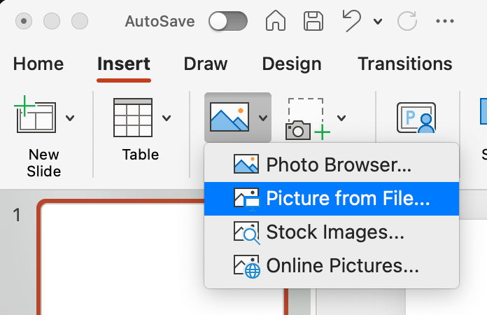
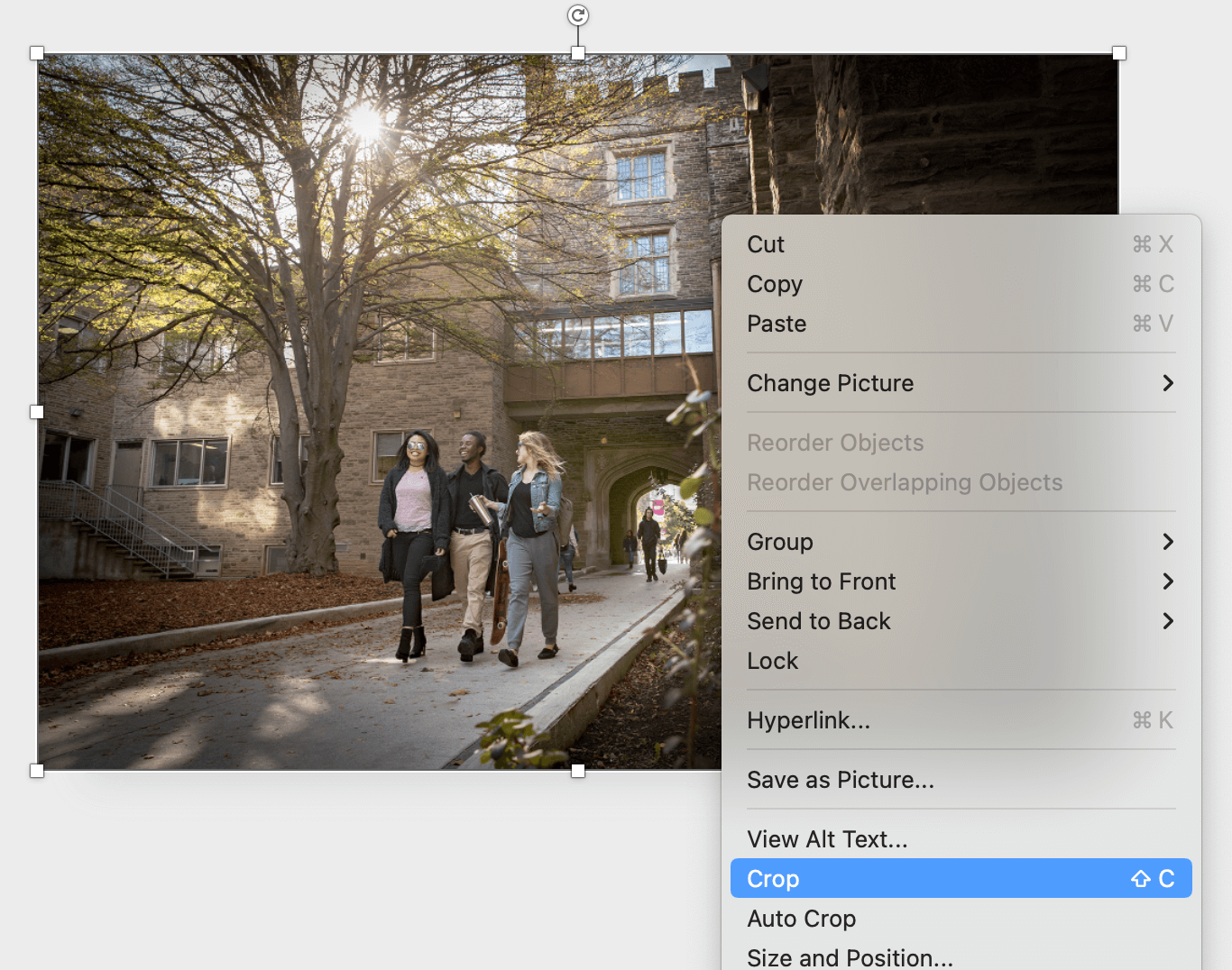
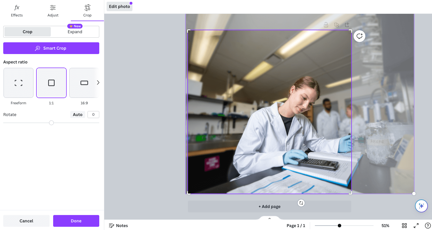
Once you have your page setup to the desired size, you can insert your photo of choice. Ensure when you are resizing an image you always hold shift, while dragging the corner, to maintain the aspect ratio. Additionally you can use the “Crop” tool to adjust the cropping of the image to ensure your subject is positioned ideally within the page and there is space for your other elements to sit.
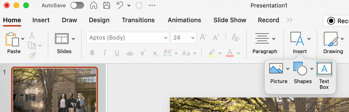
Next you can place your logo or logo lockup. Be sure to follow all logo rules when selecting the correct version (left or right alignment, colour or reversed, etc.). With your logo in place, you can insert a text box for the copy.
Note – Poppins will need to be downloaded and installed in order to be used within Microsoft.
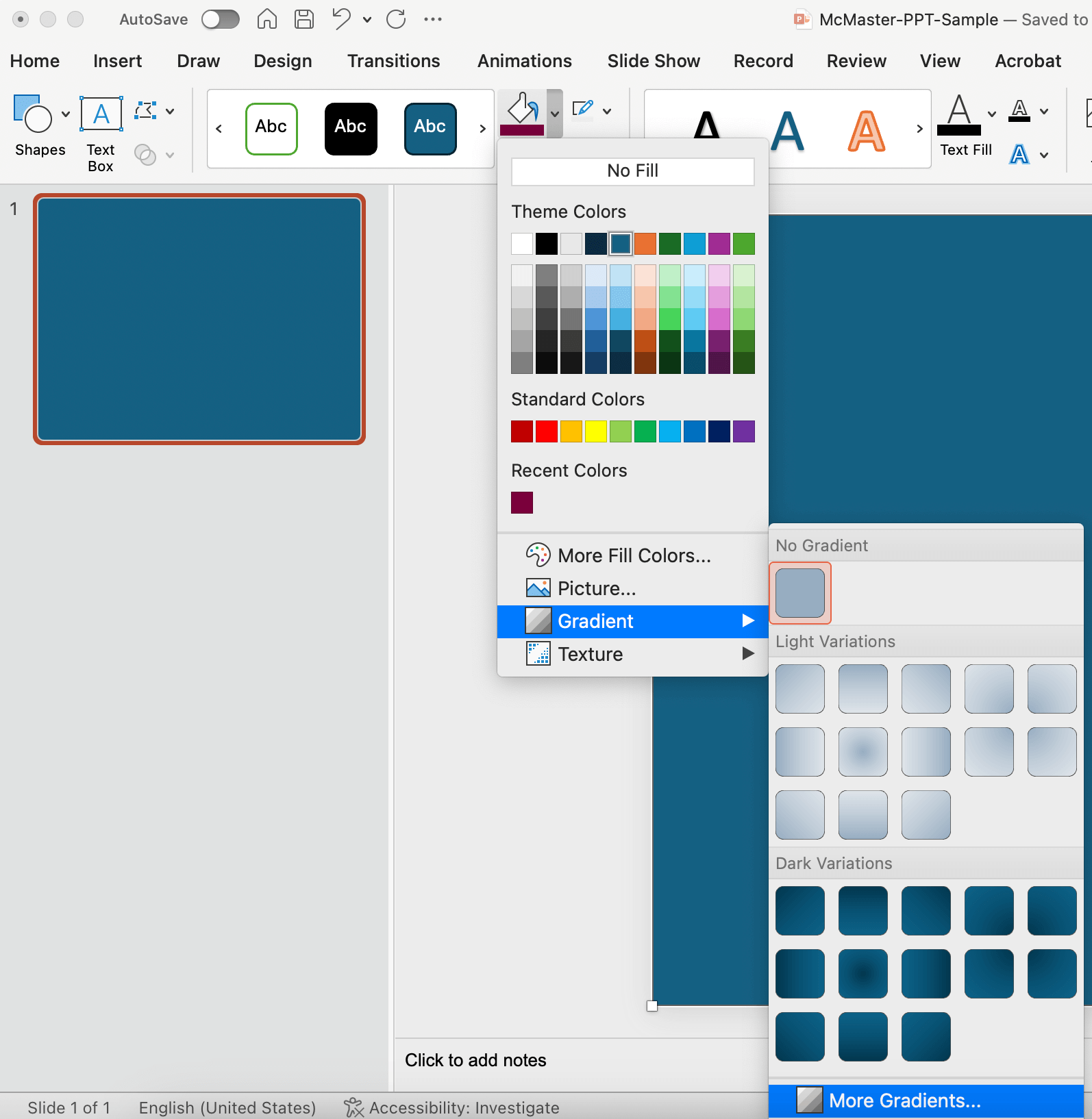
If there is not sufficient contrast between the copy and the photo, create a subtle gradient overlay to place between the copy and photo. Start by creating a shape the full size of your asset. Next, go into the “Fill” menu and select “Gradient”, “More Gradients…”
Select the “Gradient fill” option. Adjust the Angle, Gradients stops (and their colours), and the Transparency of each Gradient stop. In the example below the far left Gradient stop is set to 30% transparency, while the one on the right is set to 100% (fully transparent). It has also been positioned in from the right edge of the slider to keep a portion of the photo clear of the overlay. Use only black or white, and keep the overlay as minimal as possible, to provide contrast for the copy, but maintain as much of the natural image colour and vibrance as possible.
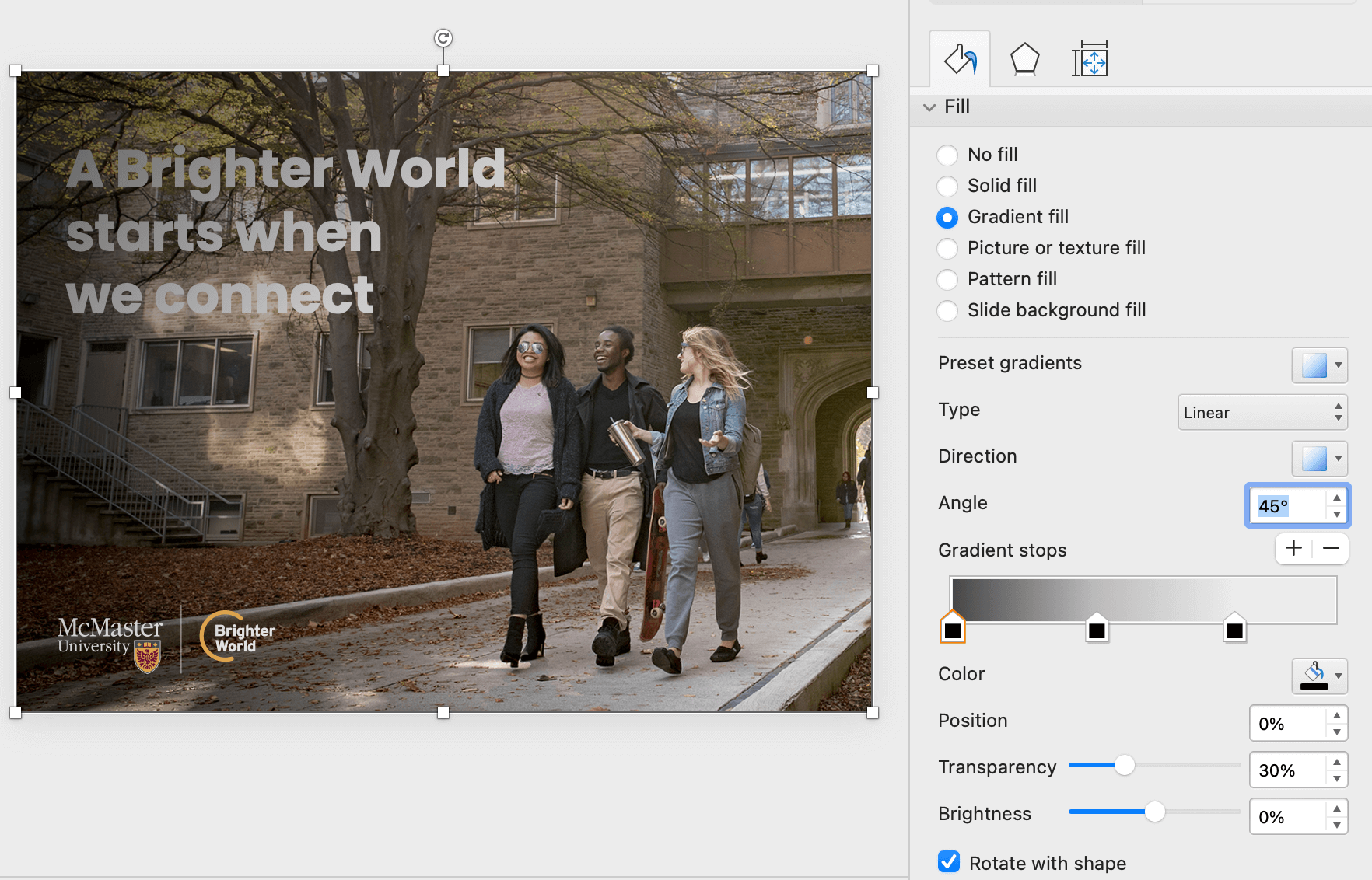
Once the gradient has been set up, use the “Send Backward” option in the top menu bar to position the gradient overlay behind the copy, as well as the logo (but in front of the photo).
 .
. 
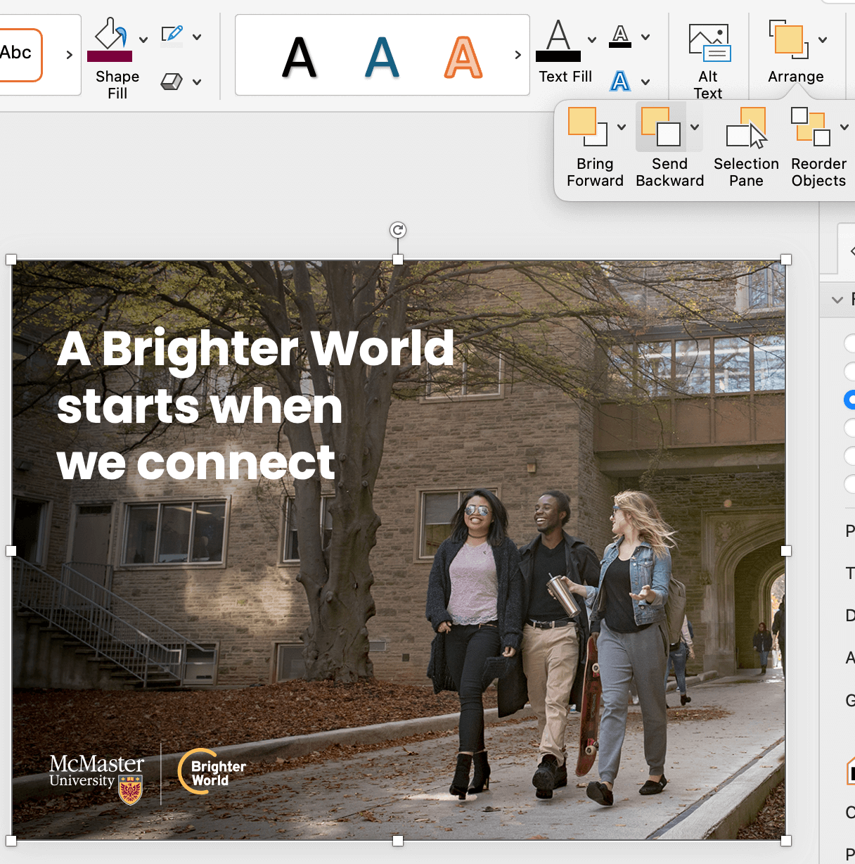
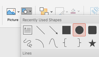
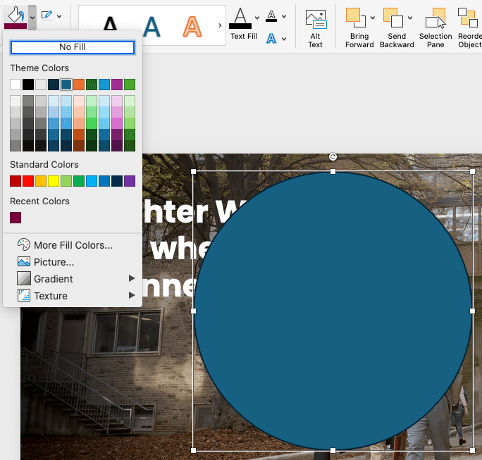
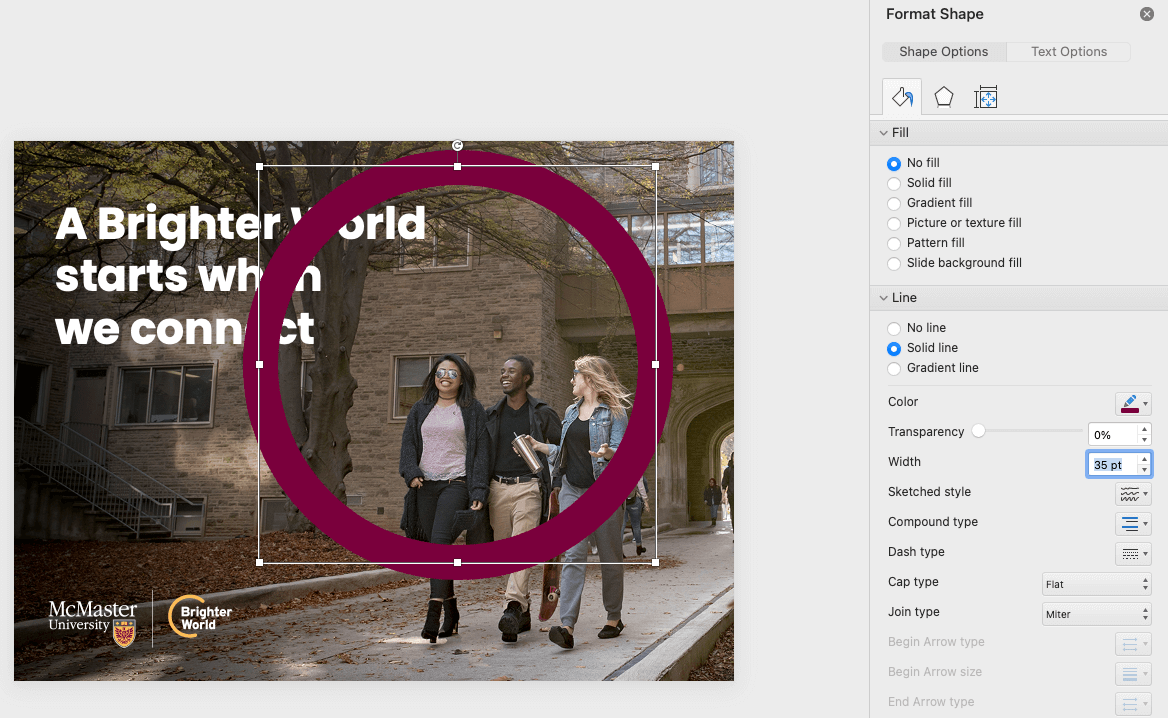
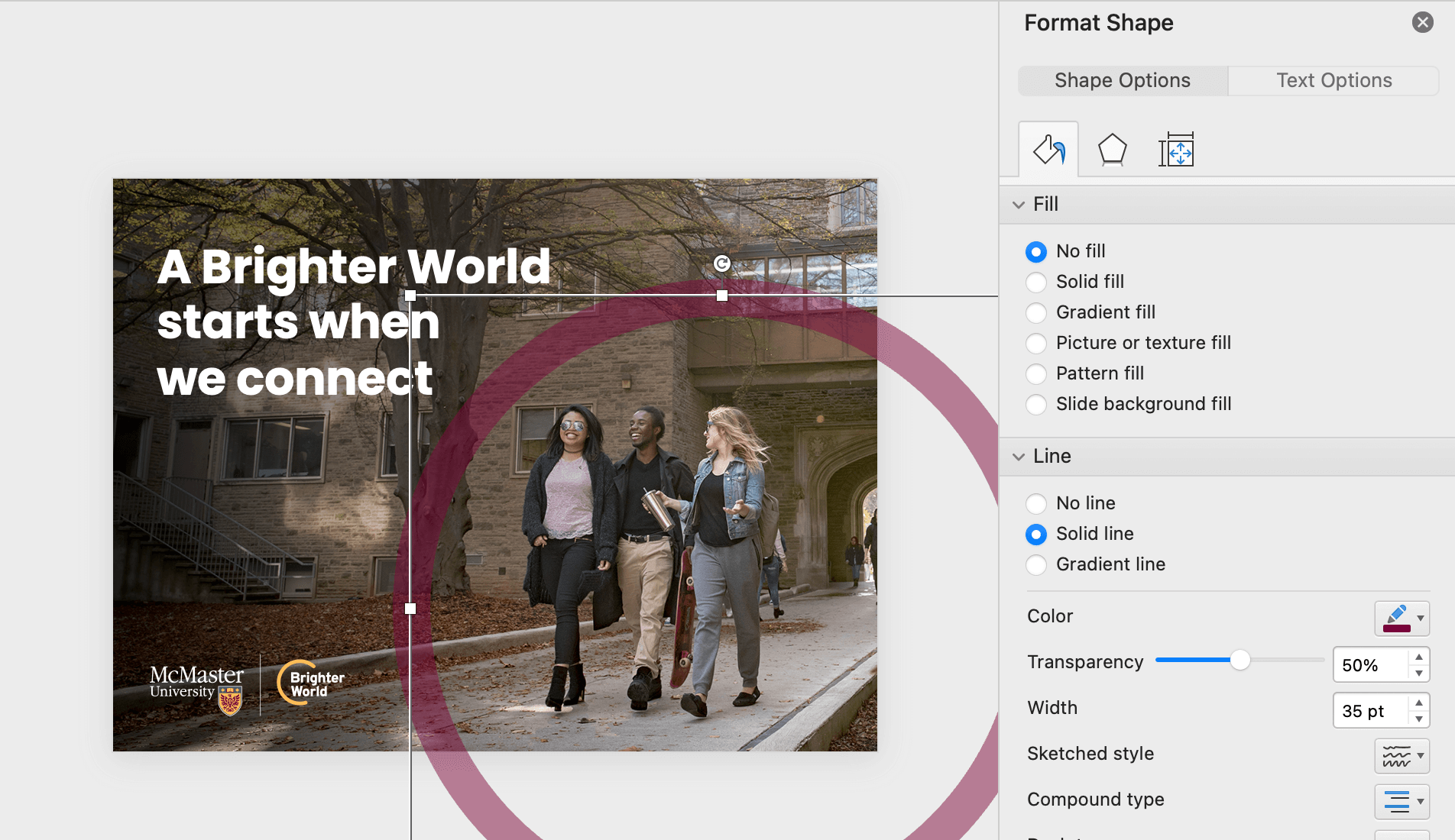
To create the circle element, insert a circle shape. Be sure to hold shift when drawing the circle to constrain the proportions and ensure it does not get stretched to an oval shape. Change the fill to “No Fill” and the outline to the desired colour (most likely Heritage Maroon). Open the Format Shape panel to adjust the stroke weight and the transparency. The stroke weight should be close to the height of the largest capital letters on the page. The transparency should be between 50-70%, depending on how dark the photo is. Position the circle element accordingly.
If the copy includes a positive benefit or outcome, this can be highlighted using the maroon box typography treatment. Create a rectangle shape slightly larger than the words you are highlighting. As a general guide, the space between the top, left, and right of the letters and the outside edge of the box should be the approximate thickness of a vertical bar in the letters. The space below the letters should be about double, to account for descending letters. Use the ‘Send Backwards’ tool to move the box behind the copy.
Your asset is complete!

Are you unsure how to check if your text has sufficient contrast on top of your background image? Download the Colour Contrast Analyzer tool for free at this link. Whenever possible, aim for AAA Web Content Accessibility Guideline (WCAG) compliance.
Collaborating with a colleague and need to communicate the accessibility of colour options? Use a tool like Color Review to create visual and text examples of a colour’s accessibility compliance.
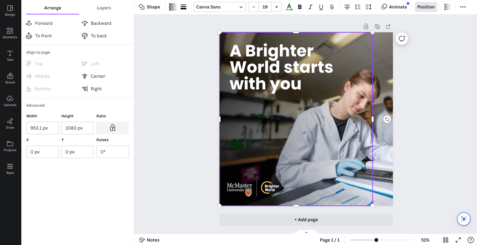
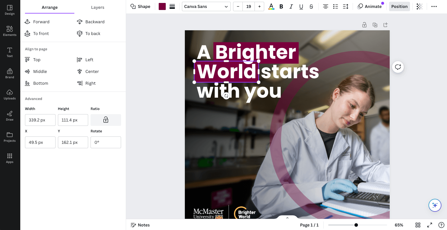
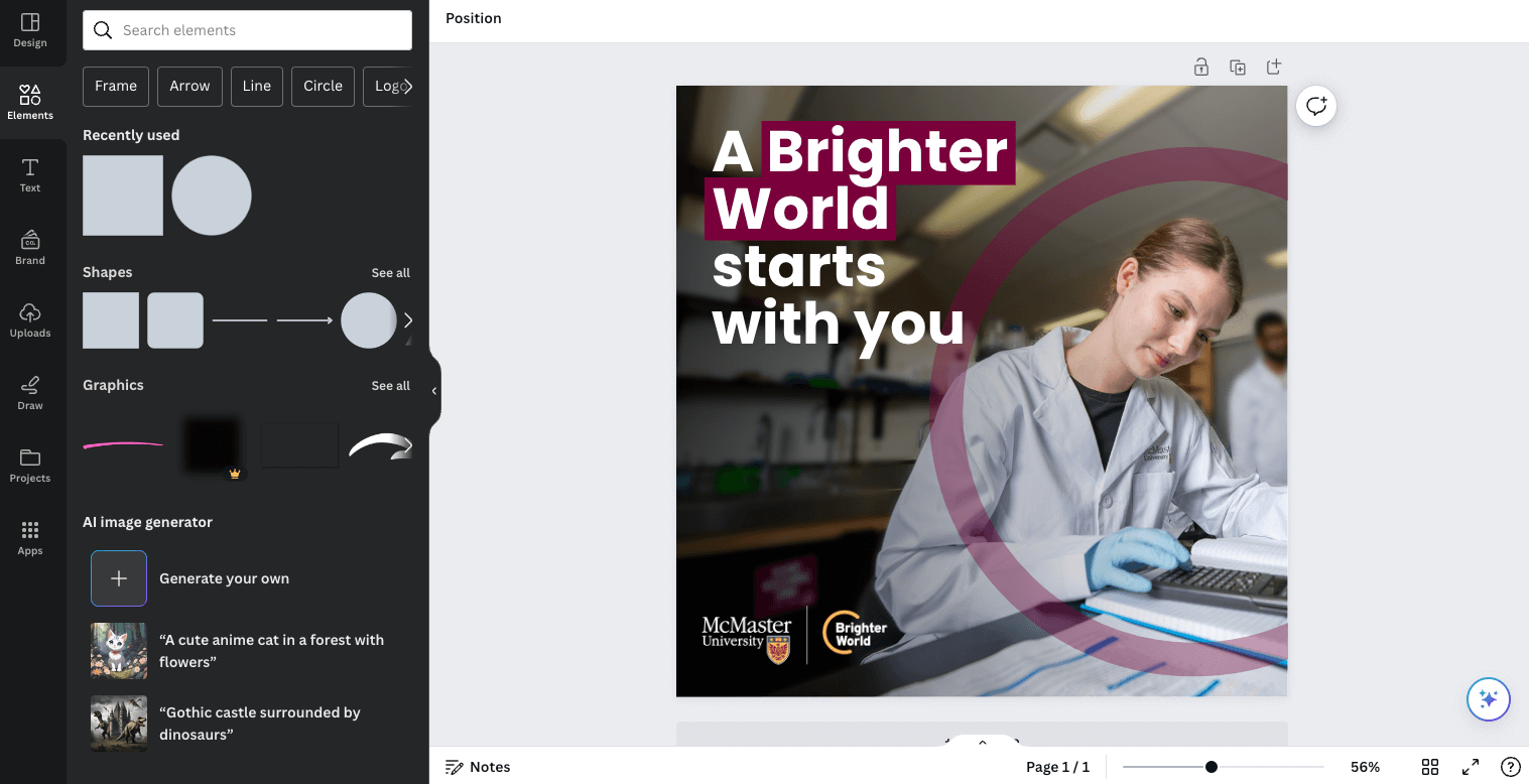
Once you have your page setup to the desired size, you can insert your photo of choice. When you are resizing an image, ensure you drag from the corner to maintain the aspect ratio. Additionally, ensure your subject is positioned in a way that allows for space for your other elements to sit.
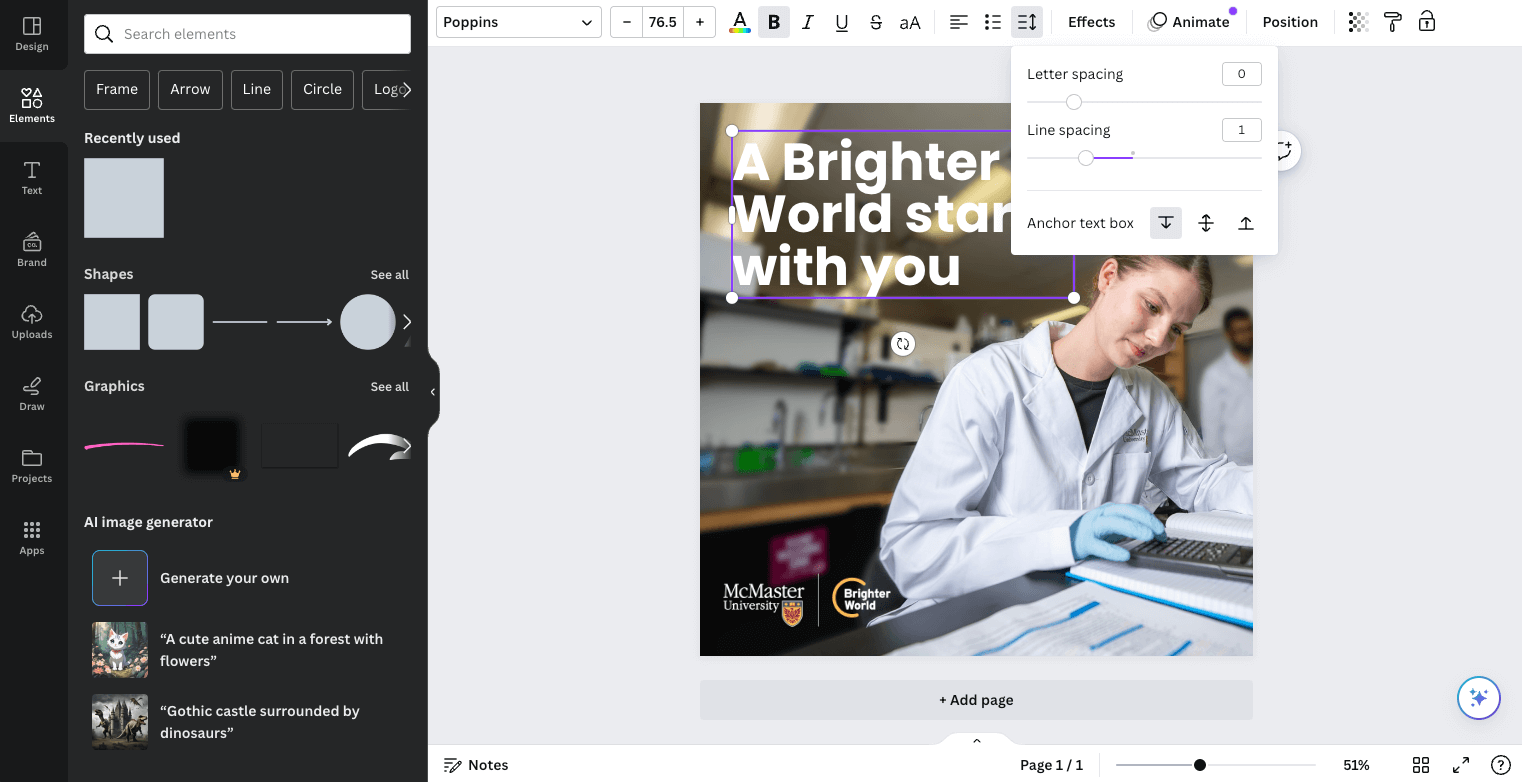
Next, place your logo or logo lockup. Be sure to follow all logo rules when selecting the correct version (left or right alignment, colour or reversed, etc.). With your logo in place, you can insert a text box for the copy. Use the tool bar across the top to edit your text – the font, colour, line spacing, alignment, etc. Line spacing should be set to 1.
Note: Poppins may need to be downloaded and installed in order to be used within the application. You can download the font here.
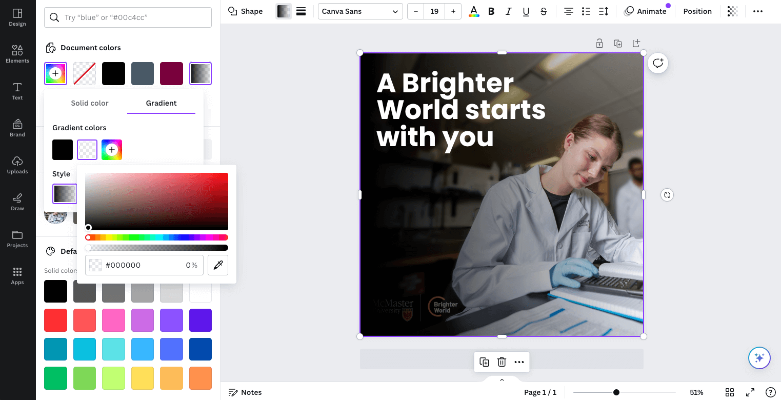
If there is not sufficient contrast between the copy and the photo, create a subtle gradient overlay to place between the copy and photo. Start by creating a shape the full size of the page. Next, use the tool bar across the top to adjust the fill, and the menu that pops up on the left to adjust the gradient colours and transparency.
Adjust the angle, gradient stops (and their colours), and the transparency of each gradient stop. In the example below, the far left gradient stop is set to 30% transparency, while the one on the right is set to 100% (fully transparent). It has also been positioned in from the right edge of the slider to keep a portion of the photo clear of the overlay. Use only black or white, and keep the overlay as minimal as possible, to provide contrast for the copy, while maintaining as much of the natural image colour and vibrance as possible.
Once the gradient has been set up, use the “Position” option in the top menu bar and then “Backward” in the panel on the left, to position the gradient overlay behind the copy, as well as the logo (but in front of the photo).
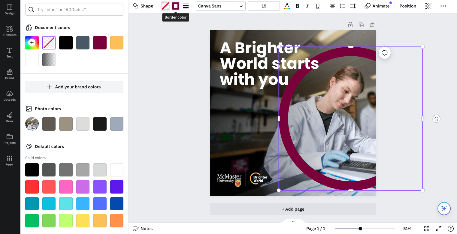
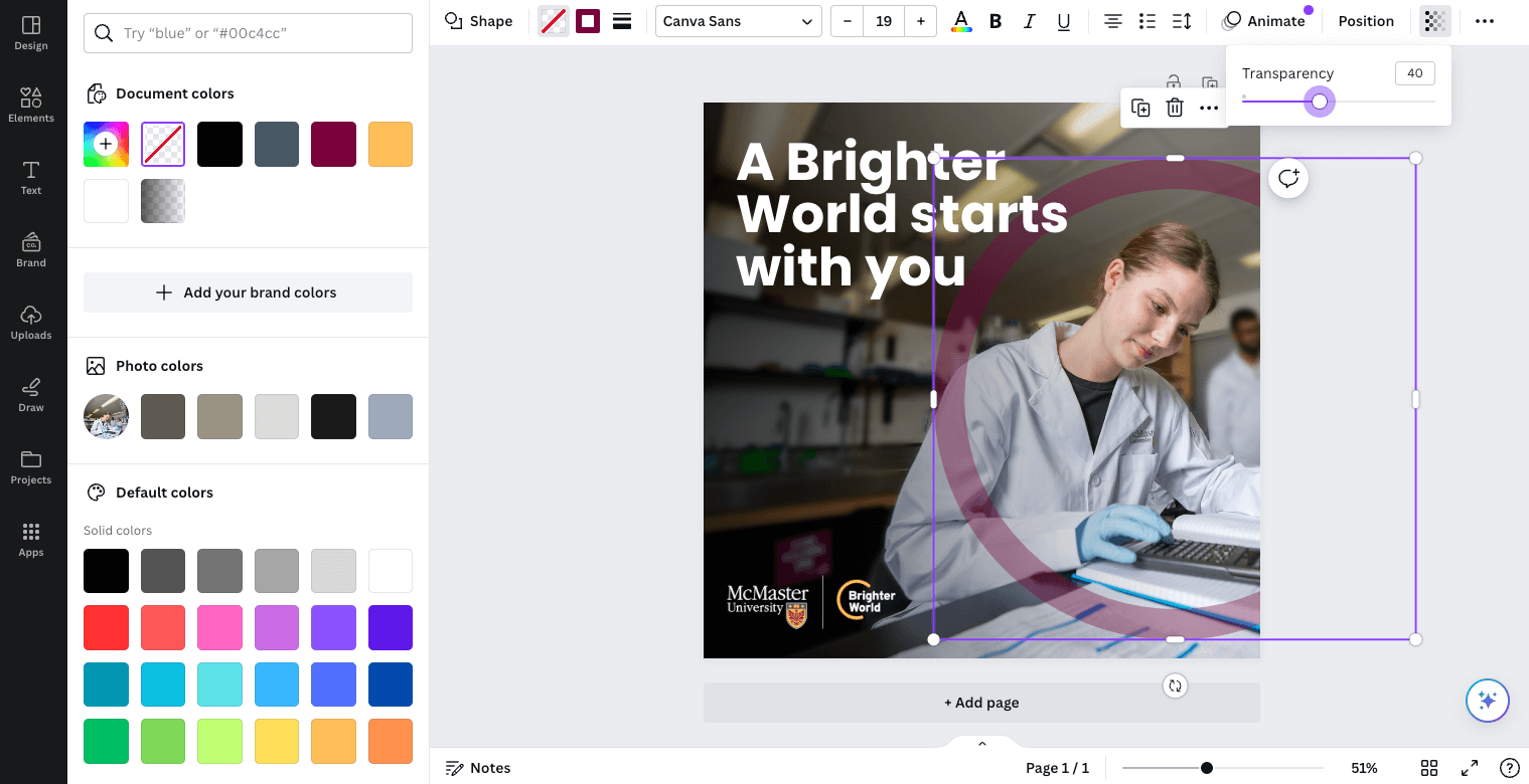
To create the circle element, insert a circle shape. Be sure to drag the corner to adjust the size of the circle to constrain the proportions and ensure it does not get stretched to an oval shape. Use the tool bar across the top to change the fill to “No Fill” and the outline to the desired colour (most likely Heritage Maroon). You can also adjust the stroke weight to be similar in thickness to the height of the largest capital letters on the page. The transparency can also be adjusted from the top toolbar and should be between 30-50%, depending on how dark the photo is. Position the circle element accordingly.
If the copy includes a positive benefit or outcome, this can be highlighted using the maroon box typography treatment. Create a rectangle shape slightly larger than the words you are highlighting. As a general guide, the space between the top, left, and right of the letters and the outside edge of the box should be the approximate thickness of a vertical
bar in the letters. The space below the letters should be about double, to account for descending letters. Use the ‘Backwards’ tool to move the box behind the copy.
Your asset is complete!
Are you unsure how to check if your text has sufficient contrast on top of your background image? Download the Colour Contrast Analyzer tool for free at this link. Whenever possible, aim for AAA Web Content Accessibility Guideline (WCAG) compliance.
Collaborating with a colleague and need to communicate the accessibility of colour options? Use a tool like Color Review to create visual and text examples of a colour’s accessibility compliance.