Skip to McMaster Navigation Skip to Site Navigation Skip to main content

Typography

A modern, accessible font helps bring Brighter World to life.

The primary font, Poppins, is a versatile, sans serif typeface that is a leading accessible font style. This modern typeface embodies McMaster’s commitment to innovation and clarity. Whether used in digital or print formats, Poppins ensures clear and legible communication, contributing to a more inclusive brand experience for everyone engaging with McMaster University. Poppins is a Google font that can be downloaded here or from the Brand Resources SharePoint site.


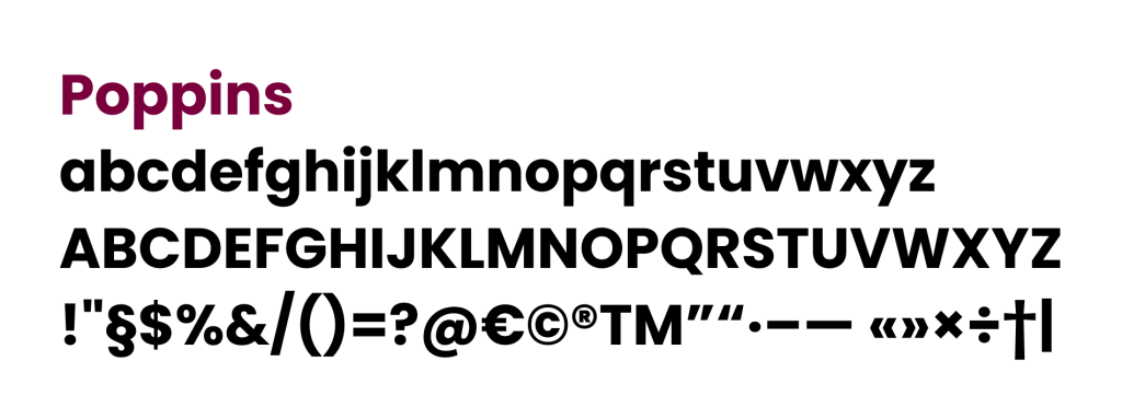
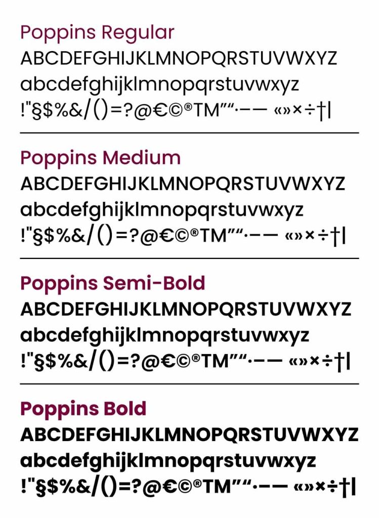
A diagram showing all the characters included with the new Poppins font.


Expandable List

McMaster assets should be created using either Poppins (primary) or Arial (secondary) fonts. There are preferred scenarios for the use of each font, as explained below. By adhering to these typography guidelines, we can maintain a cohesive visual identity that reflects the university’s professionalism, innovation and commitment to excellence.

Poppins:

The primary font, Poppins, is a versatile sans serif typeface that complies with the international Web Content Accessibility Guidelines (WCAG) 2.2 and the Accessibility for Ontarians with Disabilities Act (AODA). This modern typeface embodies McMaster’s commitment to innovation and clarity. Whether used in digital or print formats, Poppins ensures clear and legible communication, contributing to a more inclusive brand experience for everyone engaging with McMaster University. Poppins is a Google font that can be downloaded here or from the Brand Resources SharePoint site.

Usage:

Poppins should be used for the following purposes:

  1. Headlines: Poppins is the preferred font for headlines on McMaster’s print and digital assets. It provides a strong and distinctive visual appeal, helping to capture the readers’ attention.
  2. Print materials: Poppins should be used consistently in all printed materials, including brochures, posters, banners and other promotional items. This ensures visual consistency and reinforces brand recognition.
  3. Digital assets: Poppins should also be used in all digital assets, such as social media graphics and online advertisements. Consistency in typography helps to establish a cohesive visual identity across various digital channels.

Arial:

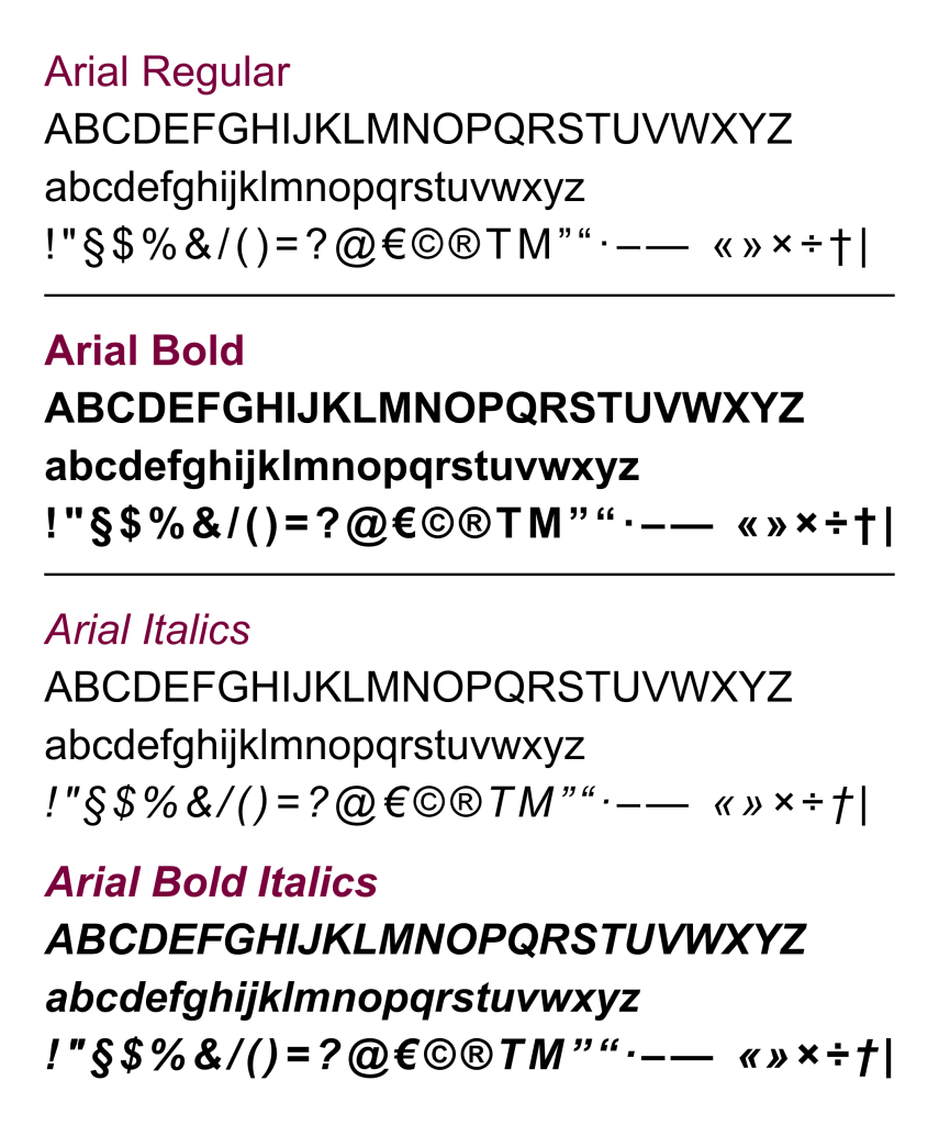
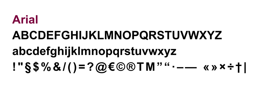
Arial serves as the secondary font for the brand and should be primarily used for web body copy, email and documents created in software such as Microsoft Word, PowerPoint, and similar applications. Arial is a system font that should be available on anyone’s computer.
Usage:

Arial should be used for the following purposes:

  1. Web body copy: Arial is the recommended font when presenting longer blocks of text on McMaster University websites. It provides excellent readability and ensures a comfortable reading experience.
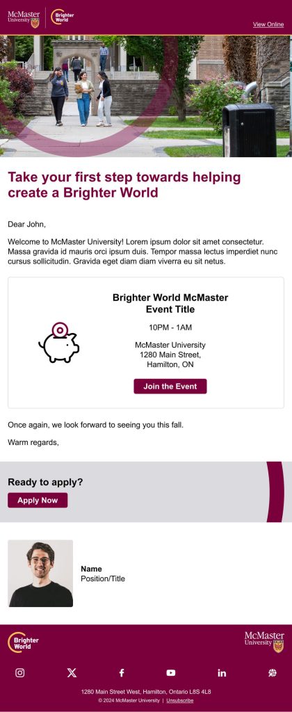
  2. Emails: Arial is the recommended font when creating emails. As a system font, its use ensures the original design will match the end-user’s experience.
  3. Word processing presentation software: When creating documents using software such as Microsoft Word, PowerPoint or any other similar tools, Arial is the preferred font. Similar to emails, the Arial font ensures the original design is the same as the end-user experience. This approach ensures consistency and makes it easier for staff and faculty members to adopt the brand guidelines in their daily work.

It is essential to adhere to our designated colour palette for typography to ensure consistency and recognition across all McMaster University communications. These colours have been carefully chosen to reflect our brand identity and ensure legibility in various applications.

Approved typography colours:

  • Black: Provides strong contrast and readability, ideal for most text applications.
  • White: Best used on darker backgrounds to ensure text stands out clearly and remains easy to read.
  • Heritage Maroon: A core brand colour that should be used strategically to draw attention or highlight important information. It can pair well with black copy to provide emphasis as needed.
  • Heritage Gold: A core brand colour that should be used strategically to draw attention or highlight important information. It can pair well with white copy to provide emphasis as needed.

When selecting and applying these colours, ensure sufficient contrast between text and background to maintain legibility. Drop shadows are not part of McMaster’s brand and should not be used to create contrast for the copy.

Avoid using Heritage Maroon or Heritage Gold for smaller text to ensure readability is not compromised.

By consistently using these typography colours, we strengthen our brand’s visual cohesion and enhance the clarity of our messaging across all platforms and materials.

Typography guidelines scenario #1 

Poppins only is the preferred scenario, ideal for any visually-driven, digital assets, as well as some print assets.

Primary font: Poppins (All font styles are Poppins)

  • H1 – Heading 1:
    • Poppins Bold, sentence case, size: 38pt, line spacing: 43pt
  • H2 – Heading 2:
    • Poppins Bold, sentence case, size: 15pt, line spacing: 18pt
  • H3 – Heading 3:
    • Poppins Bold, sentence case, size: 12pt, line spacing:: 14.4pt
  • Introduction or a quote:
    • Poppins Regular, sentence case, size: 10pt, line spacing: 17pt
  • Body copy 1:
    • Poppins Regular, sentence case, size: 9.5pt, line spacing: 13pt
  • Body copy 2:
    • Poppins Regular, sentence case, size: 9.5pt, line spacing: 13pt (alternate colour for callouts)
  • Notes, small image captions or source copy:
    • Poppins Regular, sentence case, size: 8pt, line spacing: 9.6pt
  • Bulleted list:
    • Poppins Regular, sentence case, size: 9.5pt, line spacing: 13pt
  • Highlighting important numbers (where applicable):
    • Poppins Bold, sentence case, size: 45-75pt, leading: varies
  • Sections:
    • Poppins Bold, sentence case, size: 15pt, leading: 18pt

Typography guidelines scenario #2

Hybrid (Headings/subheadings as Poppins, body copy as Arial)

  • H1 – Heading 1:
    • Poppins Bold, sentence case, size: 38pt, line spacing: 43pt
  • H2 – Heading 2:
    • Poppins Bold, sentence case, size: 15pt, line spacing: 18pt
  • H3 – Heading 3:
    • Poppins Bold, sentence case, size: 12pt, line spacing:: 14.4pt
  • Introduction or a quote:
    • Poppins Regular, sentence case, size: 10pt, line spacing: 17pt
  • Body copy 1:
    • Arial Regular, sentence case, size: 9.5pt, line spacing: 13pt
  • Body copy 2:
    • Arial Regular, sentence case, size: 9.5pt, line spacing: 13pt (alternate colour for callouts)
  • Notes, small image captions or source copy:
    • Arial Regular, sentence case, size: 8pt, line spacing: 9.6pt
  • Bulleted list:
    • Arial Regular, sentence case, size: 9.5pt, line spacing: 13pt
  • Highlighting important numbers (where applicable):
    • Poppins Bold, sentence case, size: 45-75pt, leading: varies
  • Sections:
    • Poppins Bold, sentence case, size: 15pt, leading: 18pt

Typography guidelines scenario #3

Secondary font: Arial

  • H1 – Heading 1:
    • Arial Bold, sentence case, size: 38pt, line spacing: 43pt
  • H2 – Heading 2:
    • Arial Bold, sentence case, size: 15pt, line spacing: 18pt
  • H3 – Heading 3:
    • Arial Bold, sentence case, size: 12pt, line spacing:: 14.4pt
  • Introduction or a quote:
    • Arial Regular, sentence case, size: 10pt, line spacing: 17pt
  • Body copy 1:
    • Arial Regular, sentence case, size: 9.5pt, line spacing: 13pt
  • Body copy 2:
    • Arial Regular, sentence case, size: 9.5pt, line spacing: 13pt (alternate colour for callouts)
  • Notes, small image captions or source copy:
    • Arial Regular, sentence case, size: 8pt, line spacing: 9.6pt
  • Bulleted list:
    • Arial Regular, sentence case, size: 9.5pt, line spacing: 13pt
  • Highlighting important numbers (where applicable):
    • Arial Bold, sentence case, size: 45-75pt, leading: varies
  • Sections:
    • Arial Bold, sentence case, size: 15pt, leading: 18pt

For academic papers, please refer to your course syllabus for proper formatting direction.

In scenarios where a serif font is preferred for stylistic or readability reasons without formal direction, Garamond should be used. As Garamond is also utilized in the McMaster logo and is readily available through platforms like Adobe and Google (EB Garamond), it is the ideal choice for maintaining brand integrity.

Please see the Brighter World Visual Expression tab for more information on the maroon typography box treatment.