Expandable List
When possible, working with a designer who uses professional design software is the first choice for creating assets. Within Adobe (Illustrator, InDesign, Photoshop, AfterEffects, etc.), a designer will be able to edit photos and elements in a more precise way to create the best visuals.
On-brand assets can still be created in other programs, however, Microsoft PowerPoint and Canva are two of the options referenced here.
Each asset we create serves its own purpose, so be sure to use your discretion about which elements make the most sense to be included. The general elements are:
- Photo or background
- Logo(s) or lockup(s)
- Copy
- Typography treatment
- Circle element
Are you unsure how to check if your text has sufficient contrast on top of your background image? Download the Colour Contrast Analyzer tool for free at this link. Whenever possible, aim for AAA Web Content Accessibility Guideline (WCAG) compliance.
Collaborating with a colleague and need to communicate the accessibility of colour options? Use a tool like Color Review to create visual and text examples of a colour’s accessibility compliance.
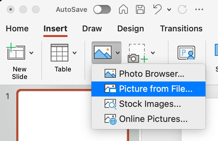
To get started, download the McMaster PowerPoint template from the Resource Library. You will need to login with your MacID and password.
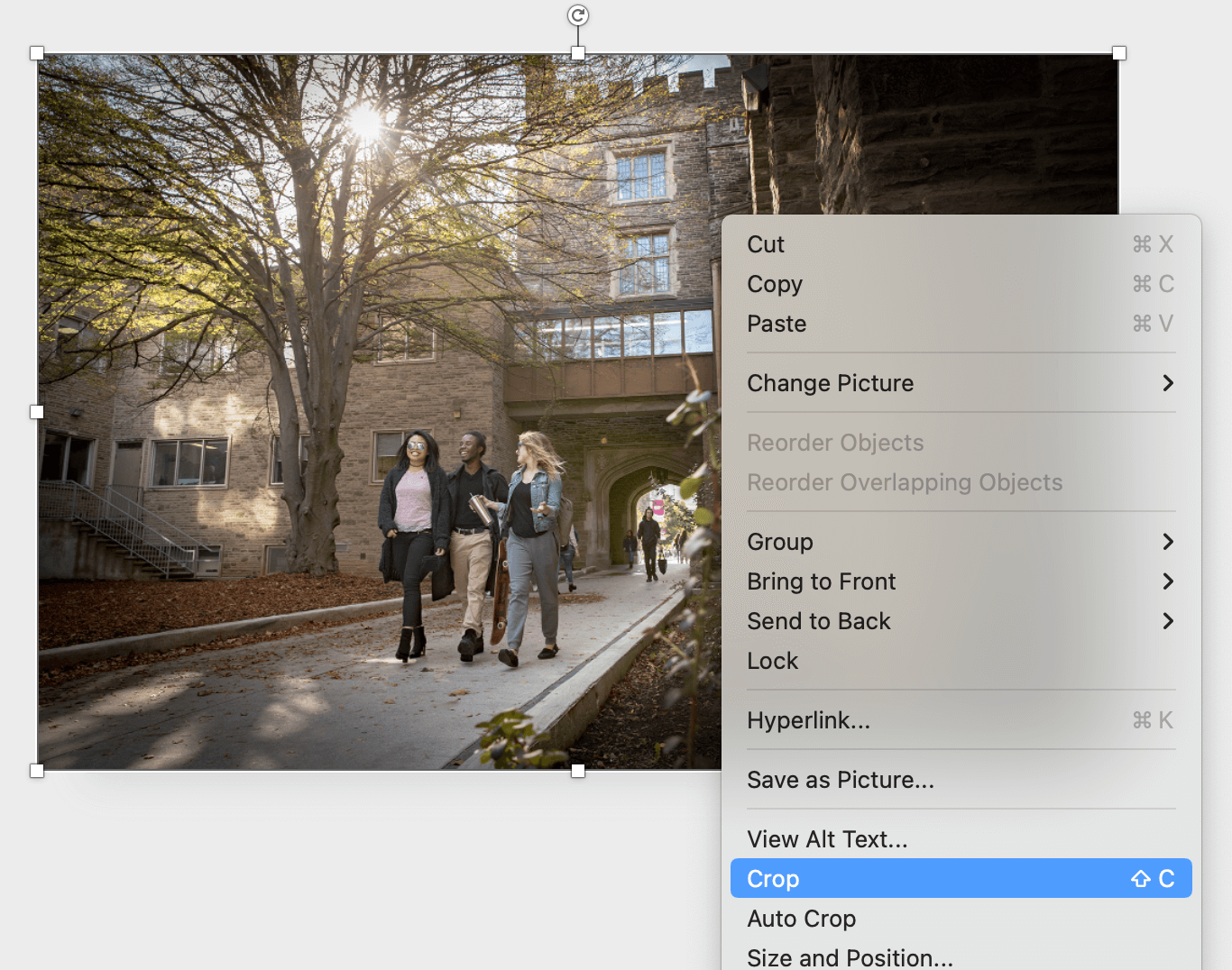
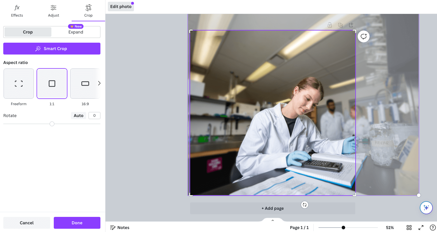
Once you have your page setup to the desired size, you can insert your photo of choice. Ensure when you are resizing an image you always hold shift, while dragging the corner, to maintain the aspect ratio. Additionally you can use the “Crop” tool to adjust the cropping of the image to ensure your subject is positioned ideally within the page and there is space for your other elements to sit.
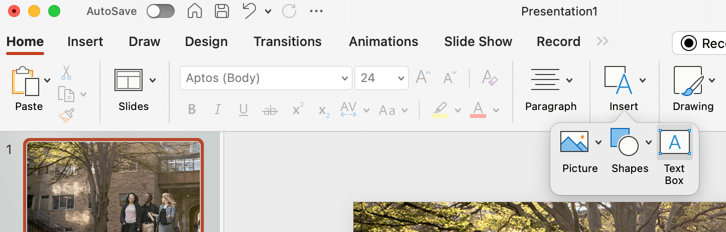
Next you can place your logo or logo lockup. Be sure to follow all logo rules when selecting the correct version (left or right alignment, colour or reversed, etc.). With your logo in place, you can insert a text box for the copy.
Note – Poppins will need to be downloaded and installed in order to be used within Microsoft.
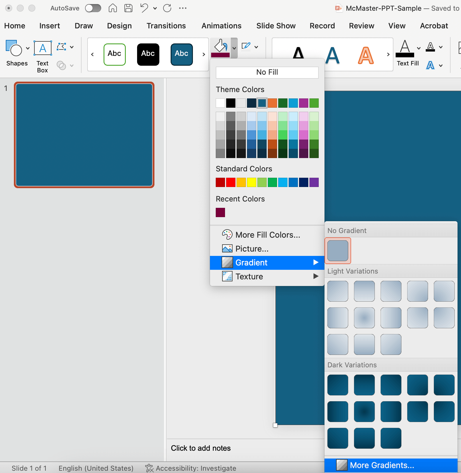
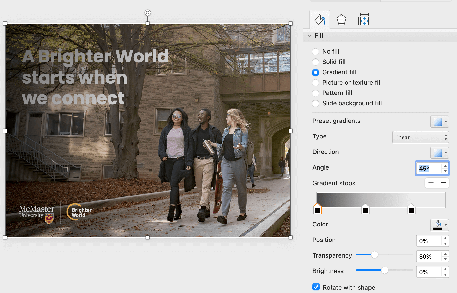
If there is not sufficient contrast between the copy and the photo, create a subtle gradient overlay to place between the copy and photo. Start by creating a shape the full size of your asset. Next, go into the “Fill” menu and select “Gradient”, “More Gradients…”
Select the “Gradient fill” option. Adjust the Angle, Gradients stops (and their colours), and the Transparency of each Gradient stop. In the example below the far left Gradient stop is set to 30% transparency, while the one on the right is set to 100% (fully transparent). It has also been positioned in from the right edge of the slider to keep a portion of the photo clear of the overlay. Use only black or white, and keep the overlay as minimal as possible, to provide contrast for the copy, but maintain as much of the natural image colour and vibrance as possible.
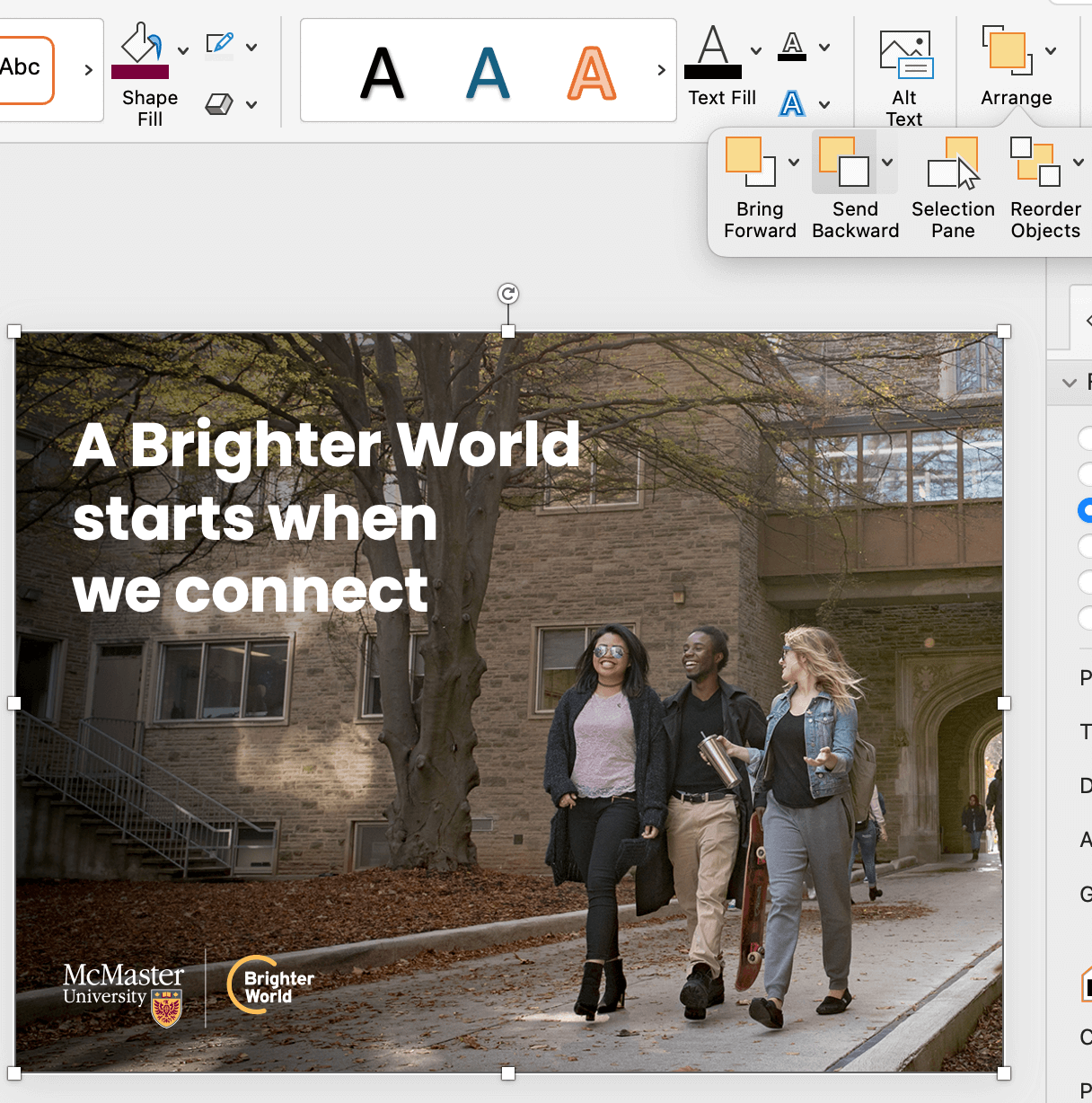
Once the gradient has been set up, use the “Send Backward” option in the top menu bar to position the gradient overlay behind the copy, as well as the logo (but in front of the photo).
 .
. 
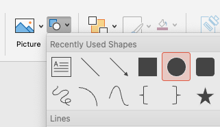
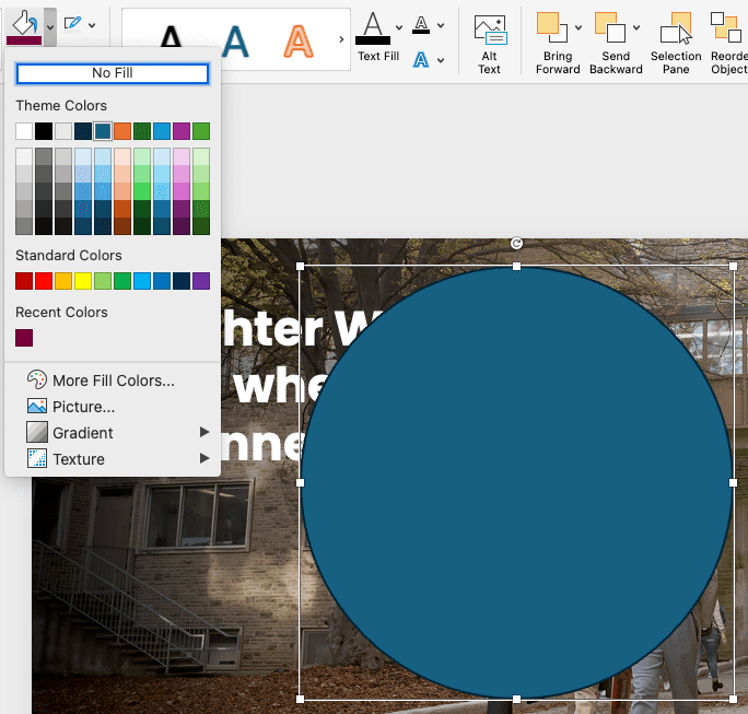
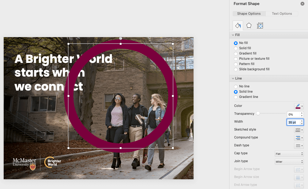
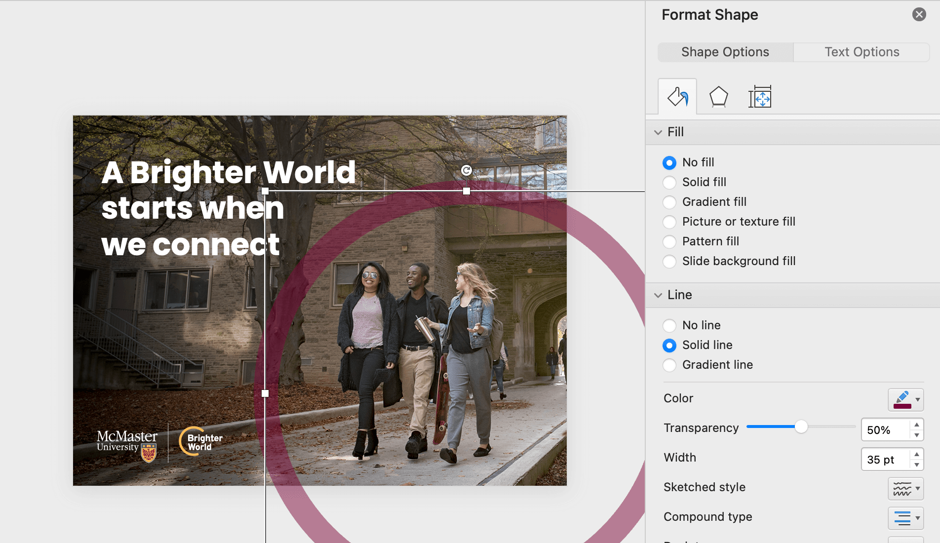
To create the circle element, insert a circle shape. Be sure to hold shift when drawing the circle to constrain the proportions and ensure it does not get stretched to an oval shape. Change the fill to “No Fill” and the outline to the desired colour (most likely Heritage Maroon). Open the Format Shape panel to adjust the stroke weight and the transparency. The stroke weight should be close to the height of the largest capital letters on the page. The transparency should be between 50-70%, depending on how dark the photo is. Position the circle element accordingly.
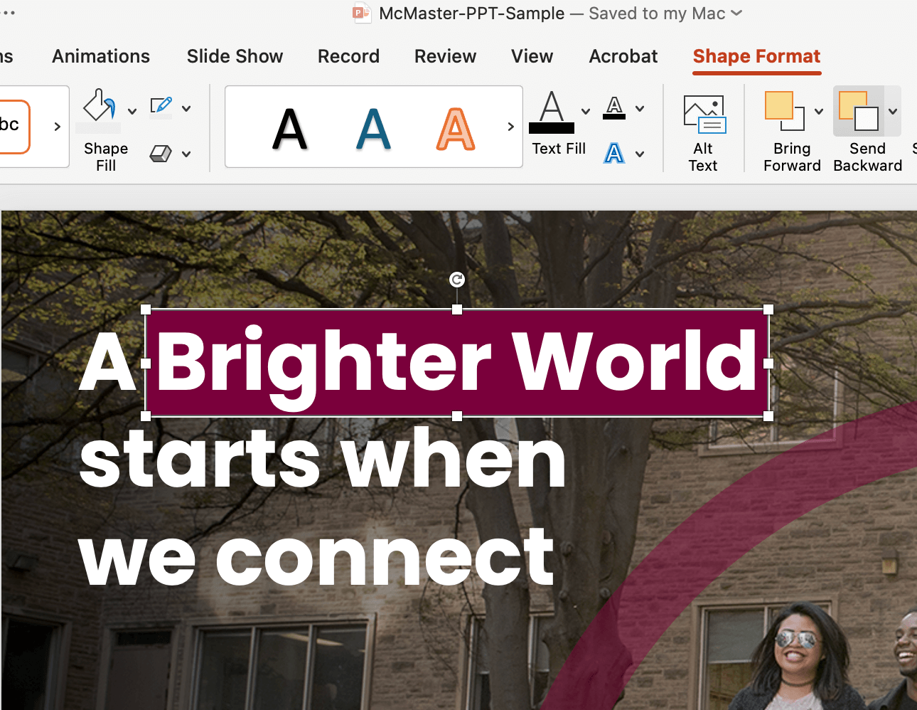
If the copy includes a positive benefit or outcome, this can be highlighted using the maroon box typography treatment. Create a rectangle shape slightly larger than the words you are highlighting. As a general guide, the space between the top, left, and right of the letters and the outside edge of the box should be the approximate thickness of a vertical bar in the letters. The space below the letters should be about double, to account for descending letters. Use the ‘Send Backwards’ tool to move the box behind the copy.
Your asset is complete!

Are you unsure how to check if your text has sufficient contrast on top of your background image? Download the Colour Contrast Analyzer tool for free at this link. Whenever possible, aim for AAA Web Content Accessibility Guideline (WCAG) compliance.
Collaborating with a colleague and need to communicate the accessibility of colour options? Use a tool like Color Review to create visual and text examples of a colour’s accessibility compliance.
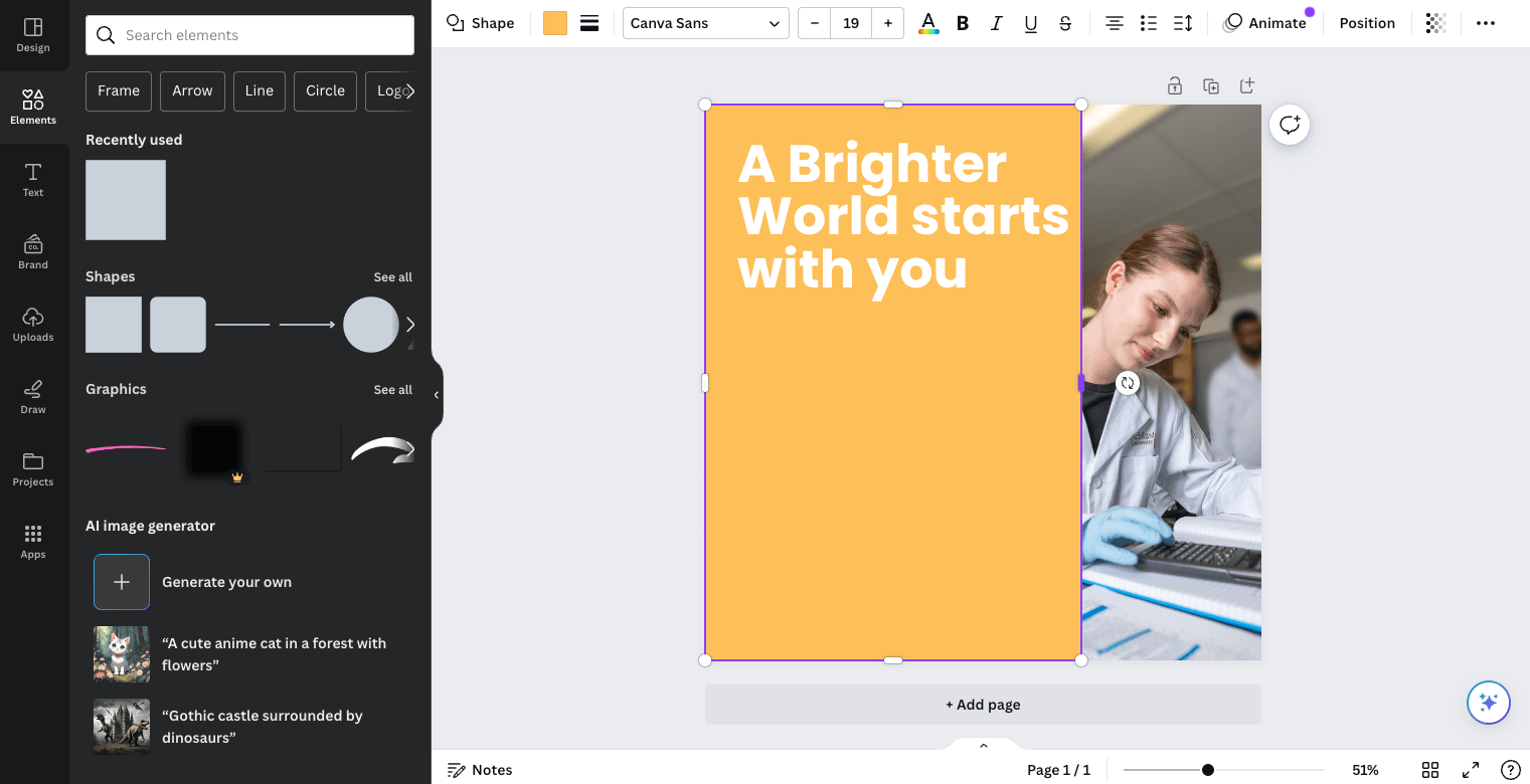
Once you have your page setup to the desired size, you can insert your photo of choice. When you are resizing an image, ensure you drag from the corner to maintain the aspect ratio. Additionally, ensure your subject is positioned in a way that allows for space for your other elements to sit.
Next, place your logo or logo lockup. Be sure to follow all logo rules when selecting the correct version (left or right alignment, colour or reversed, etc.). With your logo in place, you can insert a text box for the copy. Use the tool bar across the top to edit your text – the font, colour, line spacing, alignment, etc. Line spacing should be set to 1.
Note: Poppins may need to be downloaded and installed in order to be used within the application. You can download the font here.
![]()
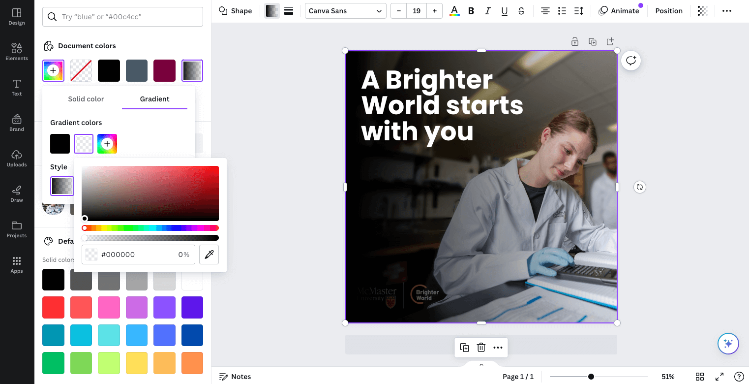
If there is not sufficient contrast between the copy and the photo, create a subtle gradient overlay to place between the copy and photo. Start by creating a shape the full size of the page. Next, use the tool bar across the top to adjust the fill, and the menu that pops up on the left to adjust the gradient colours and transparency.
Adjust the angle, gradient stops (and their colours), and the transparency of each gradient stop. In the example below, the far left gradient stop is set to 30% transparency, while the one on the right is set to 100% (fully transparent). It has also been positioned in from the right edge of the slider to keep a portion of the photo clear of the overlay. Use only black or white, and keep the overlay as minimal as possible, to provide contrast for the copy, while maintaining as much of the natural image colour and vibrance as possible.
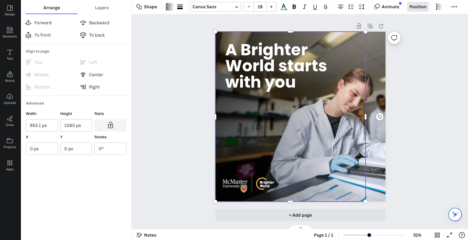
Once the gradient has been set up, use the “Position” option in the top menu bar and then “Backward” in the panel on the left, to position the gradient overlay behind the copy, as well as the logo (but in front of the photo).
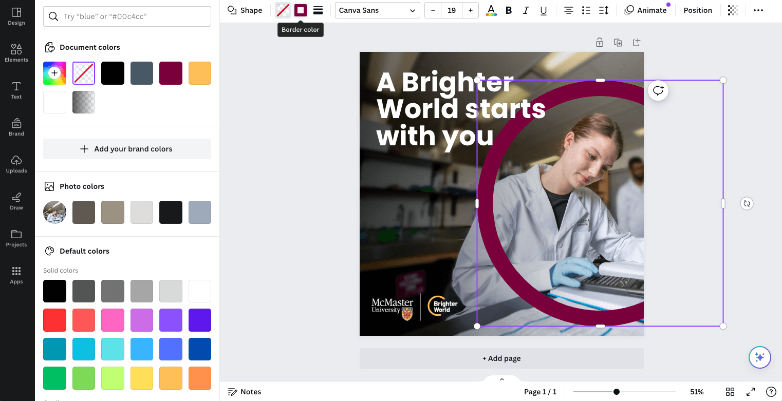
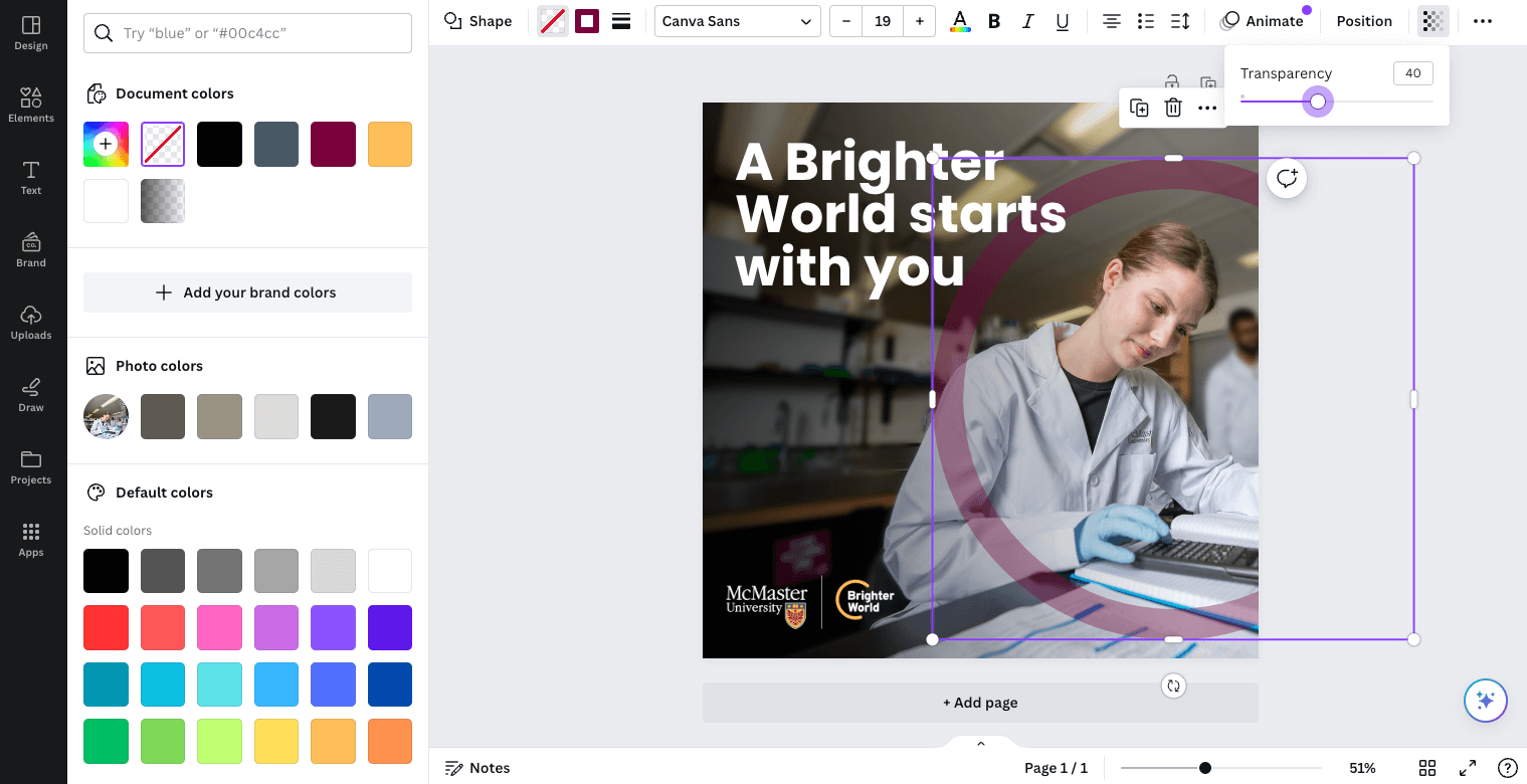
To create the circle element, insert a circle shape. Be sure to drag the corner to adjust the size of the circle to constrain the proportions and ensure it does not get stretched to an oval shape. Use the tool bar across the top to change the fill to “No Fill” and the outline to the desired colour (most likely Heritage Maroon). You can also adjust the stroke weight to be similar in thickness to the height of the largest capital letters on the page. The transparency can also be adjusted from the top toolbar and should be between 30-50%, depending on how dark the photo is. Position the circle element accordingly.
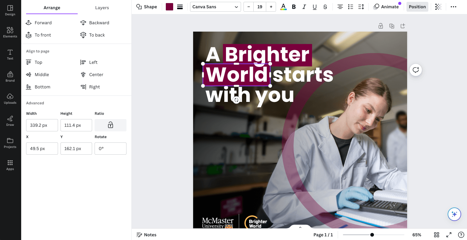
If the copy includes a positive benefit or outcome, this can be highlighted using the maroon box typography treatment. Create a rectangle shape slightly larger than the words you are highlighting. As a general guide, the space between the top, left, and right of the letters and the outside edge of the box should be the approximate thickness of a vertical
bar in the letters. The space below the letters should be about double, to account for descending letters. Use the ‘Backwards’ tool to move the box behind the copy.
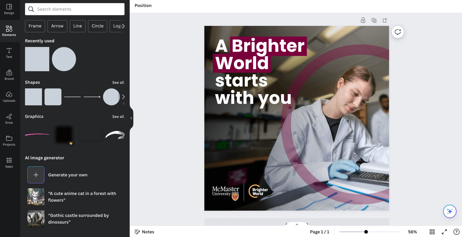
Your asset is complete!
Are you unsure how to check if your text has sufficient contrast on top of your background image? Download the Colour Contrast Analyzer tool for free at this link. Whenever possible, aim for AAA Web Content Accessibility Guideline (WCAG) compliance.
Collaborating with a colleague and need to communicate the accessibility of colour options? Use a tool like Color Review to create visual and text examples of a colour’s accessibility compliance.