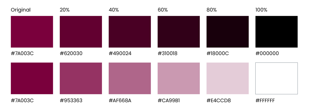
For decades, McMaster’s visual identity has been linked to our signature maroon. Brighter World embraces this tradition by featuring maroon as our primary colour, while introducing some new secondary colours to the mix.
Expandable List
Strengthen the McMaster brand by consistently using the McMaster colour palette. The rich hues convey tradition and stability. These colours are all reflected in the McMaster logo, an essential element of our brand identity. McMaster Heritage Maroon is the primary colour, and best represents the McMaster brand. It should always be the first choice of colour used in designs or layouts.
McMaster Heritage Maroon
If McMaster Heritage Maroon has been prominently used, secondary colours may be used for further visual interest and differentiation in the layout. If even more colour range is necessary, there is a collection of approved accent colours that can be explored. Continue reading for guidance on the use of these additional colours.
 |
|
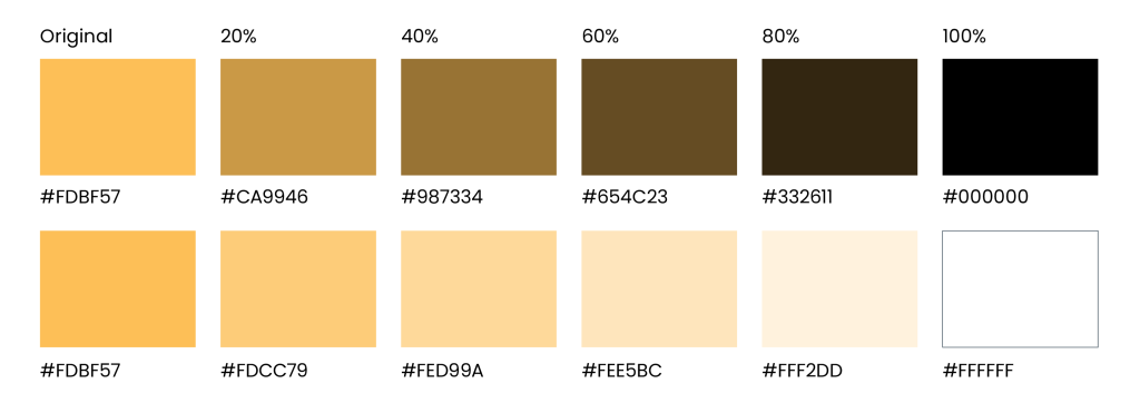
McMaster Heritage Gold
McMaster Heritage Gold should be the first additional colour choice after McMaster Heritage Maroon, ensuring McMaster Heritage Maroon is always the more prominent colour.
 |
|
McMaster Heritage Grey
McMaster Heritage Grey is part of the McMaster and Brighter World logos; however, it should not be used as a dominant design colour. It can be used for body copy in web and email applications as a softer alternative to black.
 |
|
Tints and shades
A tint is a lightened version of a colour, while a shade is a darkened version. Tints and shades of the McMaster Heritage colour palette (only) are allowed in select scenarios, such as tables and charts, when information should be separated to increase legibility or provide a hierarchy of information. Tints and shades of accent colours should not be used.
Tints and shades can be created by adding white or black to the original colour. Aim for 20% increments to ensure sufficient differentiation between each iteration.
Gold tints:
Maroon tints:
The primary and secondary colour palettes should be the dominant colours used for all external-facing assets, including documentation, web pages, graphics, ads, and more; this ensures the McMaster brand is clearly and consistently represented and reinforced in the community and beyond. When assets are developed for an internal audience, additional flexibility is available when it comes to the use of colours. While the primary and secondary colour palettes should still be the most prominent, a collection of accent colours has been carefully selected to complement the Heritage colour palette and each other. Developed to be vibrant and diverse and pay homage to the city of Hamilton, these colours help to reflect the Brighter World brand story and spirit of collaboration at the university.
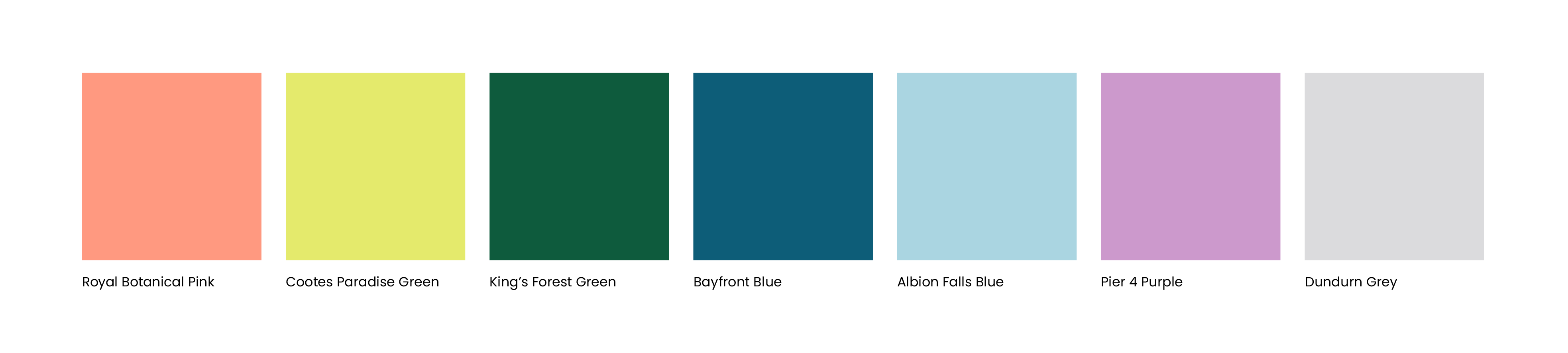
Royal Botanical Pink
 |
|
Cootes Paradise Green
 |
|
King’s Forest Green
 |
|
Bayfront Blue
 |
|
Albion Falls Blue
 |
|
Pier 4 Purple
 |
|
Dundurn Grey
 |
|
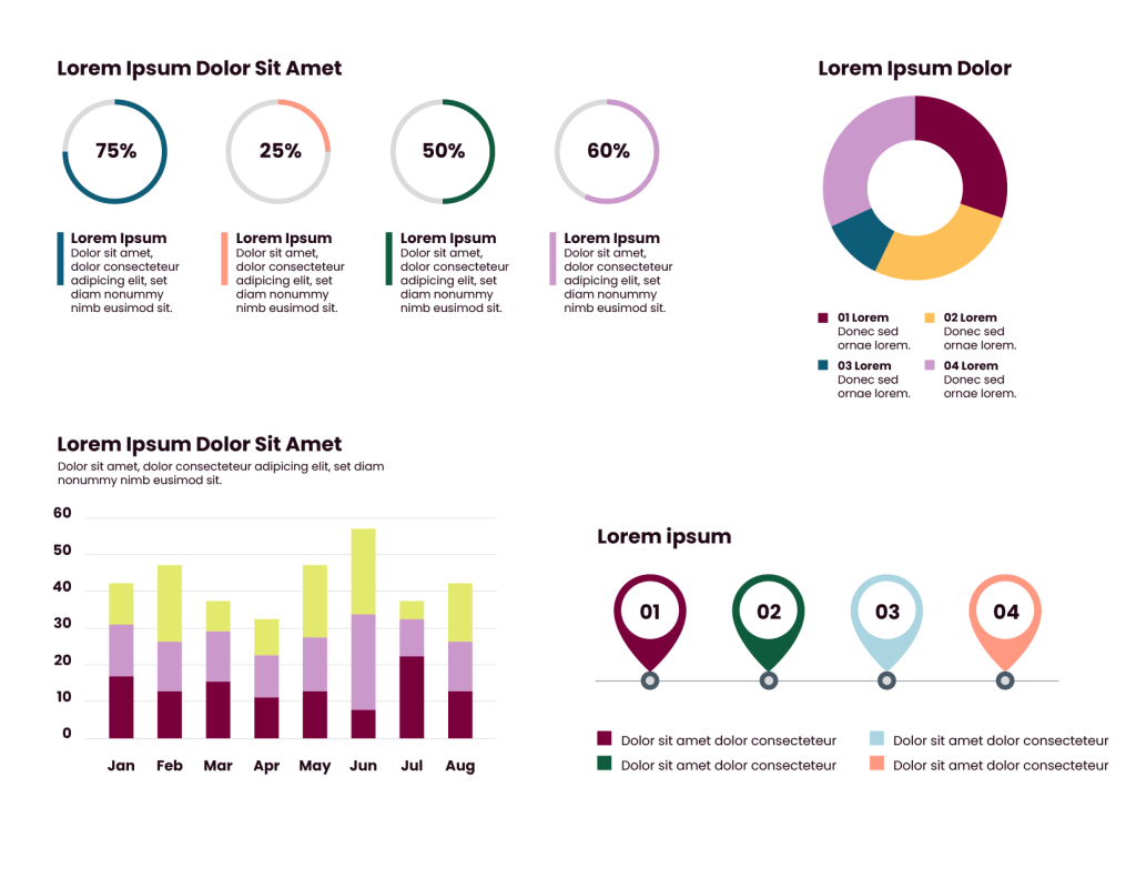
Brighter World accent colours should be reserved for scenarios where the primary and secondary colours have already been used, however, additional variations are still required for function or design. Examples include large or multi-page documents with the primary colours already heavily used, data-driven documents with charts and graphs, or infographics. Accent colours can be used independently in charts or graphs or mixed in with primary and secondary colours. Creative assets being developed exclusively for an internal audience can have more flexibility with the use of the accent colour palette. However, the creative should still include primary and secondary colours to ensure brand consistency.
Brighter World accent colours can be used sparingly after primary and secondary colours are predominant. They are ideal for small details such as icons, callout boxes and stats, especially within multiple-page documents.
When building a multipage document, accent colours should be limited to one or two colours per page. When two pages are facing each other (a “spread”), this should be treated the same, only using one or two accent colours across the two pages.
Do Not:
- Use accent colours more dominantly than primary and secondary colours.
- Use accent colours to create the circle element.
Sufficient colour contrast is crucial for accessibility. It ensures that individuals with various visual abilities easily perceive visual content. Inadequate contrast makes it difficult for people with impairments to read or understand information accurately. By providing sufficient contrast, designers can make their content more inclusive, allowing all users to easily access and navigate digital experiences. Adhering to colour contrast guidelines enhances legibility and usability for a broader audience, resulting in a better user experience.
More flexibility is available when using the accent colour palette for items that are simply adding visual interest to an asset. However, when these colours are used for elements that are critical to the message or context of the asset, follow these guidelines:
On a white background, the following colours have sufficient contrast:

On a black background, the following colours have sufficient contrast:

Black icons can be used on the following coloured backgrounds:
White icons can be used on the following coloured backgrounds:
While they are not built into the colour palette, black and white are available as neutral colours. They will be the primary colours for copy on most assets, selected accordingly based on how dark or light the image is; this will ensure proper contrast and legibility. Black and white can also be used as background colours.