The Brighter World logo is representative of every facet of the McMaster experience. Whether you’re a student, a staff member, a researcher or faculty, Brighter World is for you. Featuring a modern font and circle element, the evolved Brighter World logo symbolizes the inclusivity and collaboration that makes McMaster such a special place.
Expandable List
The Brighter World logo always appears as shown below. Always use the artwork files that are provided. The logos below use McMaster Heritage Maroon, McMaster Heritage Grey, McMaster Heritage Gold, and white. The single-colour logo, in either black or white, can be used when the full-colour logo cannot be reproduced. It is ideal for single-colour printing, etching, stamping, engraving, and embossing.
You can download the updated Brighter World logo suite from the Brand Resource Library > Logos > Brighter World.
DO NOT:
- Manually type the words Brighter World
- Centre or right align
- Replace the colour
- Change the font



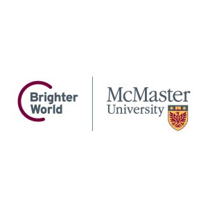
Using the Brighter World logo with the McMaster logo in the following combinations reinforces our brand personality – in print materials, on banners and in online communications. The arrangement of the elements must adhere to the guidelines specified below. When using any McMaster logo lockup, the McMaster logo must be on the outer side of the asset (closest to the edge of the page or artboard). When the logo lockup is centred on a page, the McMaster logo should be on the left side. Left and right logo lockup versions are available to accommodate this.
Horizontal logo arrangements







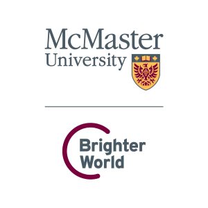
If the physical dimension of the layout is narrow and doesn’t allow for the horizontal arrangement of the logo, a vertical arrangement of the logo with the McMaster logo should be used as demonstrated below.
Always use the artwork files that are provided. The logos below use McMaster Heritage Maroon, McMaster Heritage Grey, McMaster Heritage Gold, and white. The single-colour logo, in either black or white, can be used when the full-colour logo cannot be reproduced. It is ideal for single-colour printing, etching, stamping, engraving, and embossing.
Stacked (vertical) logo arrangements



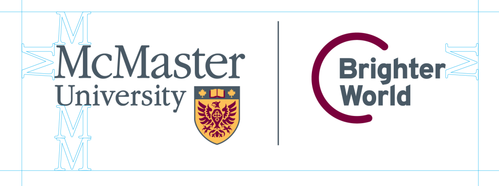
To ensure the integrity of the Brighter World logo, it is surrounded by a clear space. Do not crowd this clear space with typography, imagery, or any other elements except in approved logo lockups. The following shows the minimum amount of clear space surrounding the McMaster logo. Use the same guideline to maintain the protected space in other McMaster logo applications, regardless of the number of colours used to reproduce it.
When including a URL (either mcmaster.ca, or any other specific faculty or department) alongside the Brighter World logo lockup, the URL baseline should align with the logos as shown below. The URL should be a minimum of two “M heights” away from the edge of the Brighter World logo. The URL font should be lowercase matching the logos’ lowercase character height and in Poppins font. The URL colour may differ depending on print or digital application, but should be grey or maroon.
McMaster logo left

McMaster logo right

