Overview
Consistent logo use is critical to reinforce brand recognition across a range of platforms and communications. Maintaining uniformity in logo application inspires a professional image that resonates with our partners, enhancing trust and credibility in the brand.
McMaster University’s iconic logo was updated for accessibility in 2024, increasing the space between the letters for better legibility, particularly when used at a smaller size.
The evolved Brighter World logo includes a modern new font and circle element that symbolizes inclusivity and collaboration.
In this section, you’ll learn more about proper logo usage, as well as have the ability to download McMaster logos and logos for various institutions, groups and centres around campus.
Information Box Group

Keep McMaster's logo intact
The traditional McMaster logo consists of two elements: the McMaster University wordmark and the shield. These elements have a fixed relationship and must never be separated, modified or altered in any way.

How to use McMaster's logo
The McMaster logo represents McMaster’s dedication to collaboration and our strong history of innovation. It’s important that it appears on all official materials, documents or communications produced by the University.

Brighter World is for everyone
The Brighter World logo is representative of every facet of the McMaster experience. Whether you’re a student, a staff member, a researcher or faculty, Brighter World is for you. The Brighter World logo can be used in a lockup with the McMaster logo, or on its own, as long as the McMaster logo also appears somewhere in the creative.
Brand Resource Library
Our searchable library of tools and templates includes logo, templates, photography and video files.
The McMaster Logo
The McMaster logo represents McMaster’s dedication to collaboration and our strong history of innovation.
It’s important that the McMaster logo appears on all official materials, documents or communications produced by or for the University. The McMaster logo consists of two elements: the McMaster lettering wordmark (in the Garamond typeface) and the shield. These elements have a fixed relationship and must never be separated, modified or altered in any way and must be presented in approved colours and font only as outlined in these guidelines. The McMaster logo may not be used for commercial use or by any unauthorized individual or organization.

Expandable List
To improve accessibility and readability, the kerning, or spacing between the letters of the McMaster logo, has been increased.
You can download the updated McMaster logo suite from the Brand Resource Library > Logos > McMaster University.
To have an approved logo lockup suites created, please contact brandmrk@mcmaster.ca.
Logo updated January 2024. Please ensure the latest logo version is being used.
Do not:
- Alter the size, relationship or position of the type or the shield in the McMaster logo
- Alter the colour of any part of the McMaster logo beyond the approved variations provided in this guideline
- Overprint type or photos, or place elements over the McMaster logo
- Add borders or other graphic elements to the McMaster logo
- Separate the elements of the McMaster logo
- Lockup with existing Faculty symbol
- Create your own custom logo lockups

The approved McMaster logo colour variations are illustrated below. When possible, the full-colour version is always preferred. Always use the artwork files that are provided. The logos below use McMaster Heritage Maroon, McMaster Heritage Grey, McMaster Heritage Gold, and white. The single-colour logo, in either black or white, can be used when the full-colour logo cannot be reproduced. It is ideal for single-colour printing, etching, stamping, engraving, and embossing.


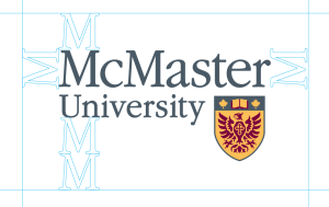
To ensure the integrity of the McMaster logo, it is surrounded by a clear space. Do not crowd this clear space with typography, imagery, or any other elements except in approved logo lockups. The following shows the minimum amount of clear space surrounding the McMaster logo. Use the same guideline to maintain the protected space in other McMaster logo applications, regardless of the number of colours used to reproduce it.
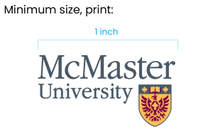
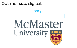
Minimum size requirements have been created to ensure the legibility of the McMaster logo and the Brighter World logo. However, the requirements may differ depending on the medium and process used for print. Always use vector-based master art for reproductions, ensuring sharpness at any scale, especially at the minimum size. Pay strict attention to the legibility of the logo. For this reason, the McMaster logo should never be smaller than the size specified below when printed at the optimum resolution of at least 300 dpi or on-screen when displayed on a calibrated screen.

McMaster University is one of Canada’s historic and most prestigious public research universities, it was officially created through an Act of the Ontario Legislative Assembly that received royal assent in 1887. This legacy should be strategically emphasized in a closer arrangement with the McMaster logo.
This arrangement should only be used in special circumstances, when the prestigious history of the university needs to be the leading message, as on the Viewbook cover.
DO NOT:
- Manually type “Since 1887”
- Rearrange the elements
- Replace the colour
- Change the font

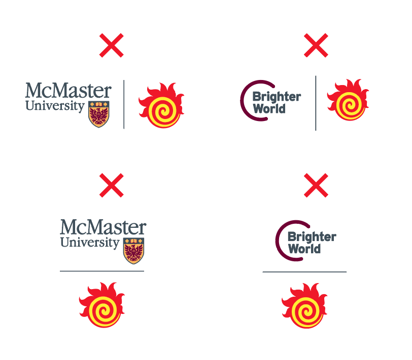
Existing Faculty symbols are permitted for use but should always be unlocked with the McMaster logo (or subsequent logos) or the Brighter World logo. It can only be used when it’s placed at a significant distance from the McMaster logo and Brighter World logo so that it is clear that it’s not part of those lockups.
The McMaster logo may not be used for commercial use or by any unauthorized individual or organization. The use of the McMaster name and any McMaster logos require written approval from the McMaster Marketing team. All partners and/or vendors are required to complete and sign the McMaster Trademark License Agreement.
To request the use of the McMaster name and logo, please contact: brandmrk@mcmaster.ca
Brighter World Logo
It takes everyone to create a Brighter World.
The Brighter World logo is representative of every facet of the McMaster experience. Whether you’re a student, a staff member, a researcher or faculty, Brighter World is for you. Featuring a modern font and circle element, the evolved Brighter World logo symbolizes the inclusivity and collaboration that makes McMaster such a special place.
Expandable List
The Brighter World logo always appears as shown below. Always use the artwork files that are provided. The logos below use McMaster Heritage Maroon, McMaster Heritage Grey, McMaster Heritage Gold, and white. The single-colour logo, in either black or white, can be used when the full-colour logo cannot be reproduced. It is ideal for single-colour printing, etching, stamping, engraving, and embossing.
You can download the updated Brighter World logo suite from the Brand Resource Library > Logos > Brighter World.
DO NOT:
- Manually type the words Brighter World
- Centre or right align
- Replace the colour
- Change the font




Using the Brighter World logo with the McMaster logo in the following combinations reinforces our brand personality – in print materials, on banners and in online communications. The arrangement of the elements must adhere to the guidelines specified below. When using any McMaster logo lockup, the McMaster logo must be on the outer side of the asset (closest to the edge of the page or artboard). When the logo lockup is centred on a page, the McMaster logo should be on the left side. Left and right logo lockup versions are available to accommodate this.
Horizontal logo arrangements




If the physical dimension of the layout is narrow and doesn’t allow for the horizontal arrangement of the logo, a vertical arrangement of the logo with the McMaster logo should be used as demonstrated below.
Always use the artwork files that are provided. The logos below use McMaster Heritage Maroon, McMaster Heritage Grey, McMaster Heritage Gold, and white. The single-colour logo, in either black or white, can be used when the full-colour logo cannot be reproduced. It is ideal for single-colour printing, etching, stamping, engraving, and embossing.
Stacked (vertical) logo arrangements


To ensure the integrity of the Brighter World logo, it is surrounded by a clear space. Do not crowd this clear space with typography, imagery, or any other elements except in approved logo lockups. The following shows the minimum amount of clear space surrounding the McMaster logo. Use the same guideline to maintain the protected space in other McMaster logo applications, regardless of the number of colours used to reproduce it.
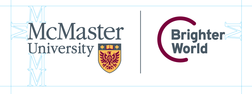
When including a URL (either mcmaster.ca, or any other specific faculty or department) alongside the Brighter World logo lockup, the URL baseline should align with the logos as shown below. The URL should be a minimum of two “M heights” away from the edge of the Brighter World logo. The URL font should be lowercase matching the logos’ lowercase character height and in Poppins font. The URL colour may differ depending on print or digital application, but should be grey or maroon.
McMaster logo left

McMaster logo right


Logo Lockups
Logo lockups highlight the collaboration at the heart of McMaster University.
Approved McMaster University logo lockups are available at various levels including faculties, departments, divisions, approved administrative units and research institutes and centres.
- Logos are produced in full colour, black, white, reverse out, right-aligned, left-aligned and vertical.
- When possible, the full-colour version logo is always preferred.
- Always use the logo files that are provided.
- Updated logo assets can be found in the Logo file on the Resource Library.
To request an approved McMaster logo lockup and logo suite, please complete the Logo Request Form. Your request will be reviewed by the university brand team in consultation with the appropriate faculty or administrative unit.

Below, you’ll find everything you need to know about logo lockups.
Expandable List
To ensure the integrity of the McMaster logo lockups, it is surrounded by a clear space. Do not crowd this clear space with typography, imagery, or any other elements except in approved logo lockups. The following shows the minimum amount of clear space surrounding the McMaster logo. Use the same guideline to maintain the protected space in other McMaster logo applications, regardless of the number of colours used to reproduce it.

When using any McMaster logo lockup, the McMaster logo must be on the outer side of the asset (closest to the edge of the page or artboard). When the logo lockup is centred on a page, the McMaster logo should be on the left side. Left, right vertical logo lockup versions are available to accommodate these placements.
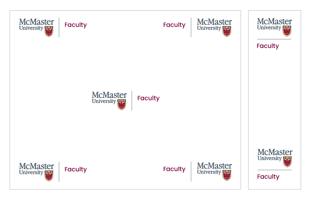
When combining multiple McMaster logo lockups, it is best practice to revert to the McMaster logo by itself and use the copy within the body text to explain any relationships between multiple faculty or departments. Using the McMaster logo on its own maintains the integrity of the McMaster brand.
When featuring multiple departments within the same faculties, it is best practice to revert to the primary faculty logo lockup, maintaining the strength and integrity of the faculty brand.

When multiple faculties are being represented, stacked faculty logos can be combined up to a maximum of three levels.

When featuring multiple department level logos, the groups should be grey, uppercase and lowercase in the Poppins font.

For multiple logos on event posters ideally use the primary faculty logos. Alternatively, list out all group sponsors in grey, uppercase and lowercase in the Poppins font leading with the copy, “In partnership with.”

In certain cases, a school logo can be separated from the McMaster faculty logo lock-up. The lockup can be used when the school logo need to be highlighted more prominently, the logos need to be enlarged, or if the McMaster logo will be repeated multiple times on the same creative.


To request an approved McMaster logo lockup and logo suite, please complete the Logo Request Form.
Research institutes and centres can include a graphical mark within a McMaster logo lockup. When locked up with the McMaster logo, removing the word “McMaster” from within the research institute or centre lockup is strongly recommended. However, it is encouraged to continue using the original name in any written copy, such as McMaster Research Institute/Centre (MRIC).


In certain cases, the research institute or centre logo can be separated from the McMaster faculty logo lock-up. The lockup can be used when the research institute or centre logos need to be highlighted more prominently, the logos need to be enlarged, or if the McMaster logo will be repeated multiple times on the same creative.


To request an approved McMaster logo lockup and logo suite, please complete the Logo Request Form.
Partner Logos
Collaborating with partners beyond our campus borders.
We are determined to advance human and societal health and well-being for all. It’s a bold vision where people with diverse talents work together to solve important challenges and build a brighter world. Part of this mission means collaborating with local, national and global partners to solve the world’s most complex challenges. Below, you’ll find everything you need to know about creating partnership logos.
Expandable List
When partnering with other affiliated organizations, the McMaster logo should remain separate and its own logo lockup. Rather than a dividing line, visual space should be used to separate affiliated organizations. When used with a McMaster logo lockup, the dividing line acts as an umbrella for all entities that exist only within McMaster University as an institution. Common affiliated organization logo lockups can be found on the Brand Resource Library.

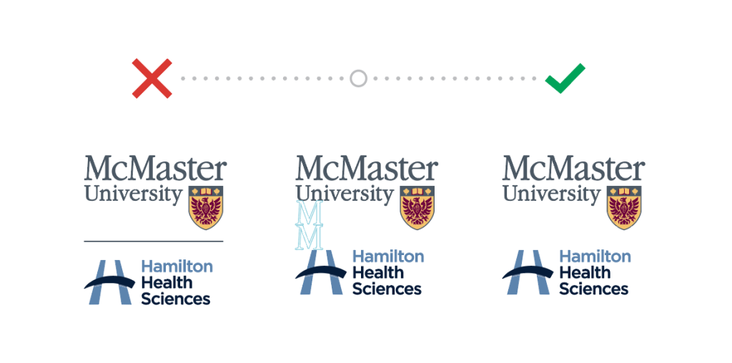

When a research institute or centre is affiliated with both McMaster and a partner institution, such as a hospital, the logo lockup should be created with both logos, followed by the vertical bar and the research institute or centre name, with or without a secondary mark.
Please note that the spacing on either side of the vertical bar in the horizontal lockup will be equal to the spacing between the McMaster and the partner institution logo combination. This spacing is larger than the standard research institute and centre secondary mark logo lock up.
The order of the McMaster University and partner institution logos can be switched depending on who the communication is being sent from.
The preferred logo lockup in the horizontal layout:

Alternatively, a stacked logo lockup can be used.

To have an approved McMaster logo lockup suite created, please contact: brandmrk@mcmaster.ca.
