Typography
McMaster’s primary corporate font is Poppins. However, since Poppins is not a font that will automatically be on everyone’s system, emails will use the secondary font, Arial. A system font ensures that the email typeface appears consistently across all devices. Arial has been selected as a clean, sans-serif font that aligns well with the McMaster brand.
These font styles should be used for headlines and subheads when creating an email.
H1
Used on hero banners.
Font: Arial Bold 28/32
Colour: #7A003C (maroon)

H2
Used on section titles for subheads, in sentence case.
Font: Arial Bold 24/28
Colour: #000 (black)

H3
Used on section titles for subheads and CTA sections, in sentence case.
Font: Arial Bold 20/24
Colour: #000 (black)

Font: Arial Regular 16/20
Colour: #000 (black)
Link Copy: #7A003C (maroon)
Font: Arial Regular 16/20 (List spacing: 16)
Colour: #000 (black)
![]()
Font: Arial Regular 12/16
Colour: #000 (black)
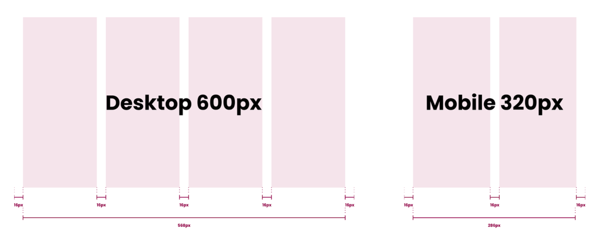
All McMaster emails should follow a four column grid layout (two columns for mobile), with a max-width of 600px, and a gutter of 16px. All content should fall inline with the columns, unless otherwise stated (i.e. CTA and header image backgrounds). This will ensure that all content is easily legible on any device.

Logo
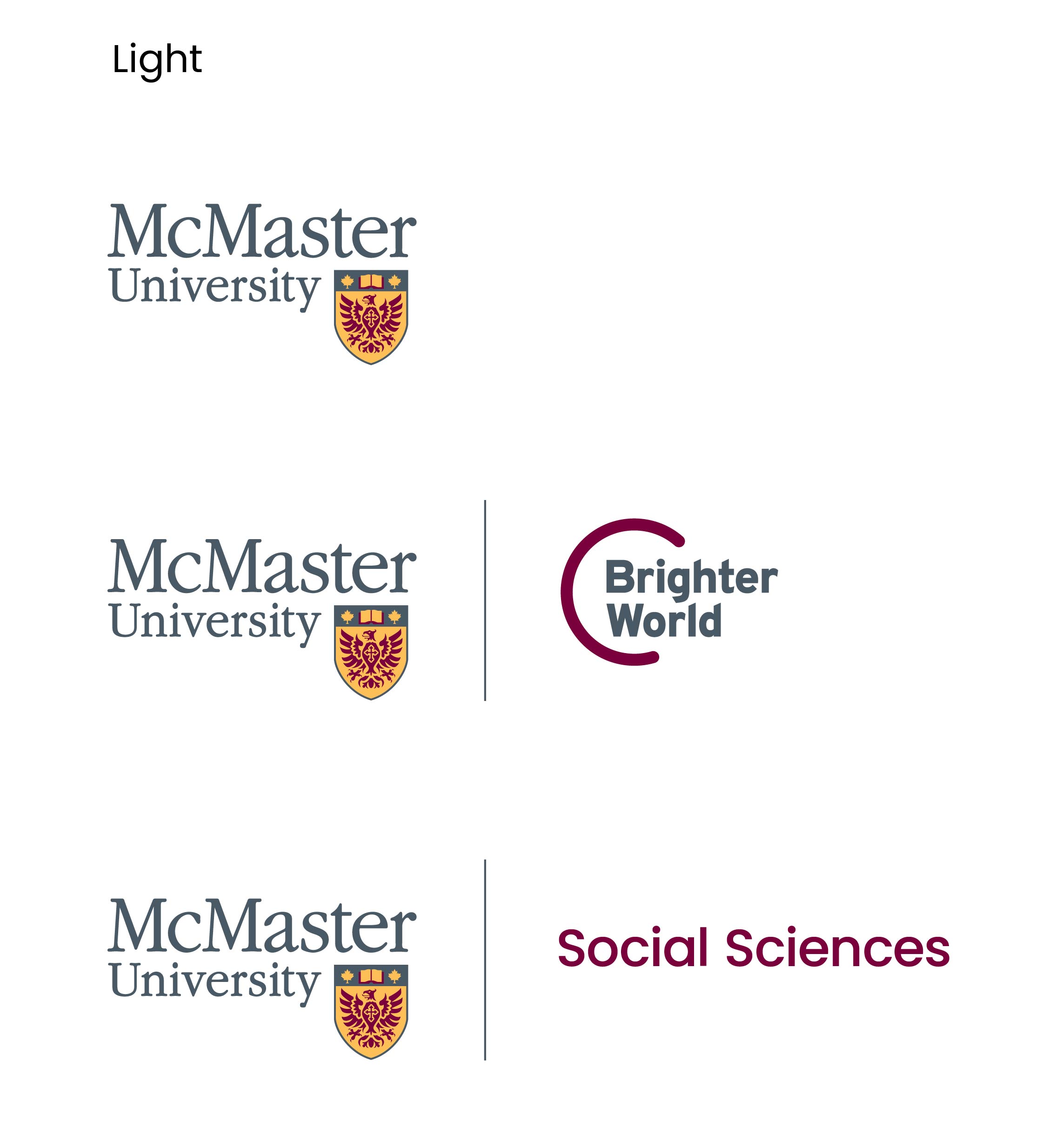
Logos are available in both full colour and reversed versions to ensure maximum accessibility.
The McMaster logo should only be visible in two locations: the header and the footer. In the footer, the Brighter World logo (solo) is always visible, while the header logo switches between faculty/programs, or the main McMaster logo.
The McMaster logo can stand on its own, or be accompanied by the Brighter World logo or a faculty/program name.
The maximum height the logo can appear on emails is 43px, with the width auto-adjusting (depending on the logo).
