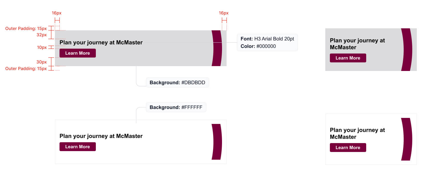
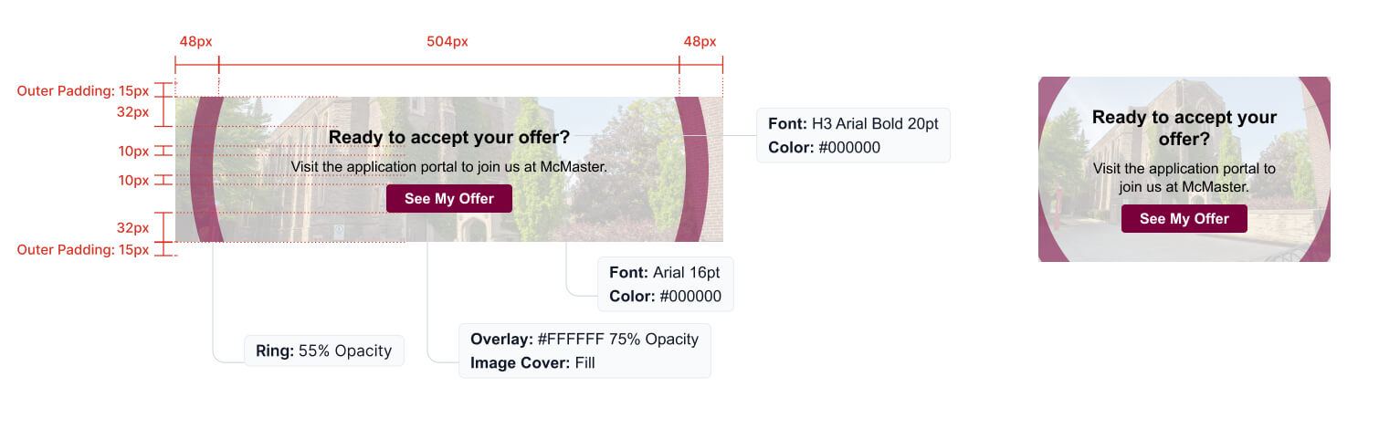
Skip to McMaster Navigation Skip to Site Navigation Skip to main content

CTA and banners

Drive engagement in your emails with strong branded CTAs and banners.

Call to action

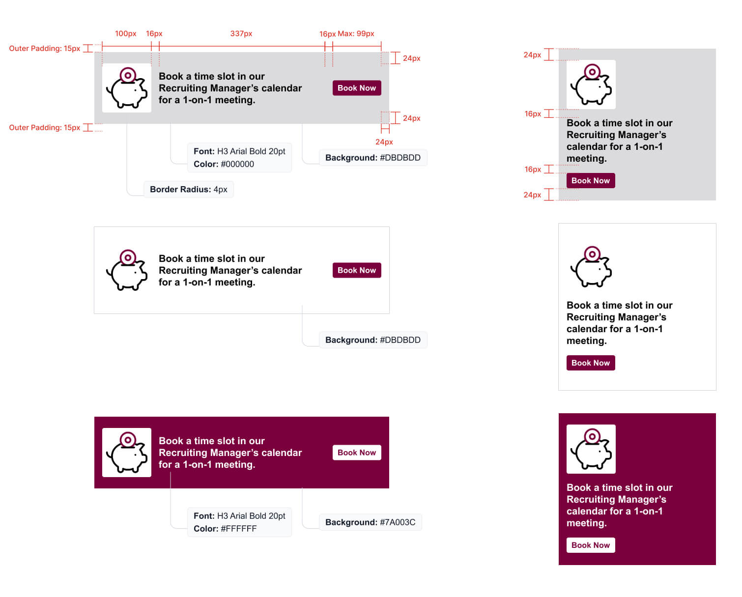
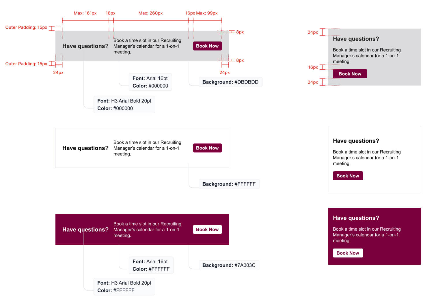
Call to action, or CTA, banners are a critical aspect of an email, as they provide the reader with an action to take to continue on their journey. Ensuring that CTAs are easy to identify and use is critical. Following the examples below to maintain a consistent look for CTAs across email and web will help to provide a seamless experience for the end user.

H3 font style is used for CTA banners and there are three background colours available for CTA banners (#000000, #7A003C and #DBDBDD)

If you use an image for the background of a CTA, it should be at 75% opacity.

Two different examples of a text-only CTA banner with the brand circle element are showcased in white/maroon and grey/maroon on both desktop and mobile.

And example of an image CTA banner with an image background and branded circle element on both desktop and mobile.

Three examples on both desktop and mobile of an icon and text CTA banner are showcased in grey/maroon, white/maroon, and maroon/white on both desktop and mobile.

Two different examples of a text-only CTA banner are showcased in white/maroon and grey/maroon on both desktop and mobile.

Banners

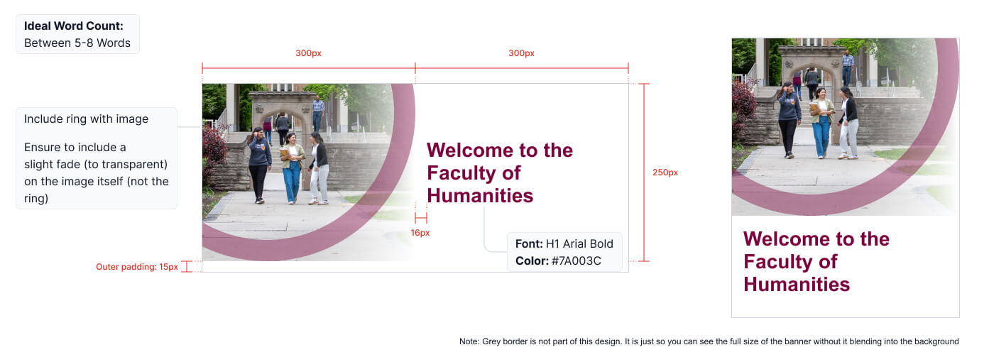
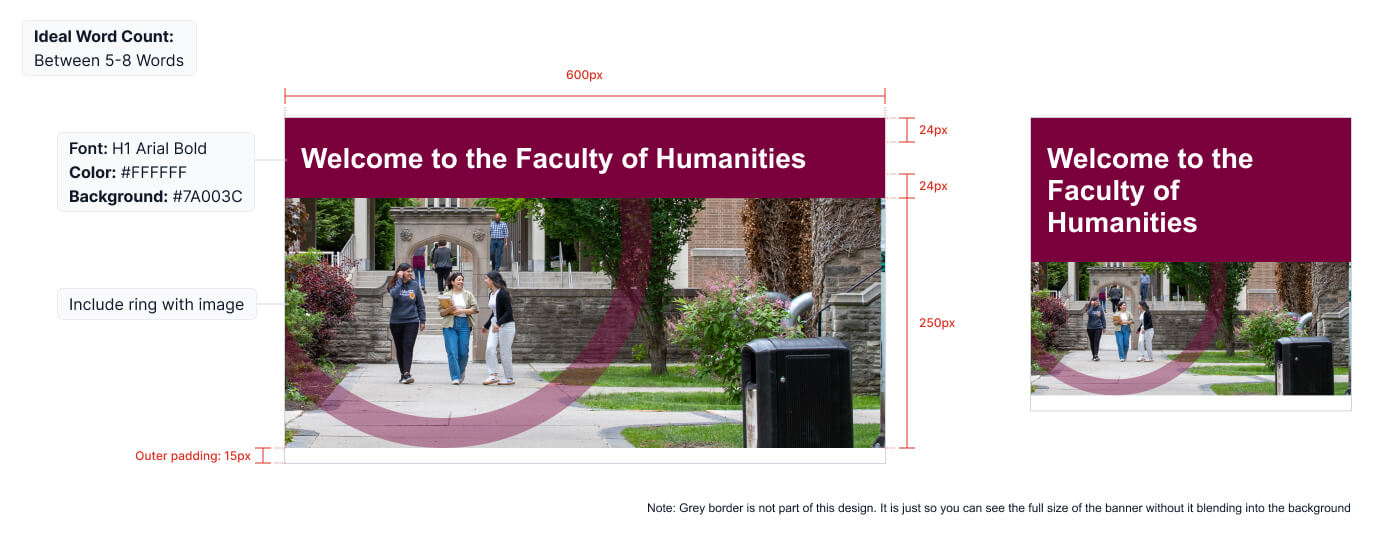
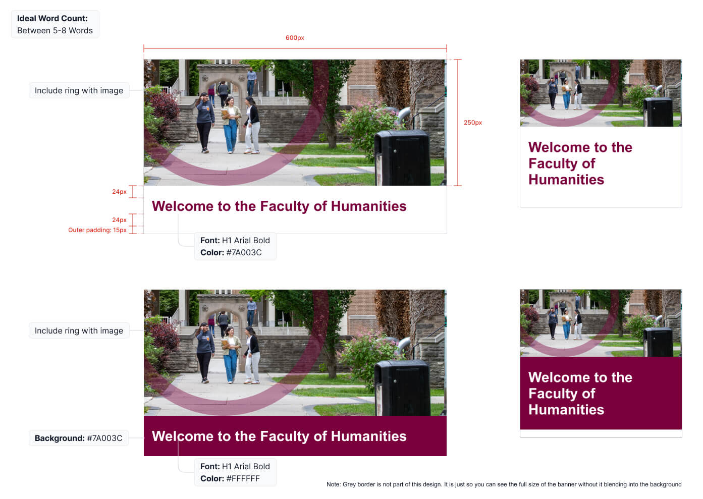
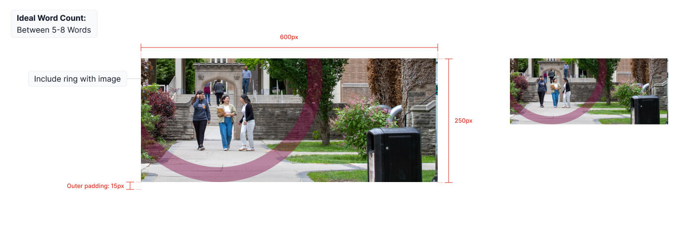
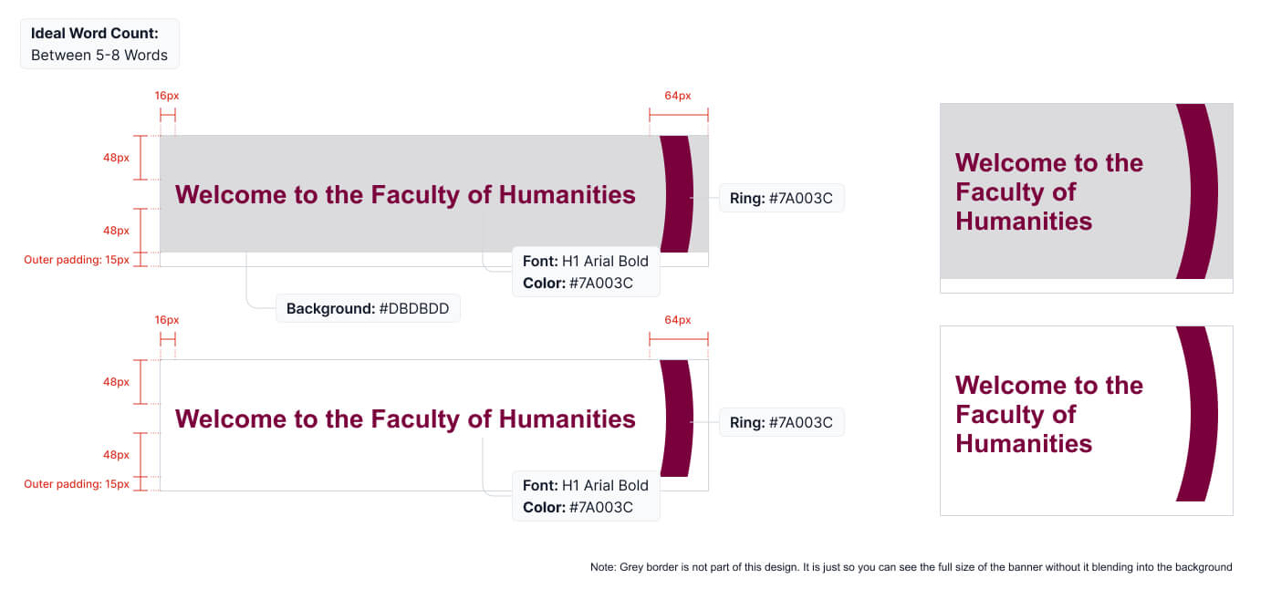
As the first part of the email that viewers will see and read, hero banners play an important role in encouraging the viewer to continue reading. This is also an important area to align to brand guidelines. Follow these rules when creating hero banners:

  • The circle element should be used on images where it works and makes sense. Refer to the Visual Expression section of the McMaster Brand Guidelines for more information.
  • Copy should always remain as live type, not an image, to ensure it can be read by a screen reader in order to meet accessibility requirements.
  • Keep headline copy as short and simple as possible, ideally around 5-8 words.
  • An image should be included when possible, but in cases where one is not available, a header banner can be created with only copy and graphic elements, as shown below.
  • When using the hero banner with an image on the left hand side only, you should include slight transparent fade on the image itself (not on the ring)
  • Note: Grey outline on images below are not part of the design and are only included for contrast with the background in the example format.

Hero Banner showcased on desktop and mobile. The desktop version showcases a left-aligned image with the branded circle element overlaid and maroon Header text to the right. On mobile, the image is on top and the Header text is below it.

Hero Banner showcased on desktop and mobile. The Hero banner consists of white Header text on a maroon background with the Hero image below it with transparent brighter way overlay.

Two different Hero Banners are showcased on desktop and mobile. One Hero banner has a Hero image on top with maroon Header text on a white background below it. The second example has a Hero image on top with white Header text on a maroon background below it. Both have transparent brighter way overlay on image.

Hero Banner showcased on desktop and mobile. The Hero Banner is an image of McMaster students with the transparent Brighter World circle overlay.

Two different Hero Banners are showcased on desktop and mobile. The first Hero Banner has maroon text on a grey background with the Brighter World circle accent. The second Hero Banner has maroon text on a white background with the Brighter World circle accent.

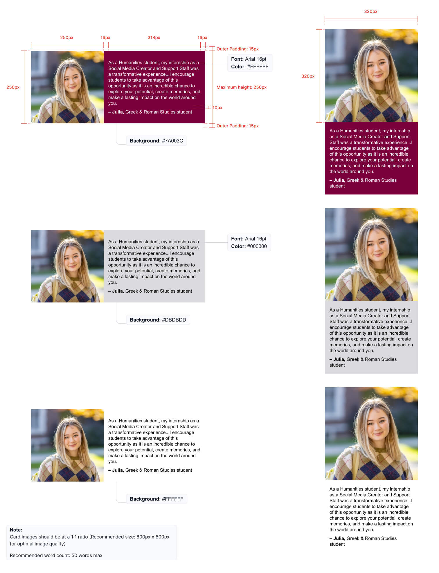
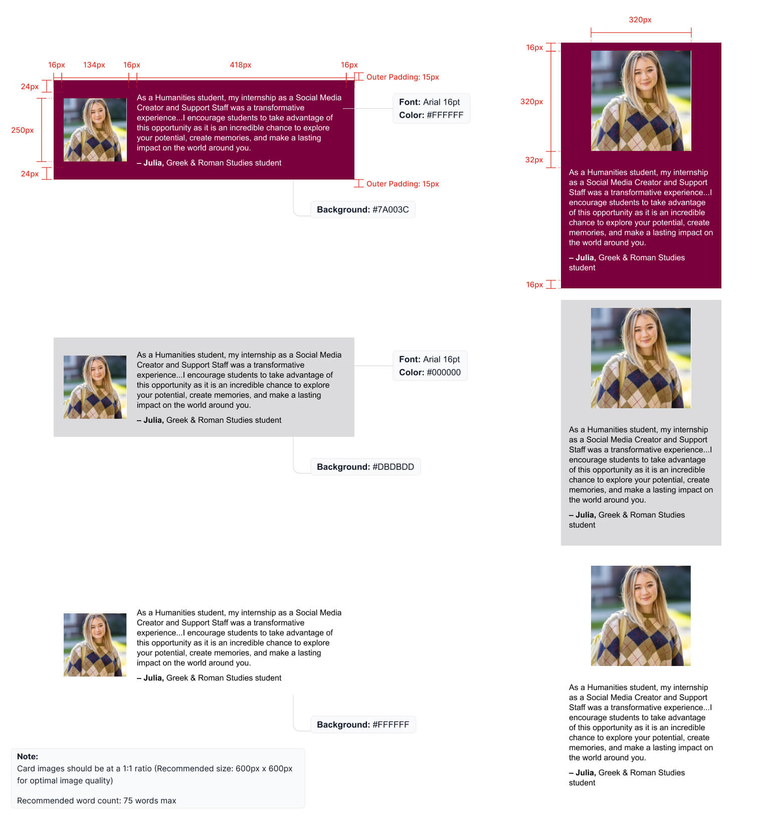
Including quotes from students and faculty helps to promote the authenticity of the McMaster brand. When adding quote banners, follow the examples shown below.

  • Card images should be at a 1:1 ration (recommended size of 600px x 600 px for optimal image quality)
  • Recommended word count for the small size quote banner is 50
  • Recommended word count for the large size quote banner is 75

Three different examples of a student Quote are shown on desktop and mobile. The desktop versions have the student's headshot to the left and the text on the right, whereas the mobile versions have the headshot on top and the quote below. The first example has a maroon background with white text. The second has a grey background with black text. The third has a white background with black text.

Three different examples of a student Quote are shown on desktop and mobile. The desktop versions have the student's headshot to the left and the text on the right, whereas the mobile versions have the headshot on top and the quote below. The first example has a maroon background with white text. The second has a grey background with black text. The third has a white background with black text.