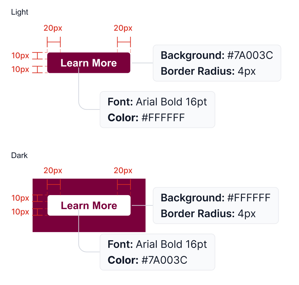
Buttons
Call to action (CTA) buttons indicate that the user can perform an action. Typically used in CTA banners, these buttons need to be consistent, clear and simple in order to guide users to the next step. Copy within a button should be Title Case, centred, and not exceed 20 characters, to keep the message clear and succinct. Copy should always be live text, not an image. See examples of primary buttons in a default and hover state.
For email platforms that allow customization of button hover states, follow the below guidelines.
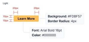
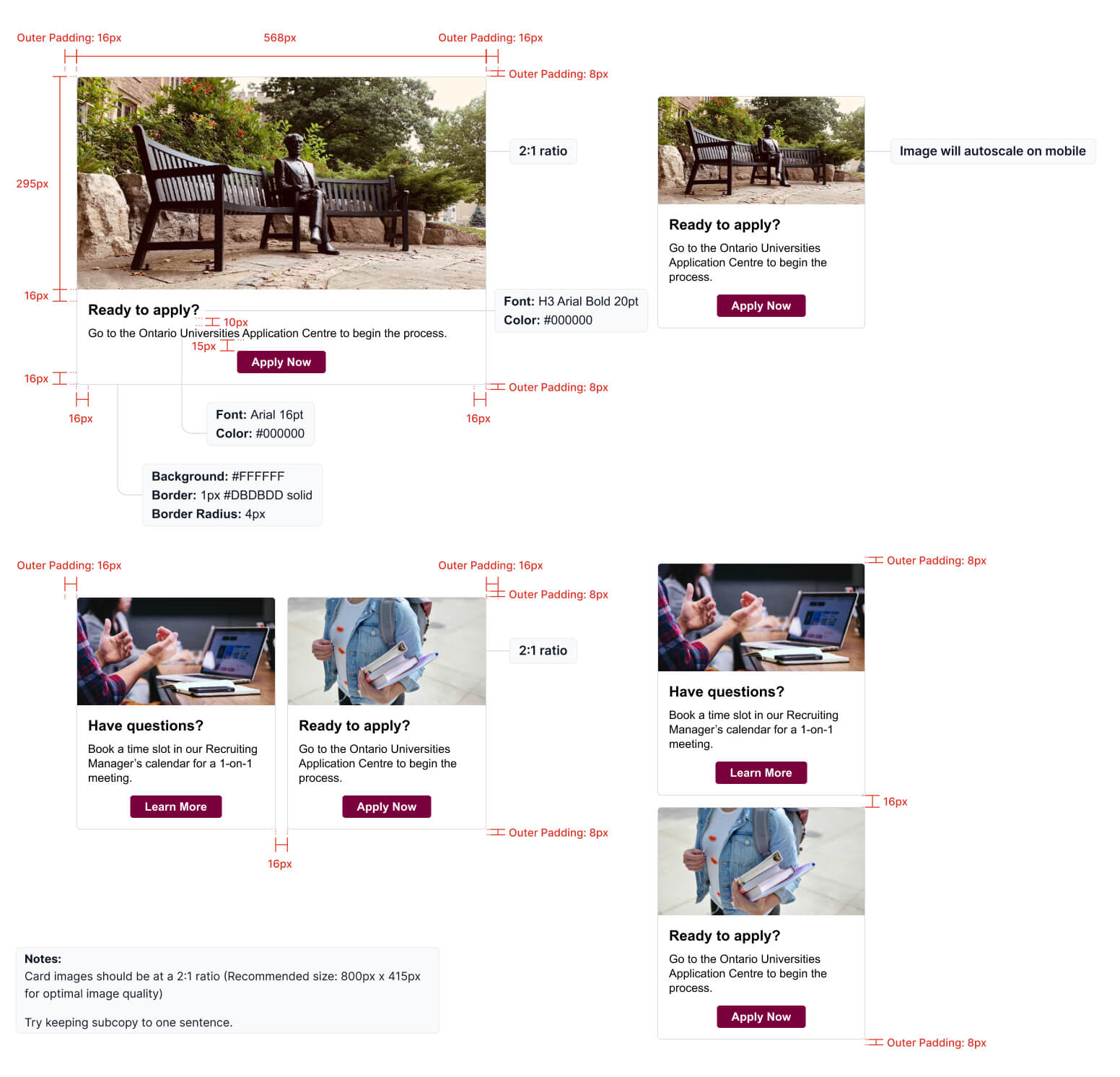
Image and icon cards
Image and icon cards combine copy and visuals into one component. They can take up an entire column, be positioned side-by-side, or be a combination of the two styles.
When using icons, in a full-width application, they should always be positioned to the left of the copy. When a 2-column format is used, the icons may be centered above the copy. This is also how they should appear for mobile.
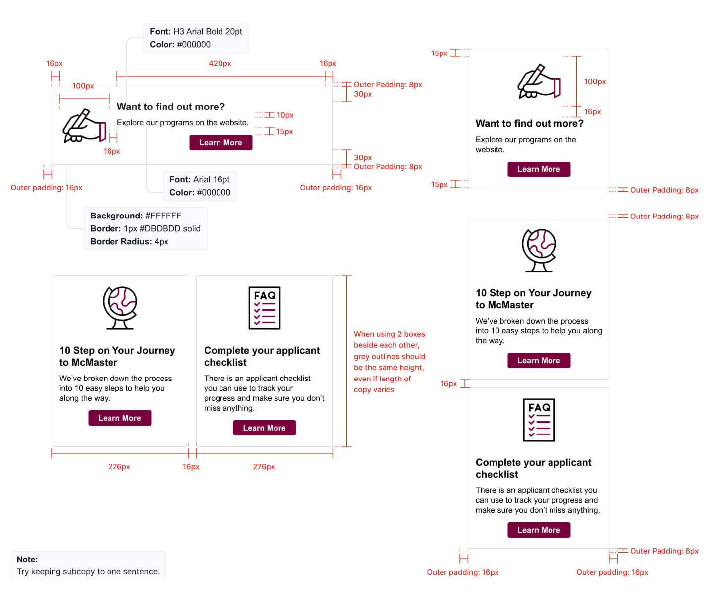
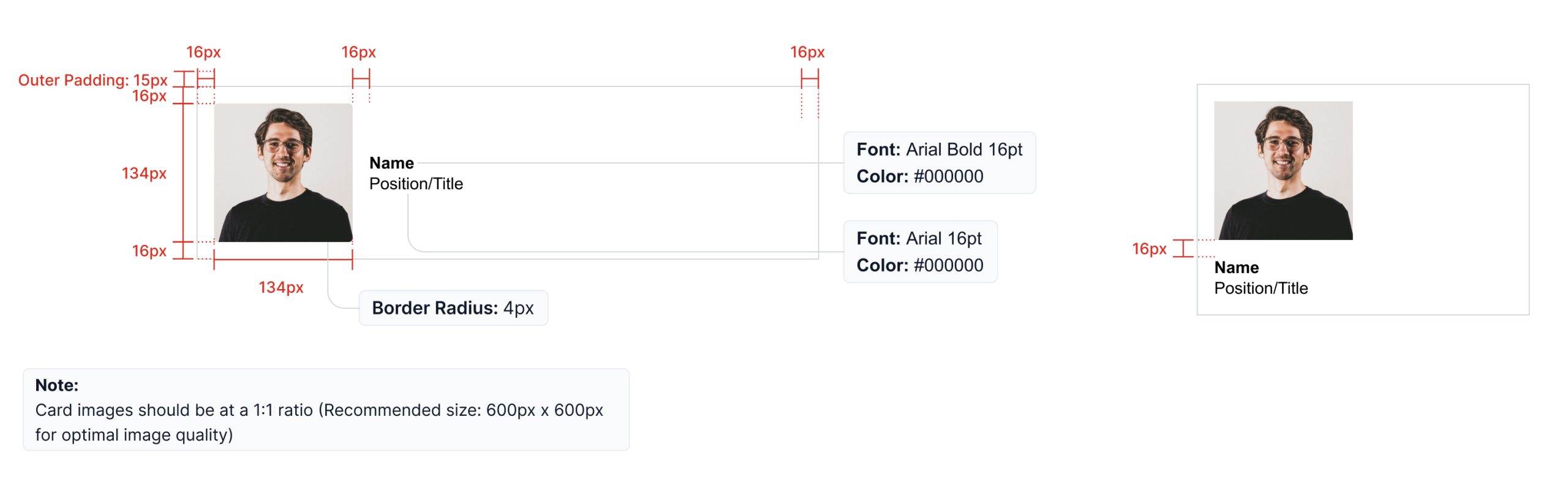
Signatures
Including a personalized signature at the end of the email is preferred, as it provides a human touch to the communication. Signatures should follow the example below.
Tables and lists
When including tables and lists in an email, keep the information clean and organized by following the examples below.
Accessibility
We need to keep in mind that most screen readers and assistive technology “reads” an email for a user is used in combination with text-only email. It might be useful to add a note about text-only versions of our emails and accessibility as an appendix in the guideline. Either way – it is a part of our process to do text only email (always) and this requires editing – for example, we can’t use buttons in text only email so writing a clear description and providing the full HTTPs address/URL for a screen reader is an appropriate way to share a link in a text only email.