Overview
Email marketing is a powerful tool to directly engage with our audiences.
McMaster’s brand relies on consistent messaging.
Email marketing offers communicators and marketers with a unique opportunity to connect our brand messages with our audiences on a personal basis.
In this section, you’ll have access to our detailed email marketing guidelines, including typography, logo usage, notes on headers and footers, buttons, layouts, banners and call-to-actions.
Information Box Group

Keep it consistent
All marketing emails coming from a McMaster account needs to have a consistent look and feel to reinforce our brand messaging.

Make it mobile-first
Most people use their phones these days. Ensure all layouts work on mobile platforms and be sure to test your emails on mobile before sending them.

Practice makes perfect
Are there any typos? Do your images display correctly on mobile? Always be sure to preview and test your emails before deploying.
Update your e-signature
Our new e-signature generator is live and ready to be used by the McMaster community.
Email Typography
Following our email typography helps to ensure a seamless, consistent experience for the user.
Typography
McMaster’s primary corporate font is Poppins. However, since Poppins is not a font that will automatically be on everyone’s system, emails will use the secondary font, Arial. A system font ensures that the email typeface appears consistently across all devices. Arial has been selected as a clean, sans-serif font that aligns well with the McMaster brand.
These font styles should be used for headlines and subheads when creating an email.
H1
Used on hero banners.
Font: Arial Bold 28/32
Colour: #7A003C (maroon)

H2
Used on section titles for subheads, in sentence case.
Font: Arial Bold 24/28
Colour: #000 (black)

H3
Used on section titles for subheads and CTA sections, in sentence case.
Font: Arial Bold 20/24
Colour: #000 (black)

Font: Arial Regular 16/20
Colour: #000 (black)
Link Copy: #7A003C (maroon)
Font: Arial Regular 16/20 (List spacing: 16)
Colour: #000 (black)
![]()
Font: Arial Regular 12/16
Colour: #000 (black)
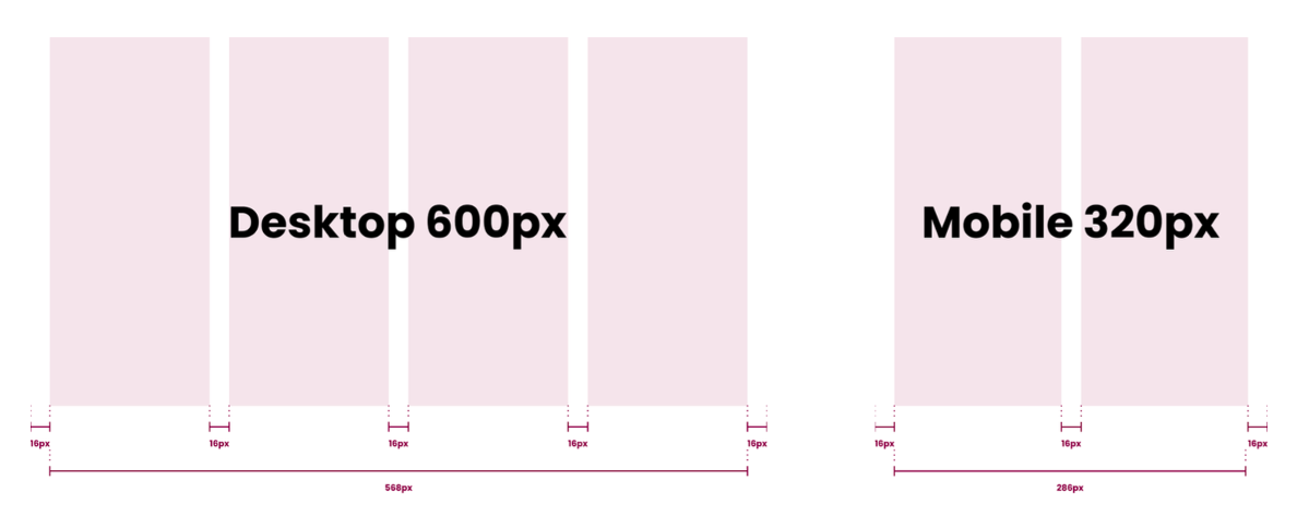
All McMaster emails should follow a four column grid layout (two columns for mobile), with a max-width of 600px, and a gutter of 16px. All content should fall inline with the columns, unless otherwise stated (i.e. CTA and header image backgrounds). This will ensure that all content is easily legible on any device.
Logo
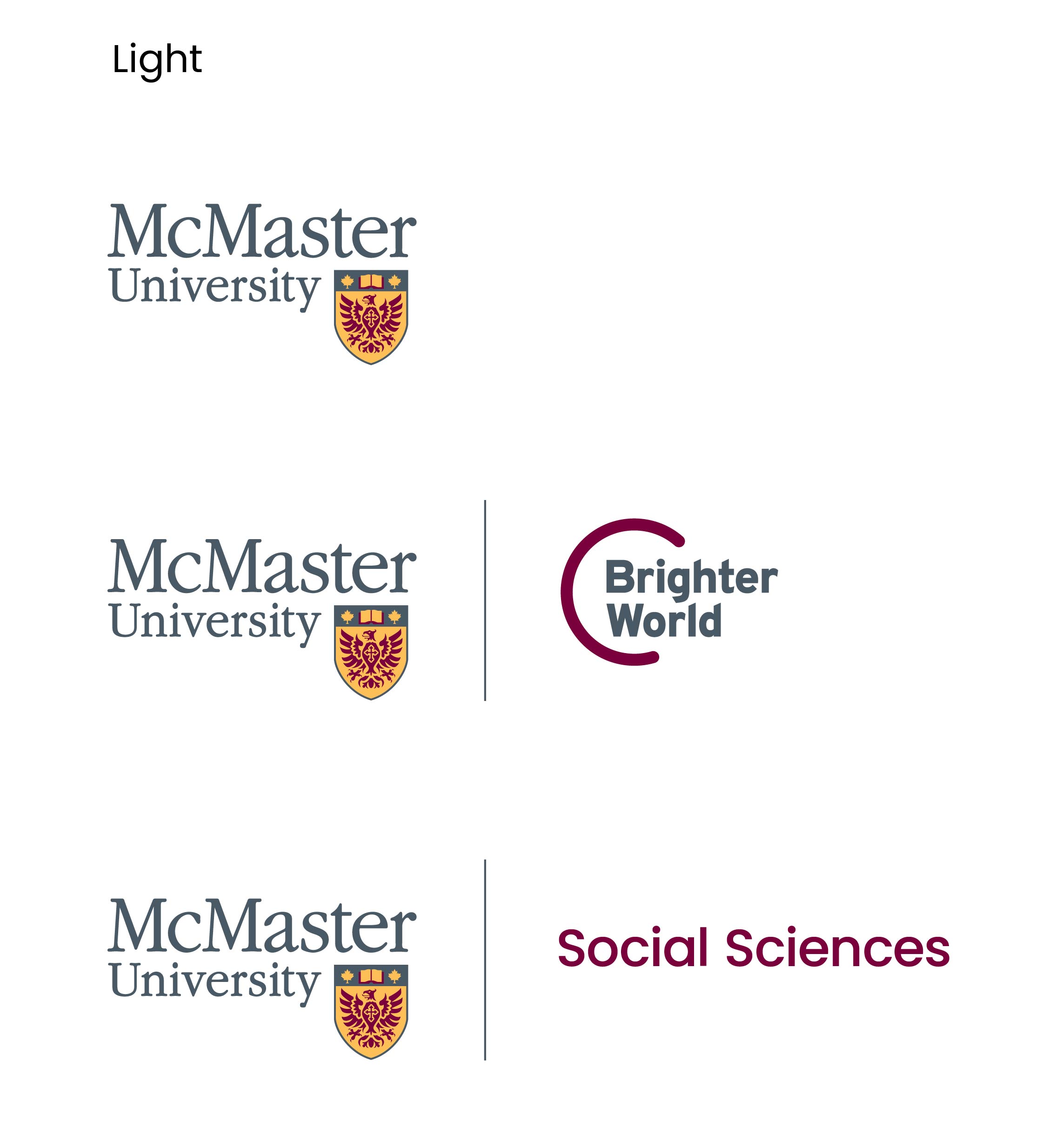
Logos are available in both full colour and reversed versions to ensure maximum accessibility.
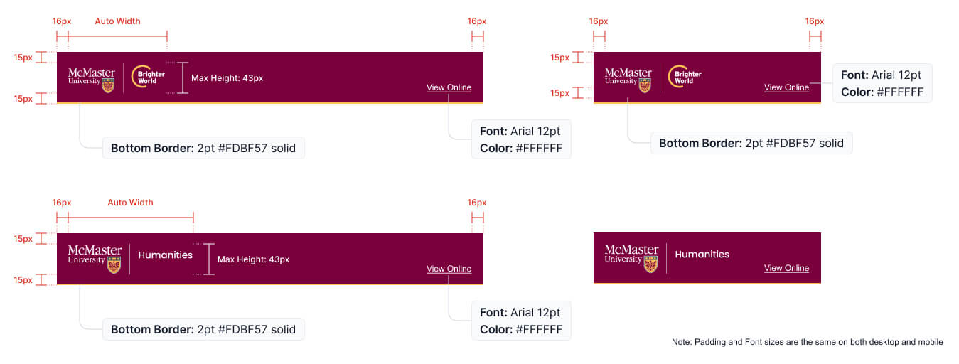
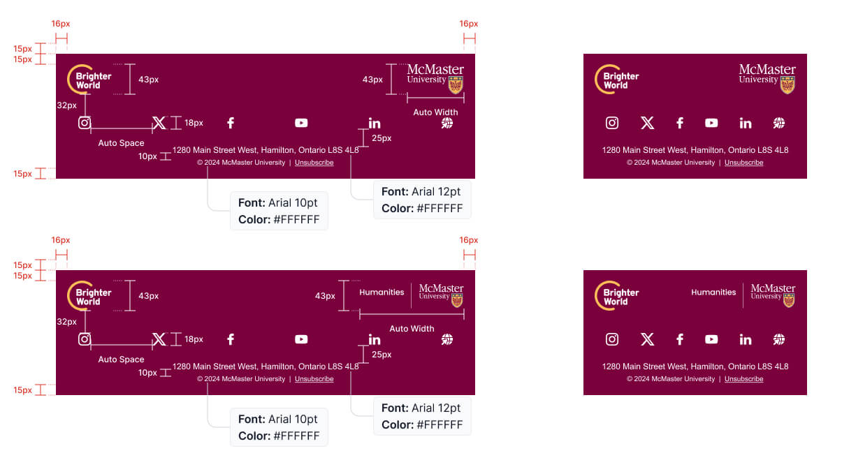
The McMaster logo should only be visible in two locations: the header and the footer. In the footer, the Brighter World logo (solo) is always visible, while the header logo switches between faculty/programs, or the main McMaster logo.
The McMaster logo can stand on its own, or be accompanied by the Brighter World logo or a faculty/program name.
The maximum height the logo can appear on emails is 43px, with the width auto-adjusting (depending on the logo).
Headers and footers
Our headers and footers help ensure McMaster’s marketing emails all have a consistent look and feel that reinforces a powerful brand image.
Expandable List
As the very first visual element of an email, the header plays a critical role in setting the visual tone. It is important for the header to clearly represent McMaster University and for headers to be consistent across all email communications.
Closing out each email in a consistent way is also important. Footers for McMaster emails should follow the example below.
CTA and banners
Drive engagement in your emails with strong branded CTAs and banners.
Call to action
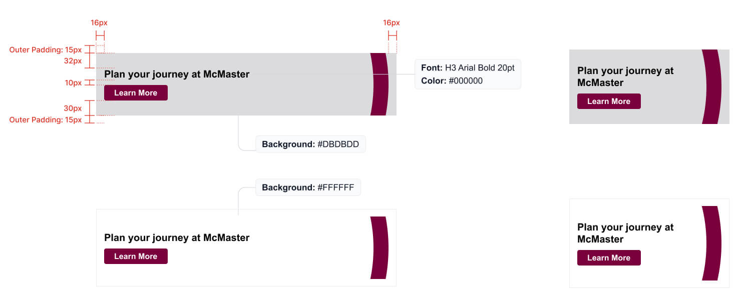
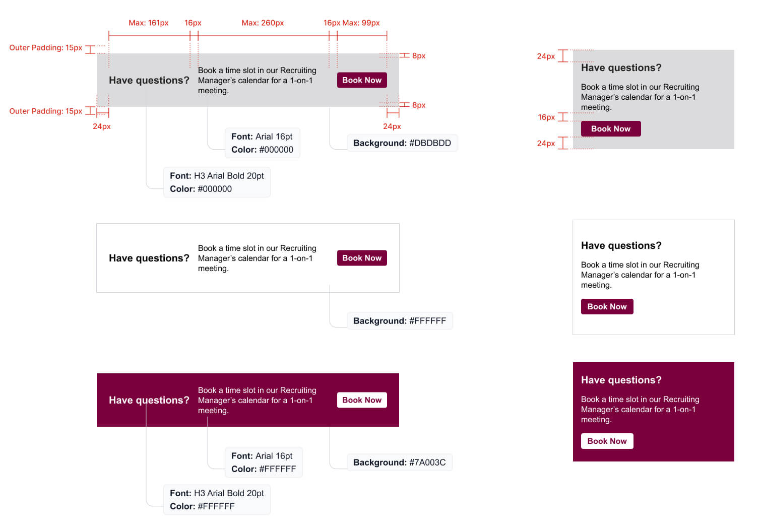
Call to action, or CTA, banners are a critical aspect of an email, as they provide the reader with an action to take to continue on their journey. Ensuring that CTAs are easy to identify and use is critical. Following the examples below to maintain a consistent look for CTAs across email and web will help to provide a seamless experience for the end user.
H3 font style is used for CTA banners and there are three background colours available for CTA banners (#000000, #7A003C and #DBDBDD)
If you use an image for the background of a CTA, it should be at 75% opacity.

![]()
Banners
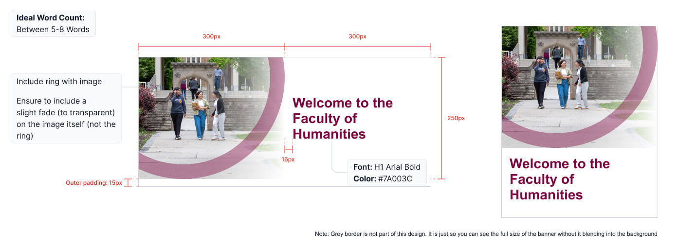
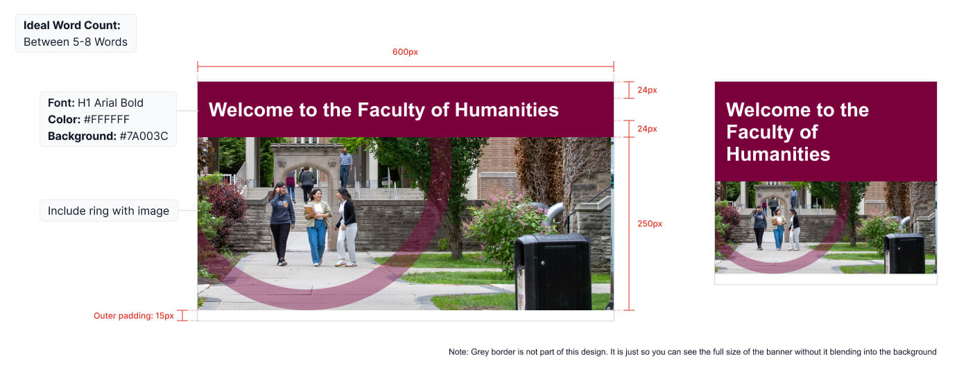
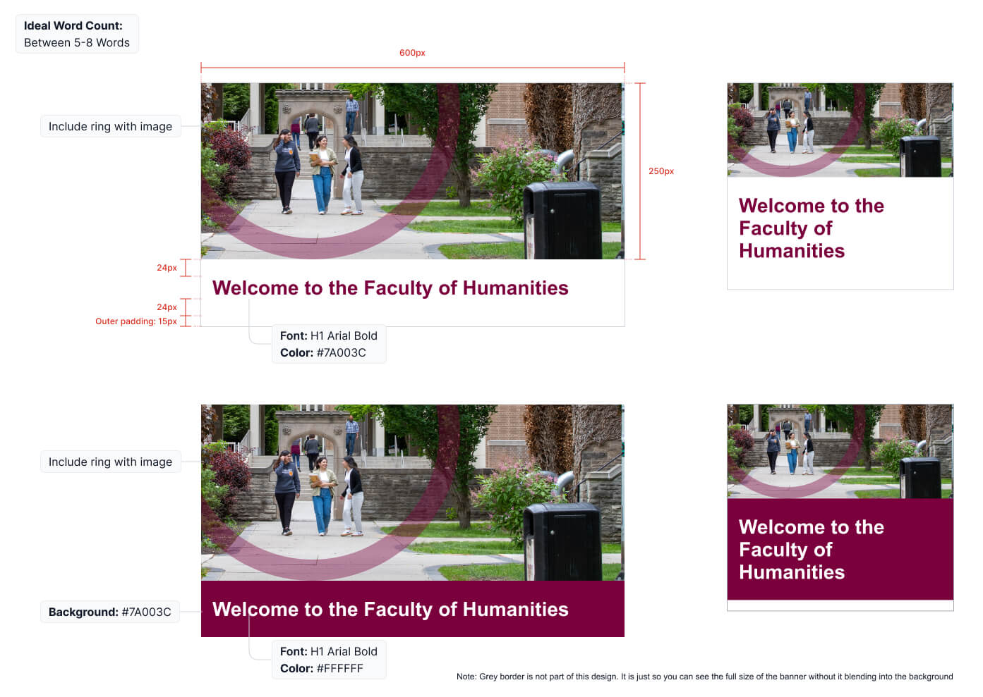
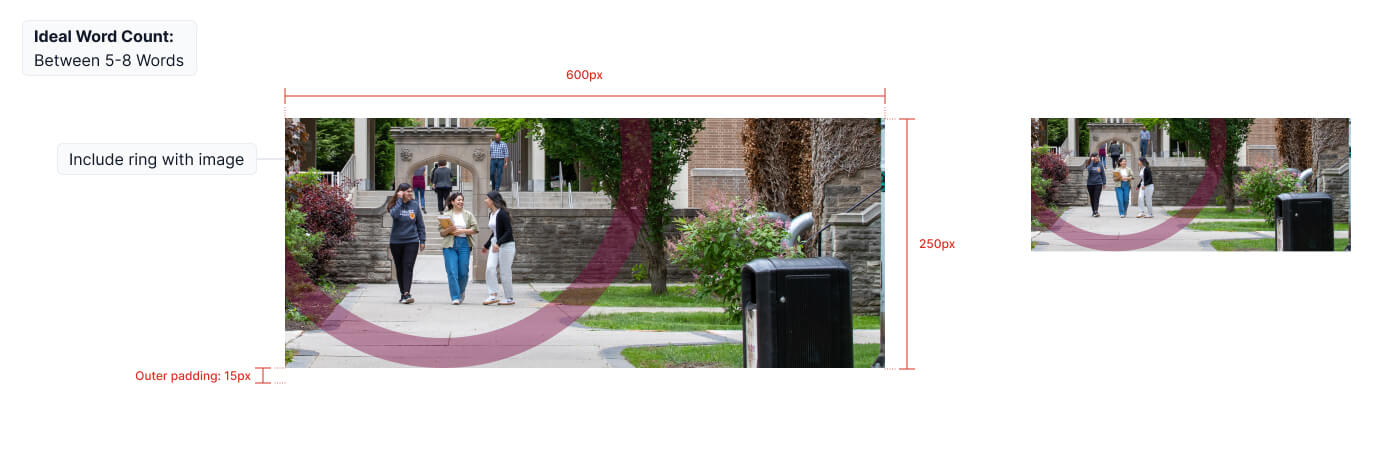
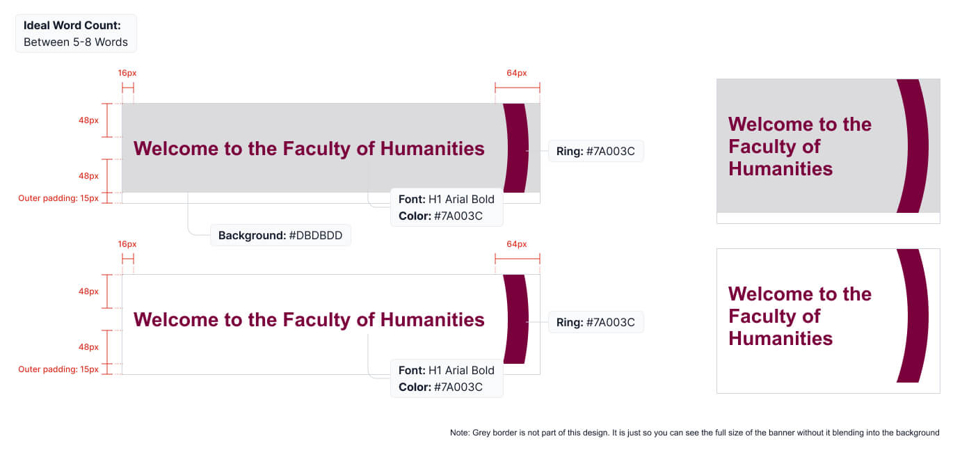
As the first part of the email that viewers will see and read, hero banners play an important role in encouraging the viewer to continue reading. This is also an important area to align to brand guidelines. Follow these rules when creating hero banners:
- The circle element should be used on images where it works and makes sense. Refer to the Visual Expression section of the McMaster Brand Guidelines for more information.
- Copy should always remain as live type, not an image, to ensure it can be read by a screen reader in order to meet accessibility requirements.
- Keep headline copy as short and simple as possible, ideally around 5-8 words.
- An image should be included when possible, but in cases where one is not available, a header banner can be created with only copy and graphic elements, as shown below.
- When using the hero banner with an image on the left hand side only, you should include slight transparent fade on the image itself (not on the ring)
- Note: Grey outline on images below are not part of the design and are only included for contrast with the background in the example format.
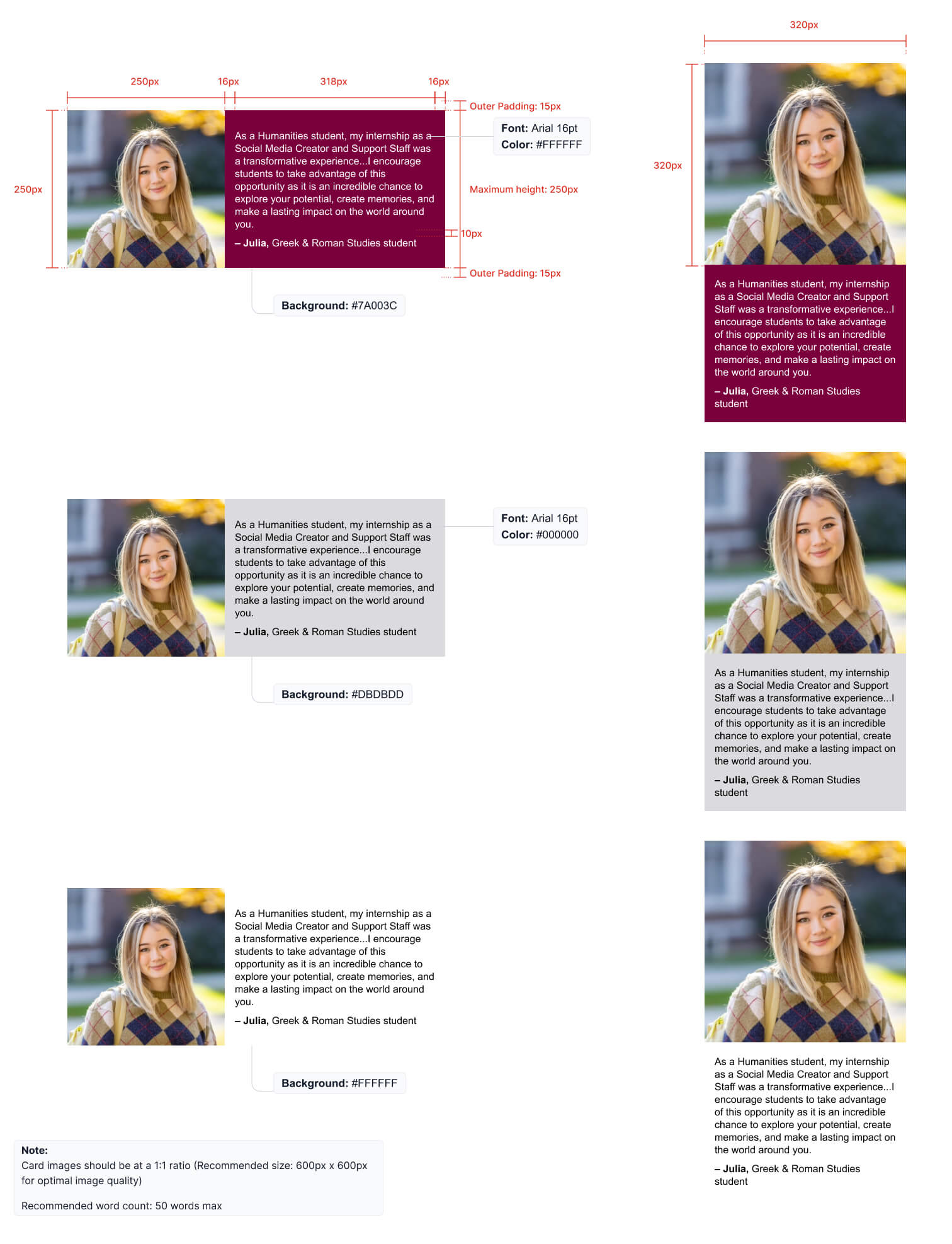
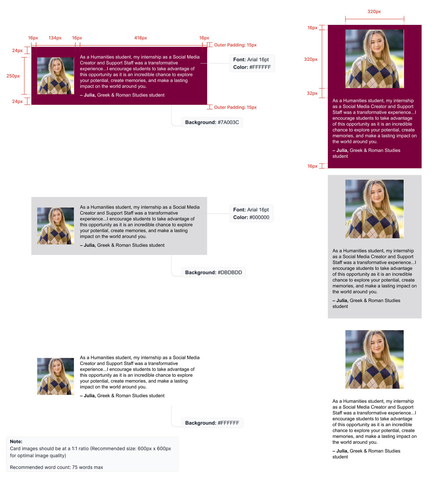
Including quotes from students and faculty helps to promote the authenticity of the McMaster brand. When adding quote banners, follow the examples shown below.
- Card images should be at a 1:1 ration (recommended size of 600px x 600 px for optimal image quality)
- Recommended word count for the small size quote banner is 50
- Recommended word count for the large size quote banner is 75
Content
Using McMaster brand guidelines for content in your email creates a strong, branded communication.
Buttons
Call to action (CTA) buttons indicate that the user can perform an action. Typically used in CTA banners, these buttons need to be consistent, clear and simple in order to guide users to the next step. Copy within a button should be Title Case, centred, and not exceed 20 characters, to keep the message clear and succinct. Copy should always be live text, not an image. See examples of primary buttons in a default and hover state.
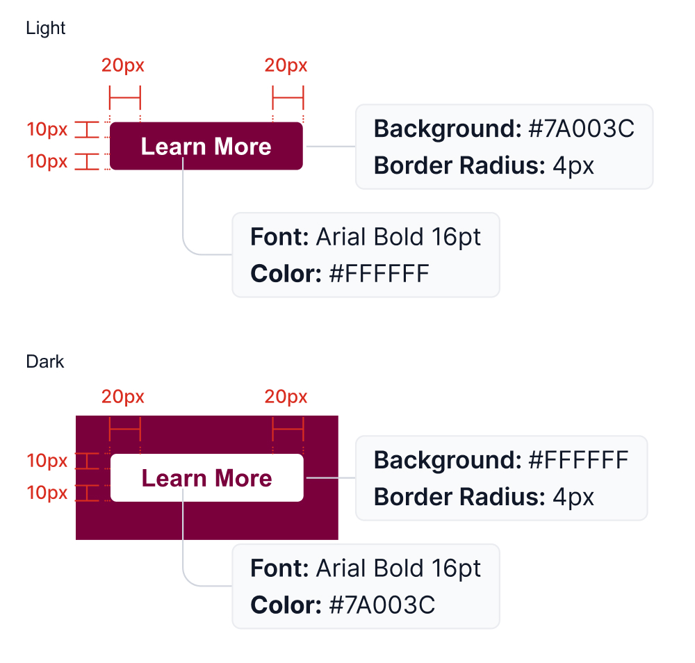
For email platforms that allow customization of button hover states, follow the below guidelines.
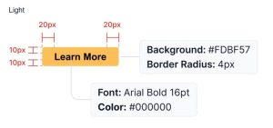
Image and icon cards
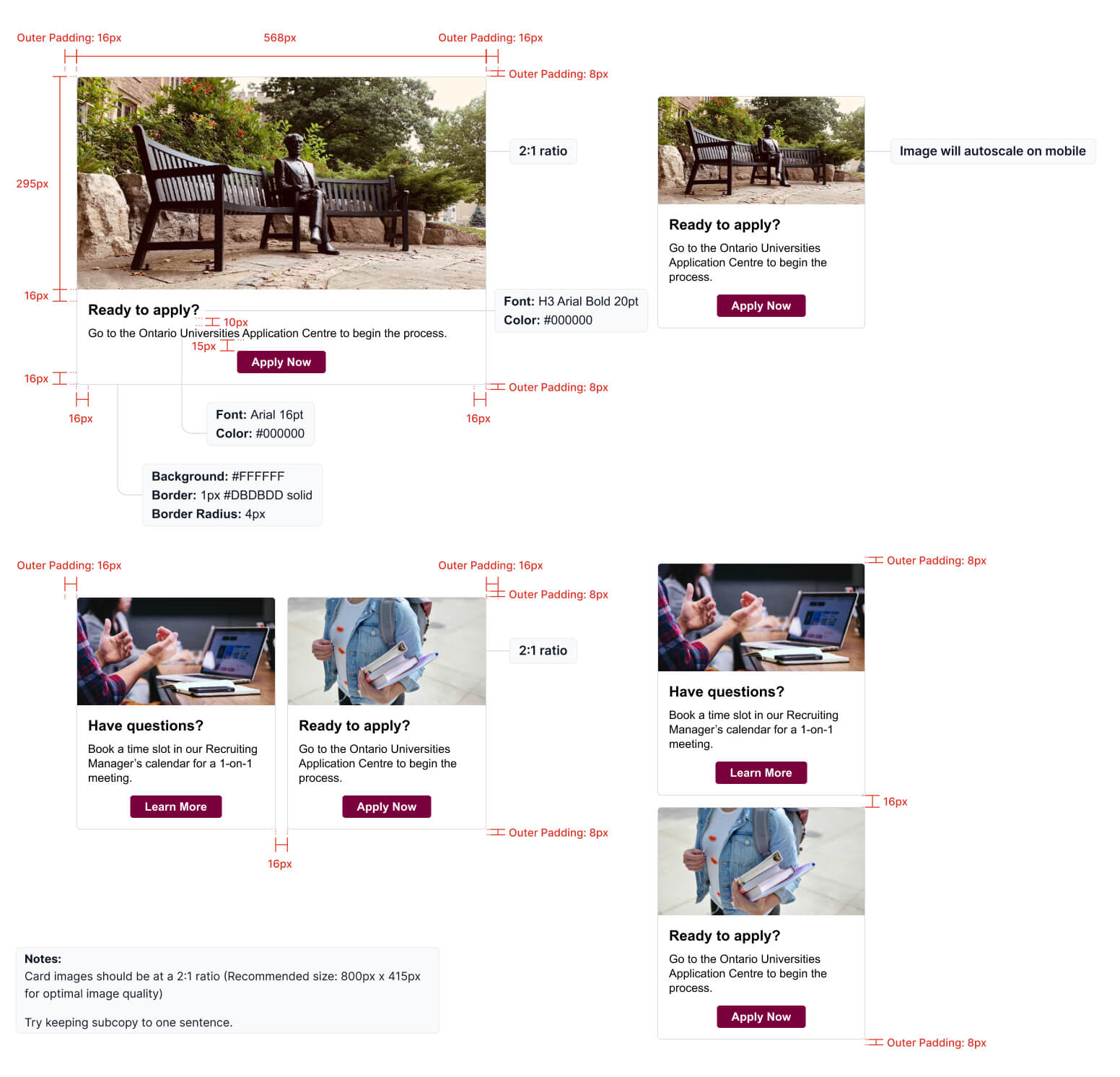
Image and icon cards combine copy and visuals into one component. They can take up an entire column, be positioned side-by-side, or be a combination of the two styles.
When using icons, in a full-width application, they should always be positioned to the left of the copy. When a 2-column format is used, the icons may be centered above the copy. This is also how they should appear for mobile.
![]()
Signatures
Including a personalized signature at the end of the email is preferred, as it provides a human touch to the communication. Signatures should follow the example below.

Tables and lists
When including tables and lists in an email, keep the information clean and organized by following the examples below.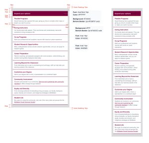
Accessibility
We need to keep in mind that most screen readers and assistive technology “reads” an email for a user is used in combination with text-only email. It might be useful to add a note about text-only versions of our emails and accessibility as an appendix in the guideline. Either way – it is a part of our process to do text only email (always) and this requires editing – for example, we can’t use buttons in text only email so writing a clear description and providing the full HTTPs address/URL for a screen reader is an appropriate way to share a link in a text only email.
Media
Images and videos are a great way to add visual interest and further tell a story through email.
Media assets
Full width images are a great way to incorporate colour and visual interest throughout emails. They are a standalone image placed within an email to break up copy or help convey a message or idea. See the Photography Guidelines of the McMaster brand guidelines for more information on selecting images to use.
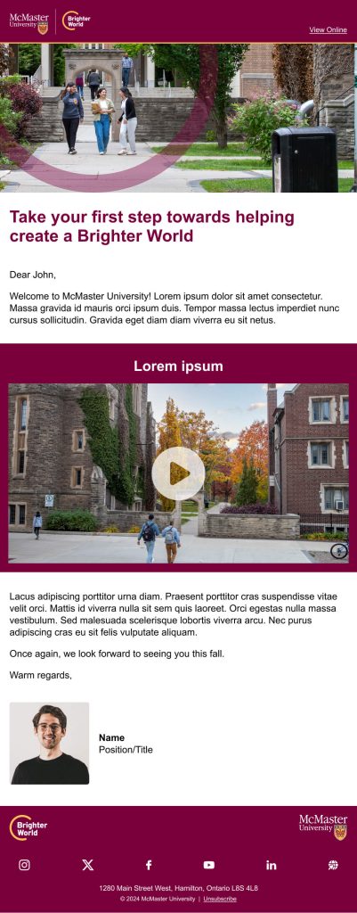
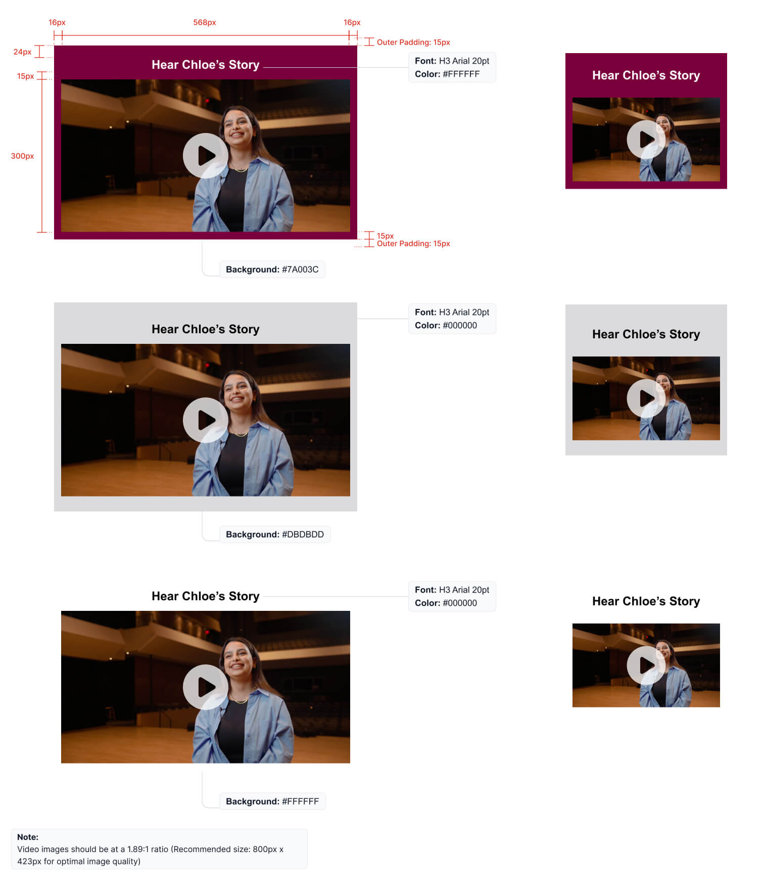
Video is a great way to engage readers and help tell a story. However, best practice is to not embed the video into the email (as they tend to be large files) and instead highlight a link to a video hosted on a website, YouTube, or Vimeo, through a simulated video player. A play button should be added onto the thumbnail image to make it clear there is a video to watch. Download approved play buttons here. Follow the examples shown below.
H3 font style is used for Video blocks and there are three background colours available for Video blocks ( #7A003C, #DBDBDD and #FFFFFF)
Note: Video images should be at a 1.89:1 ratio (Recommended size: 800px x 423px for optimal image quality)
Visual Examples
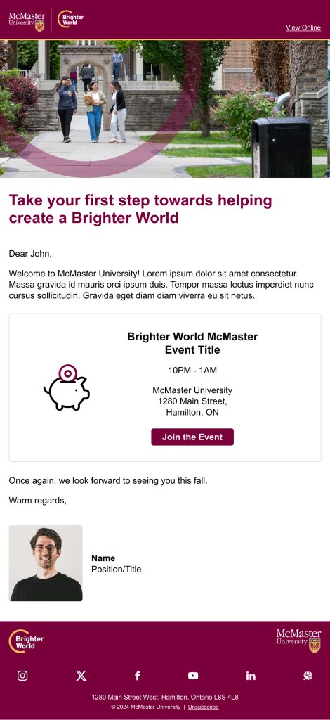
Here are some examples demonstrating how different elements can be used together to create a clean and branded email. Be sure to use a variety of block styles to avoid having too much of one colour, creating a solid mass, or alternating too much creating a striped look. For example, do not use a maroon callout box directly above the maroon footer.
E-signature Generator Tool
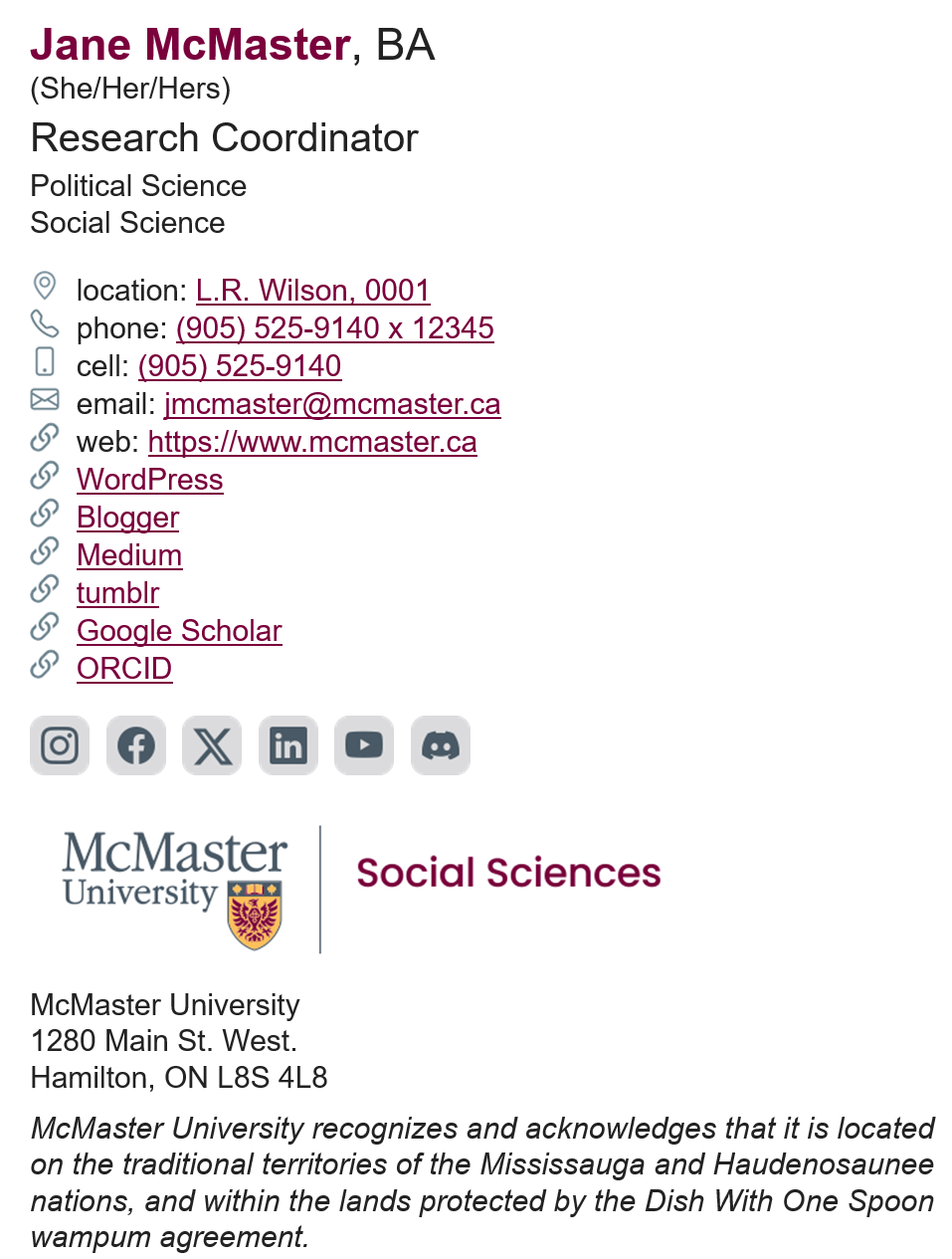
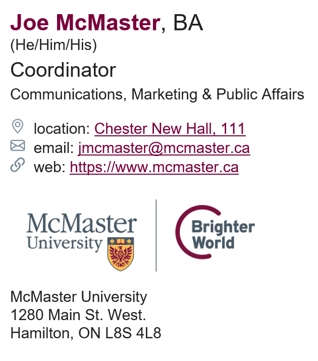
Create your new branded e-signature with our e-signature generator tool. The tool provides options for various contact details, links and McMaster logos.
Sample e-signatures
 |
 |

