Overview
The brand pieces come together to form a vibrant identity by leveraging full-colour photography, the circle element, a dynamic typography treatment, and compelling messaging. This combination of modern design elements reflects the brand’s forward-thinking approach and commitment to positively impacting the world. All together, the brand’s visual expression will capture attention and evoke a sense of energy and innovation, effectively conveying McMaster’s mission and inspiring others to join in creating a Brighter World.
Expandable List
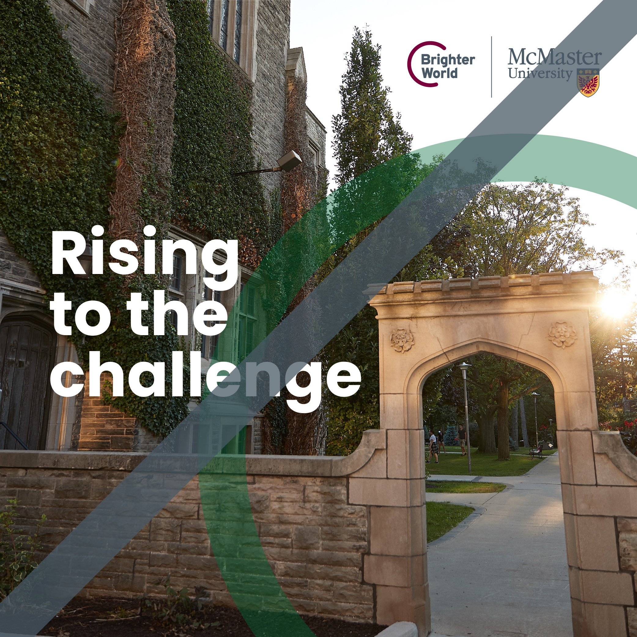
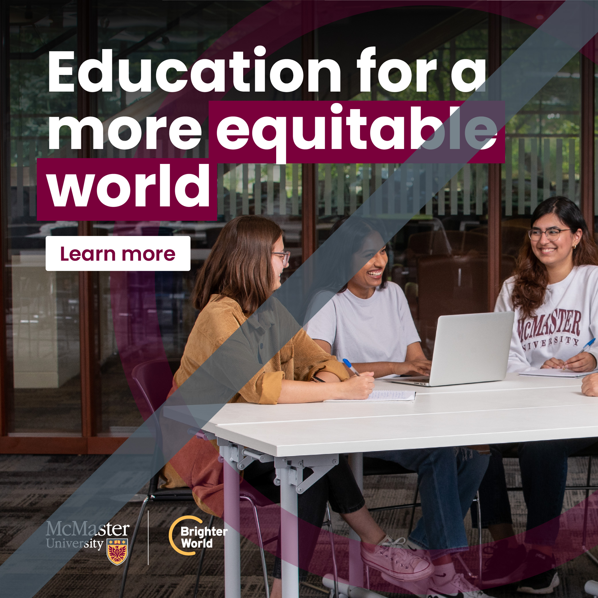
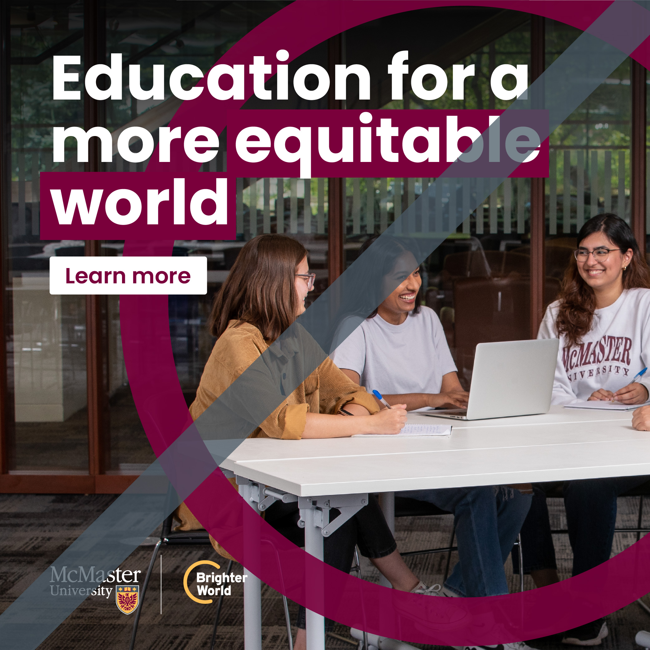
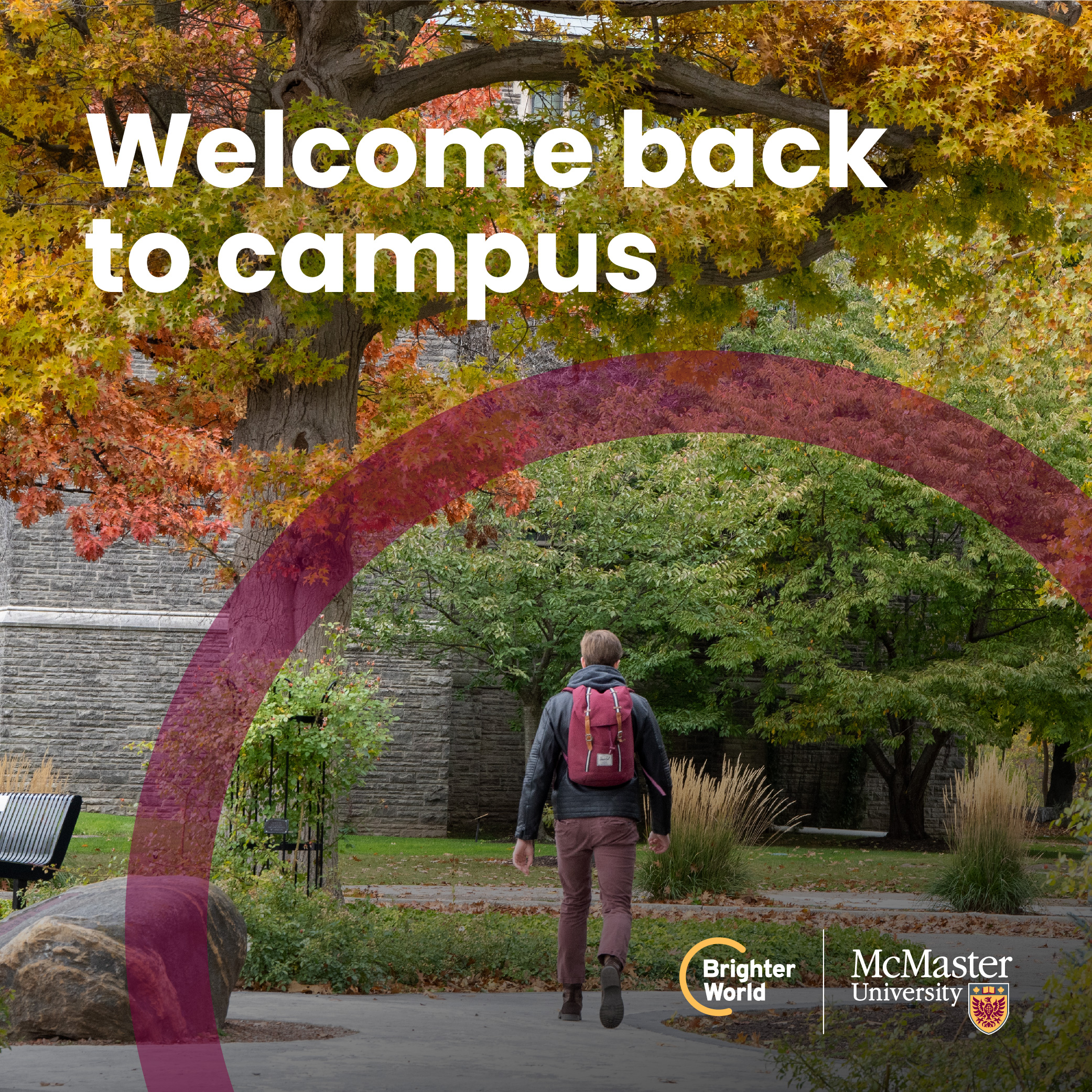
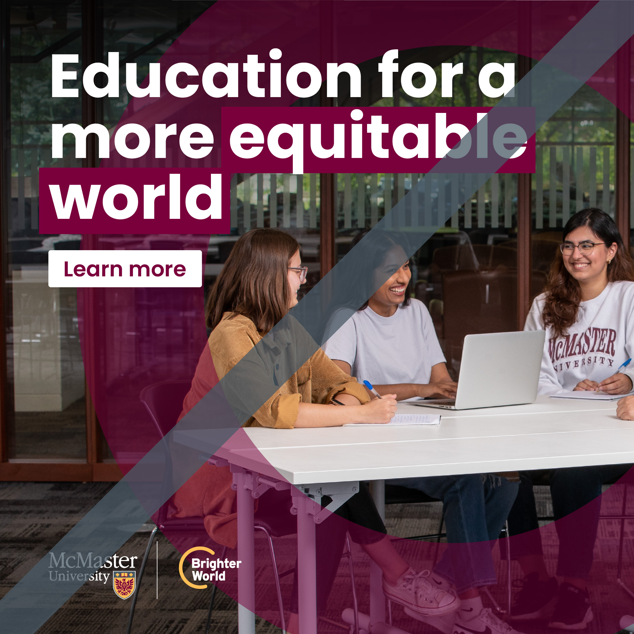
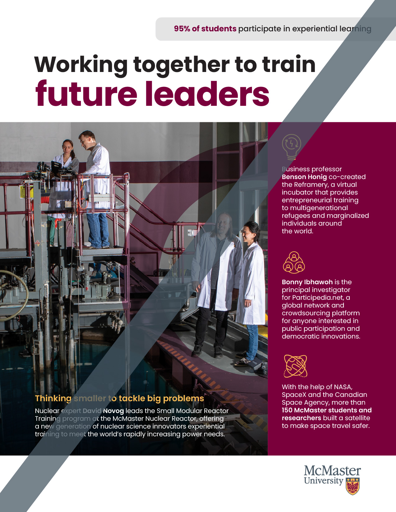
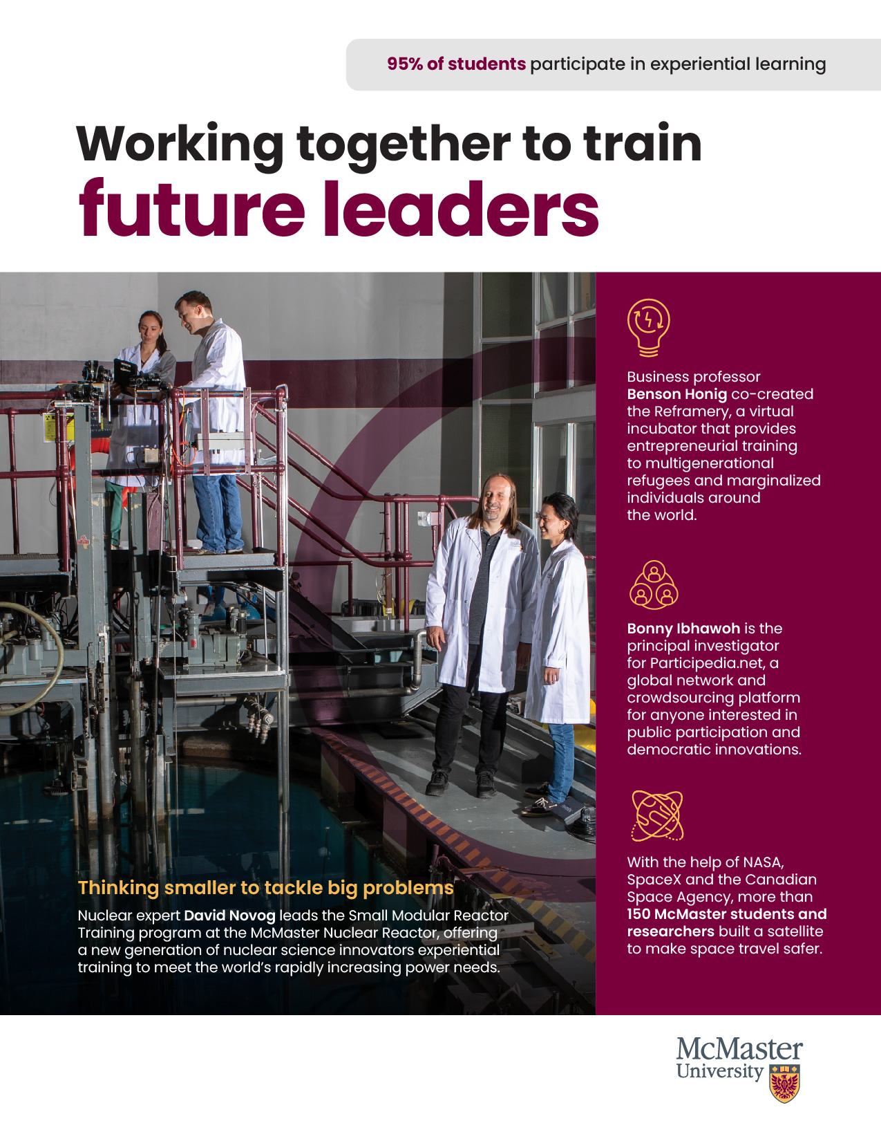
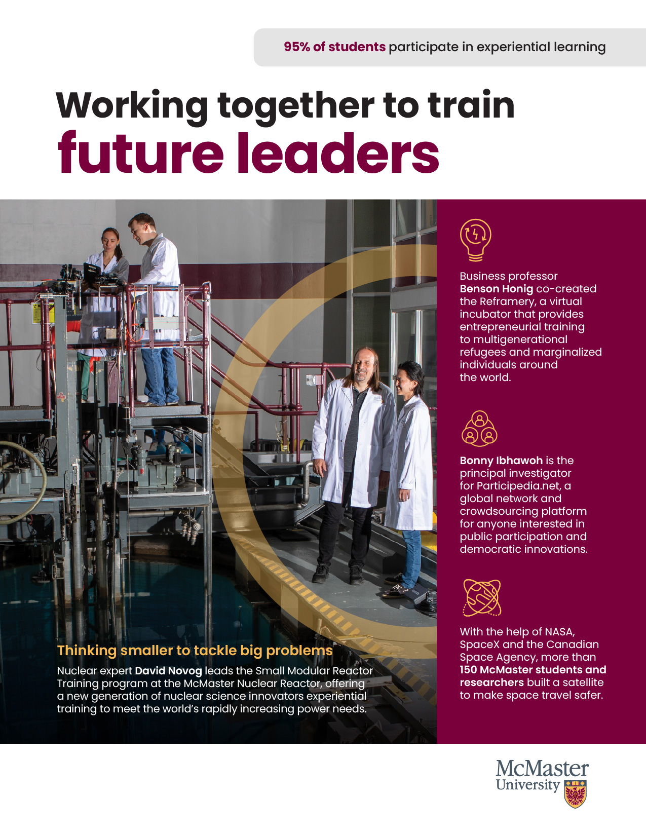
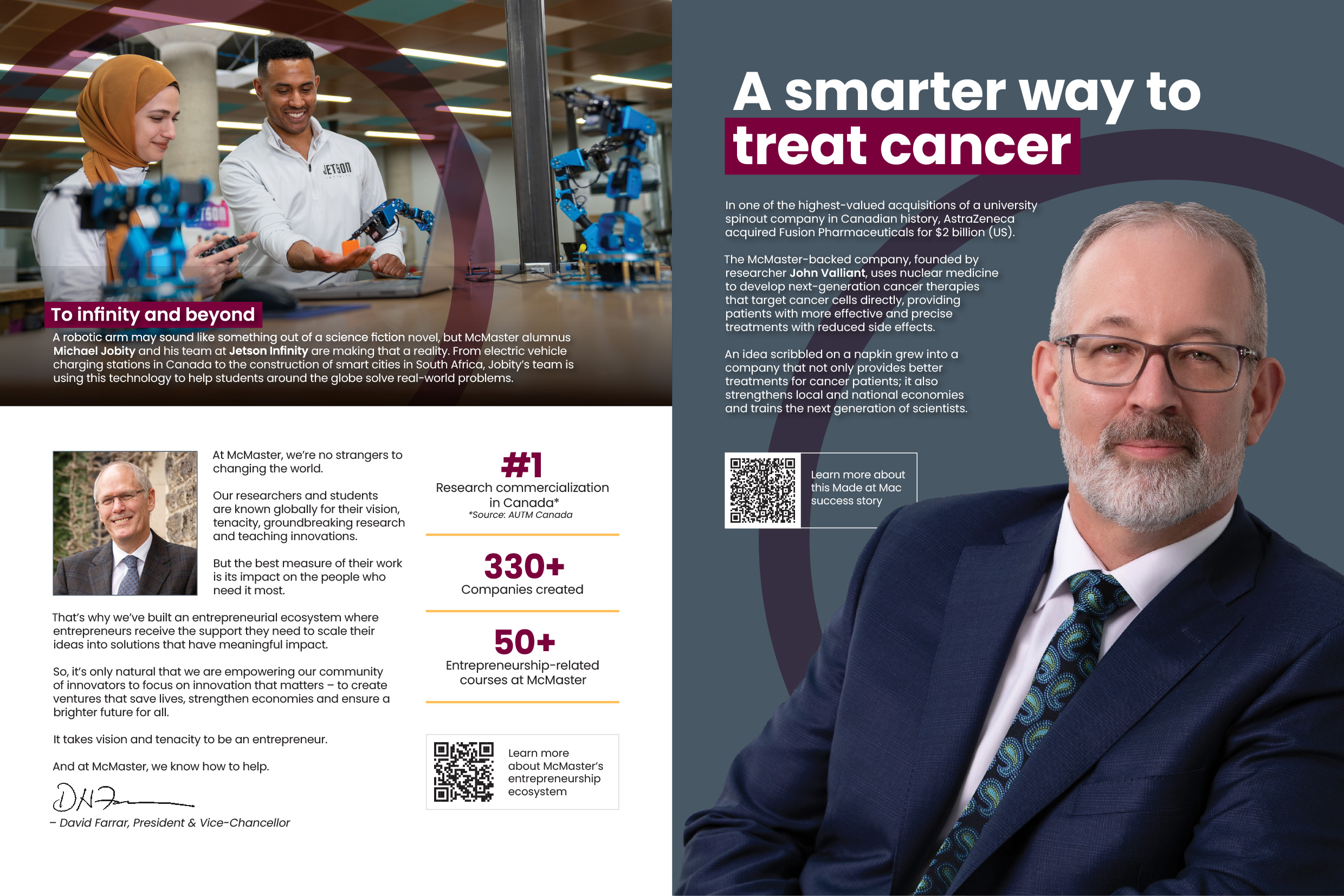
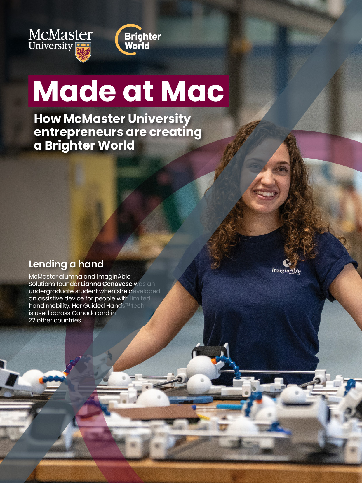
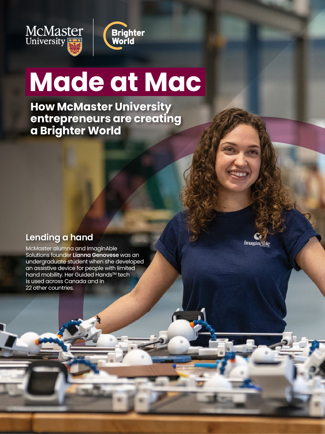
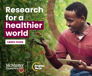
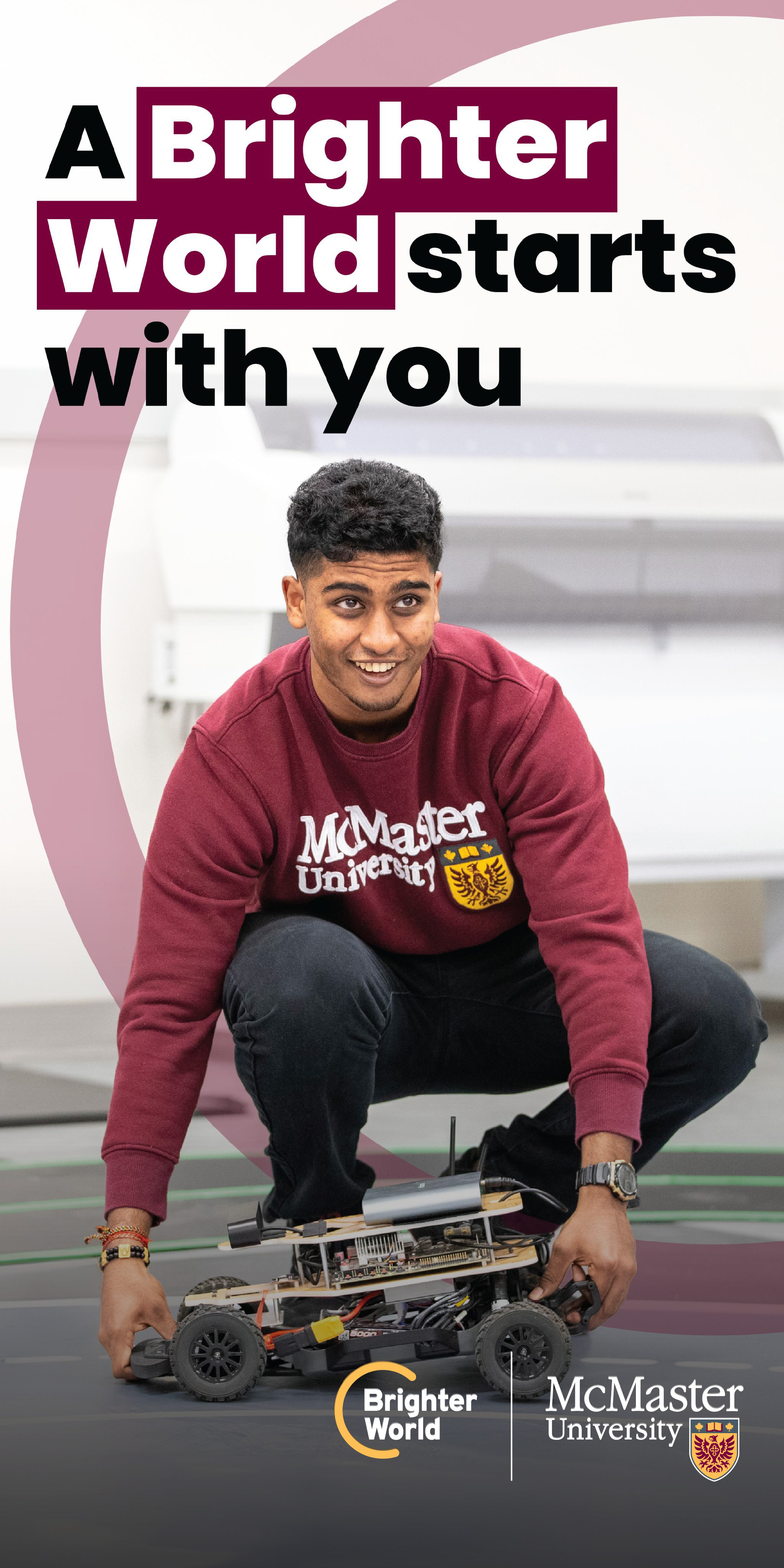
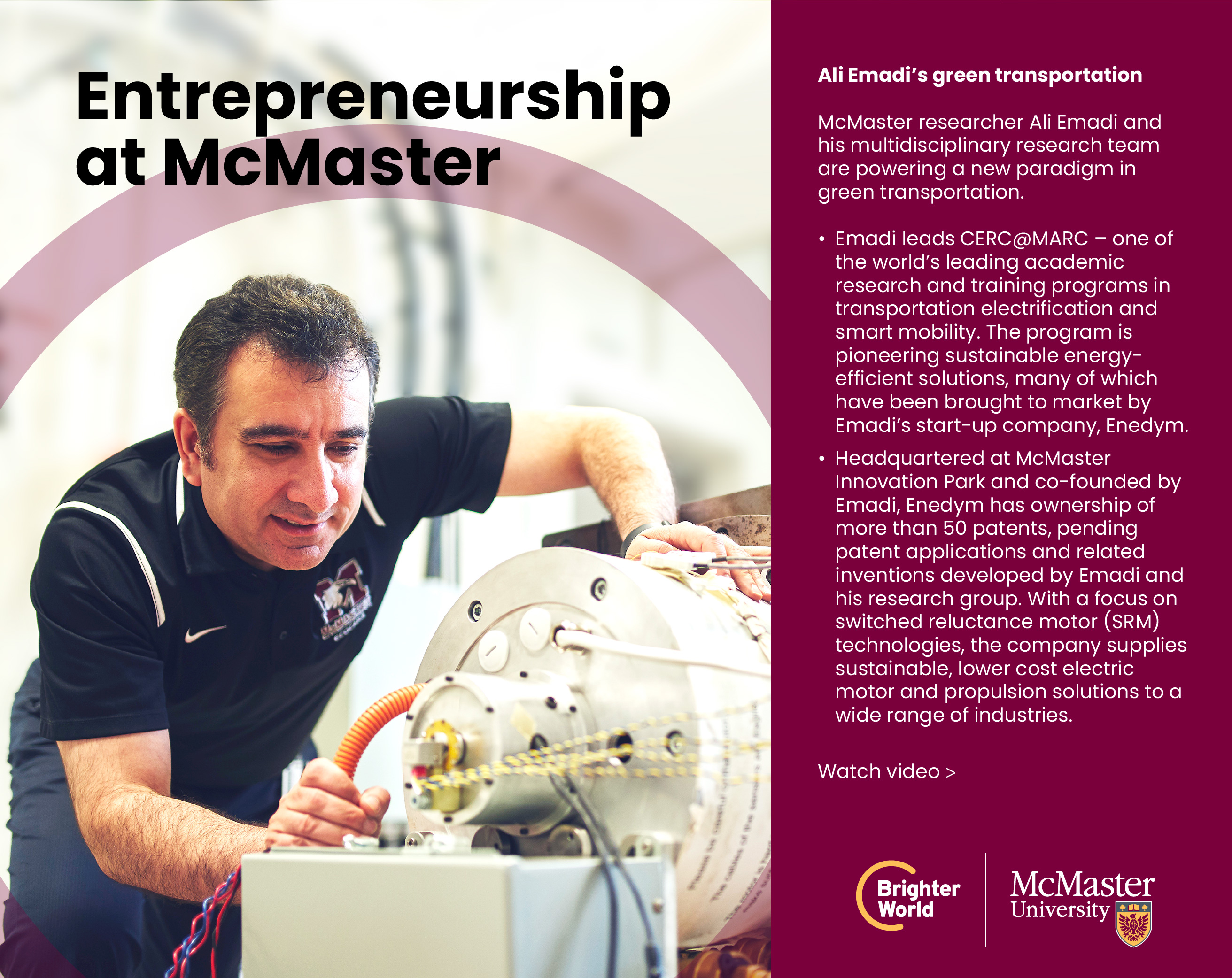
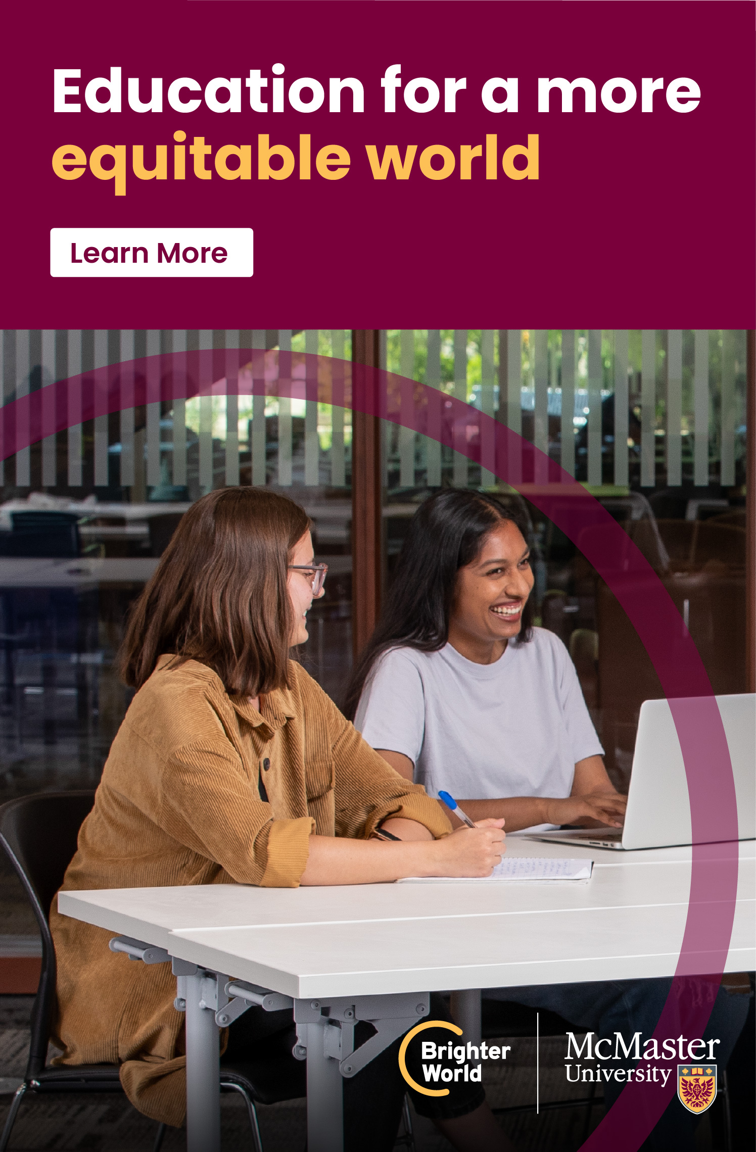
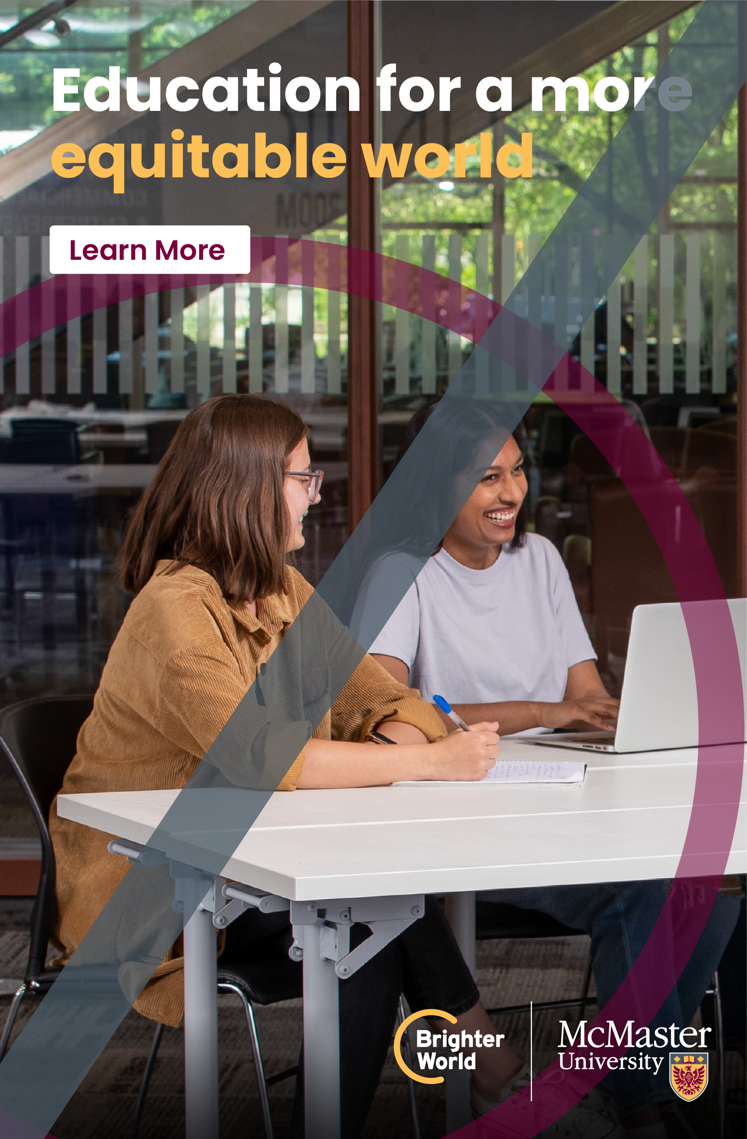
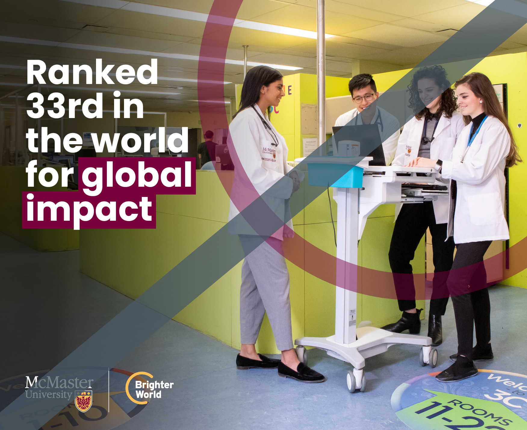
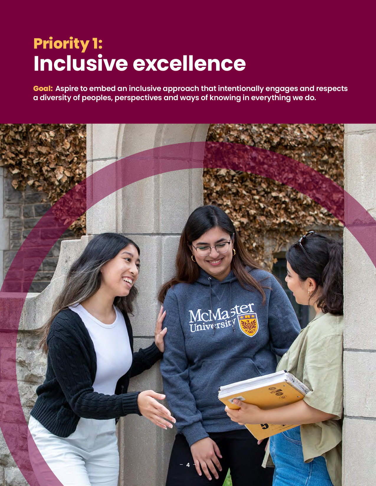
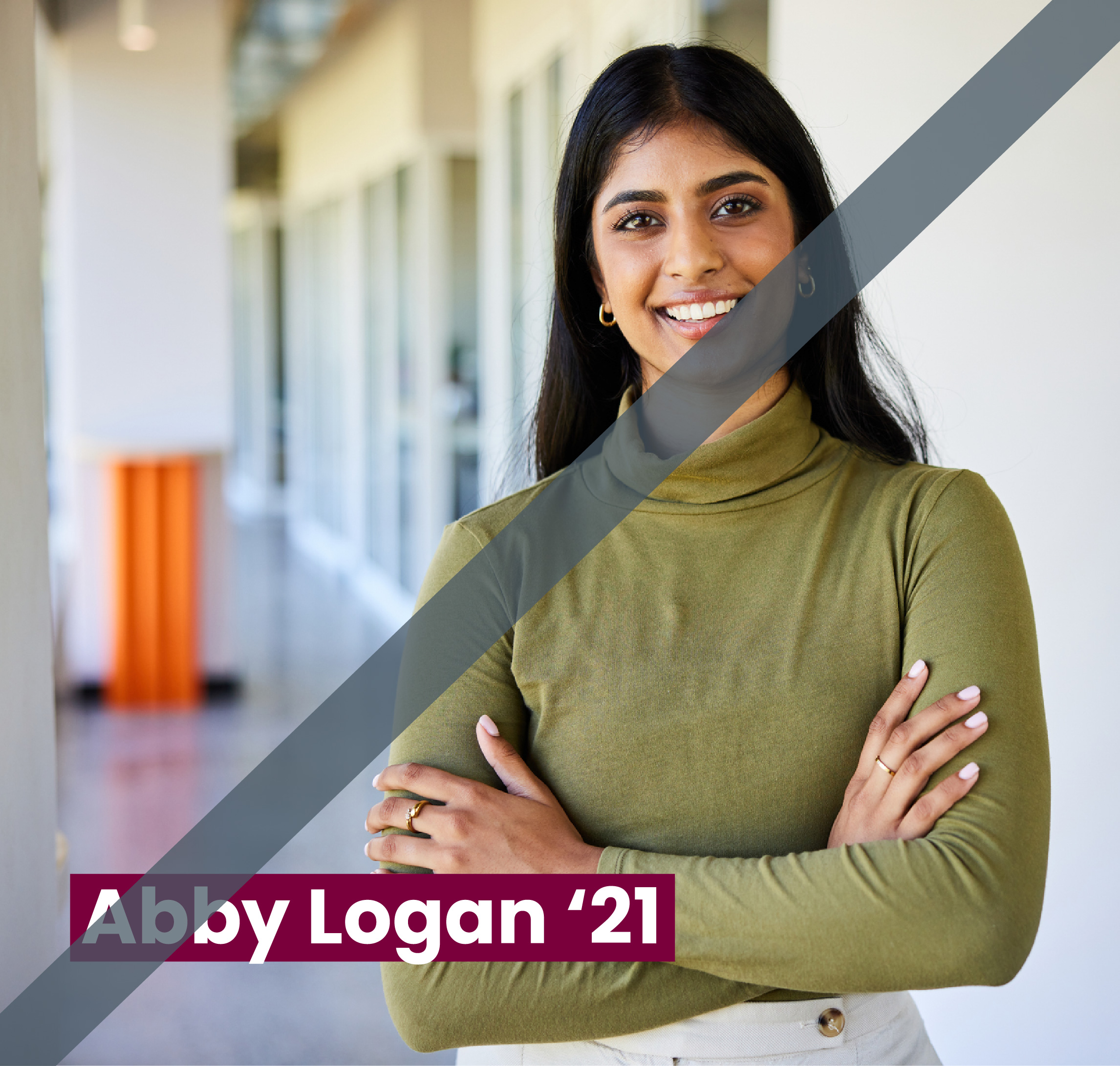
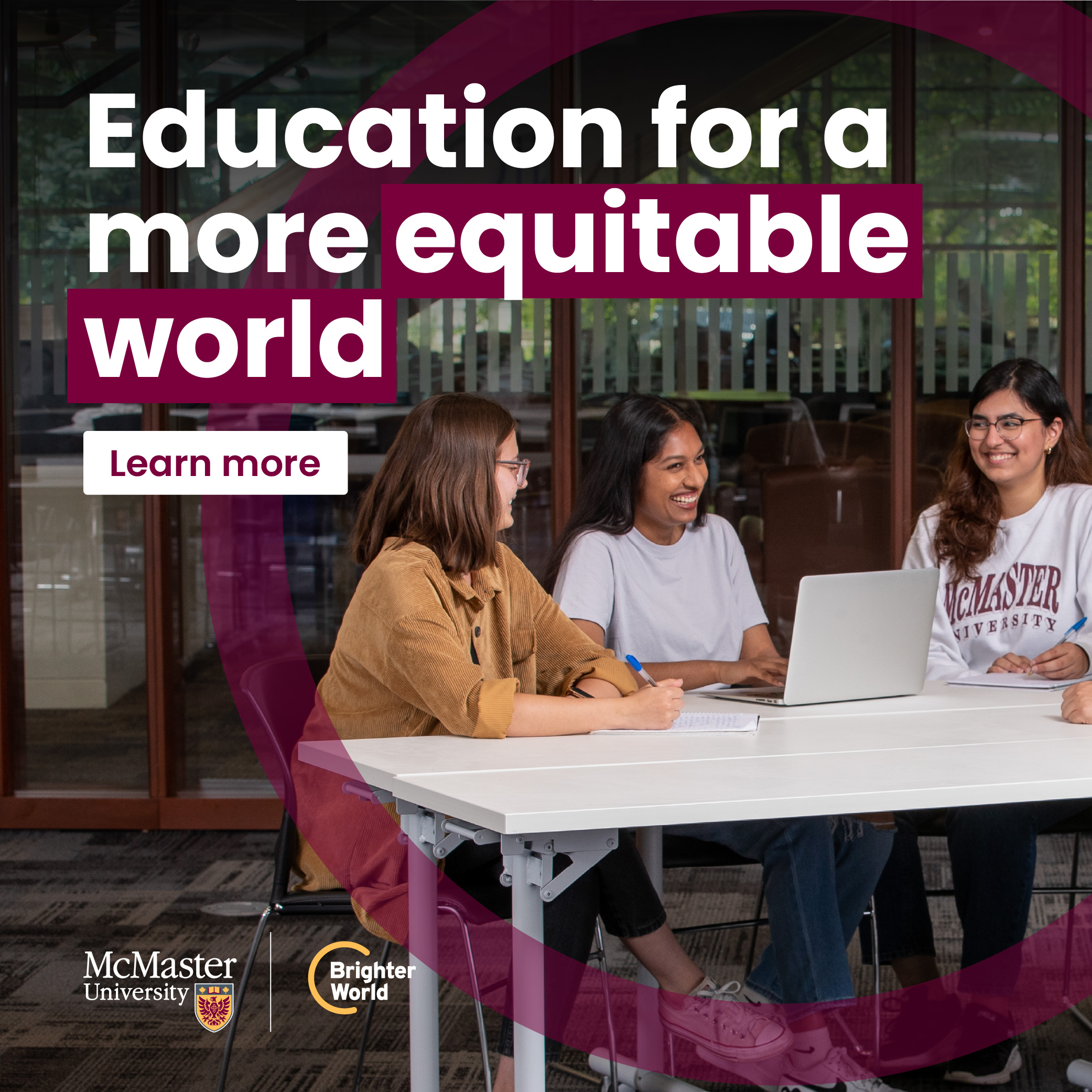
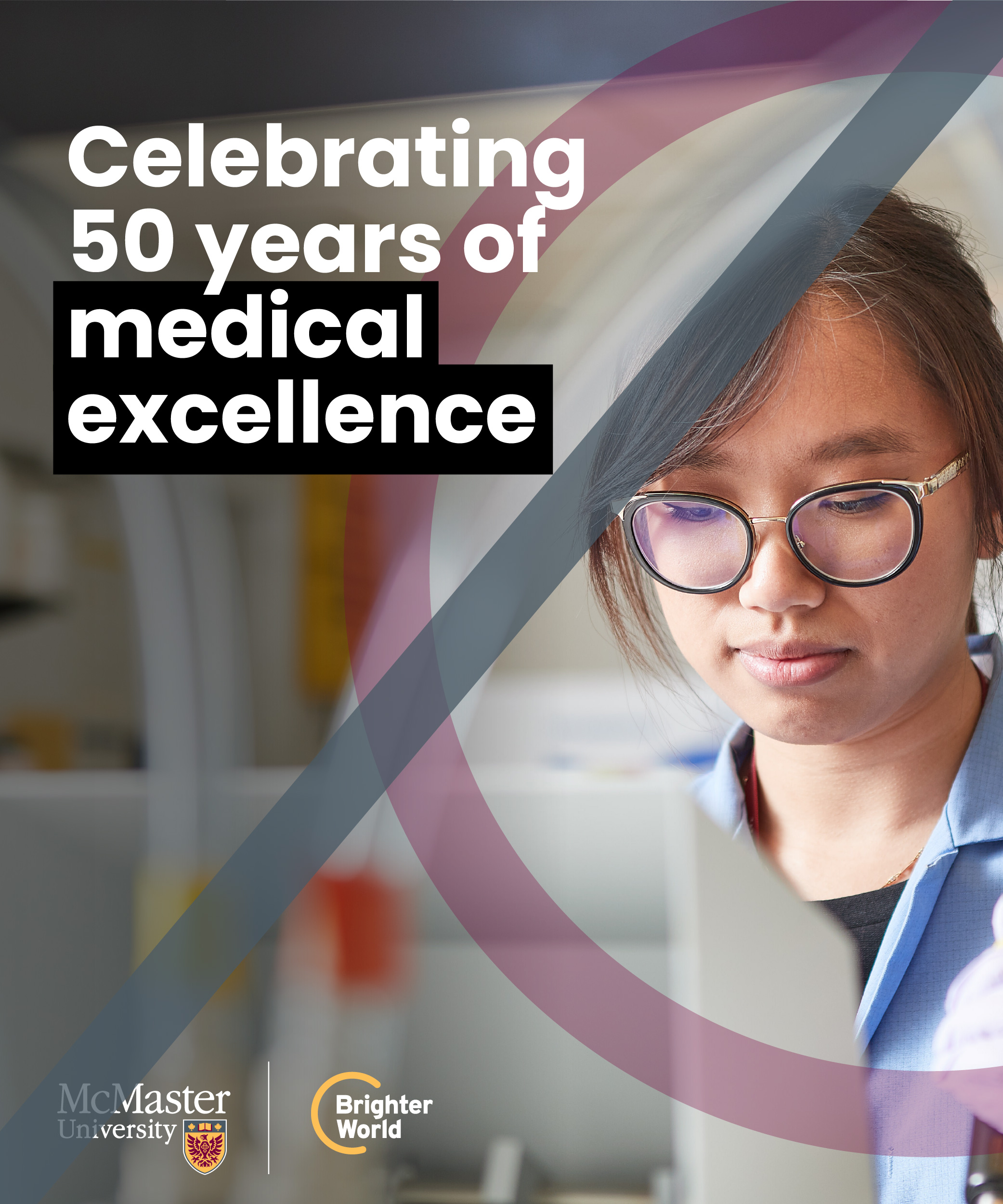
Full-colour photography brings McMaster’s brand to life, showcasing campus life and innovation, researcher and student accomplishments, and positive impacts on the community and beyond. Additionally, it allows for the expression of diversity, capturing the multicultural campus community and highlighting inclusivity. By incorporating full-colour photography into branded assets, McMaster can create a strong emotional connection, evoke a sense of pride and belonging, and showcase its efforts towards creating a Brighter World.
See the photography section for more information on the style and format of photos.
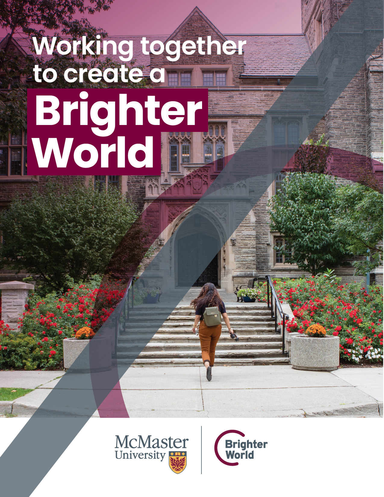
Stemming from the consultation that supported the brand evolution process, the circle element symbolizes:
- Collaboration: Like our brand story says: Excellence is not a solitary act. At McMaster, it’s a collective art.
- Welcoming Community: Our diverse and inclusive community is one where everyone is valued and respected.
- Positive Impact: McMaster’s dedication to advancing human and societal health and well-being for all guides everything we do, and the impact of our work is felt around the world.
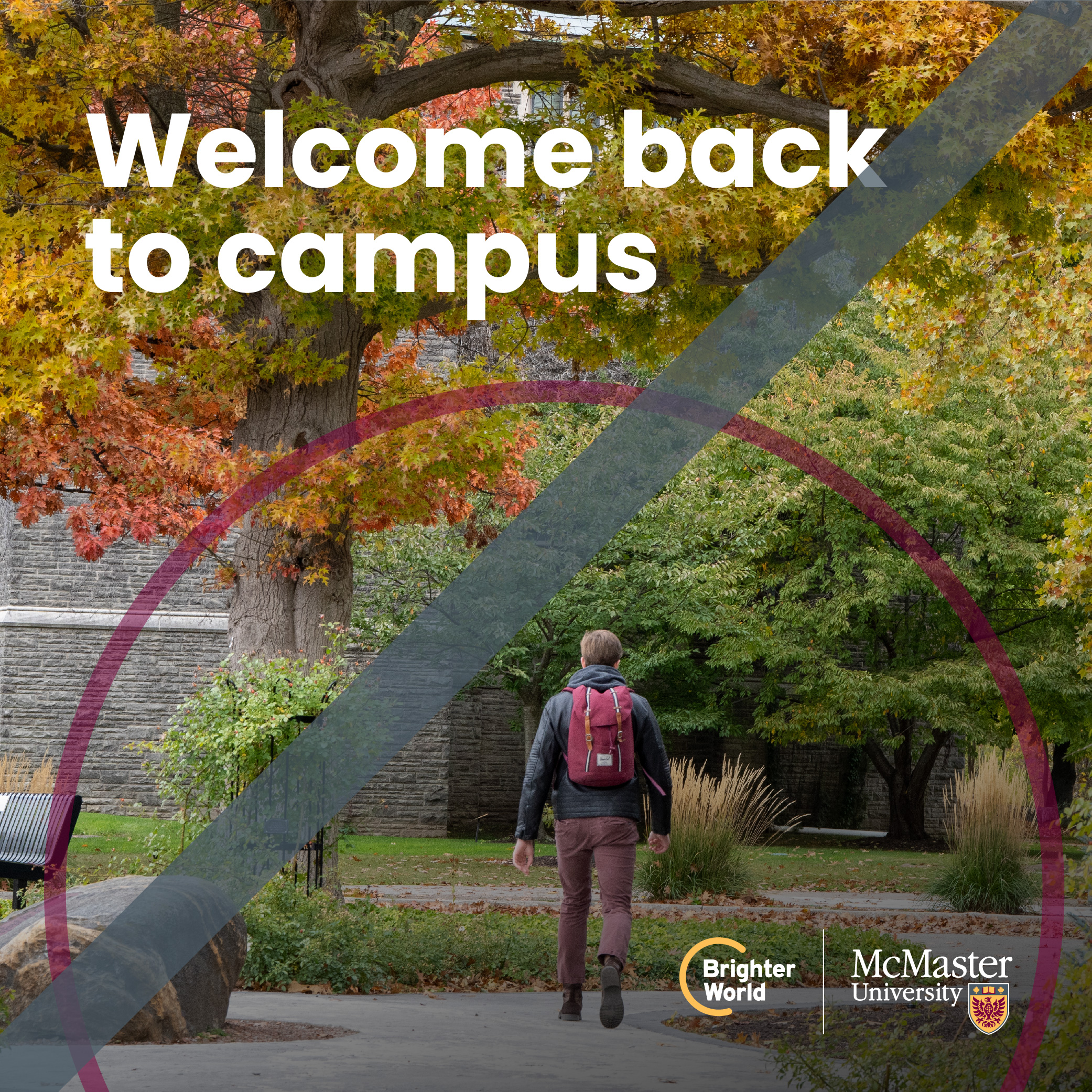
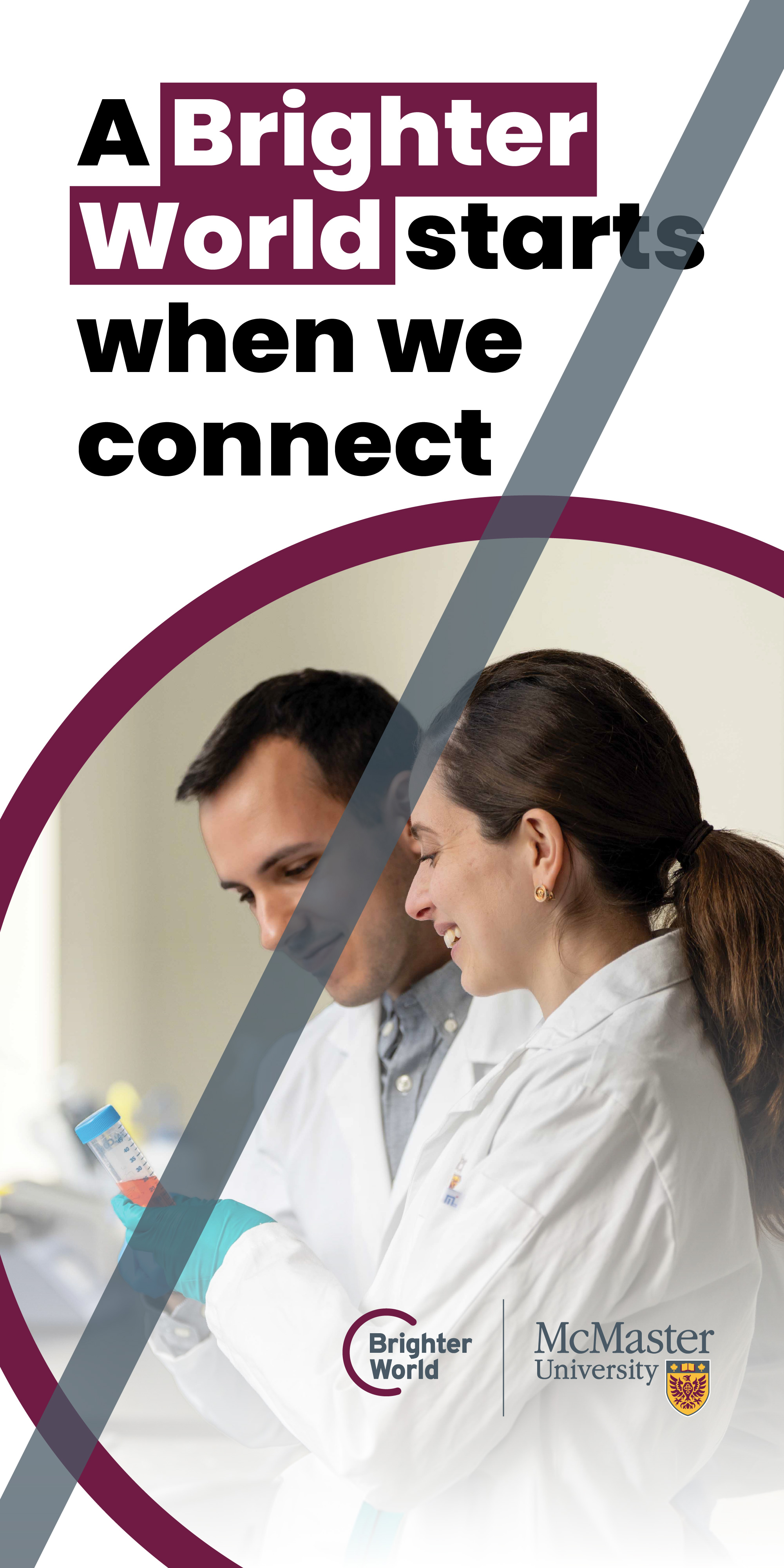
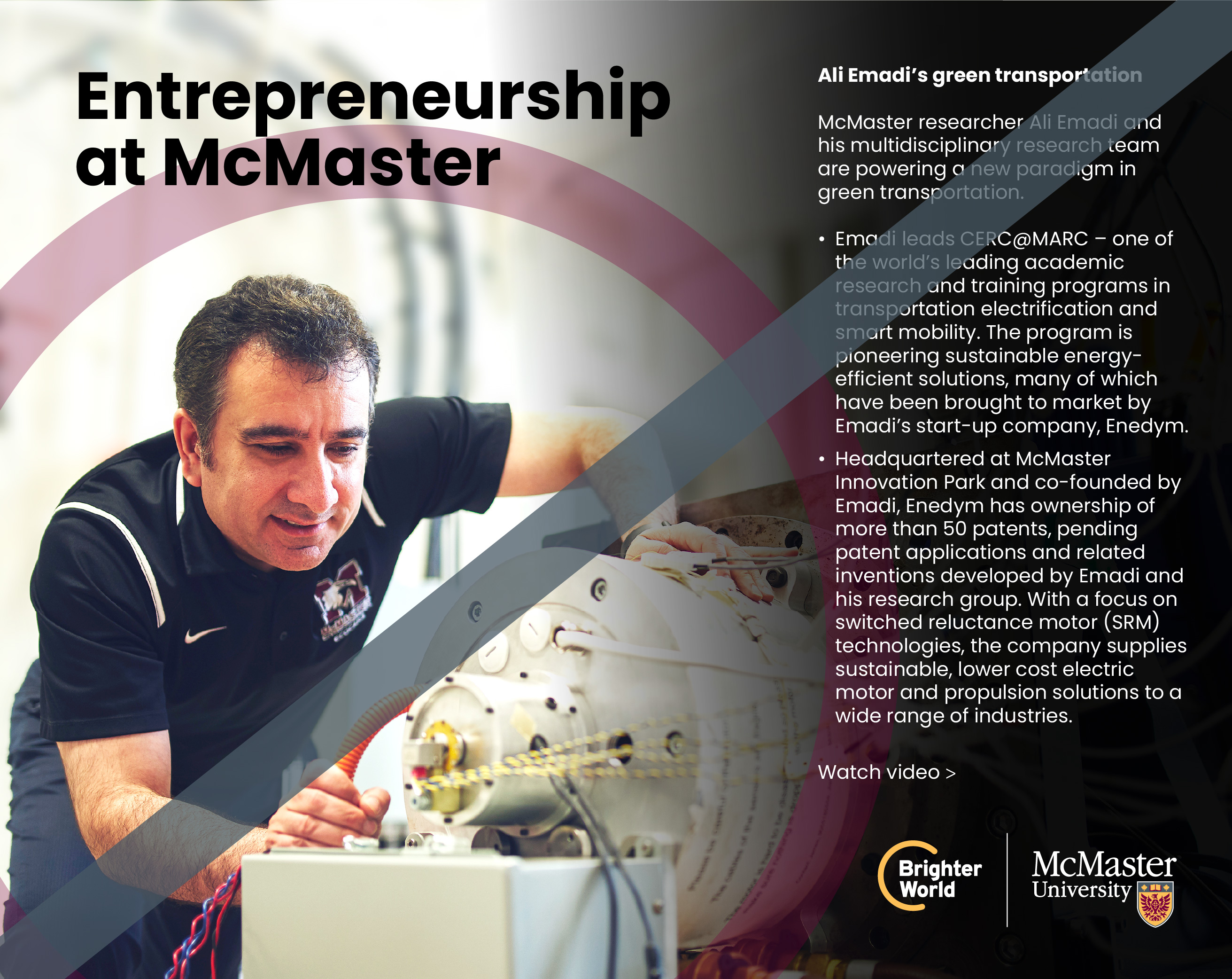
Circle cropping
Avoid a full circle within the artwork, it should always be cropped on one or two sides.


Avoid having less than ¼ or more than ¾ of a circle within the artwork.


Avoid overly centred or symmetrical circles.


Avoid large circles as they lose the curved shape.


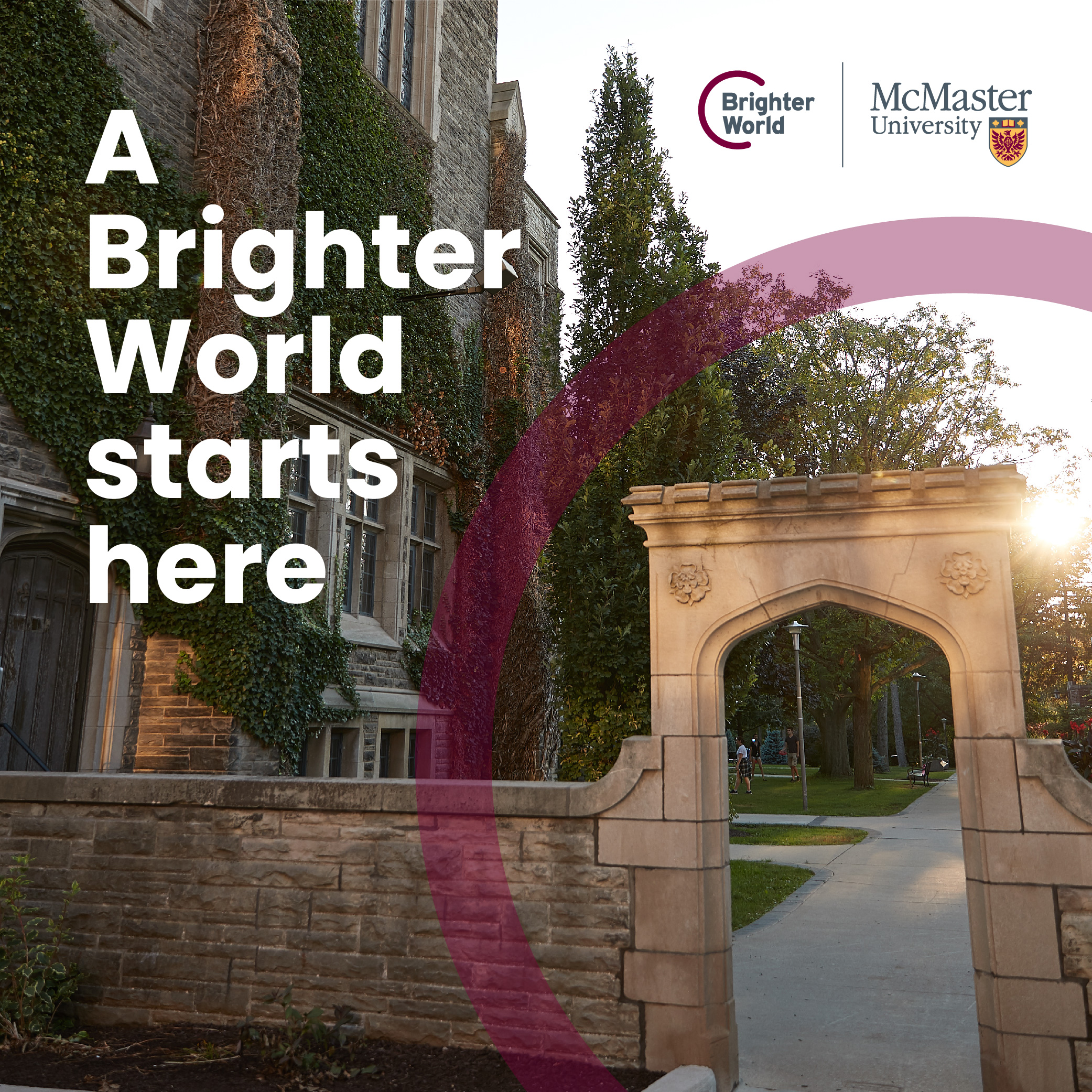
Circle colour and opacity
The circle should be McMaster Heritage Maroon (#7A003C). You can also use McMaster Heritage Gold (#FDBF57) if there is already a sufficient amount of maroon in the artwork.


No other colours may be used for the circle.

When used on a photo, the opacity of the circle should be adjusted between 30-50%, depending on the saturation of the photo. This will ensure the circle still has transparency, but is also visible.
When used on a solid colour or background, the circle should be 100% opaque (i.e. no transparency).
Circle sizing and thickness
The circle should not be so thick that it overpowers the image.
The circle should not be so thin that it appears as a stroke.
The thickness of the circle should be similar to the height of a capital letter when using headline copy.
The circle thickness should not appear greater than the size of people in the photo.
Positioning the circle in your layout
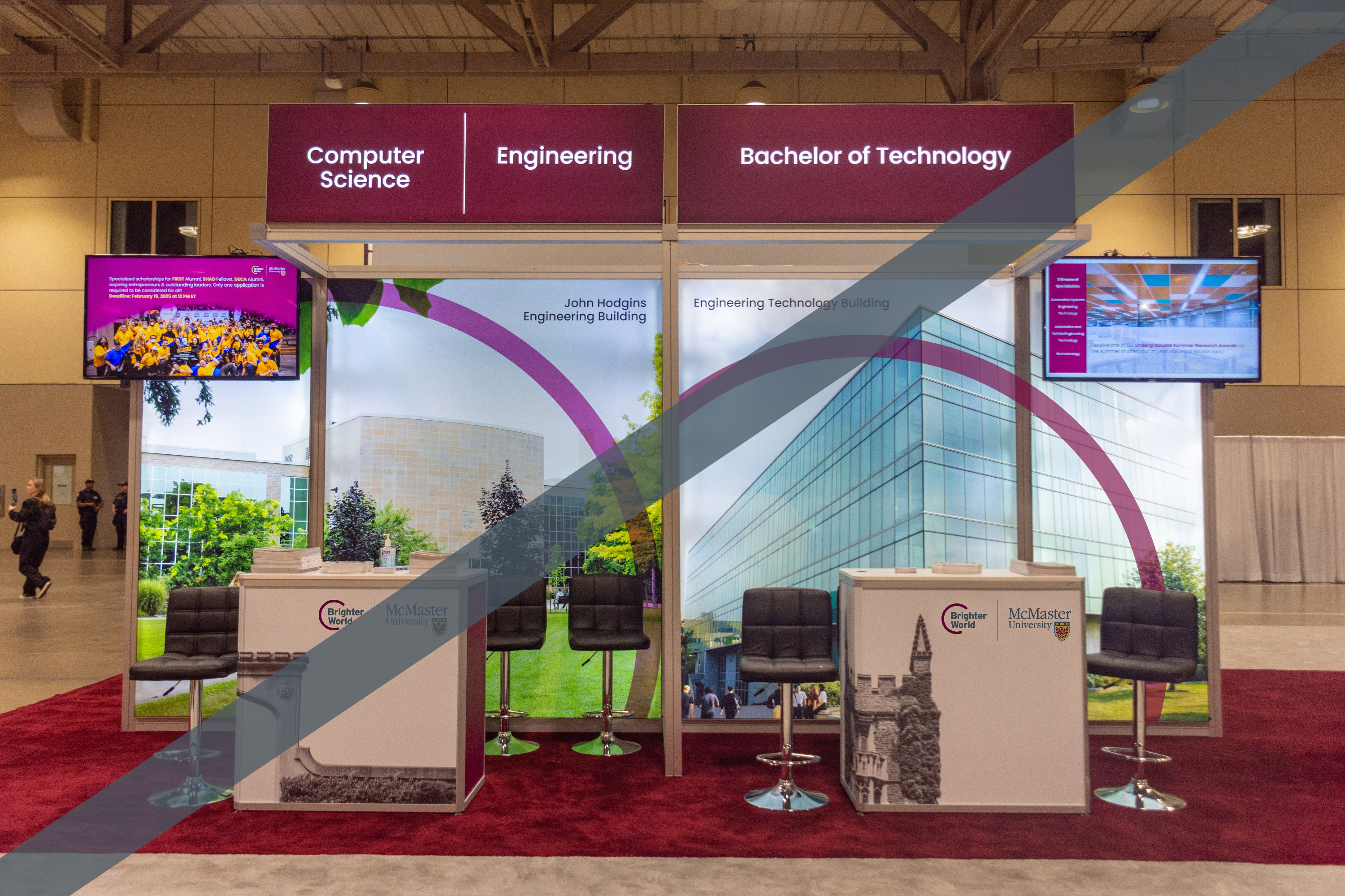
The circle should be positioned to draw the eye to the focal point of the image.
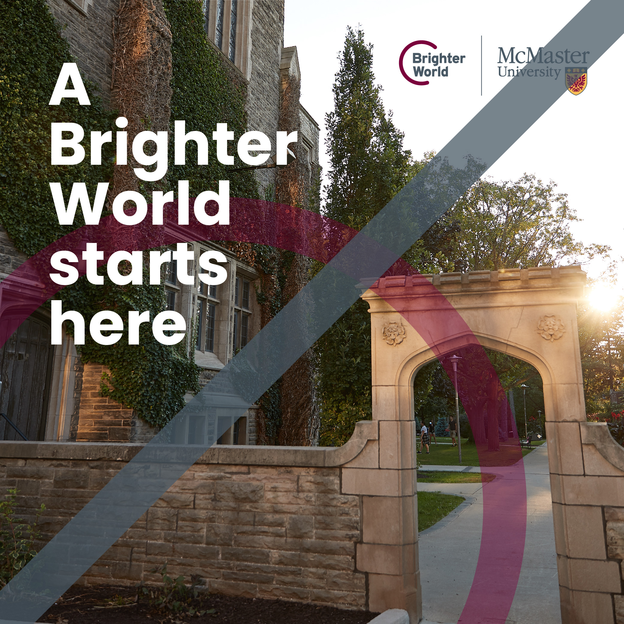

The circle may be placed behind the copy, or logos, to help create contrast and to highlight the message or logo.


An opaque circle can be used on a solid background (either white or maroon). When placed on a solid background, the circle must be thoughtfully positioned to balance a layout or to add visual interest.
The circle can be placed on either a photo or a solid background, but it should never extend across both within the same design.

General circle guidelines
Individual images or assets may only include one circle.

Page layouts can include multiple circles, when used in different sections of the page.
The circle may not be used as a container.

The circle may not be used as a divider.

When multiple photos are beside each other, either do not include circle elements at all, or only include on select photos that are not adjacent to each other.
Positioning the circle over people in photos
The circle should never overlap the skin of a person in the foreground of the photo.

The circle may overlap a person’s body, but it is important to be considerate and mindful of where on the body the circle is positioned.
If the photo has people in the background, and there is some depth of field (i.e. blurring), the circle may overlap the people, including their skin, if necessary.
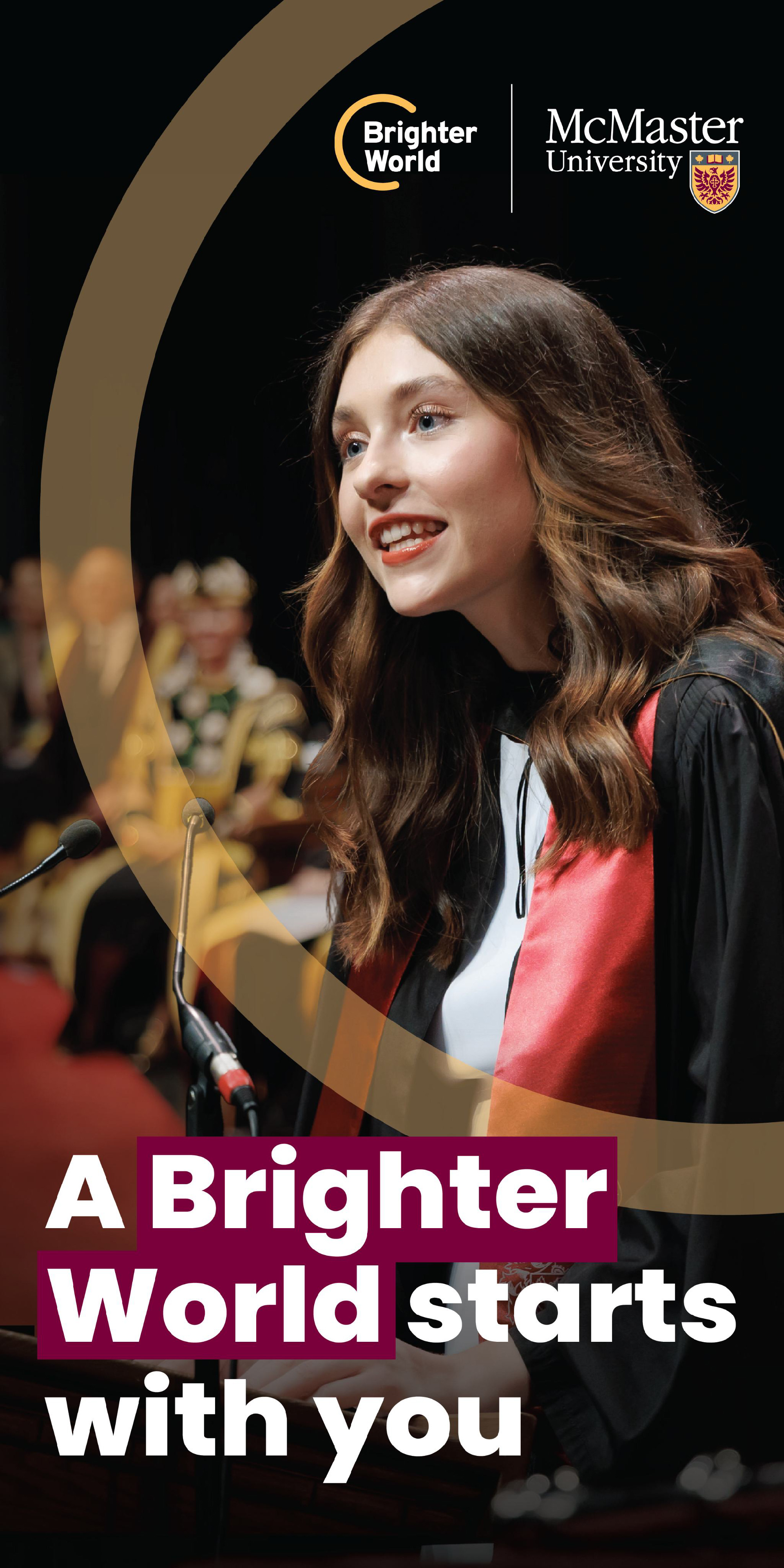
Where possible, ensure there is some space between the subject and the circle so it does not appear crowded.
Positioning the circle behind people in photos (Please engage a designer to support this application)
In select scenarios, the circle may be placed behind the subject, but in front of the background.
Do not “weave” the circle between foreground and background, it should be fully behind the subject.
Using the circle element in small assets
The circle element should be used wherever possible, even on small assets. In scenarios where the asset is too small to fit an image and the circle element, the image can be removed, but the circle element should be kept.


Multiple images in one application
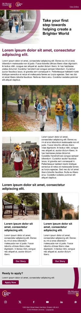
In applications where multiple assets may be stacked together, such as an email or webpage, avoid having two adjacent assets with the circle element, as it will become busy. Alternate between a range of assets, such as images with the circle element, solid colour blocks, full image blocks, and copy blocks.
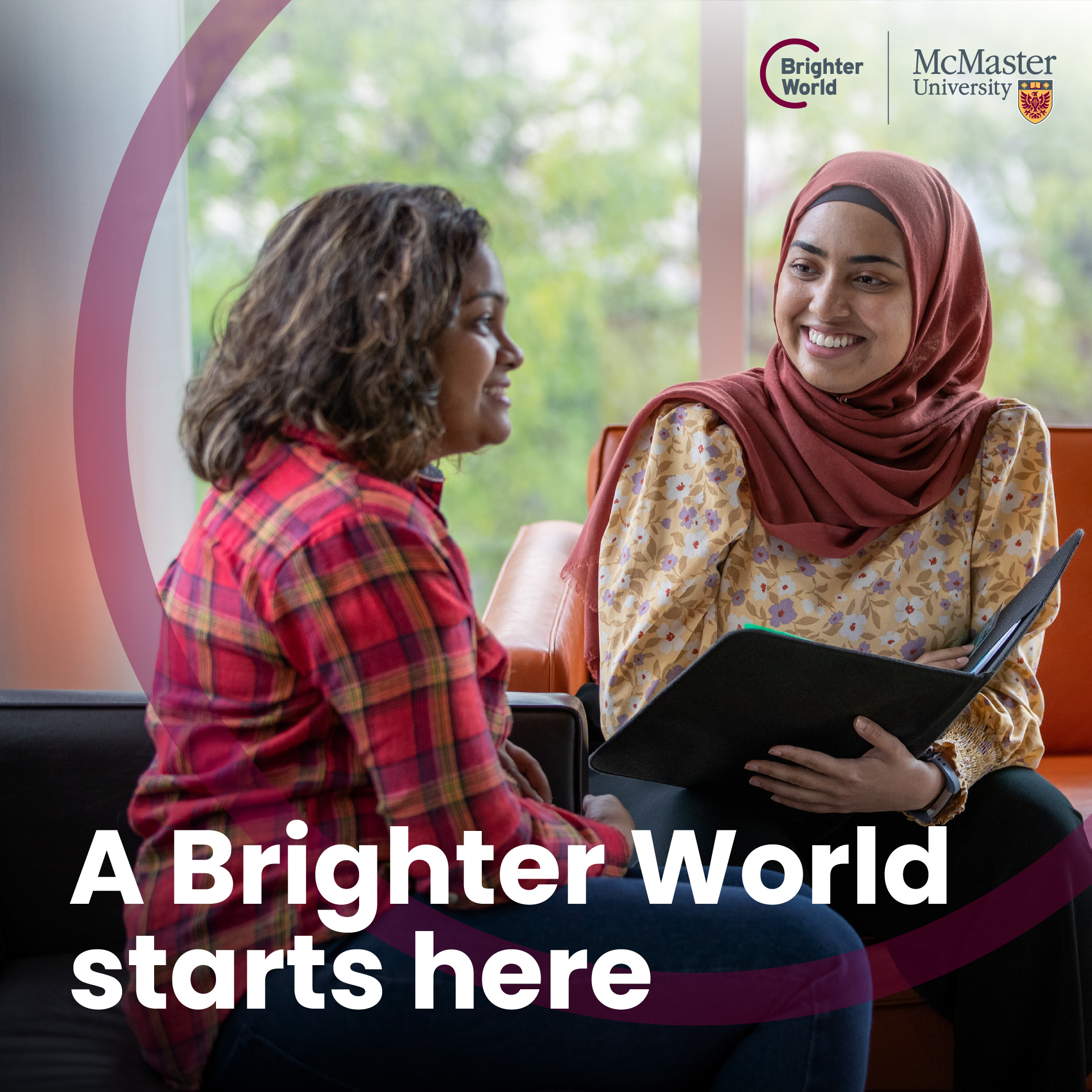
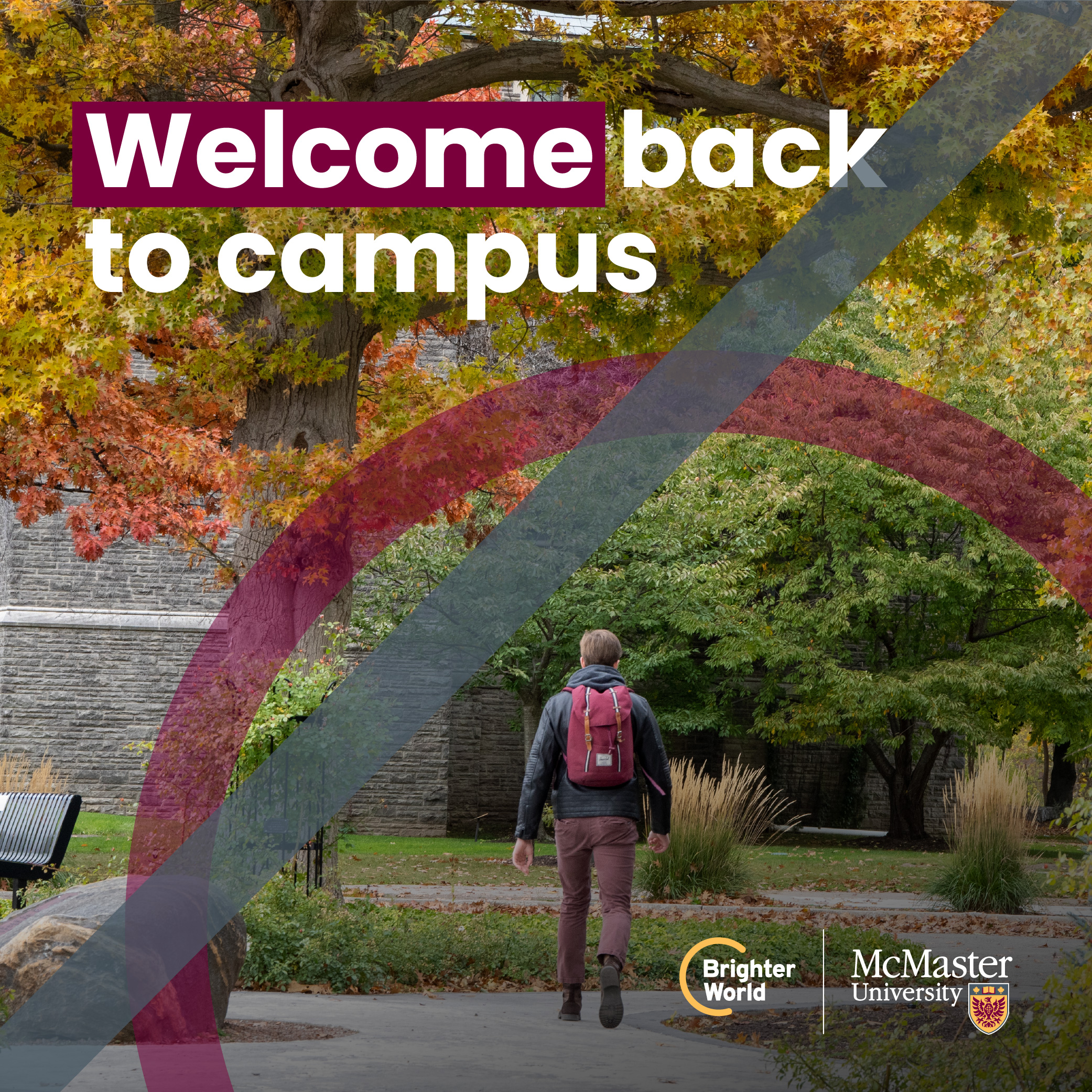
Adding copy to photography
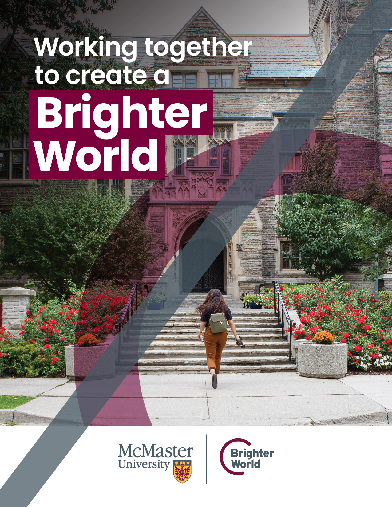
With the use of full-colour, full-page photography wherever possible within marketing assets, the preference is to place copy directly on the photo. This includes headlines and subheadlines, as well as body copy when there is sufficient space. It is essential to choose images and copy placement carefully, ensuring sufficient negative space and contrast for legibility and accessibility. In some scenarios it may be helpful to leverage AI features to extend image backgrounds or apply blurring to create sufficient space for copy. (Refer to Photography Guidelines for more information on selecting ideal photos.)
Copy positioning
Copy should be left aligned, whenever possible. The vertical position should be based on what works well with the image, rather than being aligned to a specific area of the layout.
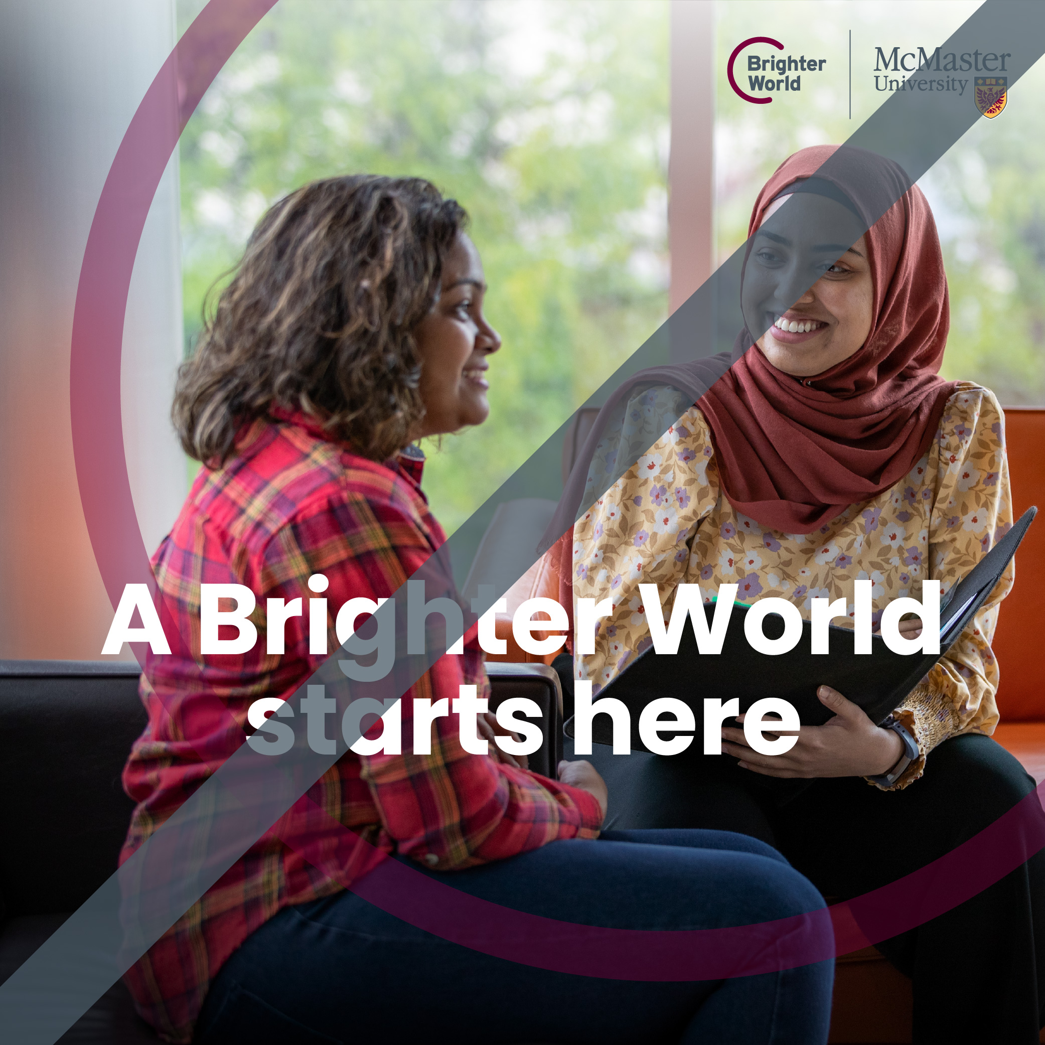
Transparent image overlays to help with legibility
Drop shadows are not part of McMaster’s brand and should not be used to create contrast for the copy.To ensure sufficient contrast, adding a semi-transparent black (preferred) or white gradient layer behind the copy may be necessary in certain cases. No other colours may be used. Overlays must be created and positioned carefully to avoid a harsh appearance. They should never fade to a solid black or white, but always maintain some transparency to appear as a shadow or highlight within the photo.
Image without sufficient contrast. Semi-transparent overlay. Image without sufficient contrast.


Important note: The overlay layer must be behind the logo, copy and typography treatment, and circle element (only in front of the photo).
Only black (preferred) or white may be used for overlays.


Black overlays often look most natural.

Overlays should have some transparency, not fade to a solid colour.
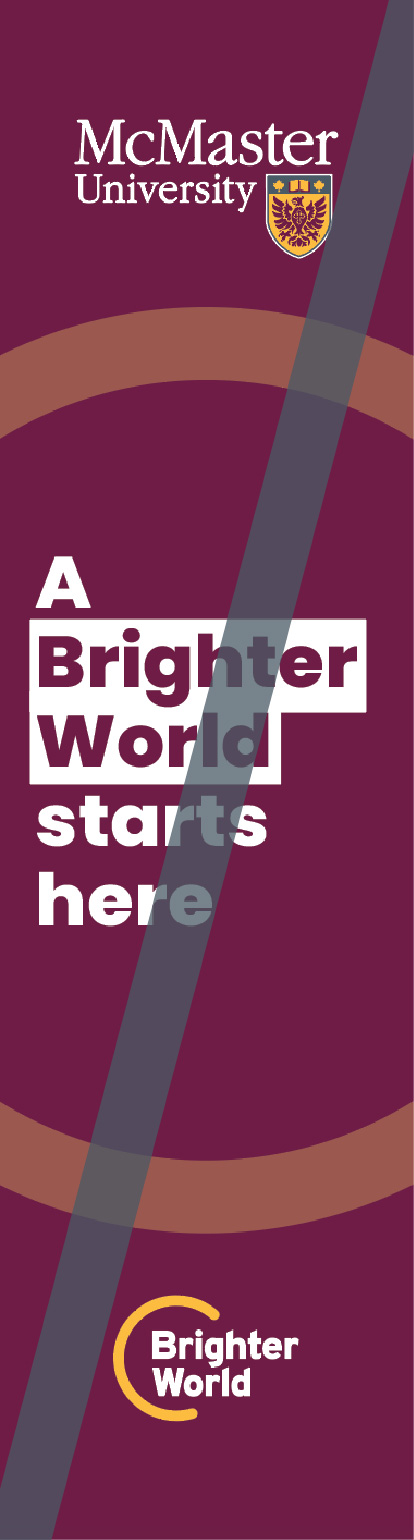
Solid copy blocks
If the above guidelines do not work, you should use a solid copy block. Here are some reasons why:
- if there is too much copy to fit over the image
- there is no area of the image that provides sufficient contrast for the copy to be legible
- the transparent overlay cannot be achieved in a natural way
When copy is more extensive than a headline and subhead, a solid copy block should be used.
If no area of the image provides sufficient contrast for the copy to be legible, a solid copy block should be used.
If an overlay does not look natural on the image, a solid copy block should be used.

The solid copy block should either be full-width, or full-height, and extend to the edge of the image Heritage Maroon is the primary choice for the area, followed by white, or black. Logos and copy can then be placed in the solid colour area to ensure acceptable contrast.
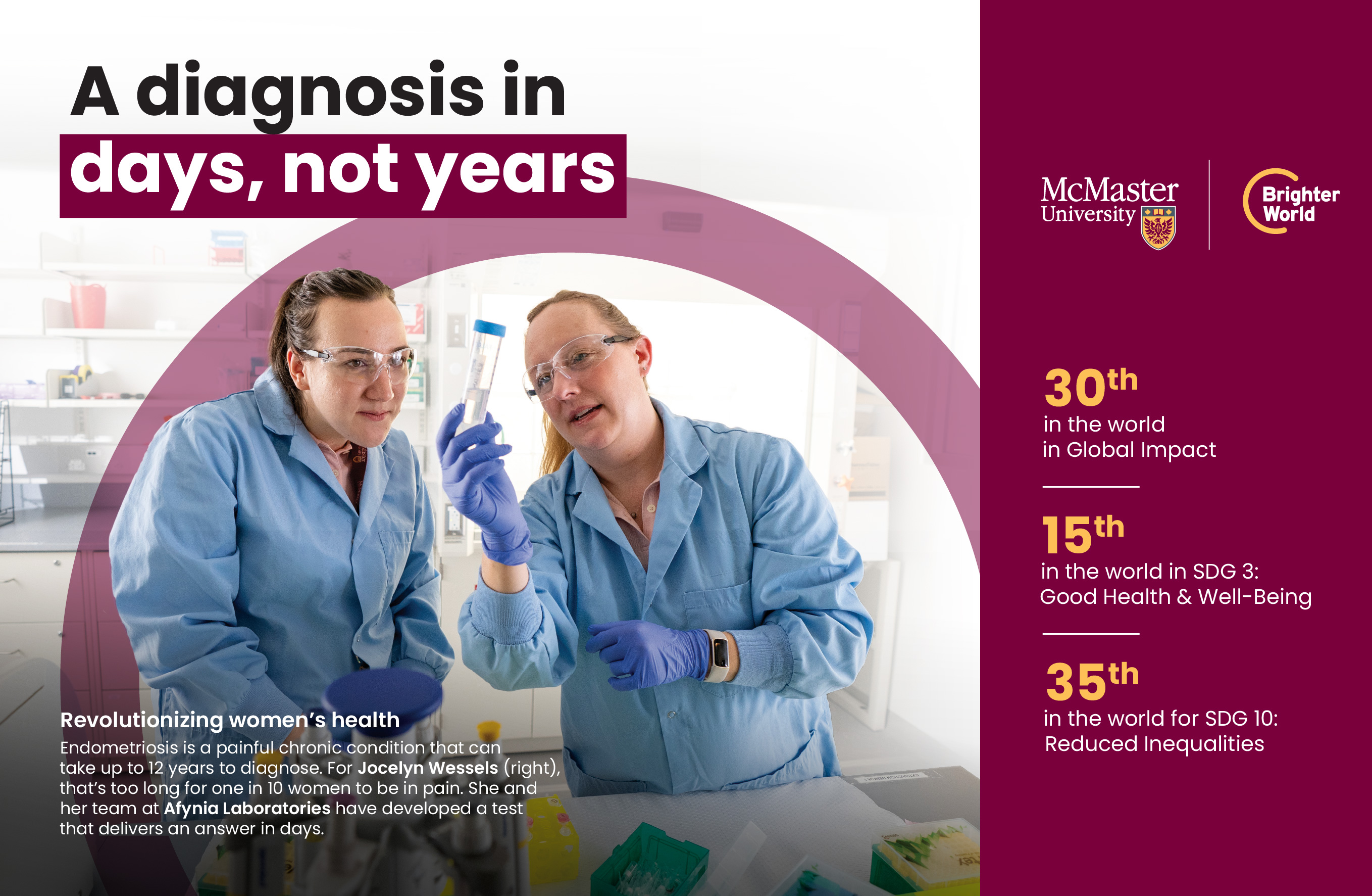
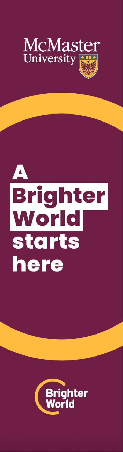
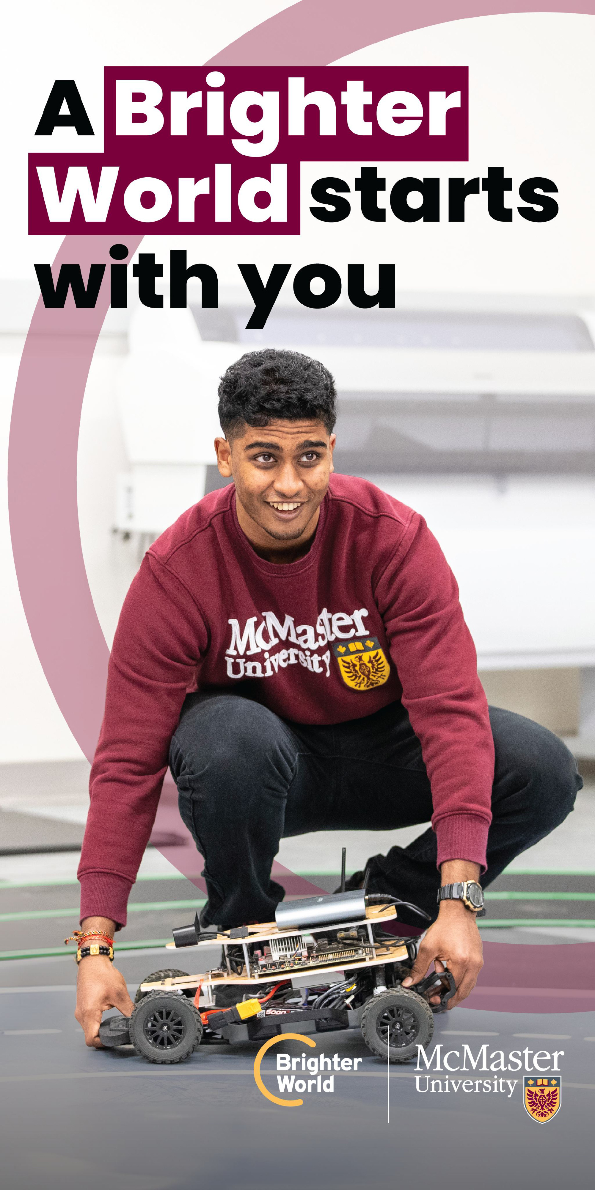
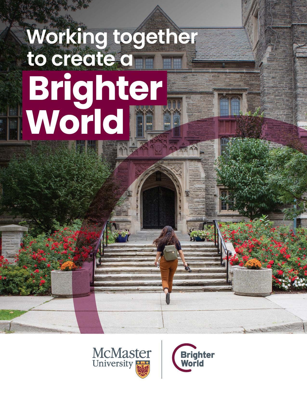
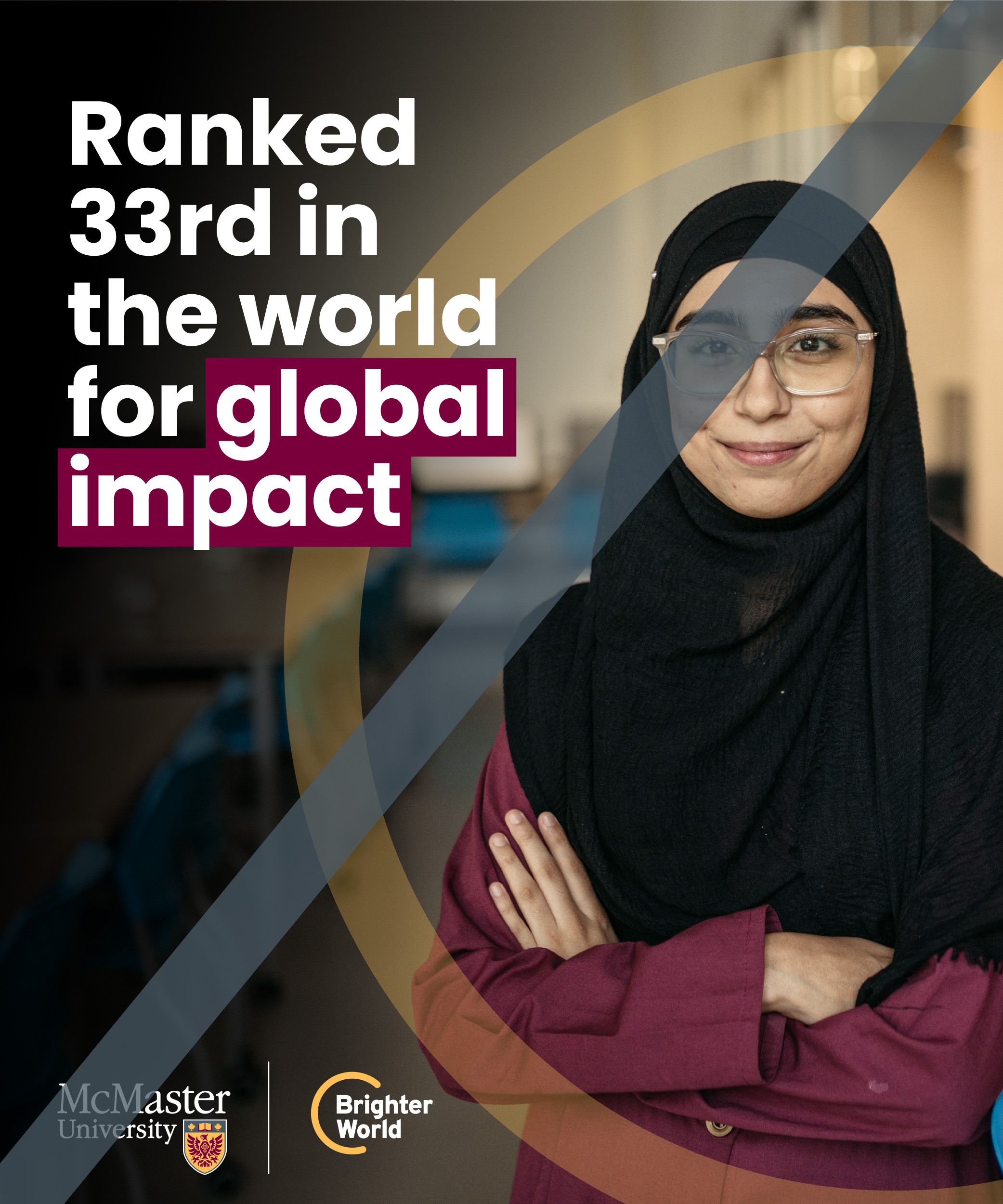
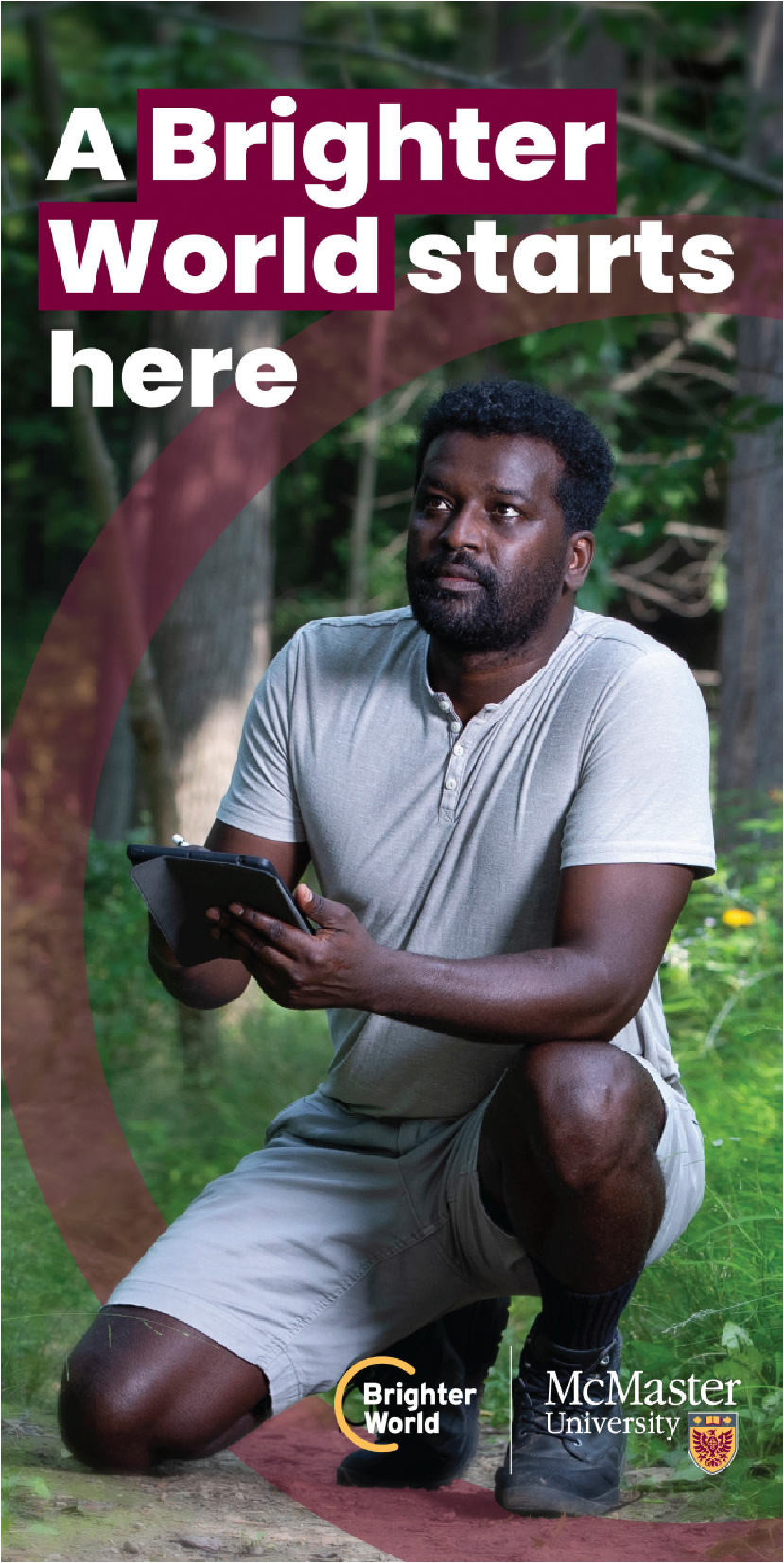
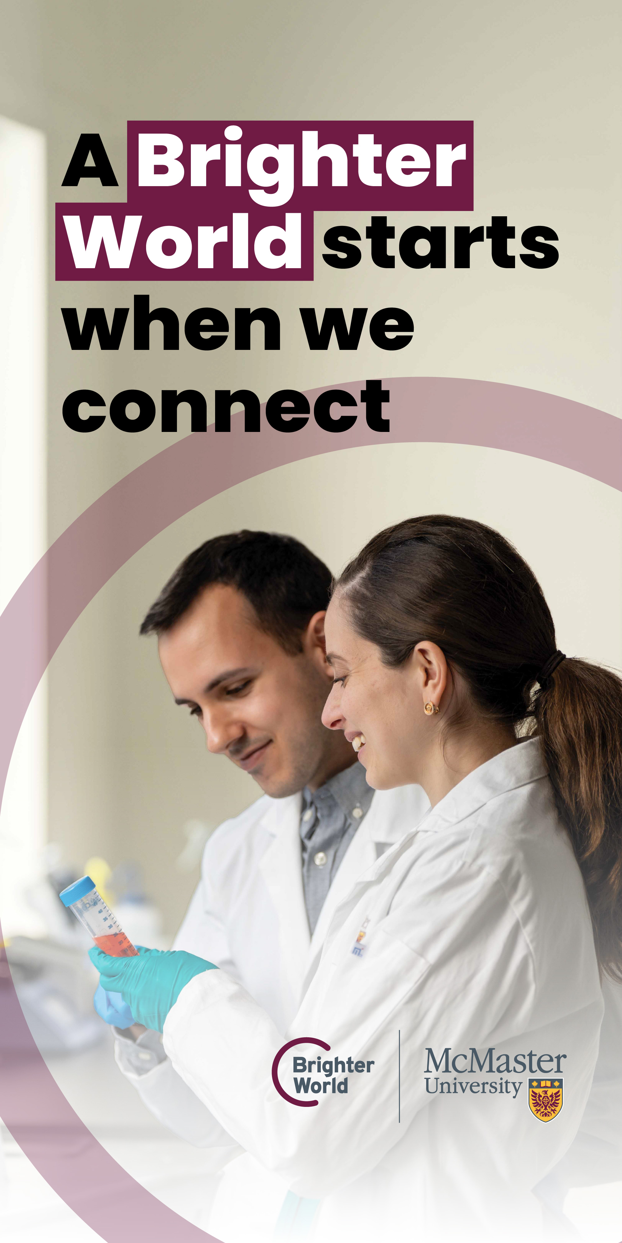
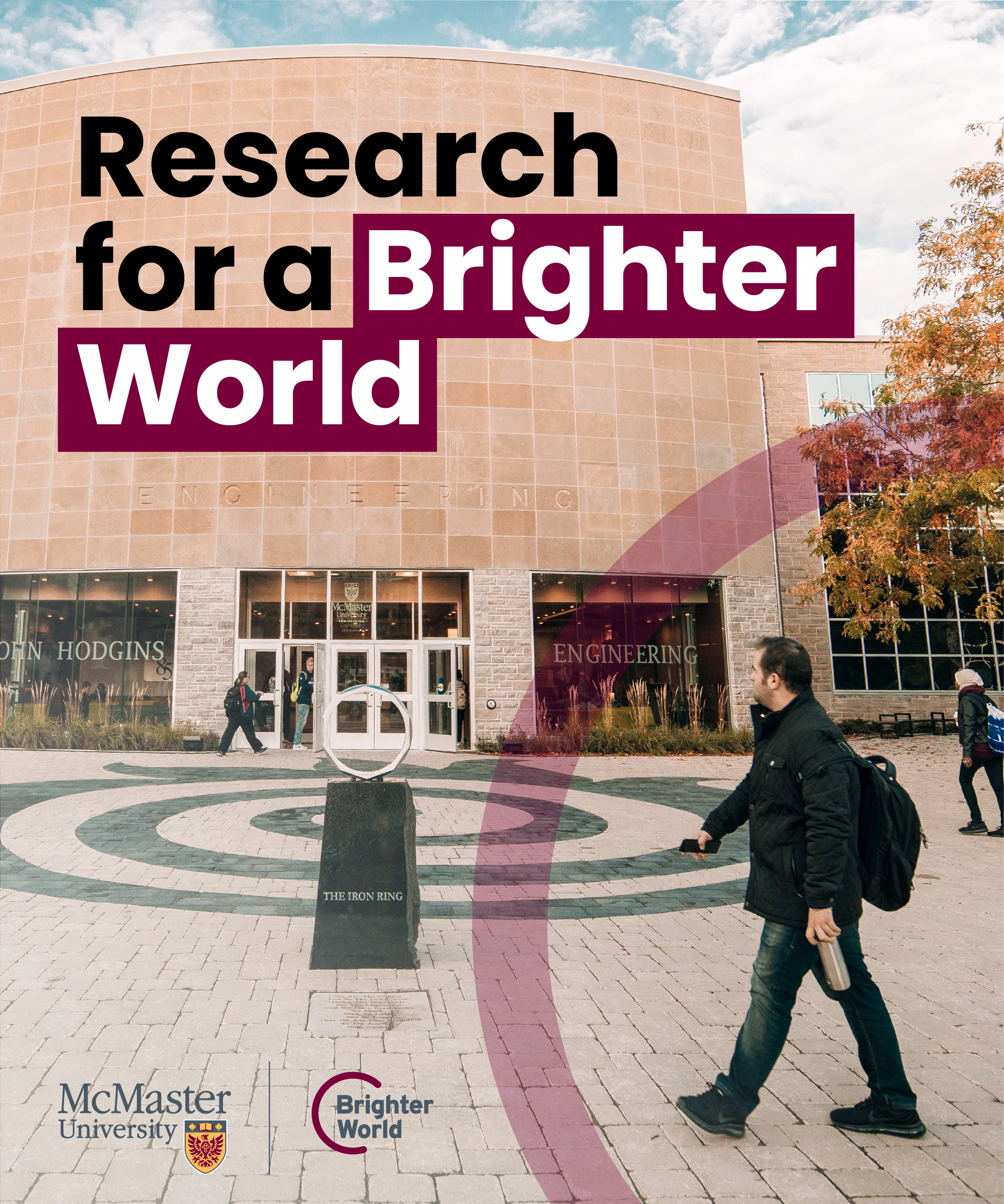
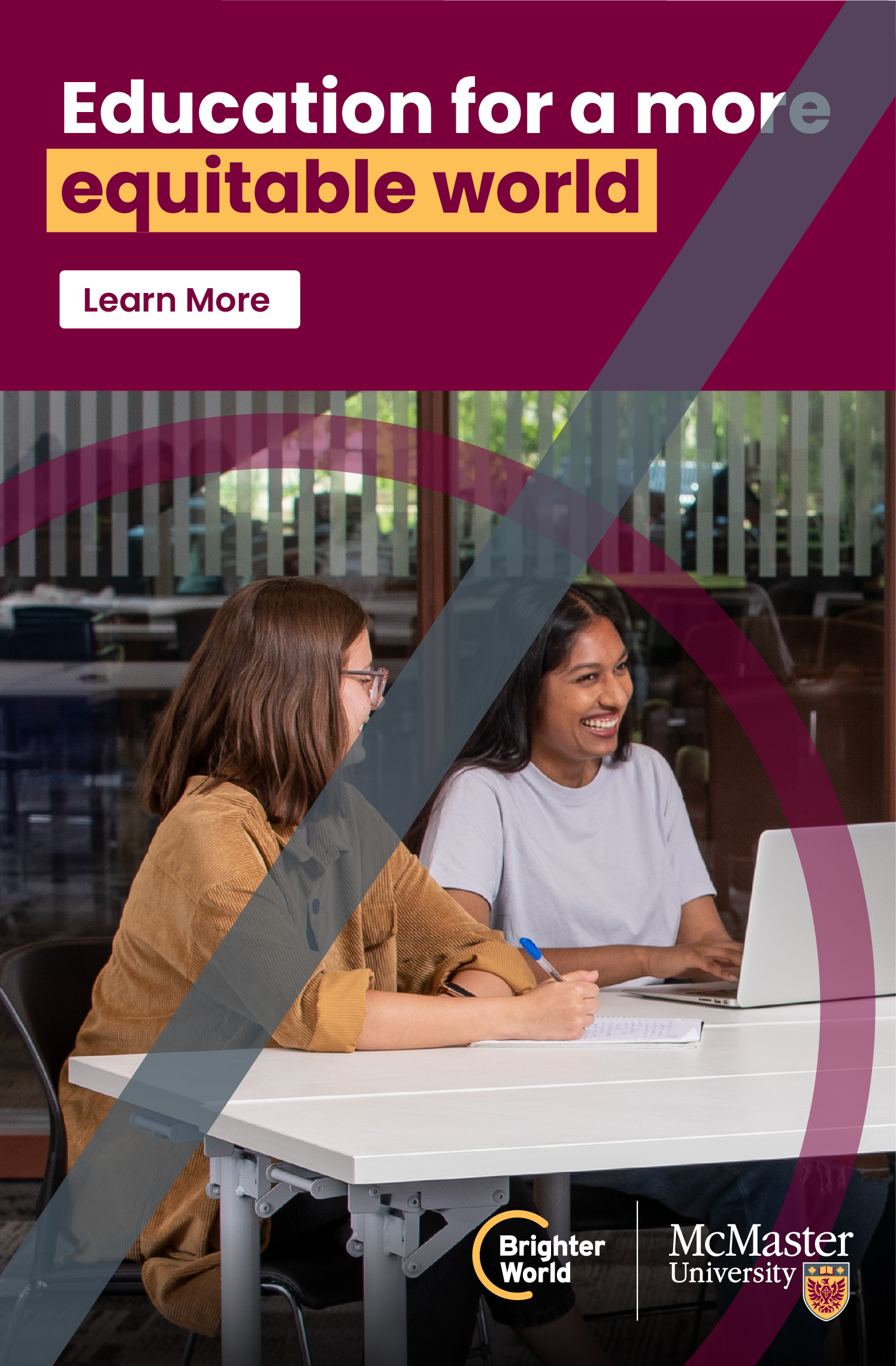
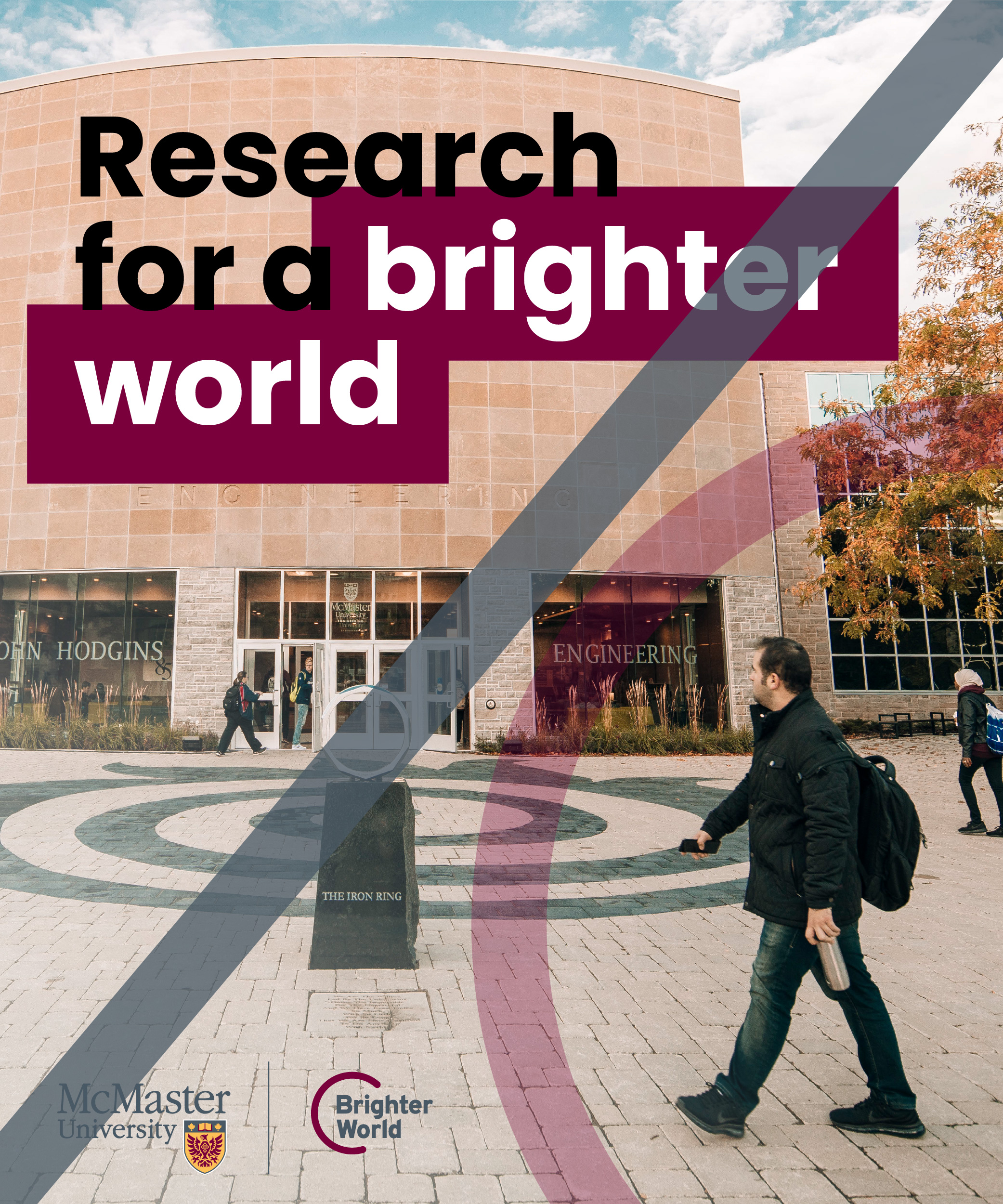
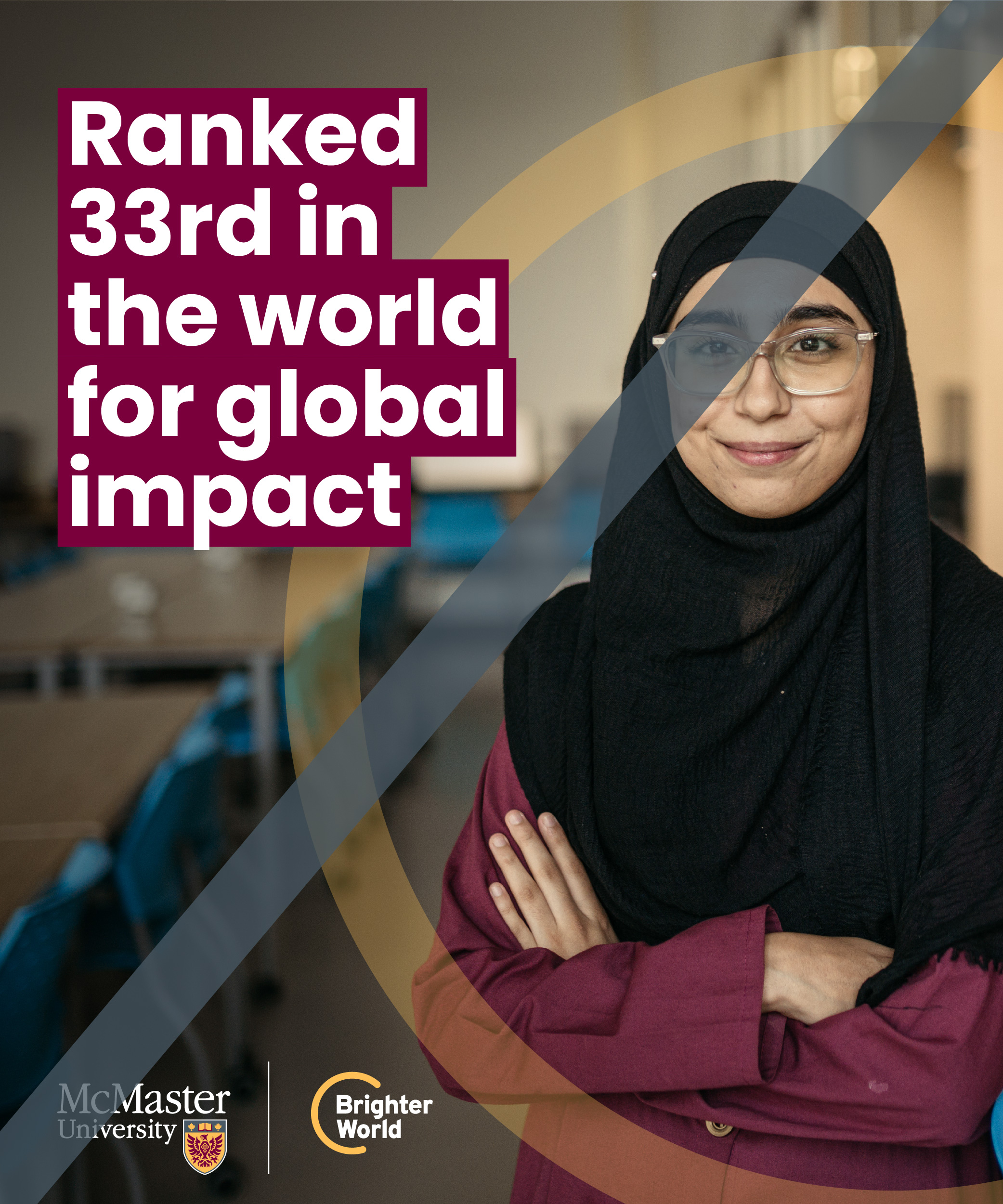
Maroon typography box treatment
To further emphasize the Brighter World messaging, a McMaster Heritage Maroon typography box treatment has been developed to highlight positive benefits or outcomes within prominent headline copy, on design-driven marketing assets. The maroon typography box serves multiple purposes:
- Emphasizes key messaging
- Provides an opportunity to further enforce the brand through the primary maroon colour
- Helps to create sufficient contrast for copy against full-colour photography
It is important to not overuse this treatment, as it will lose its impact. It should NOT be applied to all headlines such as instructional copy, names of speakers, title slides on PowerPoint or reports.
Do not use gold or white typography boxes.
Maroon typography box should only highlight positive outcomes or impact.

Only highlight the key words and not the full sentence.
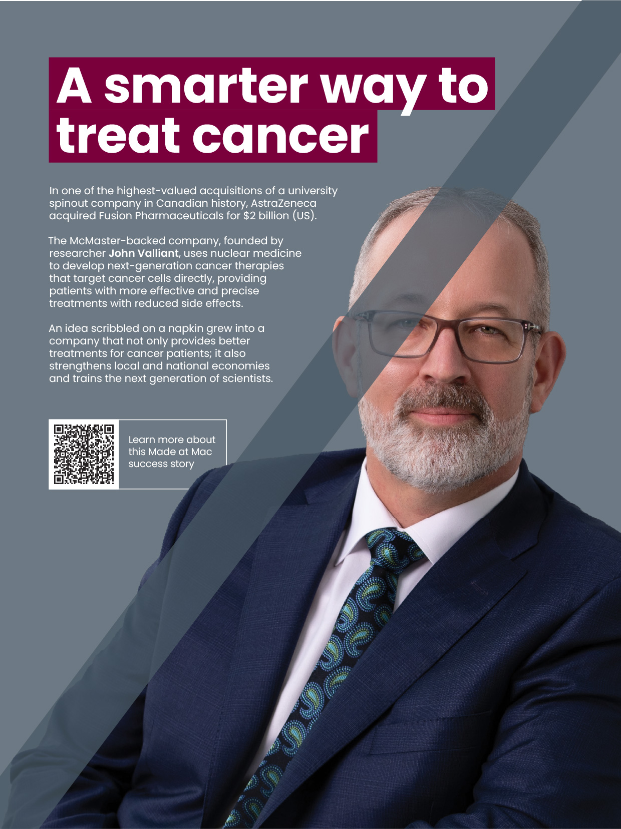
Maroon typography box is not utilized for identification.
How to apply the maroon typography box treatment
Only apply the maroon typography box treatment to the section of the copy that speaks to the positive benefit or outcome. There should only be one maroon typography box treatment used per image.
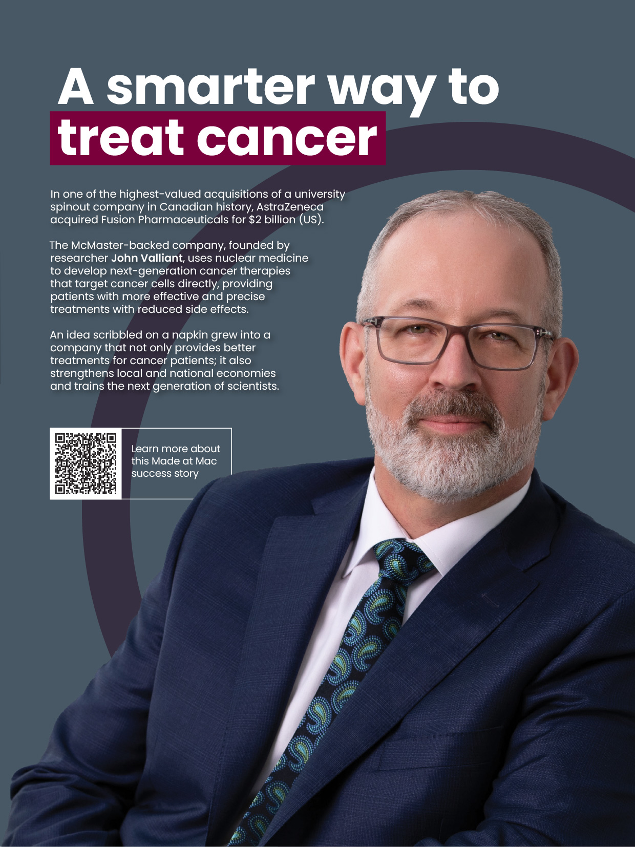
If there is more than one positive benefit or outcome in the copy, choose the most impactful one to highlight.

If the statement spans multiple line breaks, the maroon typography treatment box may follow the copy to the descending line.
Maroon typography box copy guidelines
The typography box colour should always be maroon. Therefore, the copy should always be white to ensure sufficient contrast and emphasis.
Sizing the maroon typography box
To size the maroon box appropriately, follow this guideline:
- Identify the height of a capital letter
- Multiply that number by .2 (20%)
- This will be how far the maroon box should extend above the capital letter, and to the left and right of the word(s)
- Multiply that number by .35 (35%)
- This will be how far the maroon box should extend below the baseline of the letters
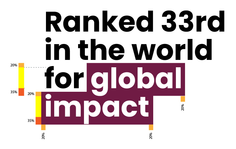
As a general reference, the box should extend beyond the highlighted words on the top and sides by the approximate thickness of an upright piece of a capital letter (or 20%), and should extend beyond the bottom of the words by about double the thickness (or 35%). This will ensure it highlights most of the descending letters without infringing too much on additional lines of copy below.
The maroon box must be sized correctly and not too large or infringing on the lines of copy around it.

The maroon box should only highlight the positive benefit or outcome, not the entire text block.
Include all the relevant words in the box to convey the positive outcome or benefit.


The typography box may only be maroon.
Additional copy highlighting guidelines
When the copy is on a solid colour background, words may still be highlighted.
- If using black copy on a light coloured background, McMaster Heritage Maroon may be used to highlight key words.
- If using white copy on a dark coloured background, McMaster Heritage Gold may be used to highlight key words.
- No other colours should be used for copy (including grey)
In these scenarios, the highlighted words can simply be words you wish to draw attention to, and do not necessarily need to be words that pertain to a positive outcome or benefit.